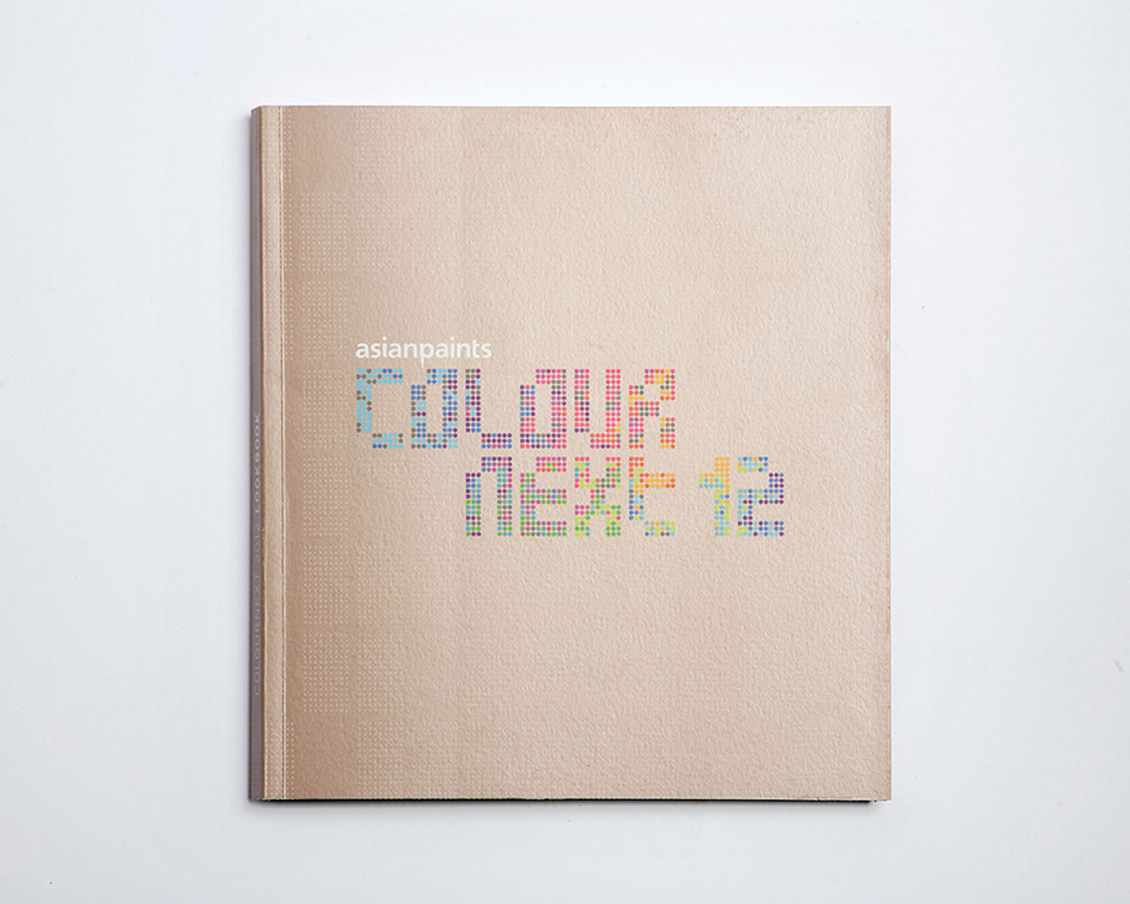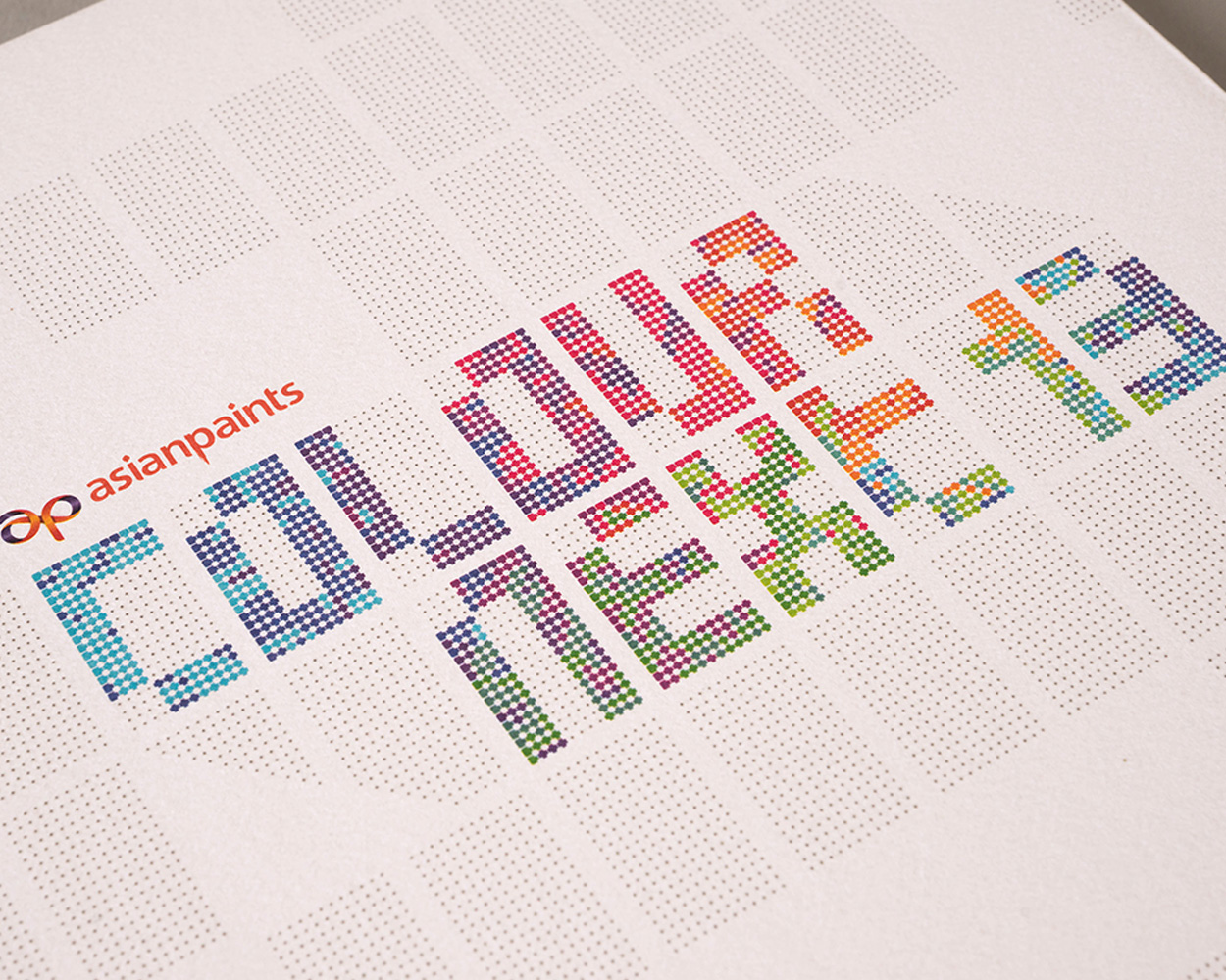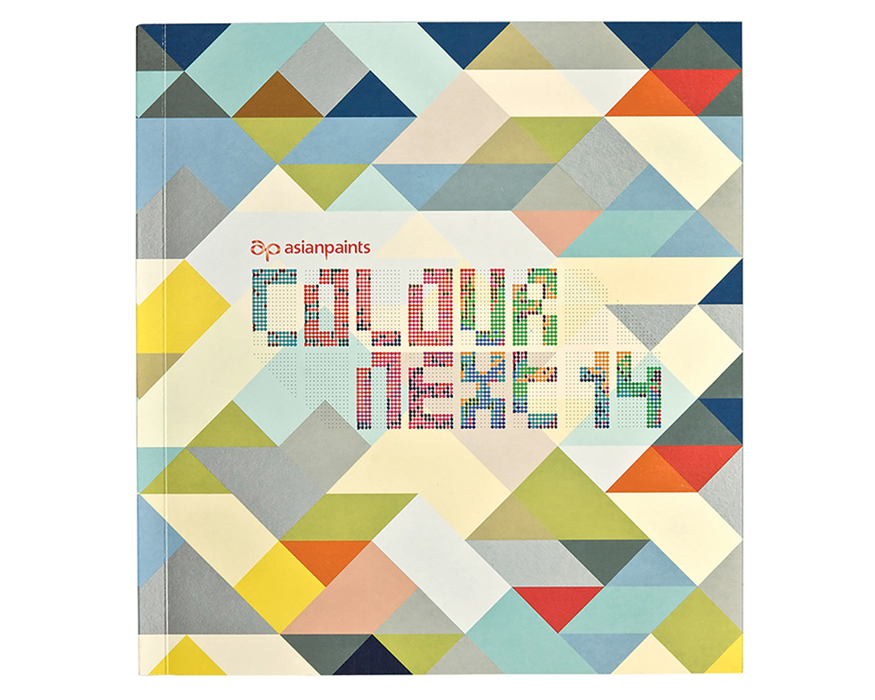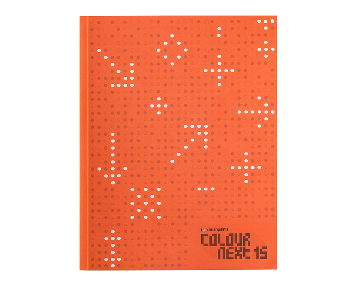
The making of India’s most definitive colour trend forecast brand: ColourNext
ColourNext as a product is an interior trends forecast. Ultimately to be positioned as an indispensable tool that gives a preview of what the next decor direction for the Indian design industry be.
The Challenges
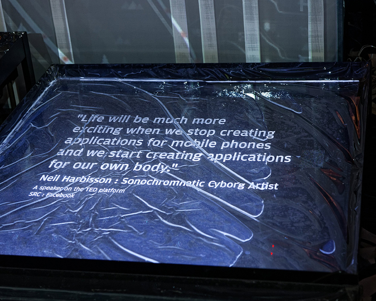
1. To differentiate the ColourNext brand from its parent company, without disowning it. There was a need to create a brand that distinguished itself from the large scale paint manufacturing and chemical formulating antecedents of Asian Paints. ColourNext had to speak as an evolved brand that is insightful and creative in the world of colour and lifestyle.2. To project the intellectual capability of ColourNext, that uses colour psychology and market research to extrapolate social trends to evolve plausible future lifestyle scenarios.
3. To find an interesting format to stage this forecast that would capture the imagination of the design-conscious target audience.
The Target Group
The interior design and architecture community of India — a demographic that is not swayed by TVC (TV Commercials) or advertisements. With a strong aesthetic sensibility and an interest in materials, form, colours, textures in a spatial context, the assumption was that they would appreciate conceptual thinking and find beauty in abstracted expressions.

Phase 1
Communication strategy 2011 - 2015
Establishing ColourNext's knowledgeable, creative and artistic persona
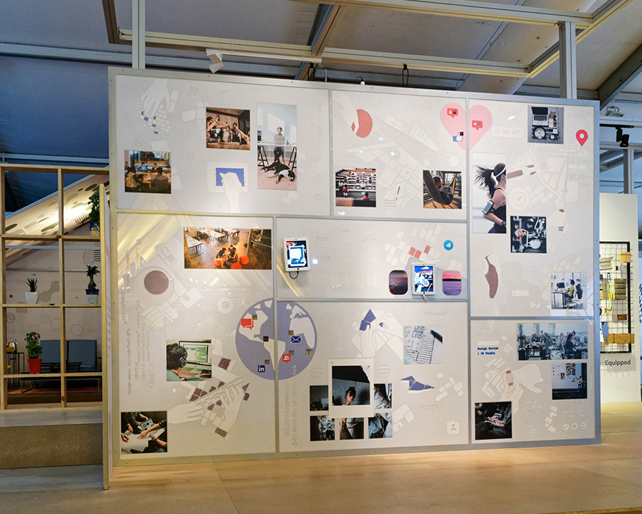
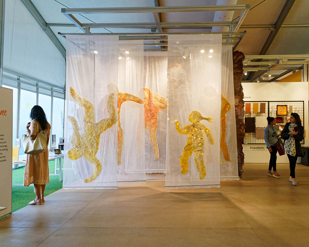
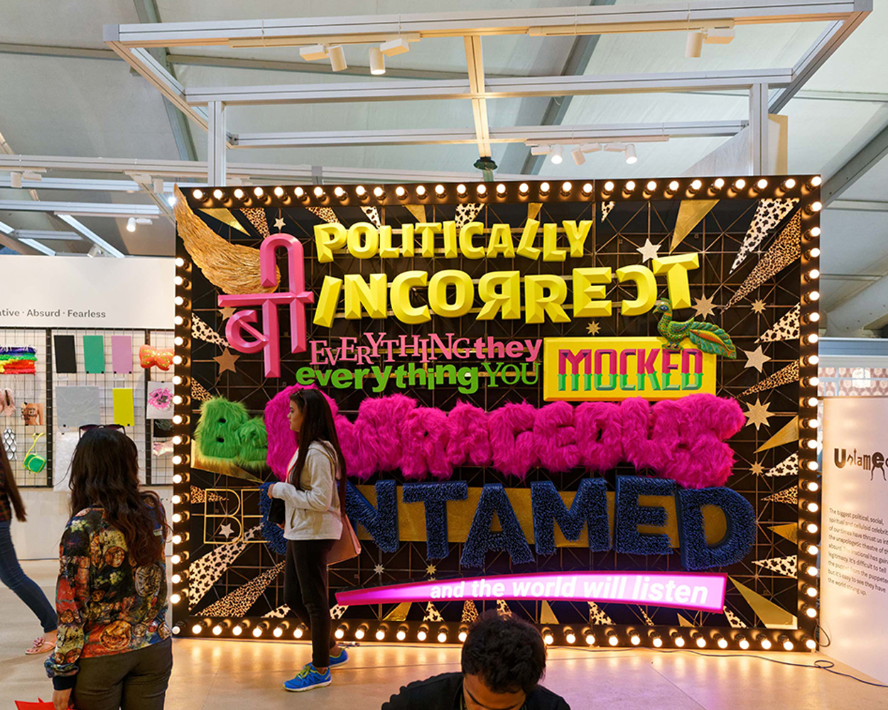
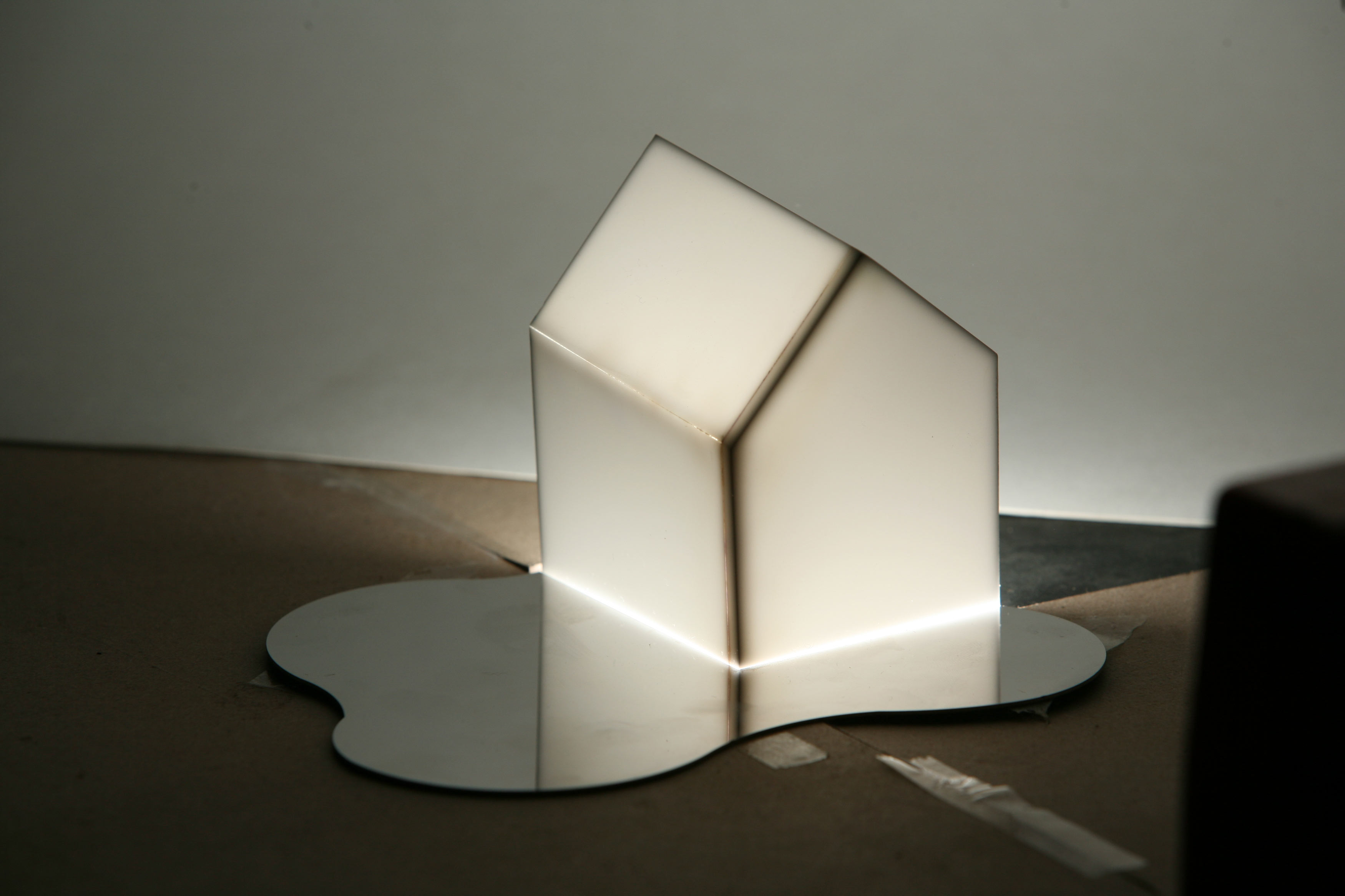
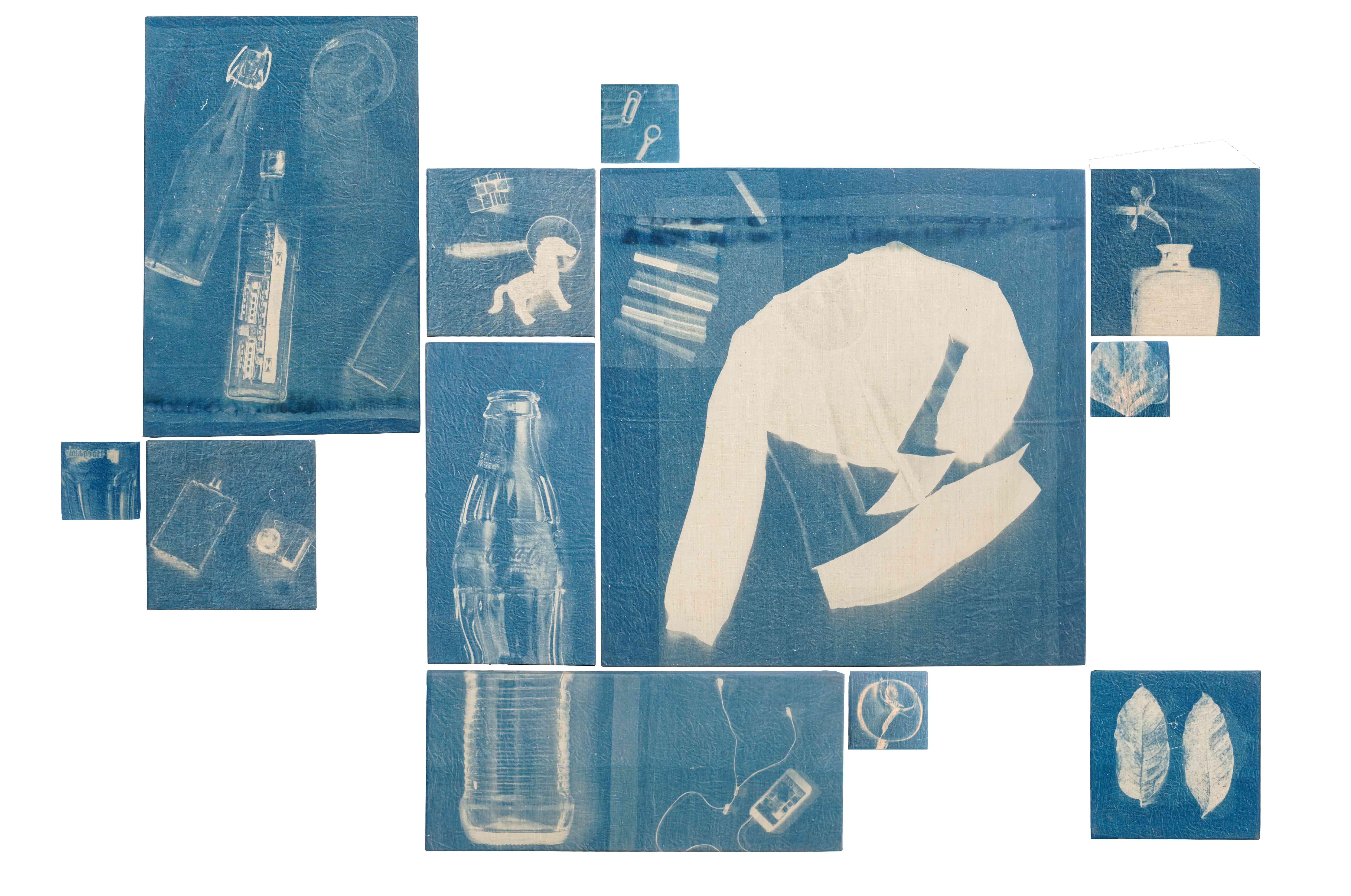
To build this property it needed to dialogue with the design community in a way that triggered curiosity and imagination. There was a need to present the forecasted themes in a way that encouraged interpretation within a theme — in a language that was creative and inspired creativity.
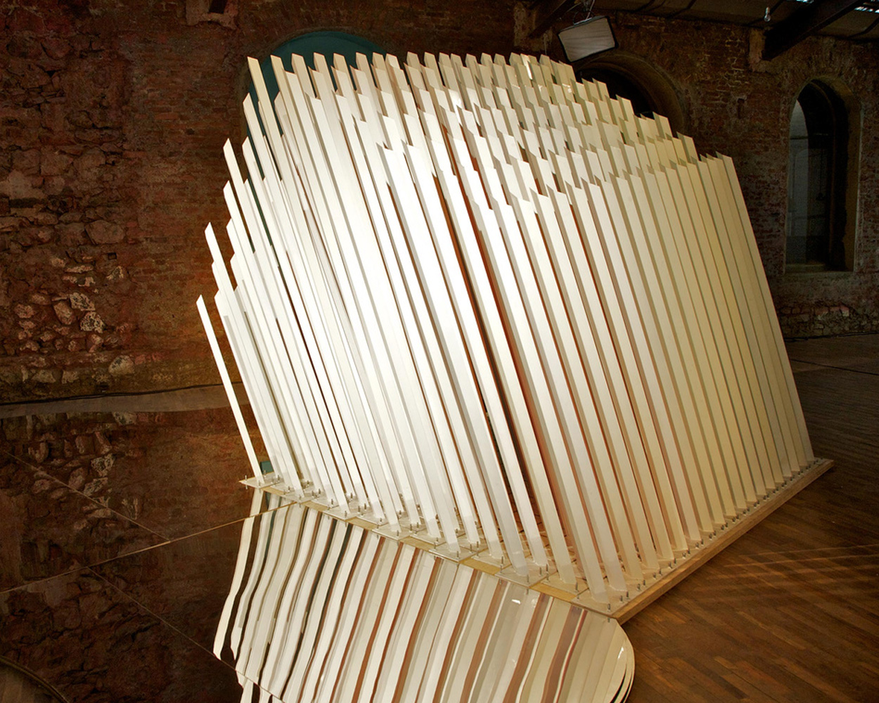
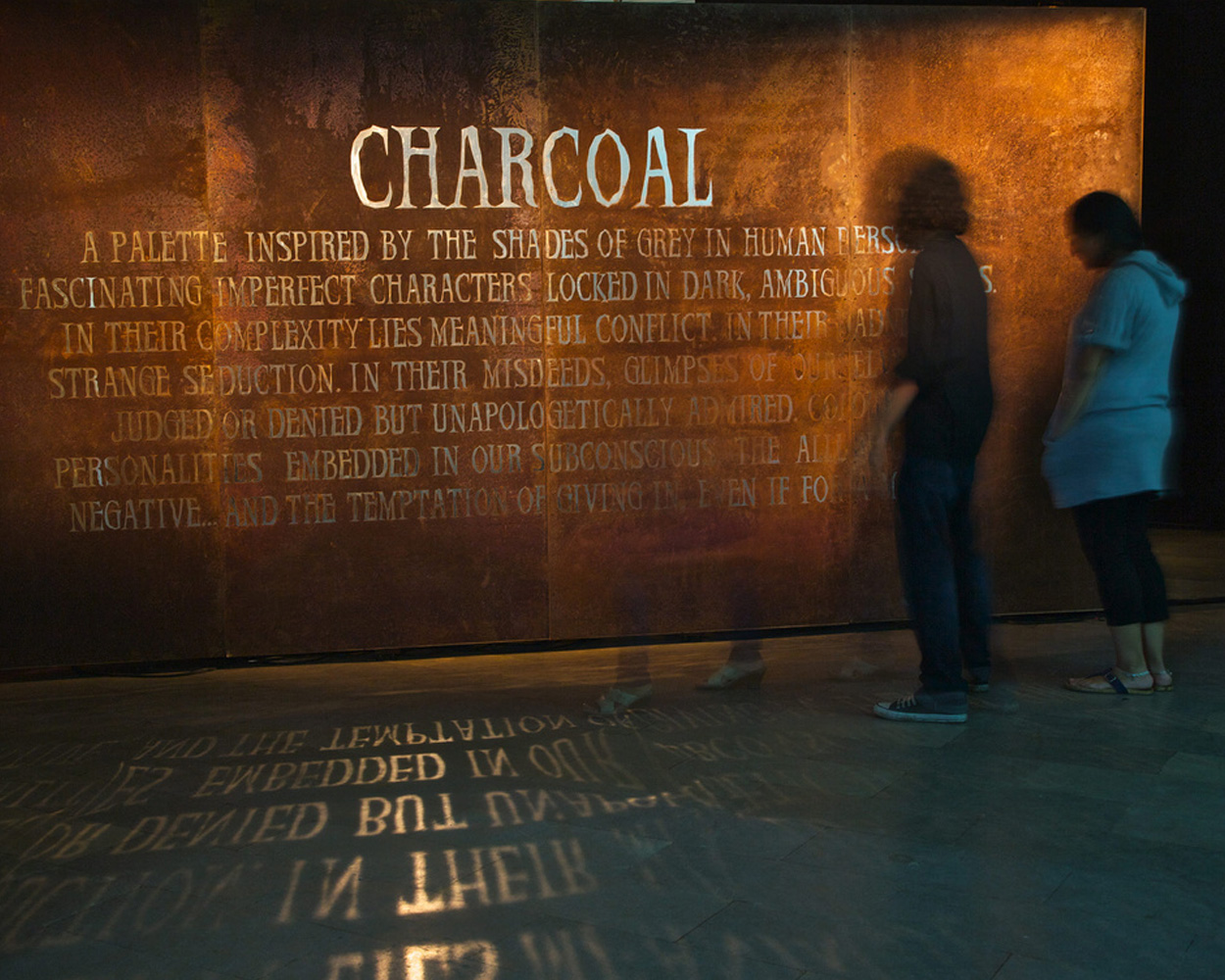
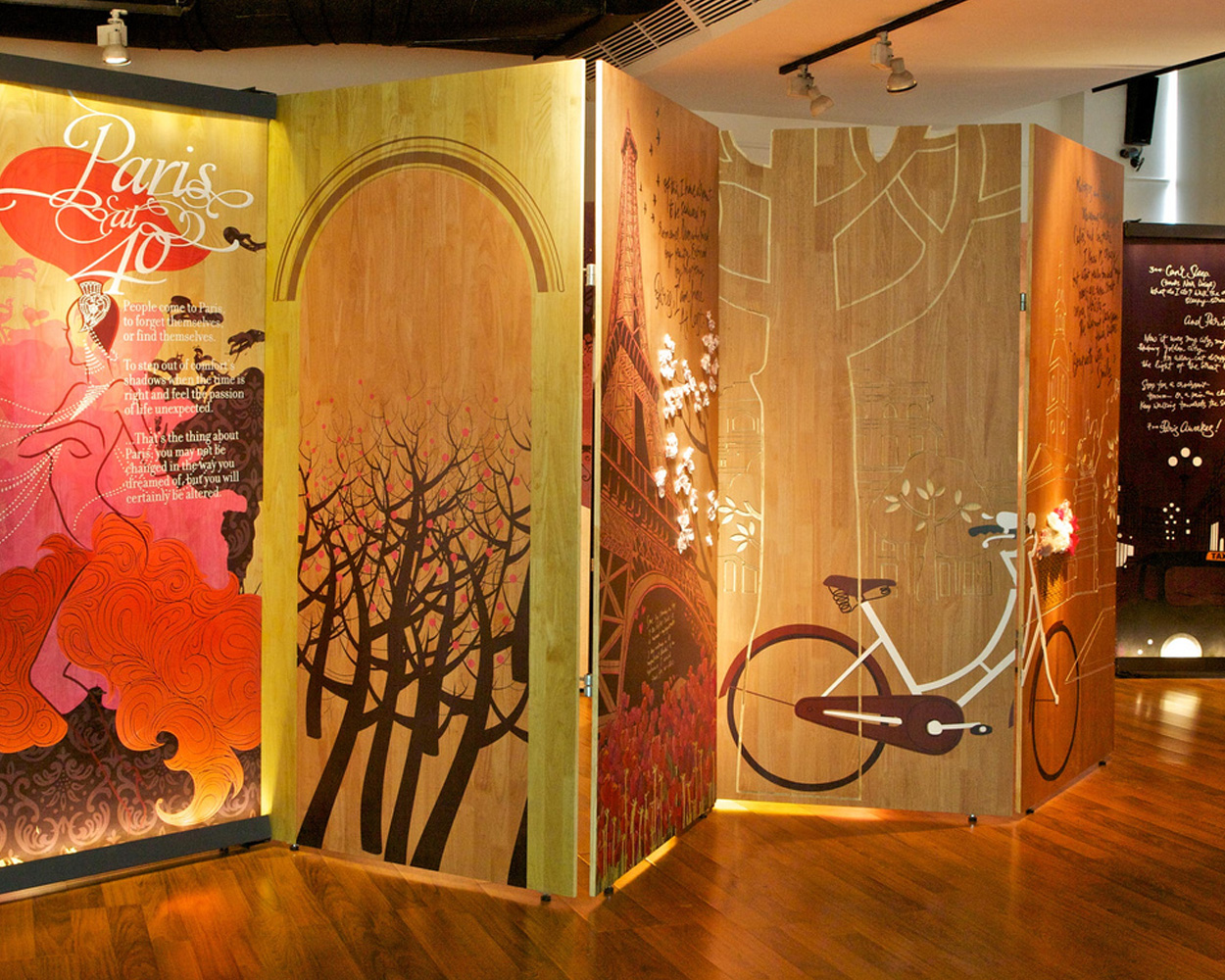
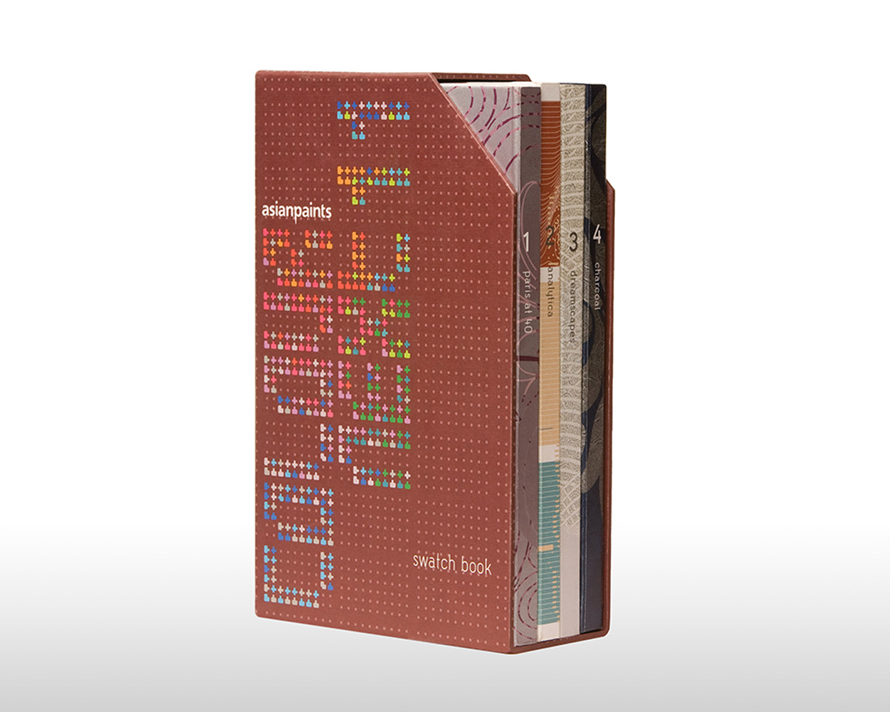
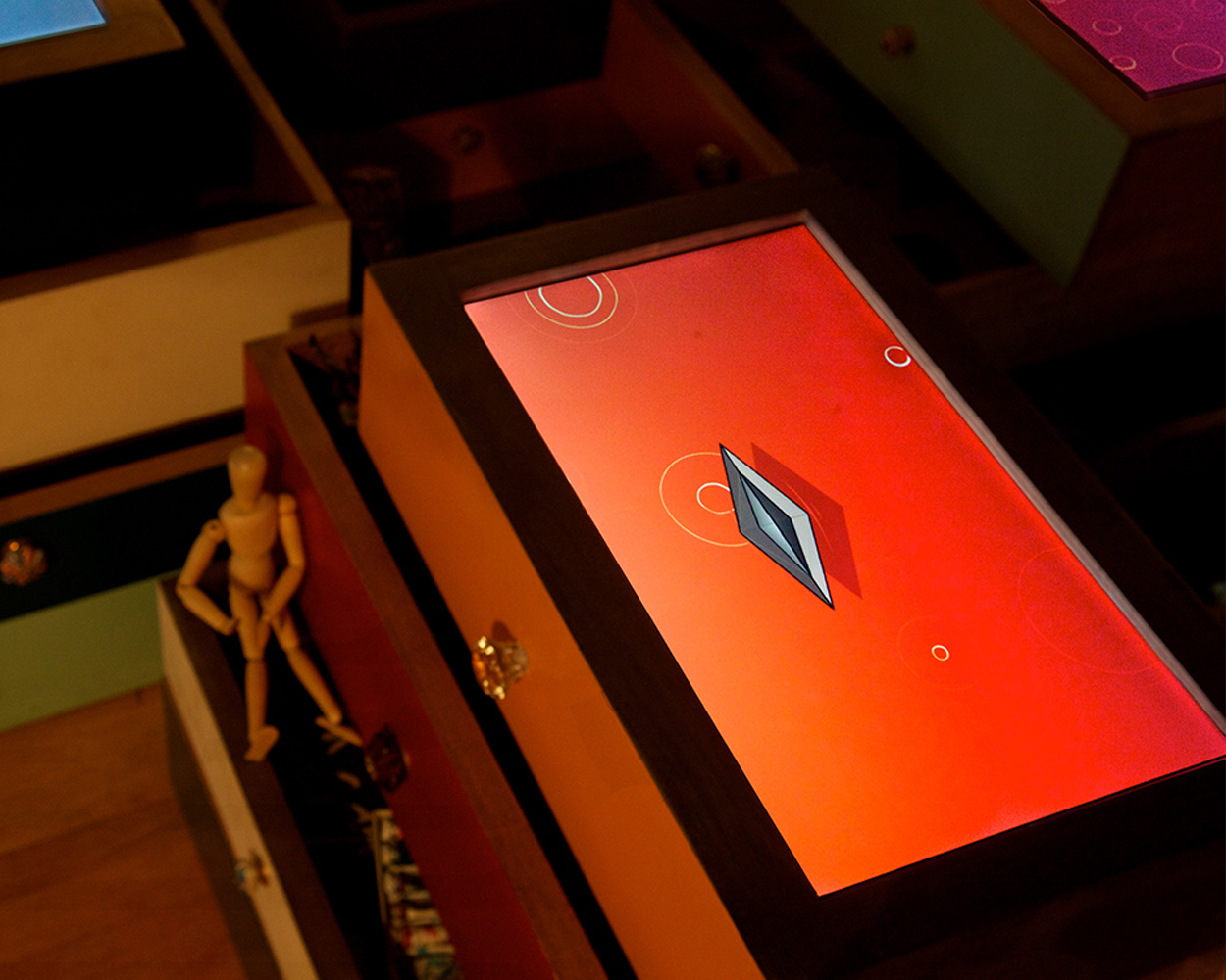
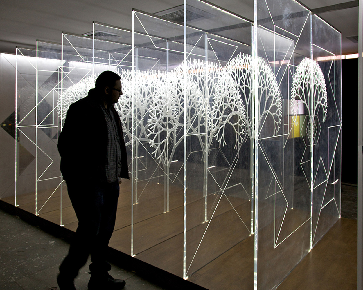
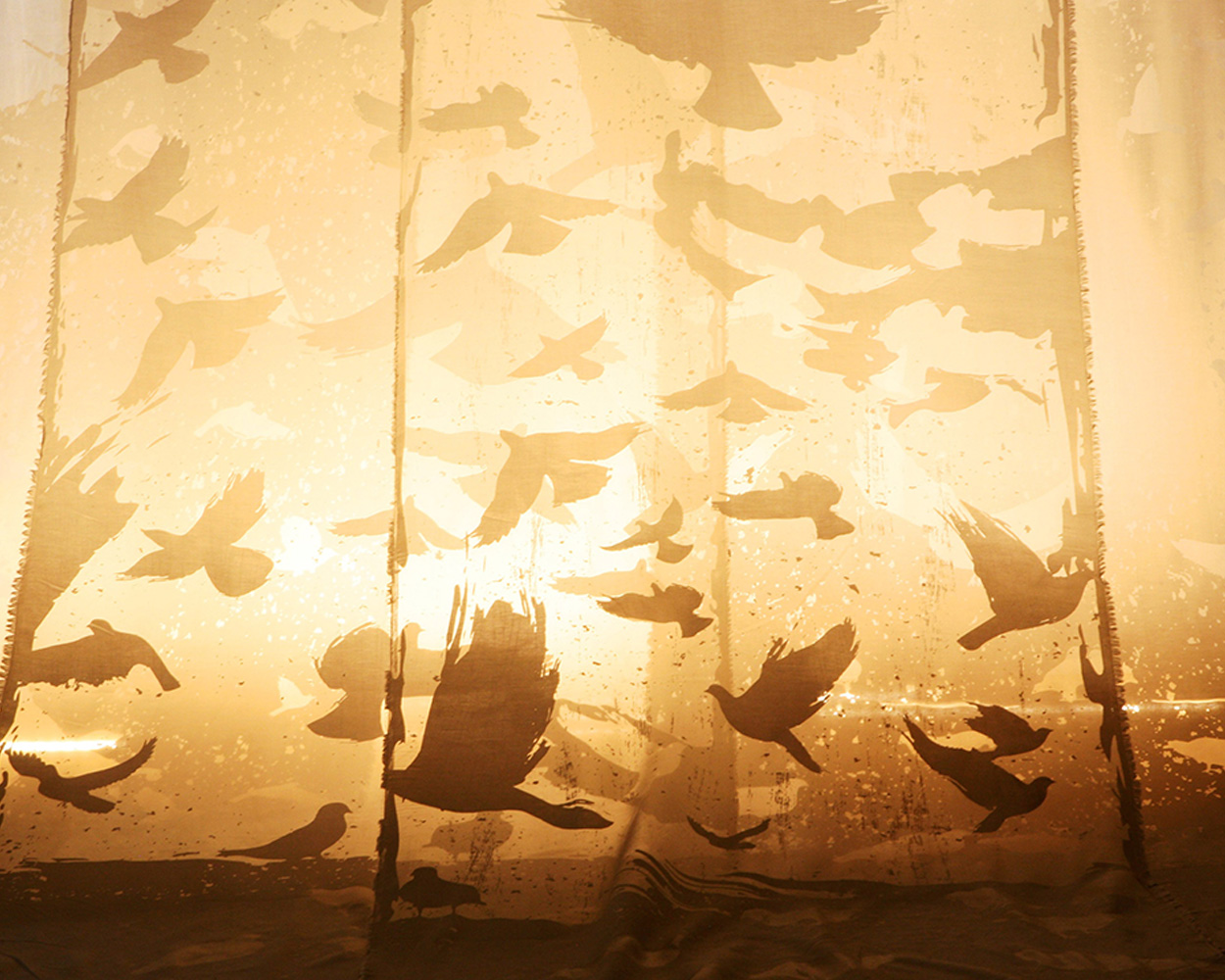
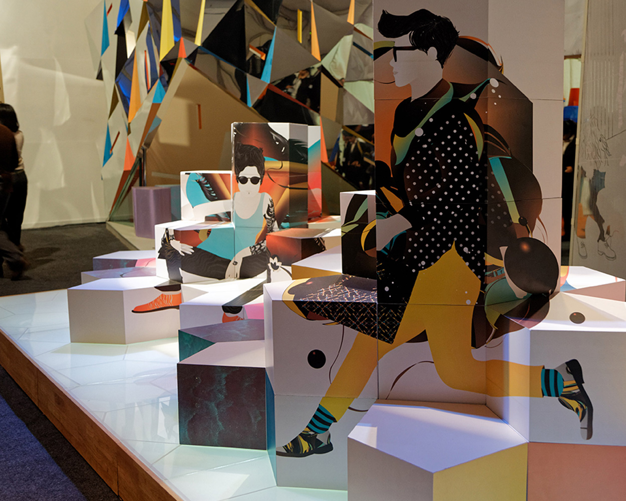
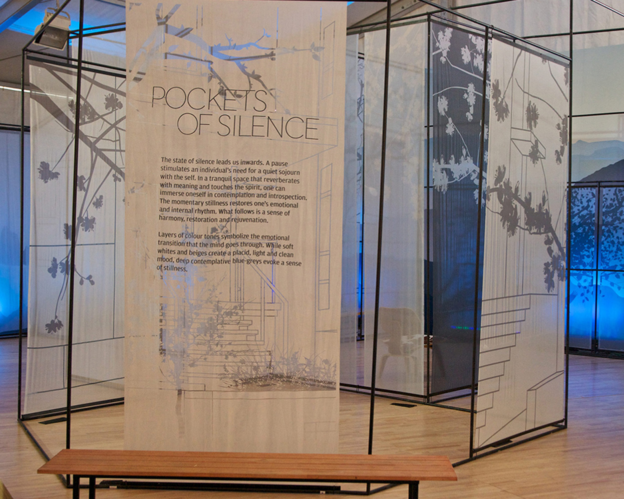
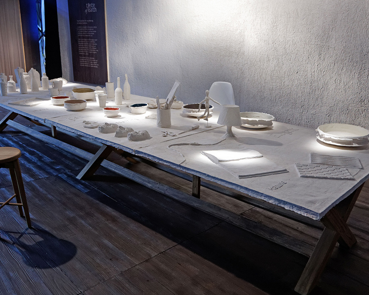
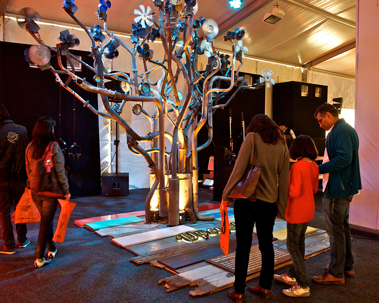
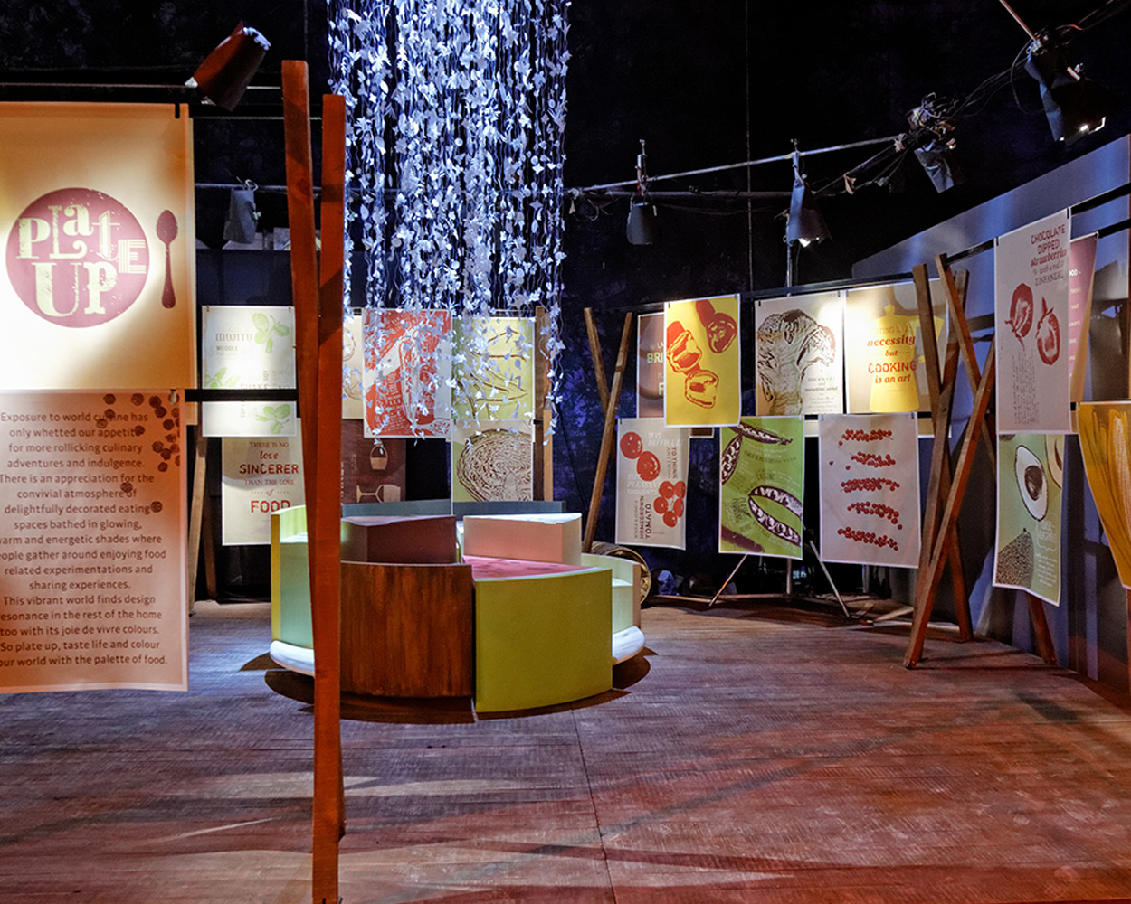
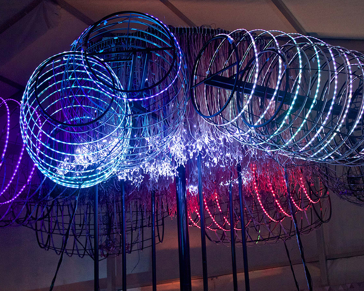
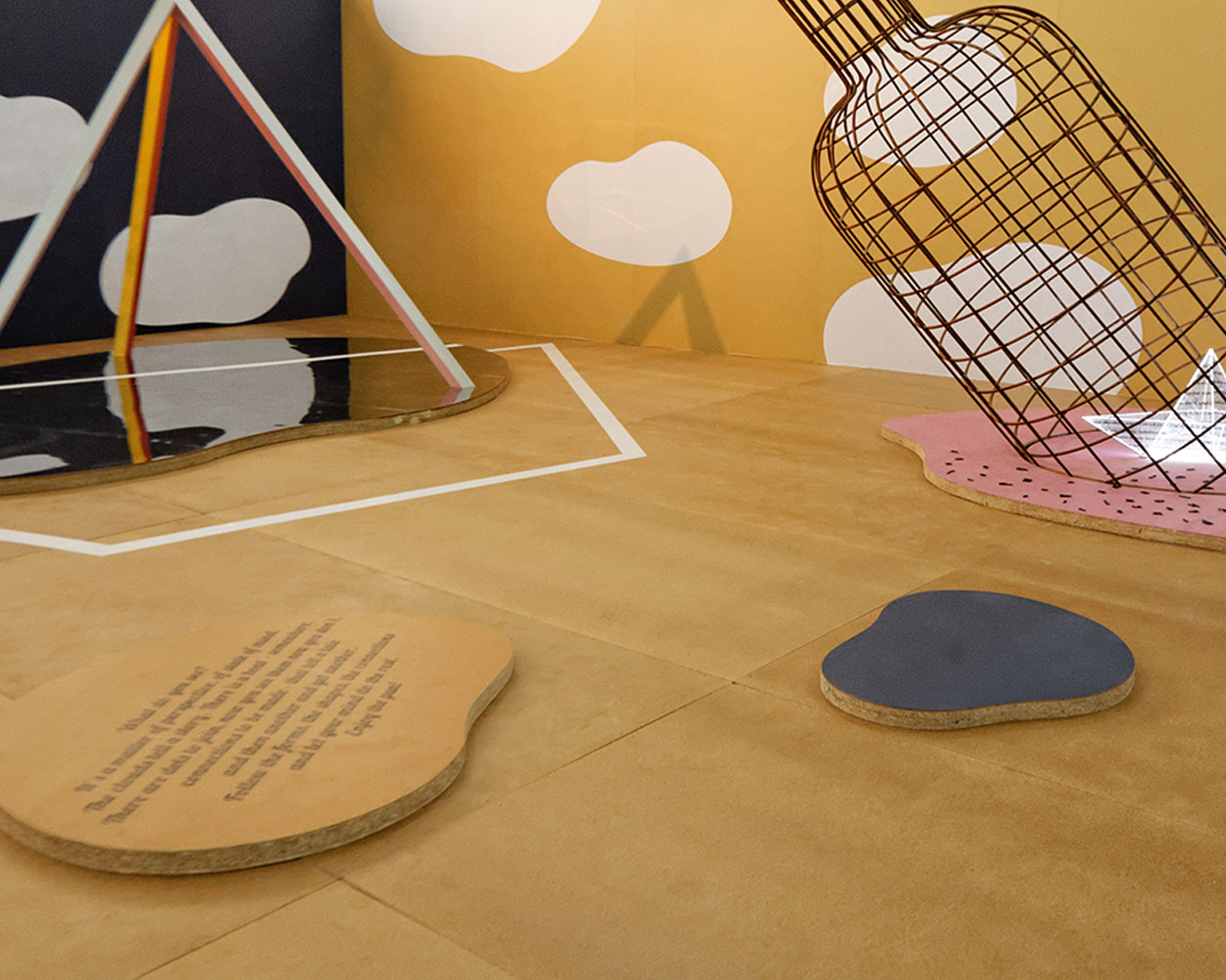
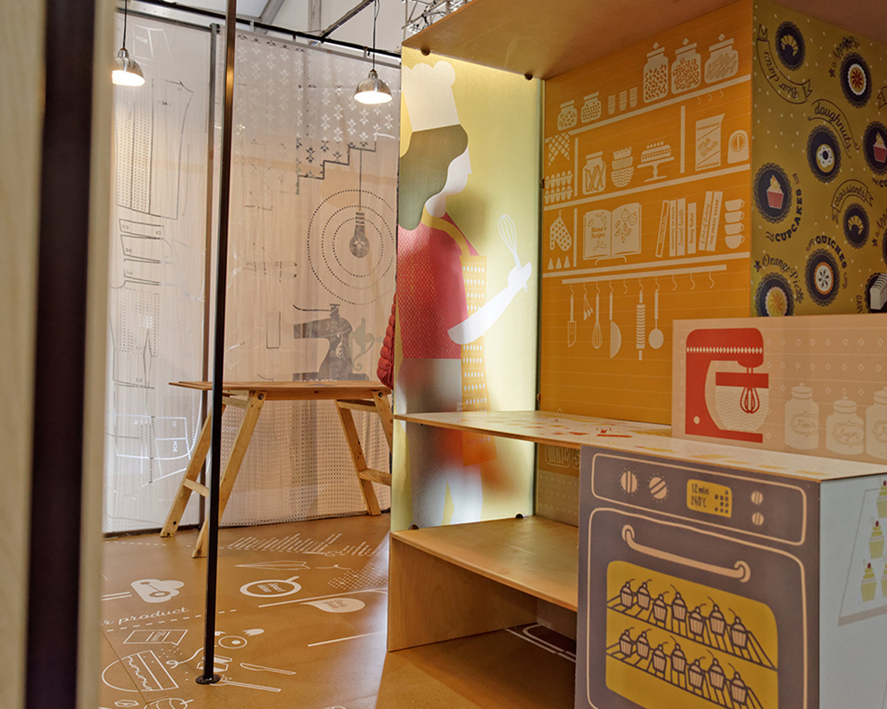
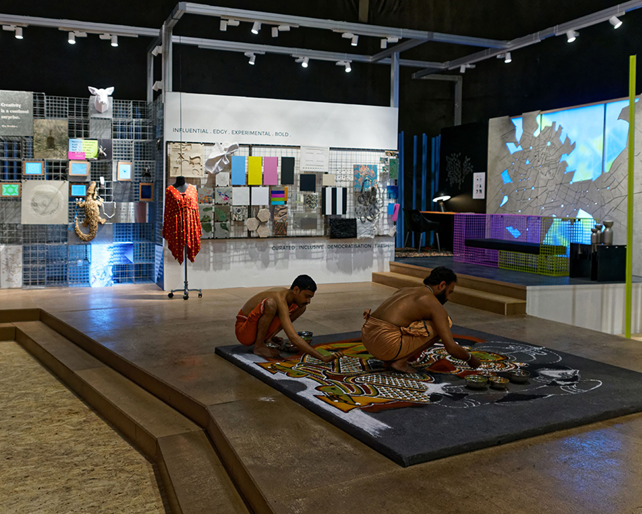
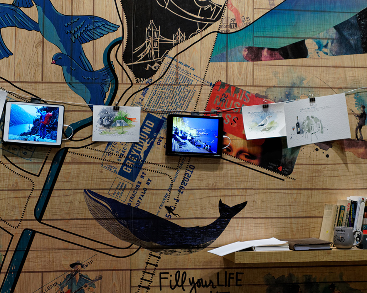
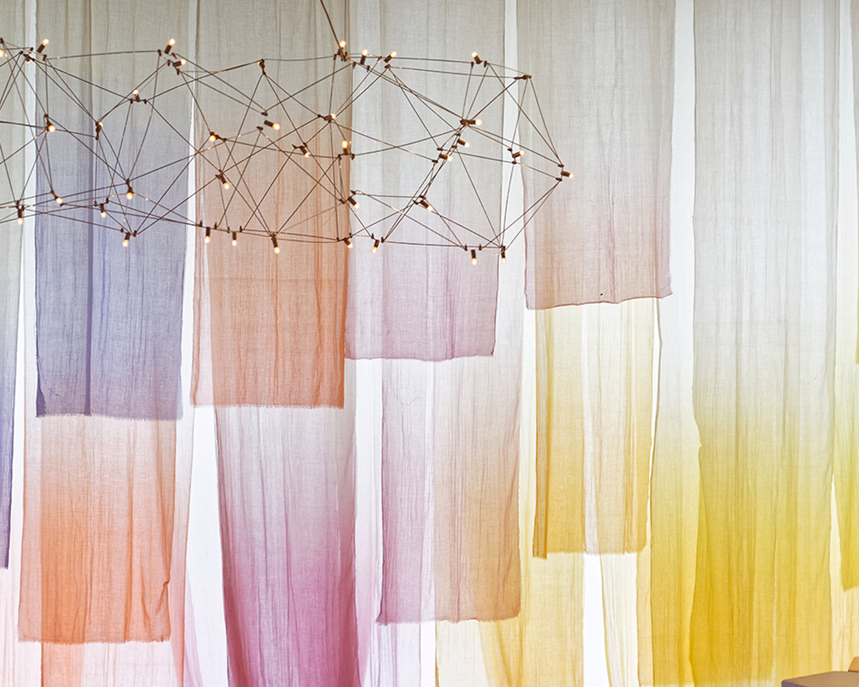
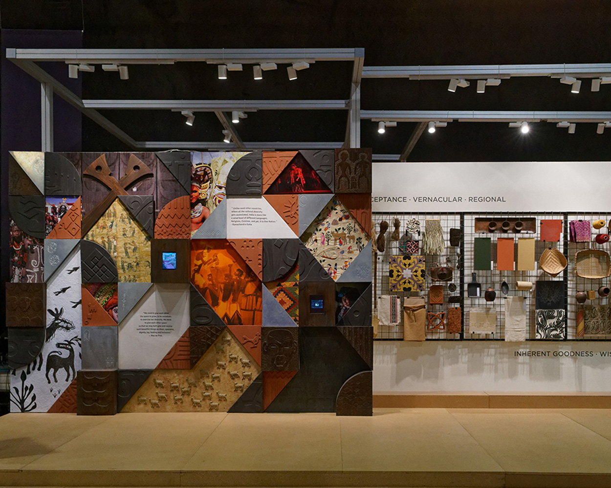
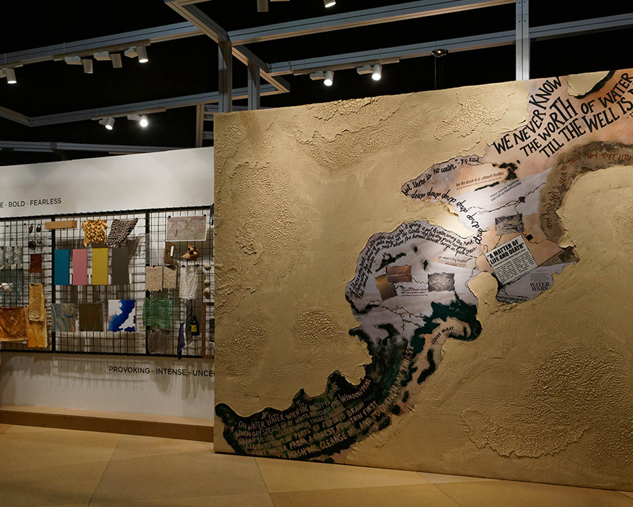
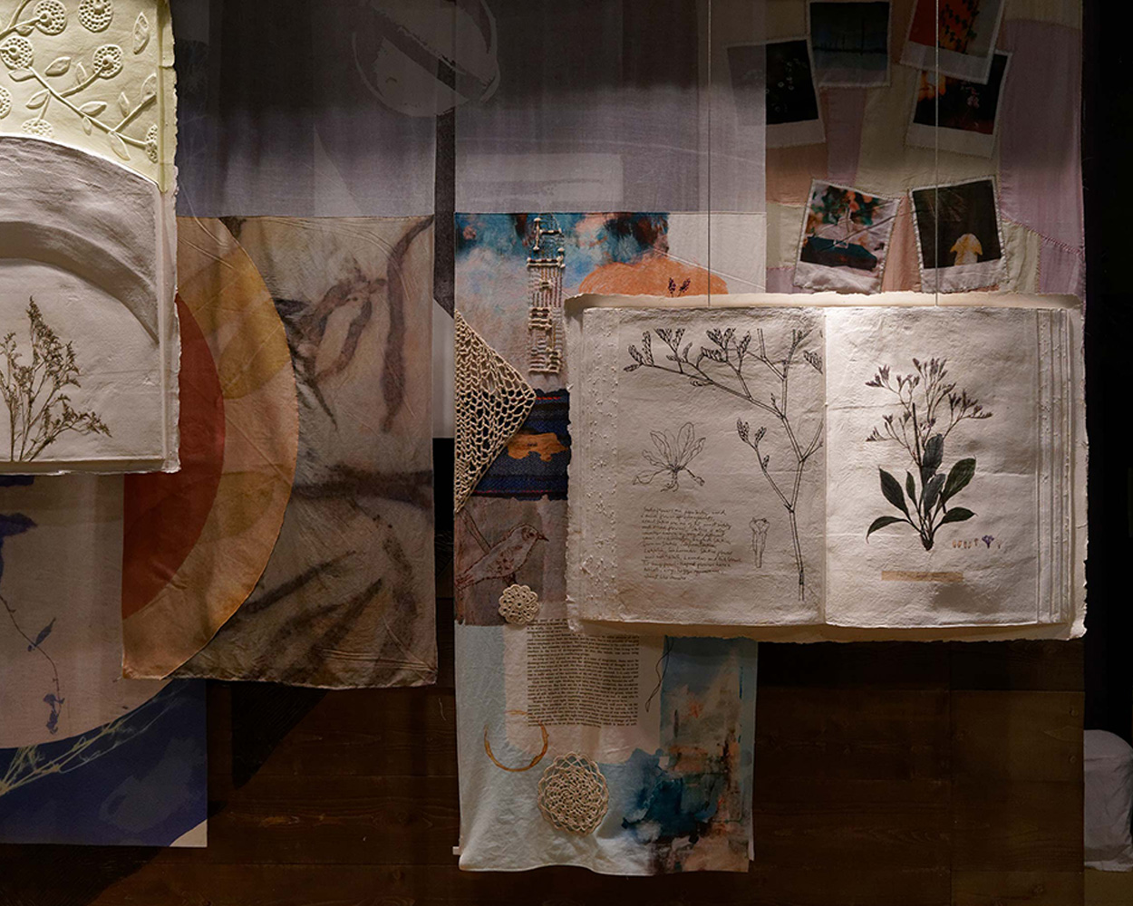
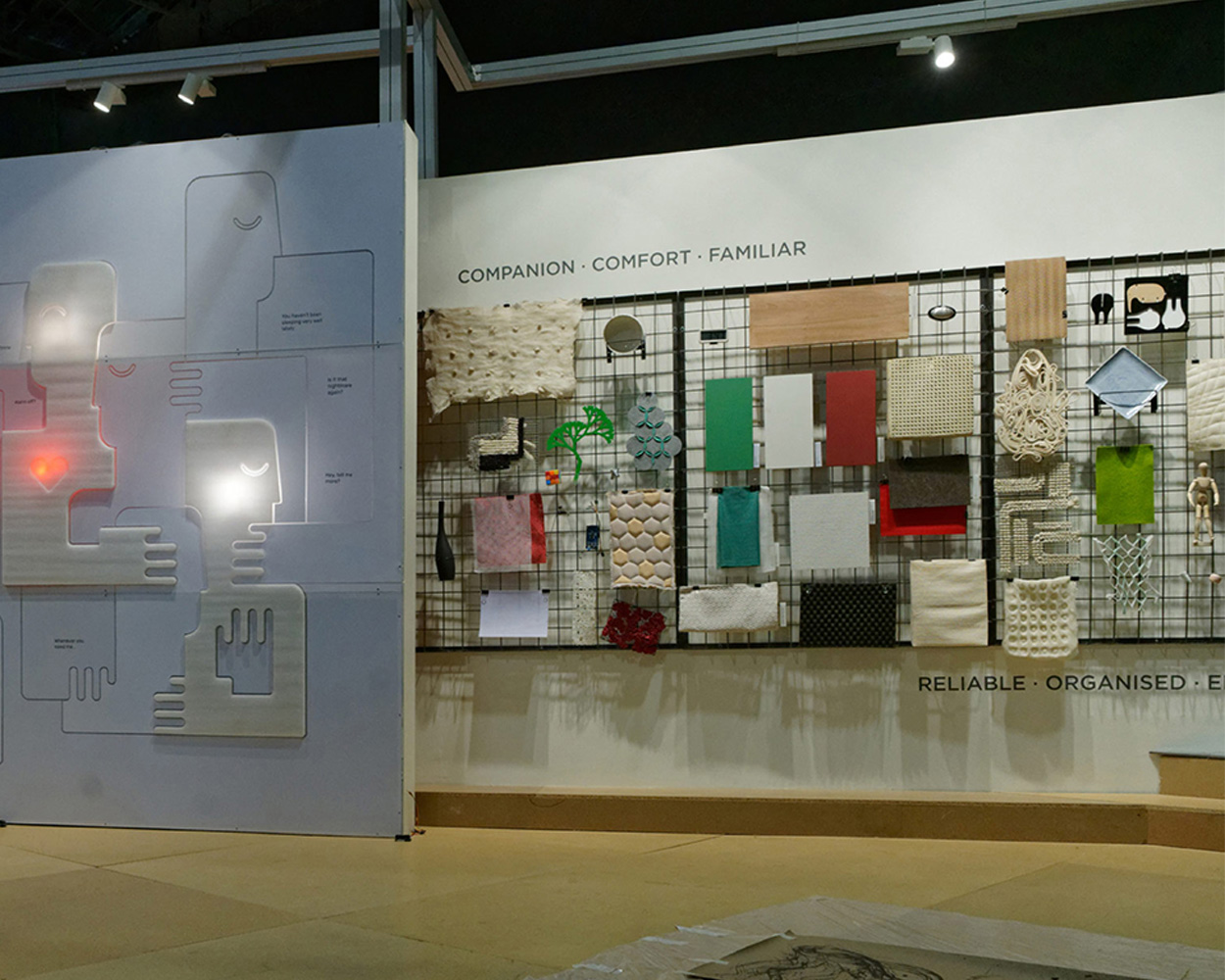
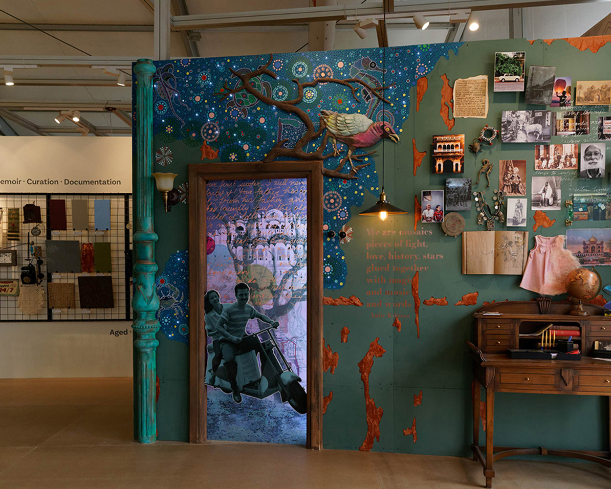
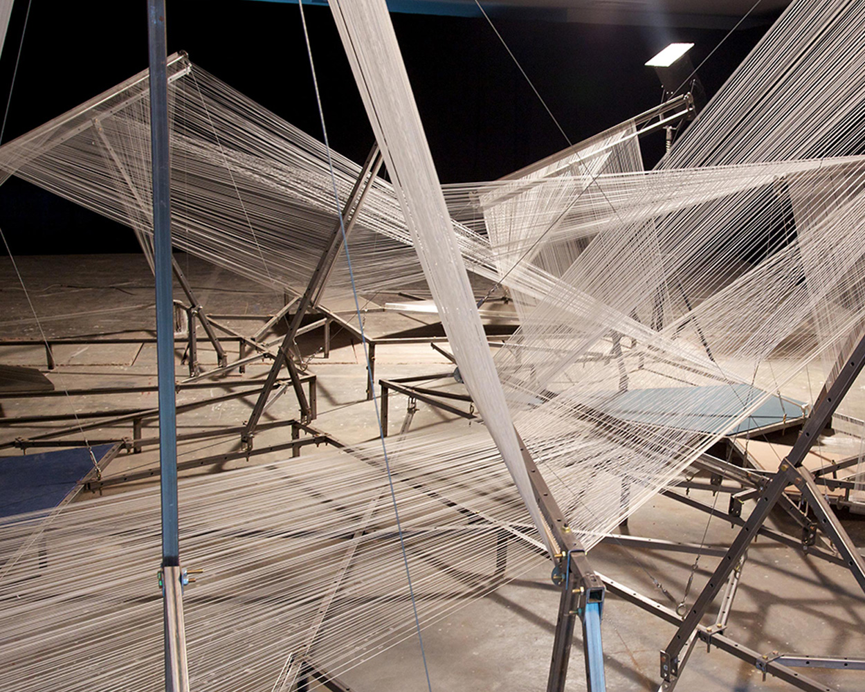
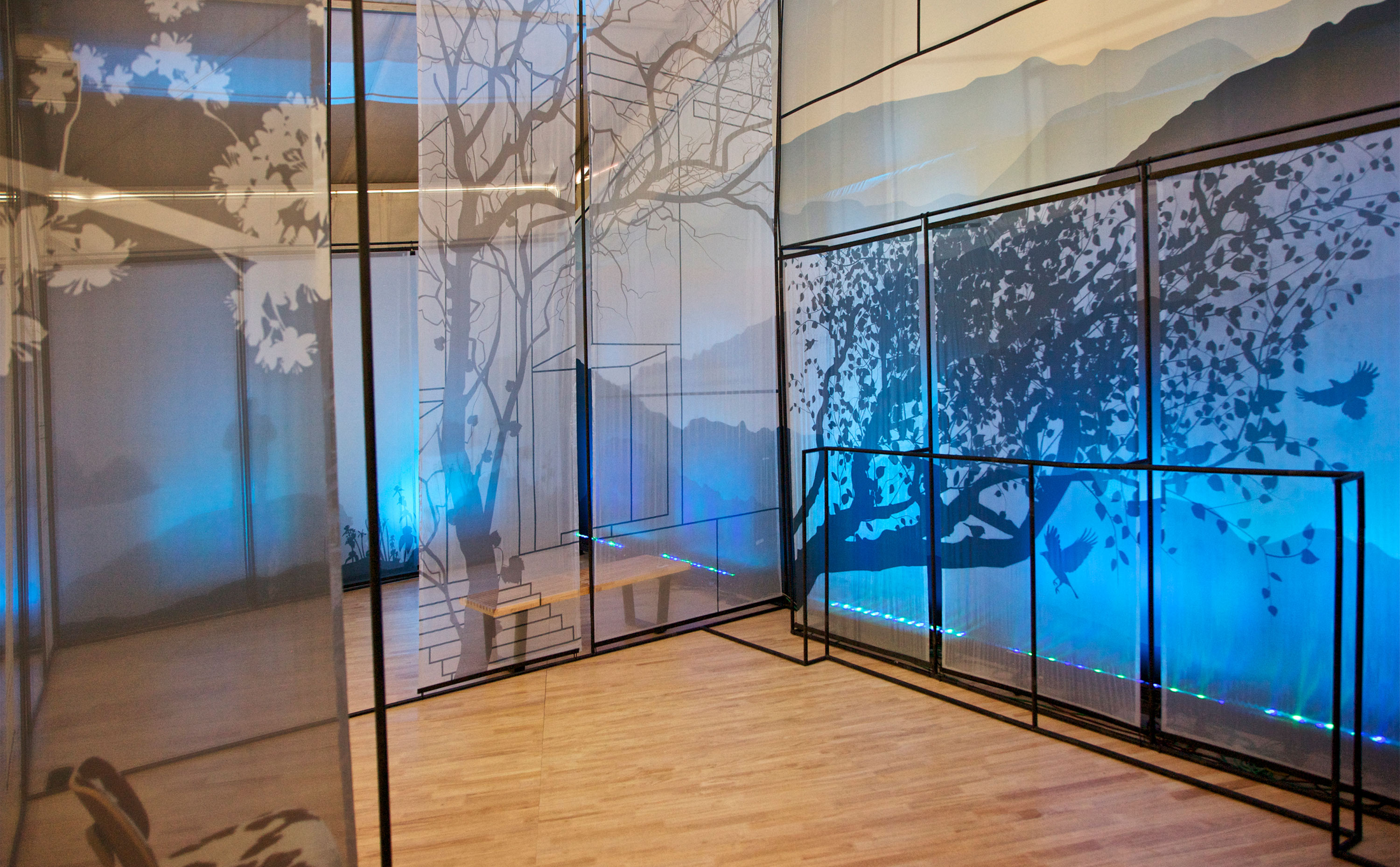
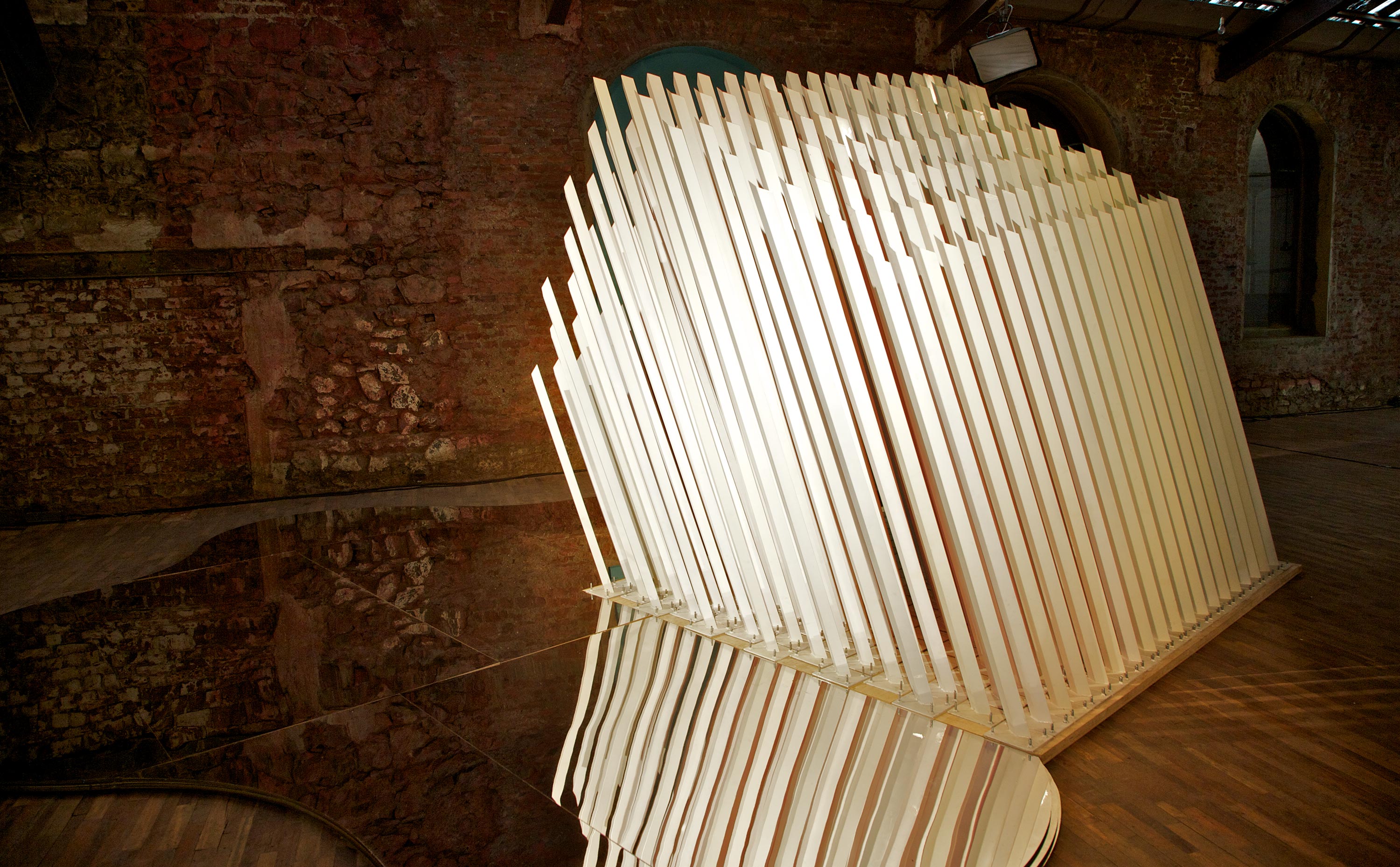
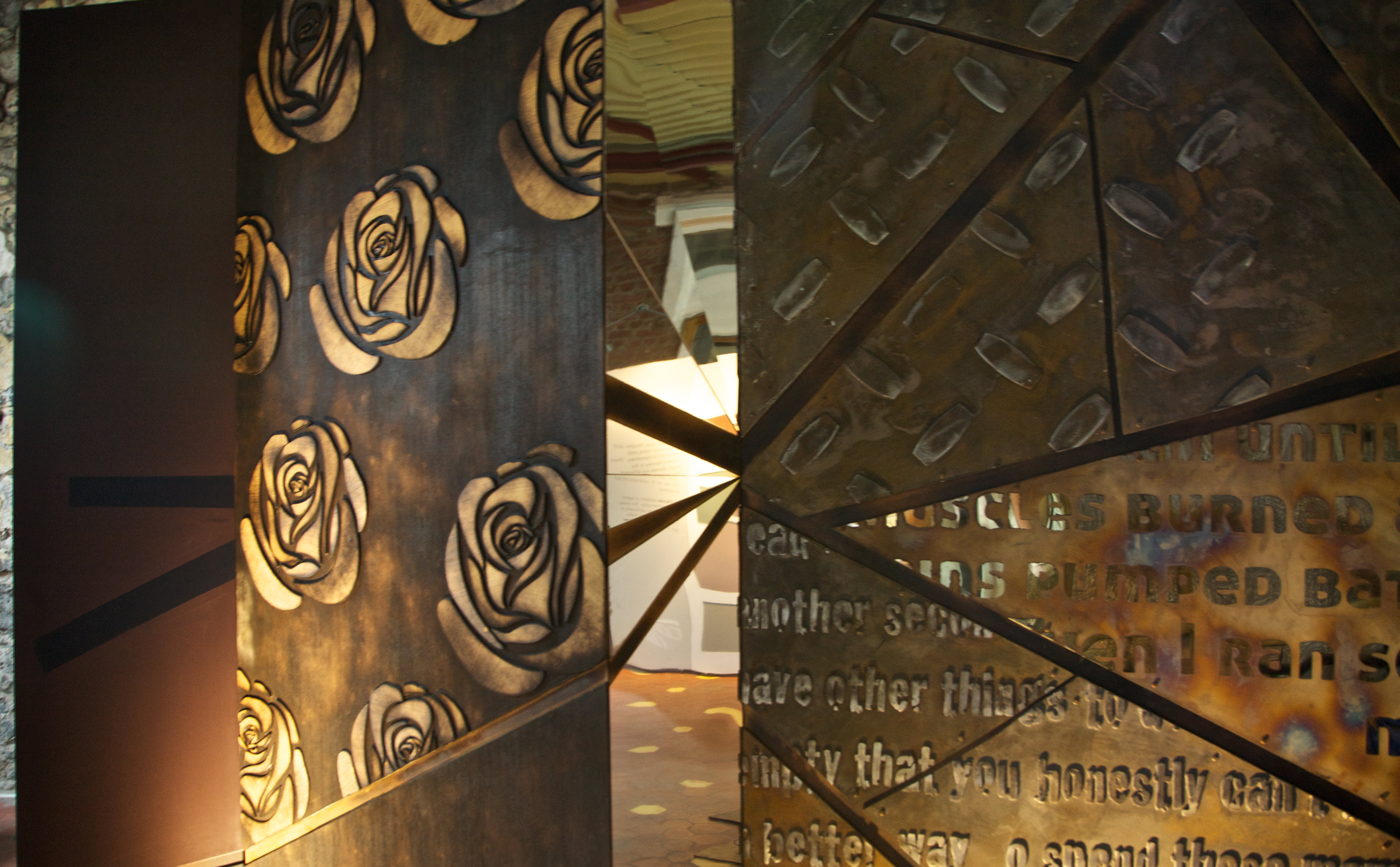
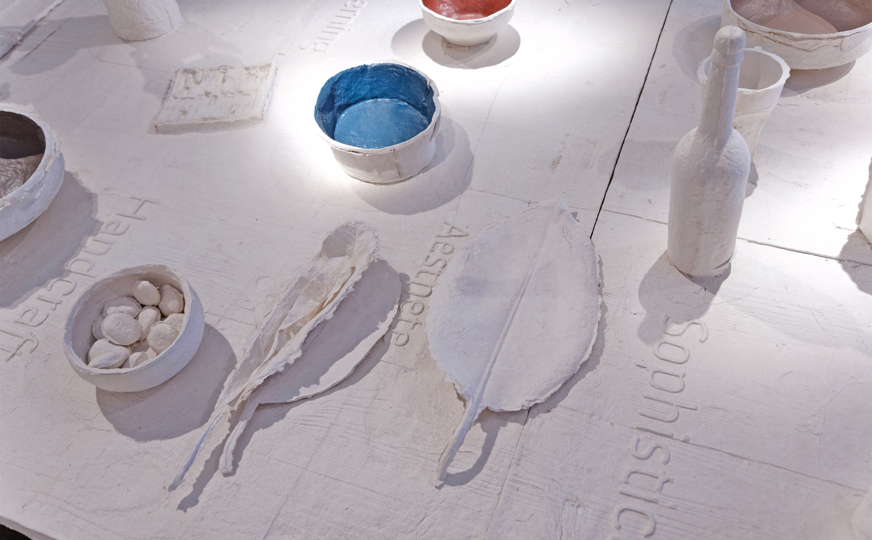
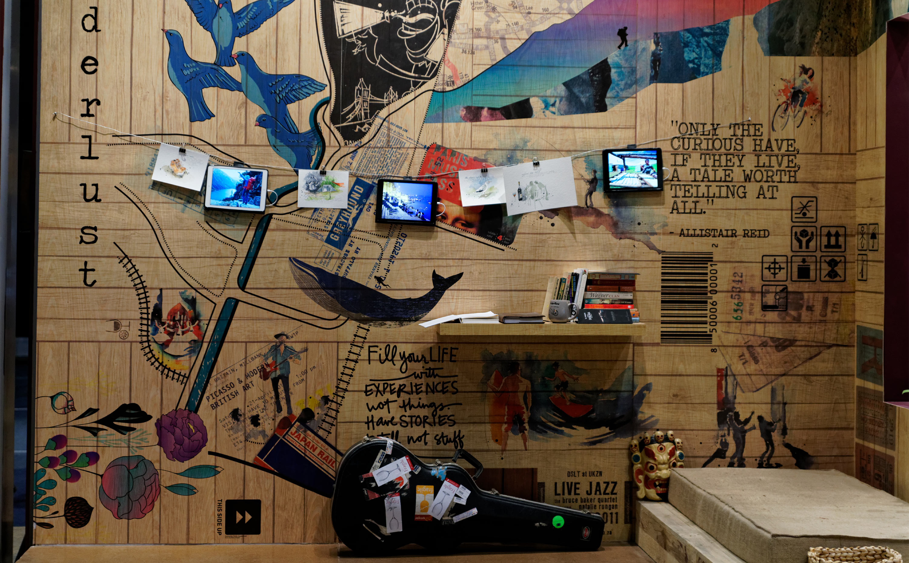
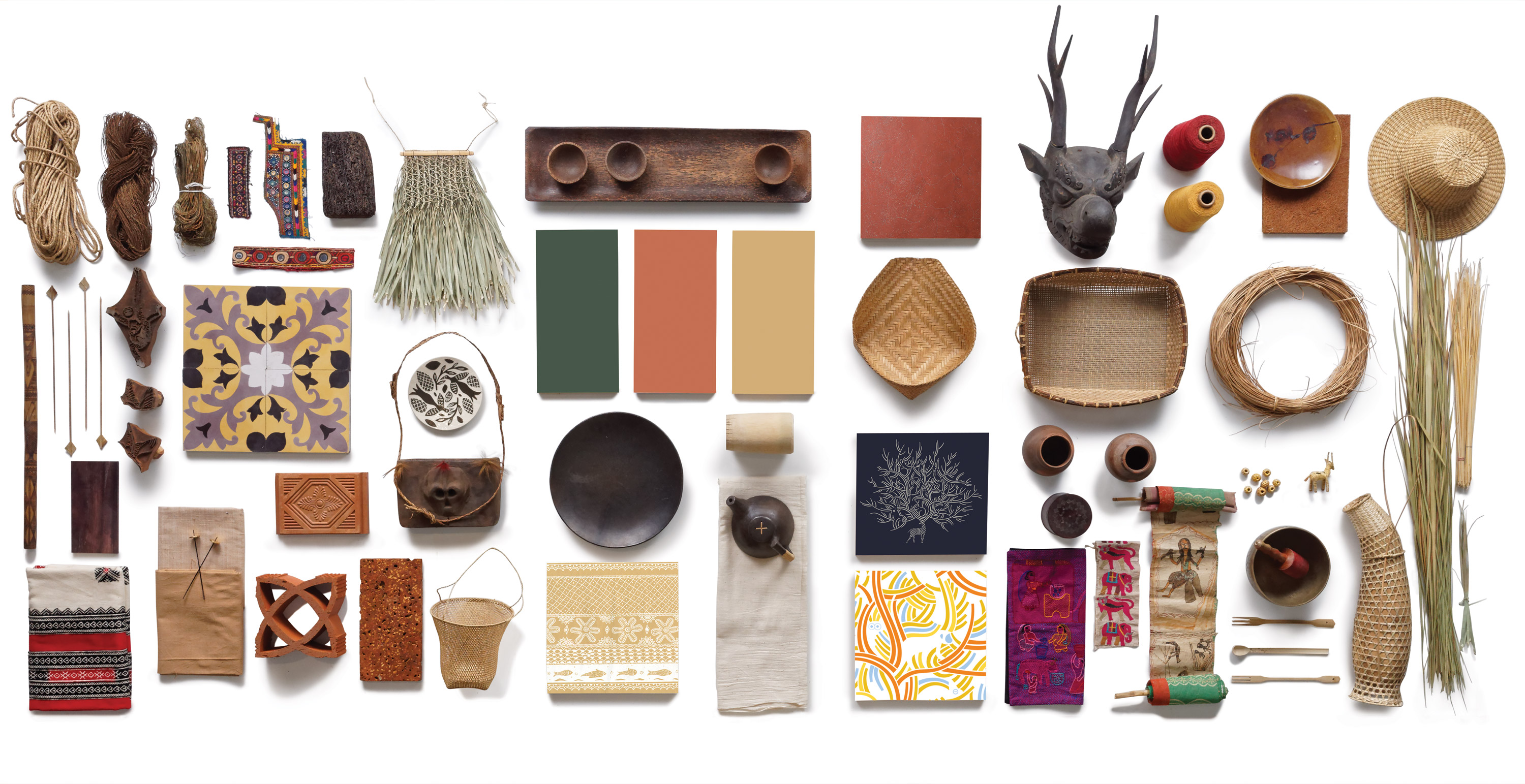
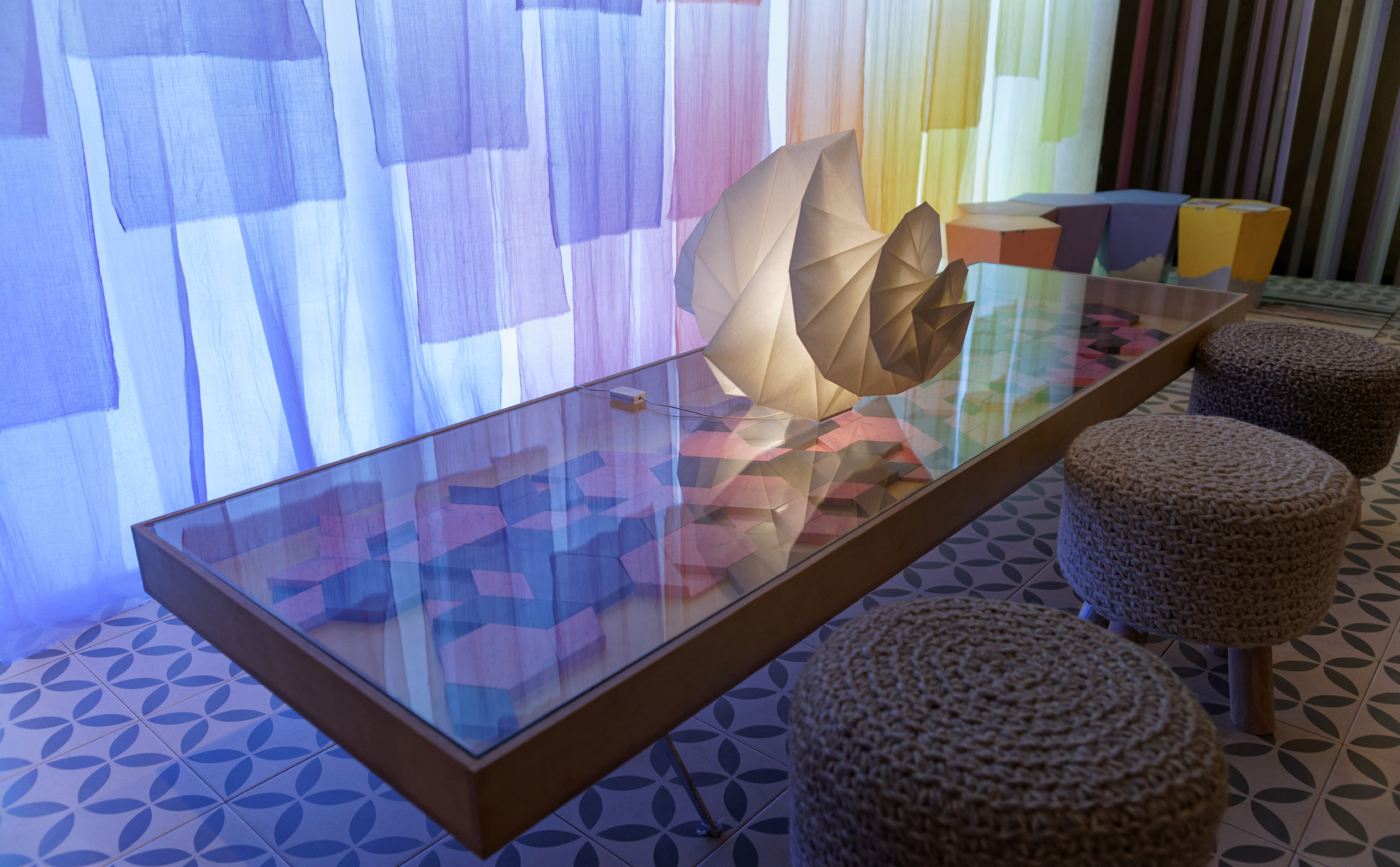
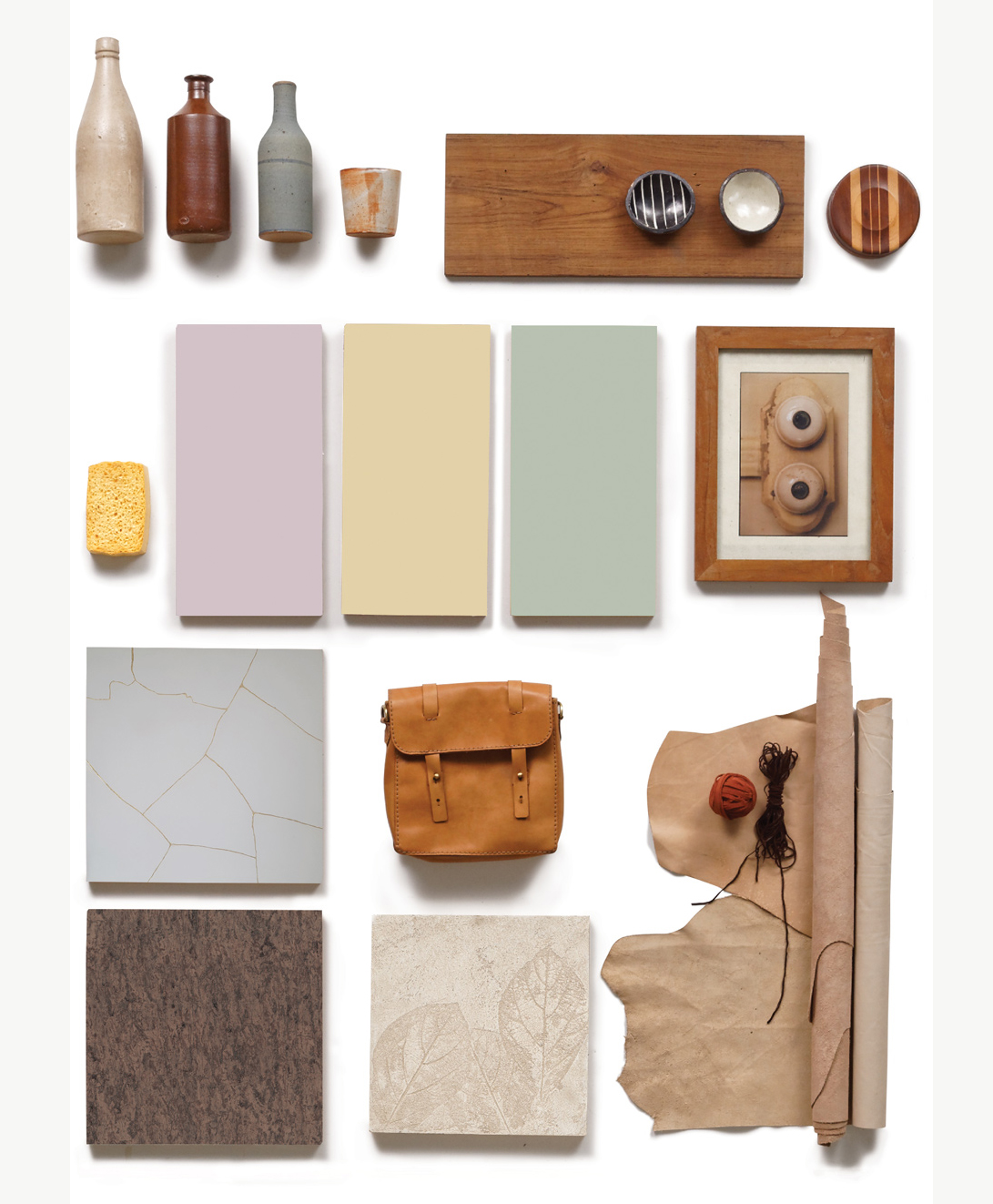
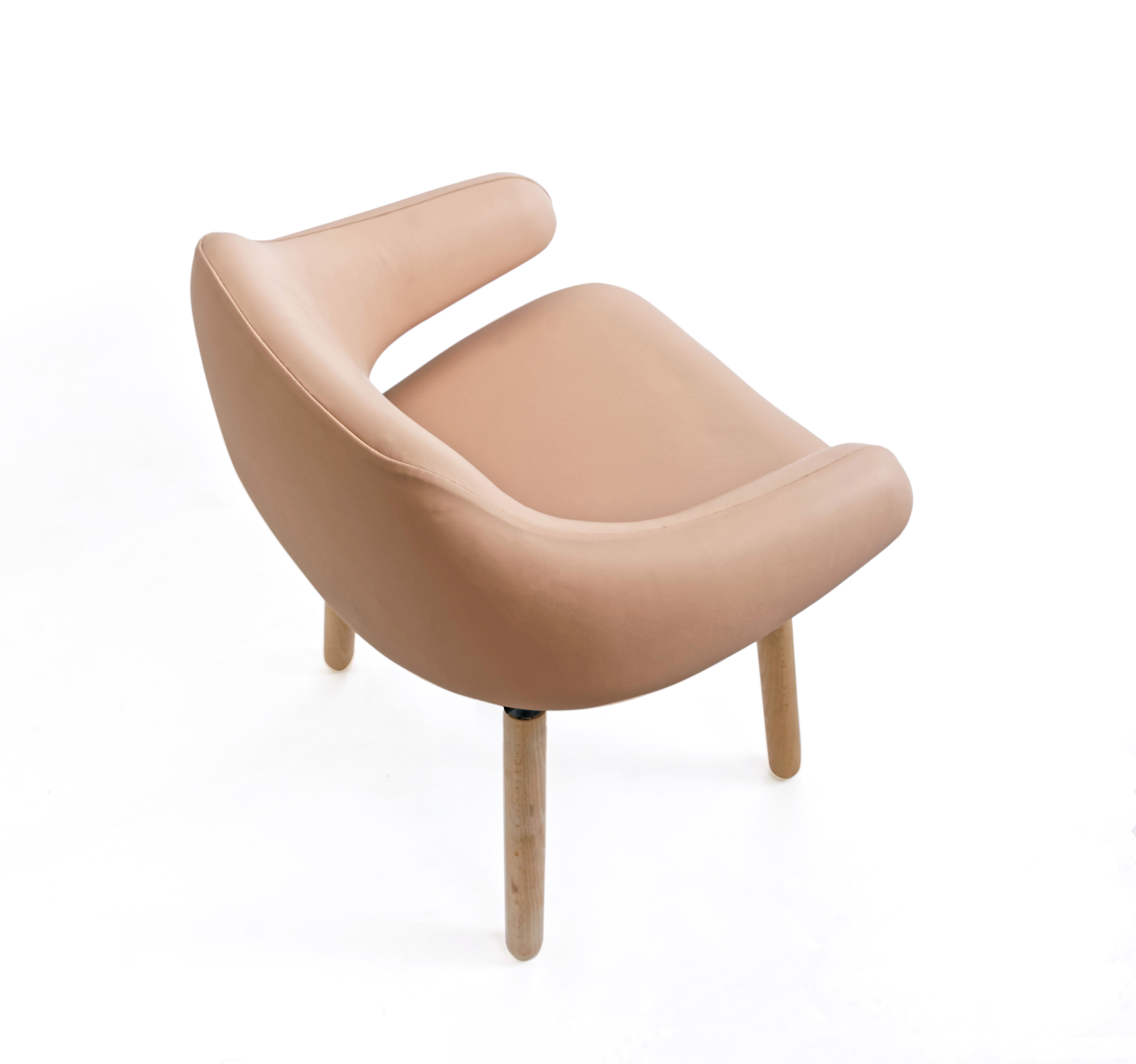
The solution was to treat each theme as an experiential narrative — rich in concept and metaphor through relevant materials, colours and textures. The idea was to help the audience remember and relate to the trending stories with distinct visual flavours in an immersive setting. We introduced a section of Colour Play towards the end where the audience could play with forecasted colours to get a feel of the colours in built space. In the subsequent forecasts, decor was added to each of the four theme stories, commissioned to four designers.

Phase 2
Communication strategy 2016 - 2018
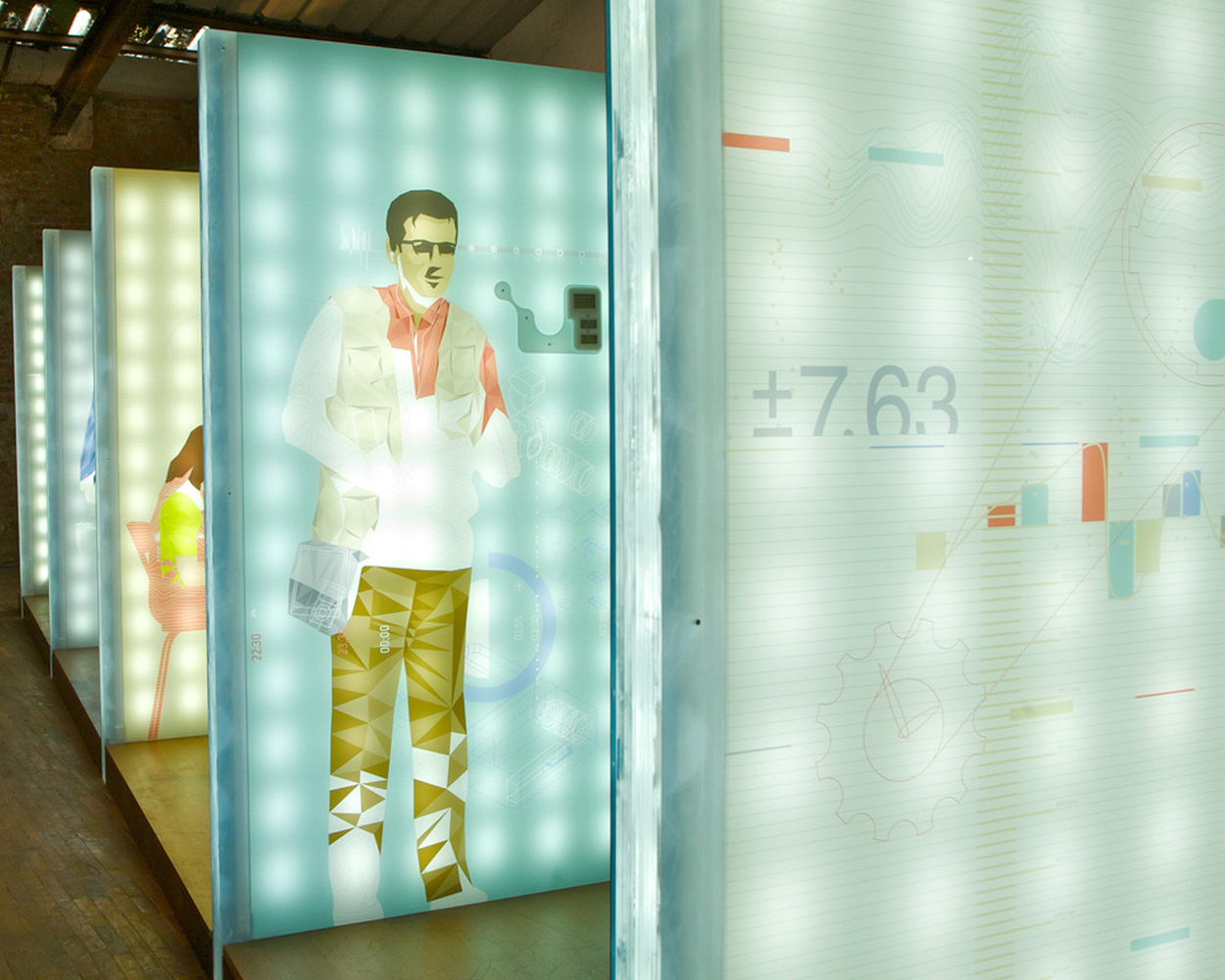
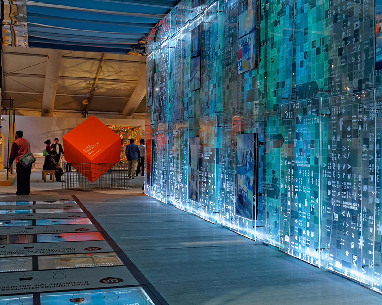
Having established the knowledgeable, creative and artistic persona, in 2016 the emphasis turned to its key strength: the showcasing of the trending Colour, Material, Finish, Texture (CMFT) directions, beyond the theme story installations.
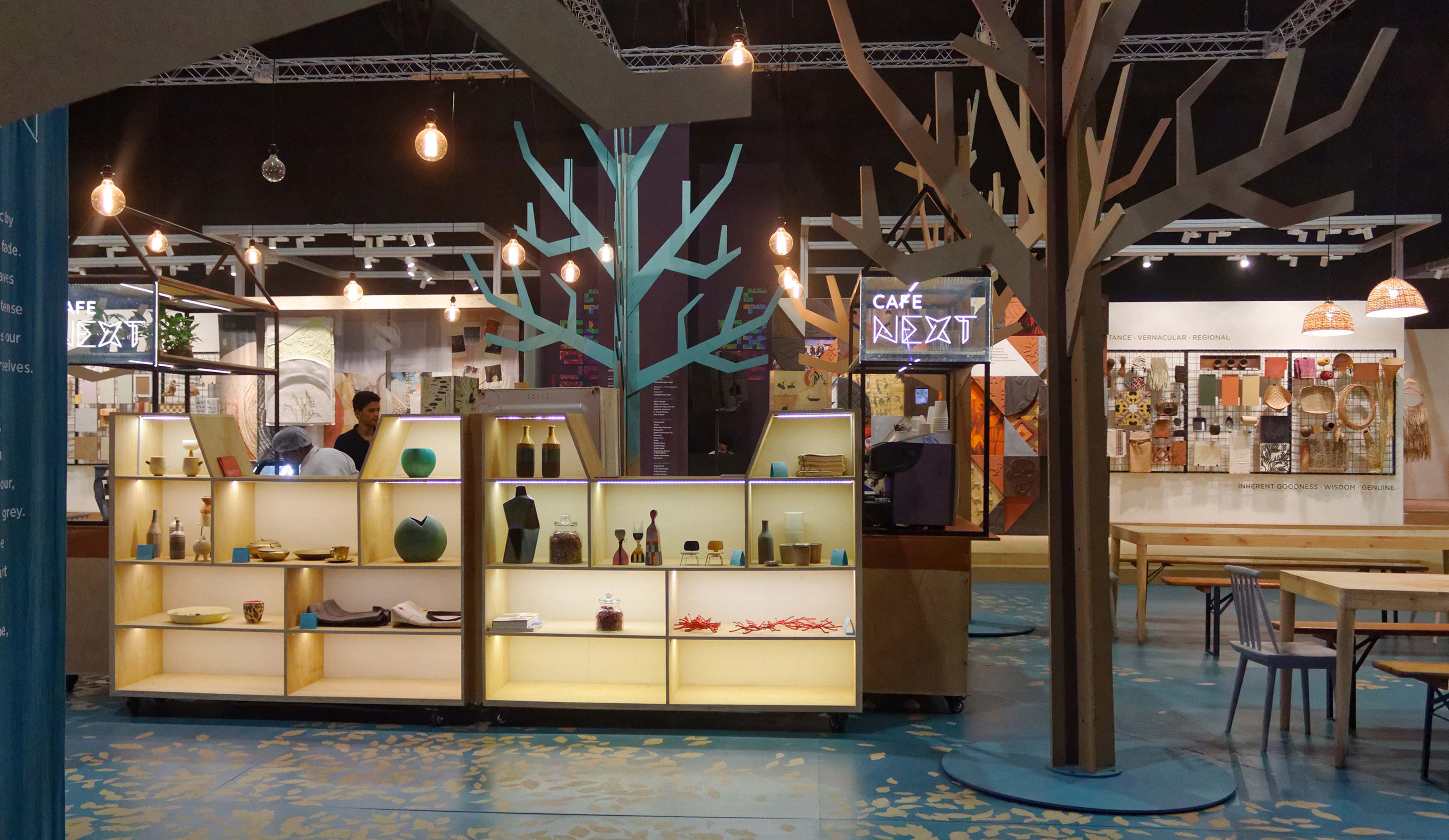
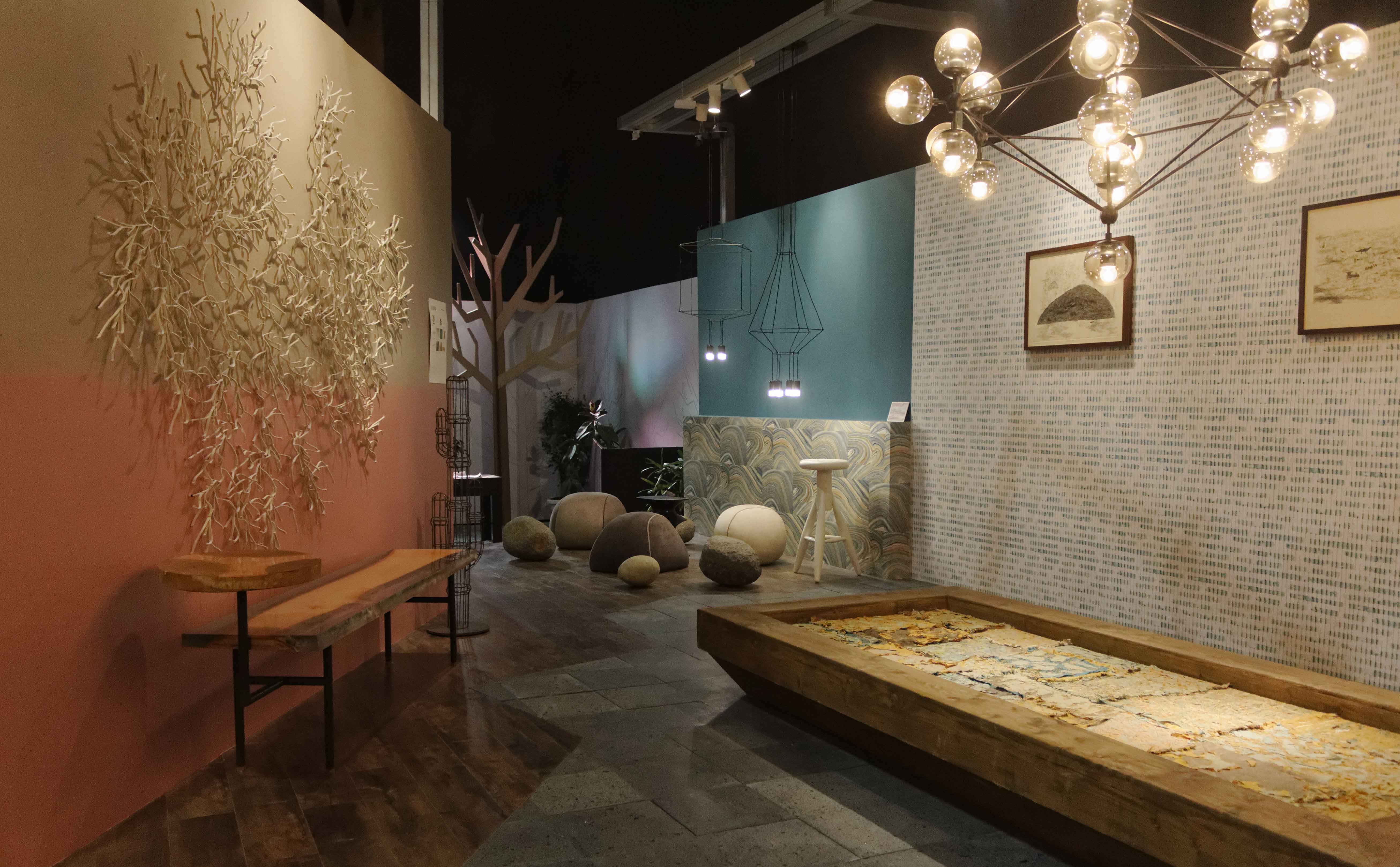
The exhibit is now designed as one complete experience with many more components:
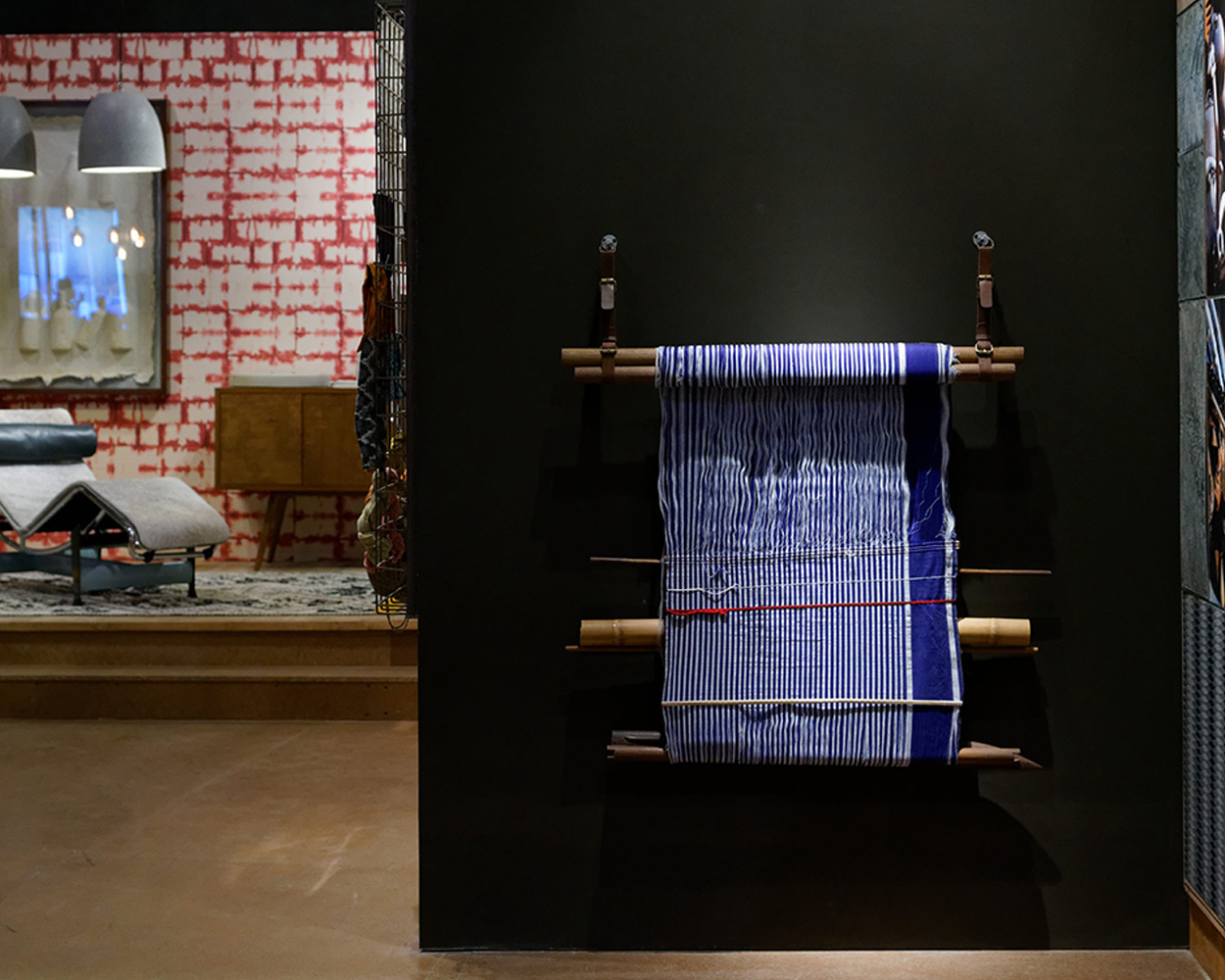
- Four forecasted theme stories + CMFT + Decor setting
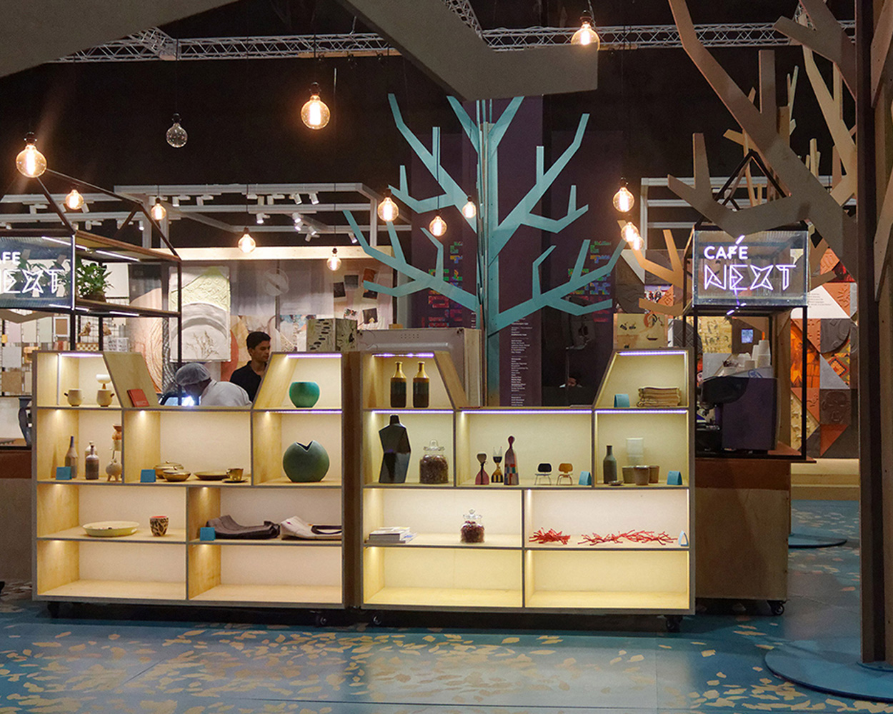
- A cafe with a library for design books in the centre that serves as a breakout space, and discussion area for themes and workshops
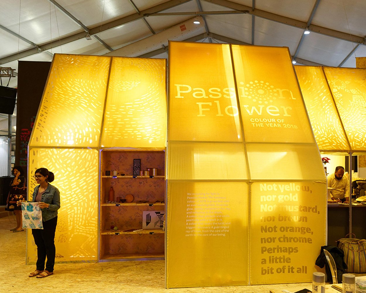
- The Colour of the Year + Wallpaper of the Year installation
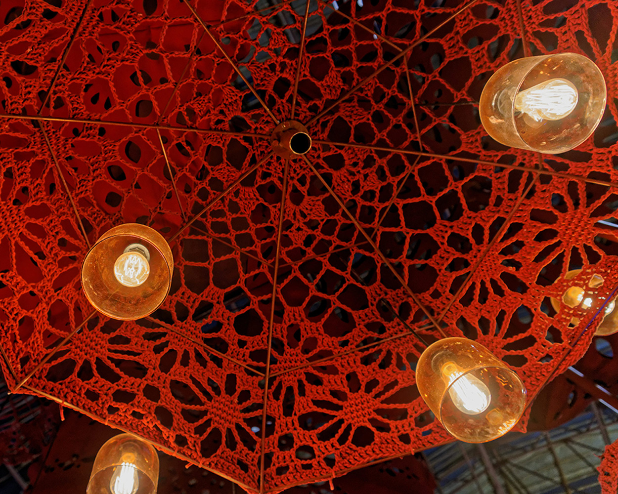
In addition to conceptualising and executing the entire ColourNext exhibit and all its communication collateral, we curate objects, furniture, lights, furnishing, flooring etc. for the decor spaces. 20% of the decor elements are created by the Wari Watai Store.
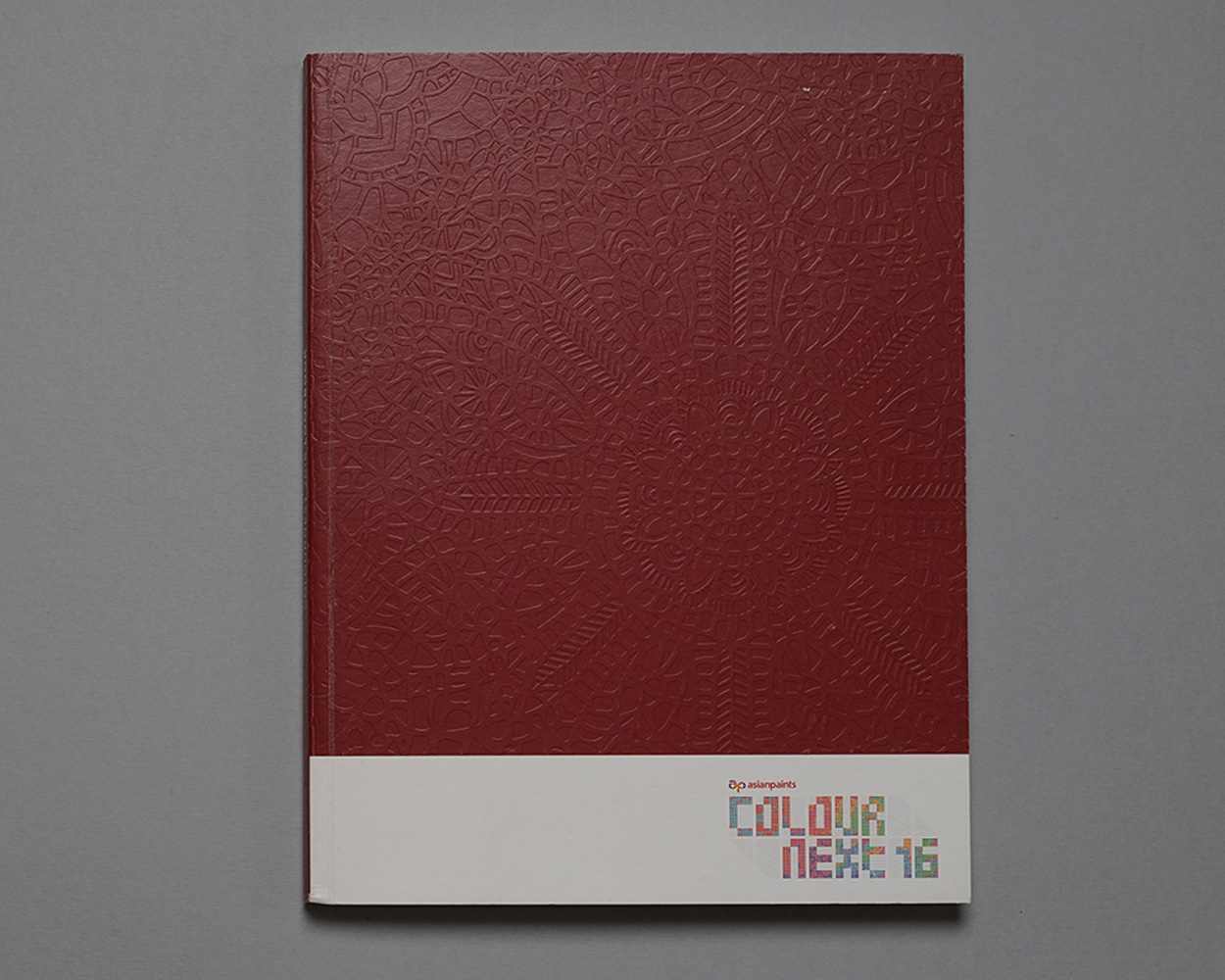
ColourNext (2011 - 2018)