

EXHIBITION DESIGN, PRINT DESIGN
ColourNext 2016
ColourNext is the annual colour forecast for Indian interiors. Targeting architects and interior designers through an exhibition, digital and print media, this excercise has been instrumental in positioning Asian Paints not just as a manufacturer of paints but a market leader and proactive visionary.
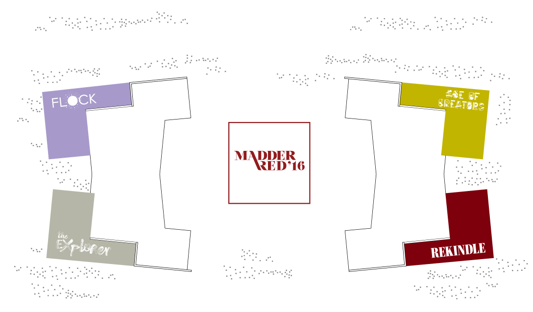
Floor Plan
Area: 700 Sq Meters
Design Associate (Exhibit layout)
STUDIO MERAKI
Area: 700 Sq Meters
Design Associate (Exhibit layout)
STUDIO MERAKI
Schema
An exciting, cohesive space that is part cafe lounge, part library and also an exhibition space, it invites people to explore, dicover and discuss colour and design in a friendly, informal and stylish setting.
1. An outer shell installation, which is an interesting play of theme colours. The shell in essense was a prelude to the discovery of the year’s themes.
1. An outer shell installation, which is an interesting play of theme colours. The shell in essense was a prelude to the discovery of the year’s themes.
2. Theme spaces were arranged such that they converged towards the Colour of the Year display. Each theme space had three sections: an experiential introduction to theme story, followed by a colour and material moodboard, and finally, the decor interpretation.
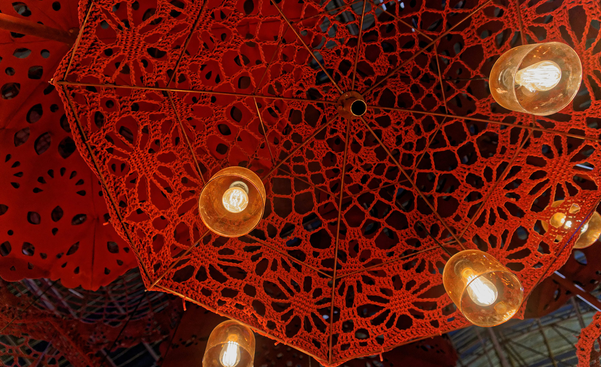
3. The Colour of the Year display celebrated Madder Red with a larger than life sculpture suspended from the ceiling.
4. At the heart of the space was Cafe Madder — a cafe and common space where people can spend time browsing through a range of design books and products designed for CN 16.
3. The Colour of the Year display celebrated Madder Red with a larger than life sculpture suspended from the ceiling.
4. At the heart of the space was Cafe Madder — a cafe and common space where people can spend time browsing through a range of design books and products designed for CN 16.


Rekindle
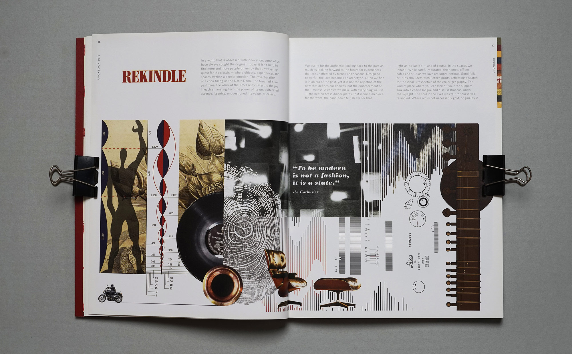
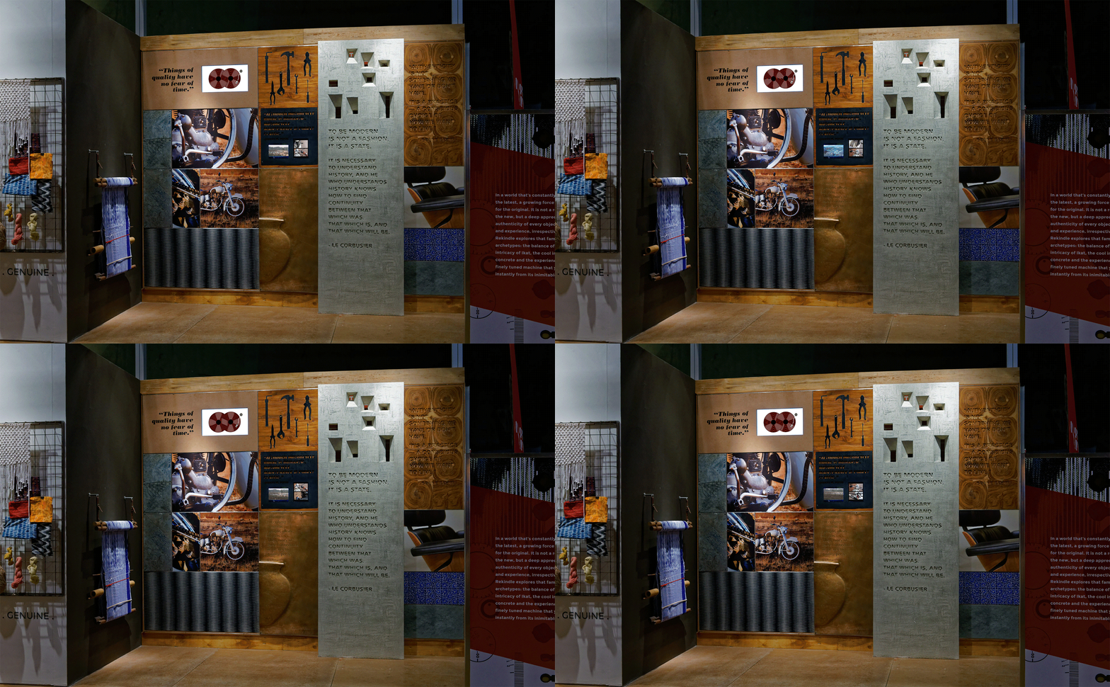
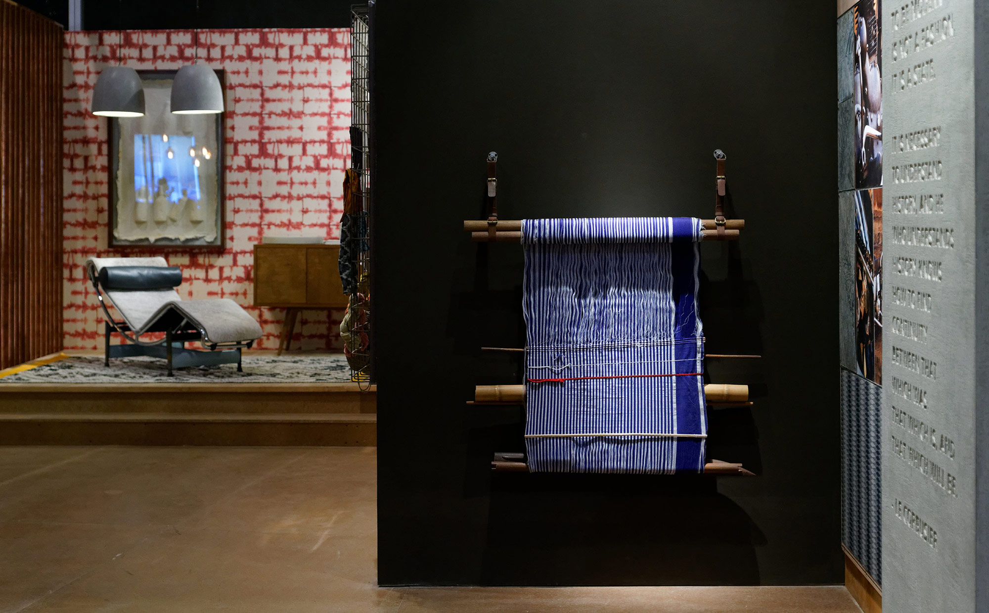
In a world that’s constantly upgrading to the latest, a growing force is on a quest for the original. Rekindle explores that familiarity of archetypes: the balance of the lota, the intricacy of Ikat, the cool intimacy of concrete and the experience of driving a finely tuned machine that you recognise instantly from its inimitable thump. The experience of the authentic came alive through a rich material landscape that contained the finer nuances of the theme story. Clever juxtaposition of appropriate quotes on surfaces and materials reinforced the narrative.
Video:
Darshan BhagatKaushik Ramnathan
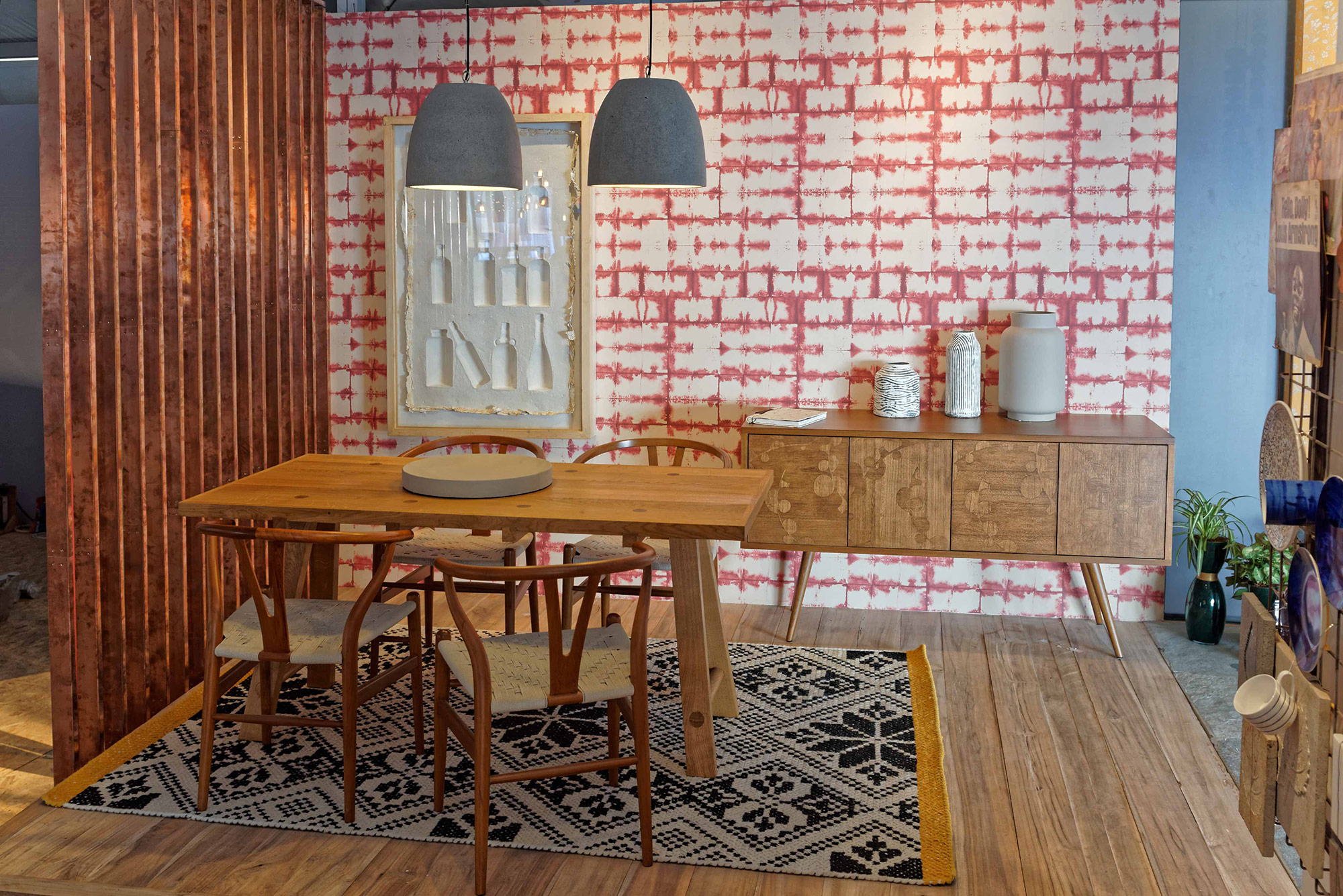

Curated Products from : KREA, POLTRONA FRAU, BOCONCEPT, VARNAM, THE RUG REPUBLIC, WARI WATAI
Age of Creators
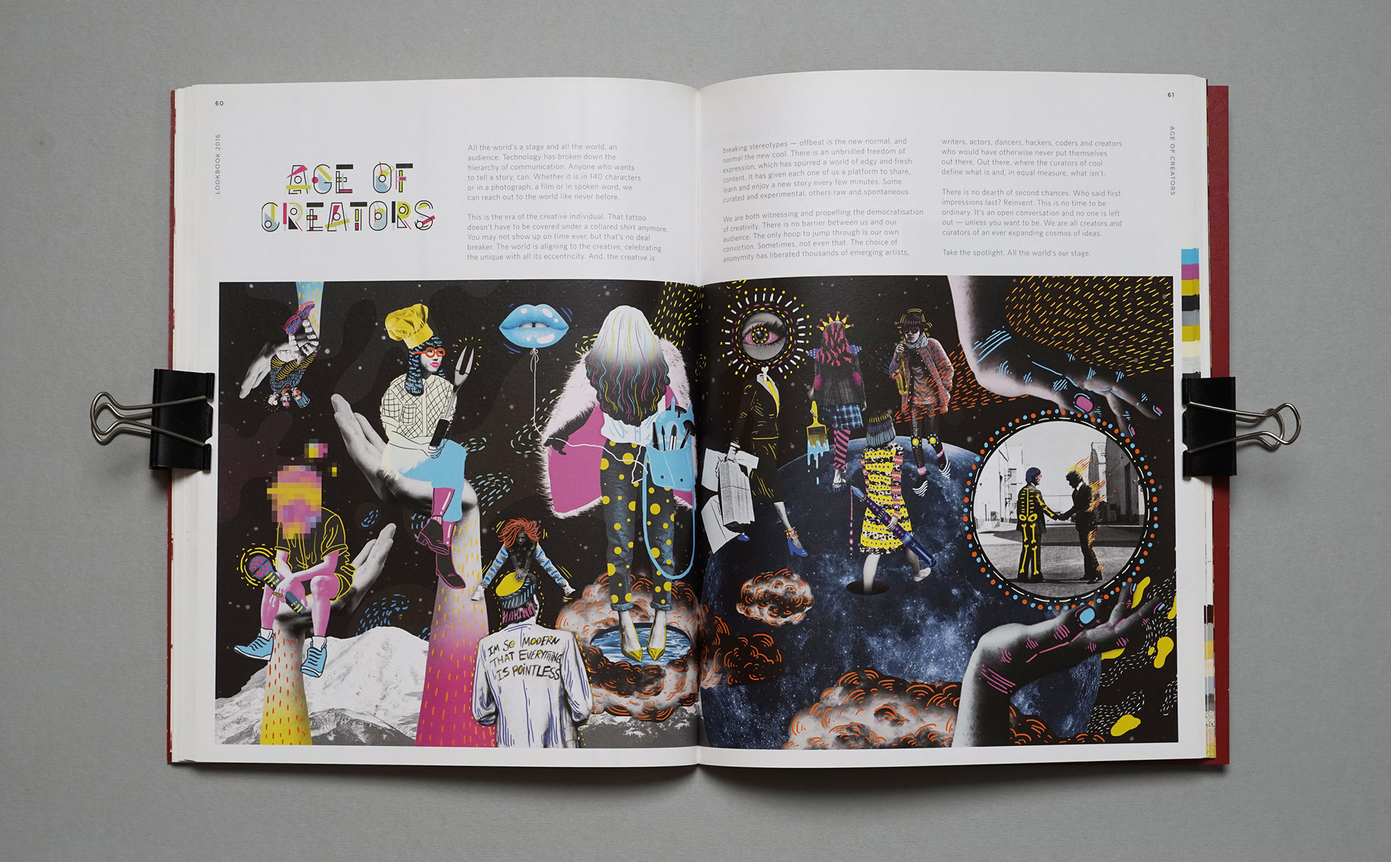
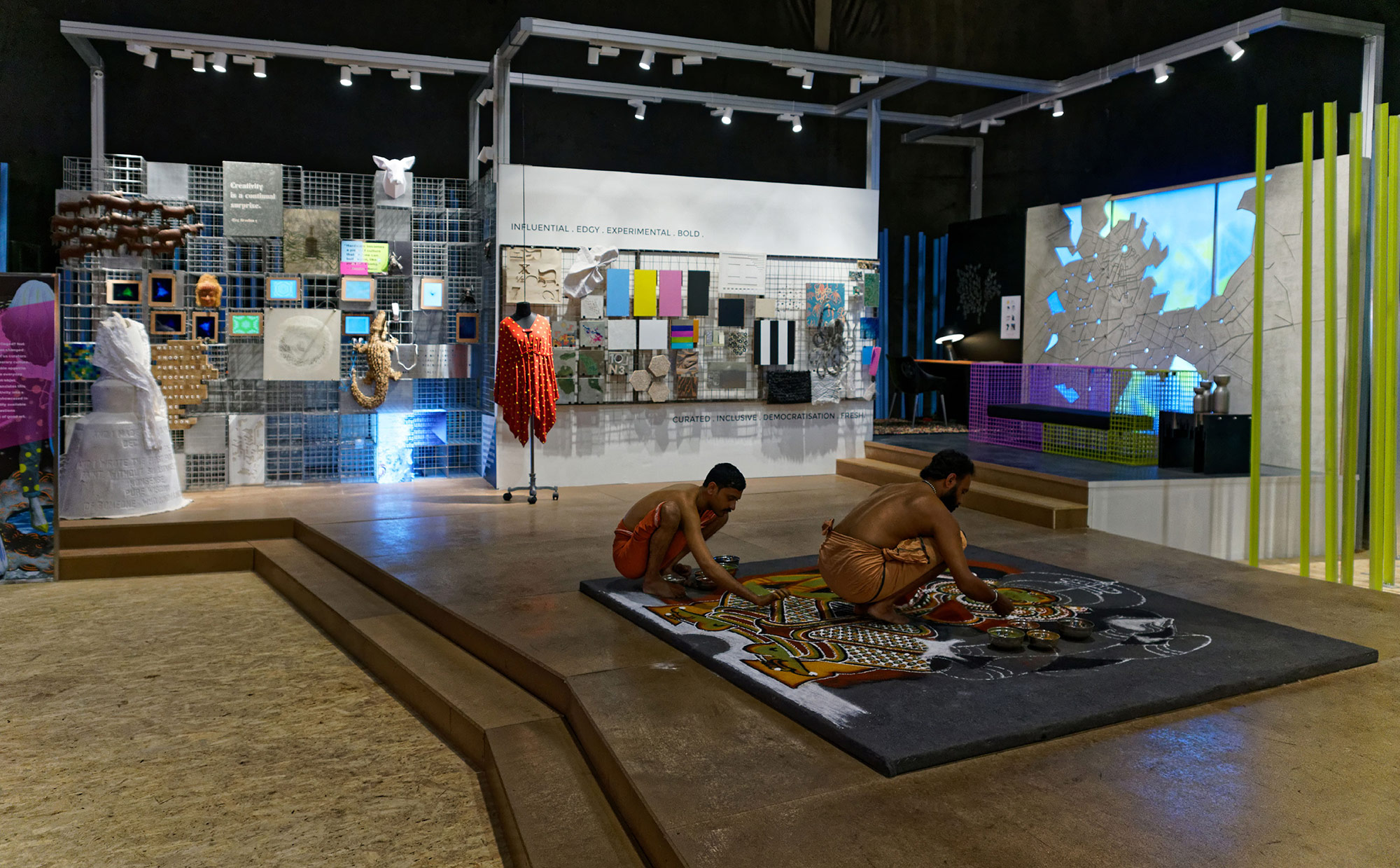
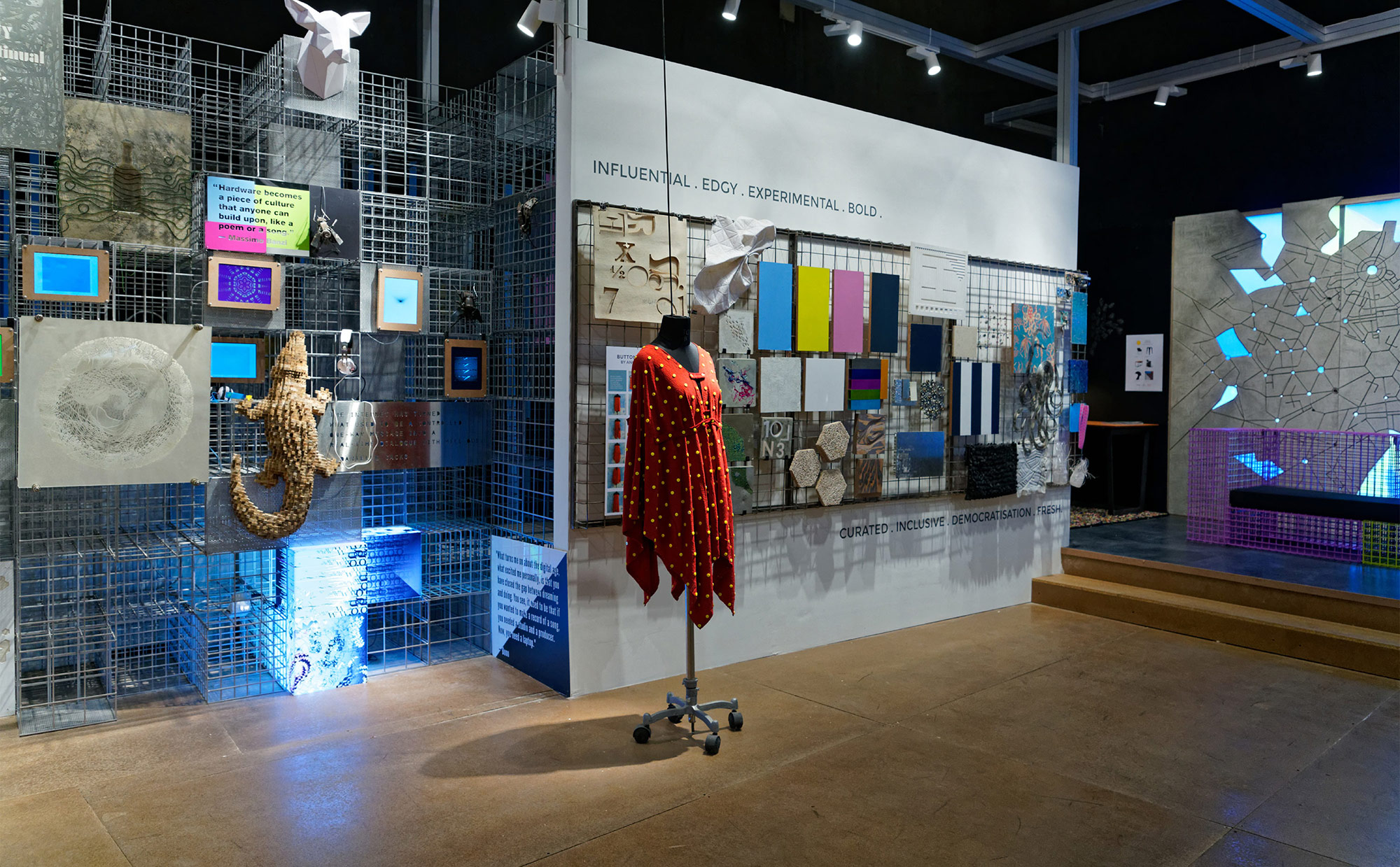
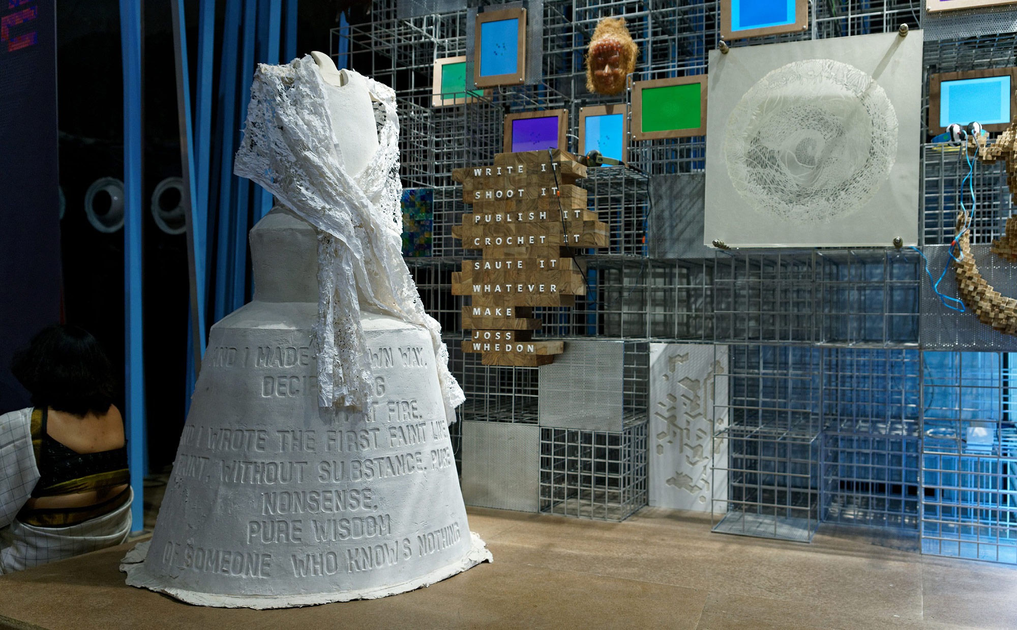
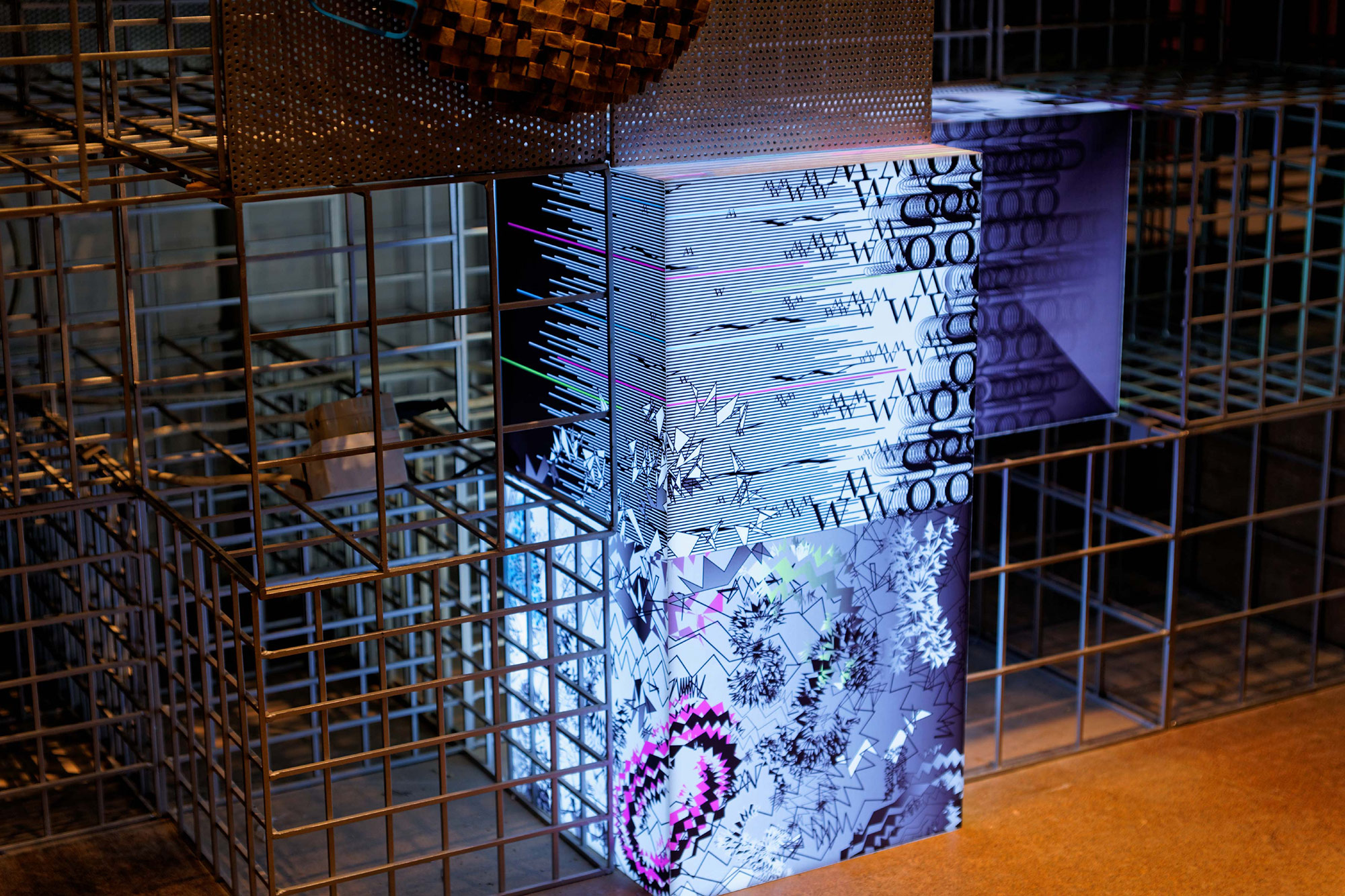
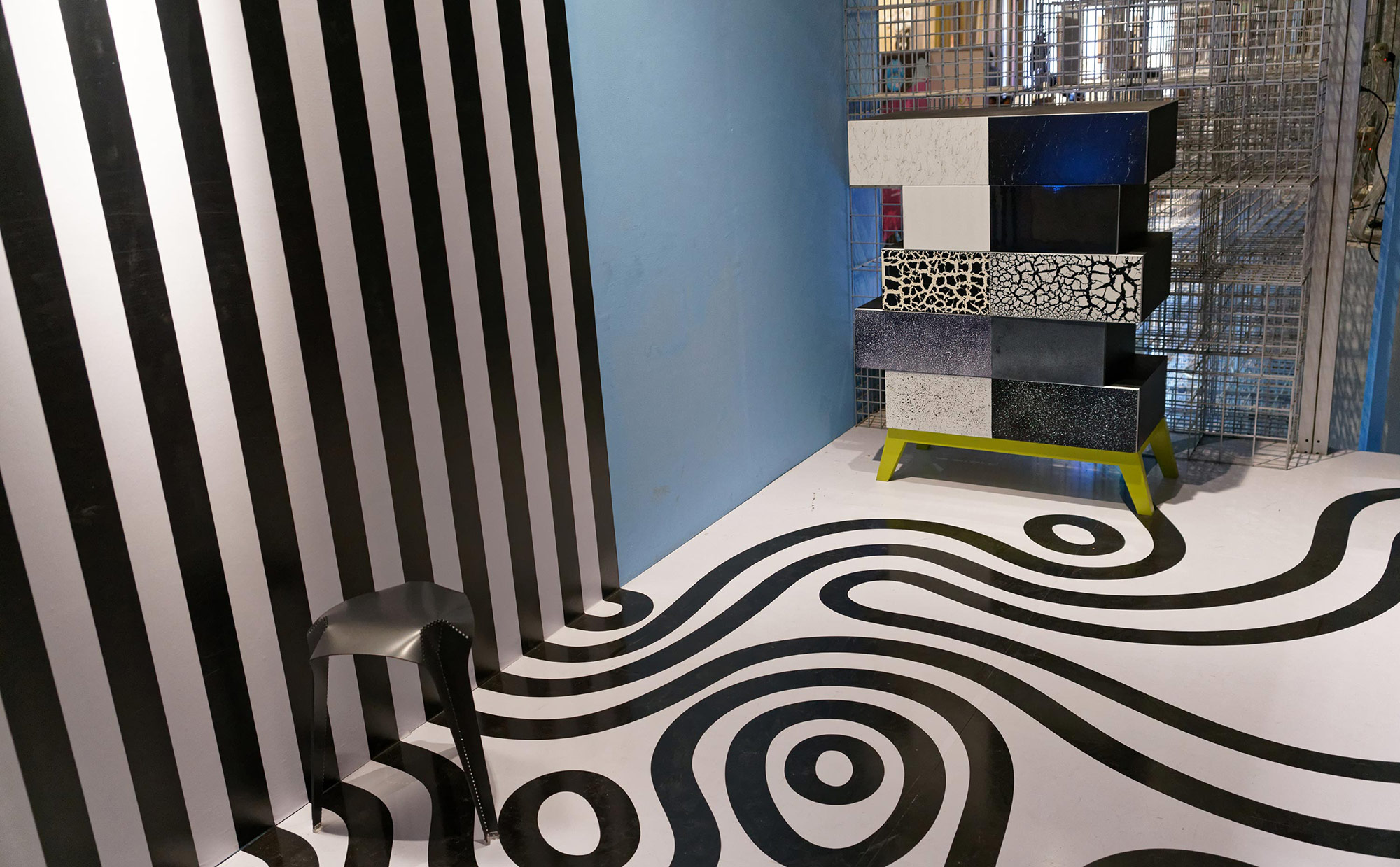
Art, a reserve of the privileged? Not anymore. The internet has changed everything, making all of us curators and creators of contemporary culture. In an age with an insatiable appetite for the experimental, the everyday finds itself elevated to an objet d’art. Age of Creators translates this democratisation of creativity into a layered wall of objects, showcased in a structure made of readily available mesh and pipes, that questions exclusivity/inaccessibility as a hallmark of good art.The theme story was told through many different types of artistic elements– 3D sculptural forms (origami paper, wood and resin etc) using different materials as well as dynamic videos. All these visual elements were embedded in a 3D wireframe, the backgrop for edgy expressions and ideas.


The Explorer
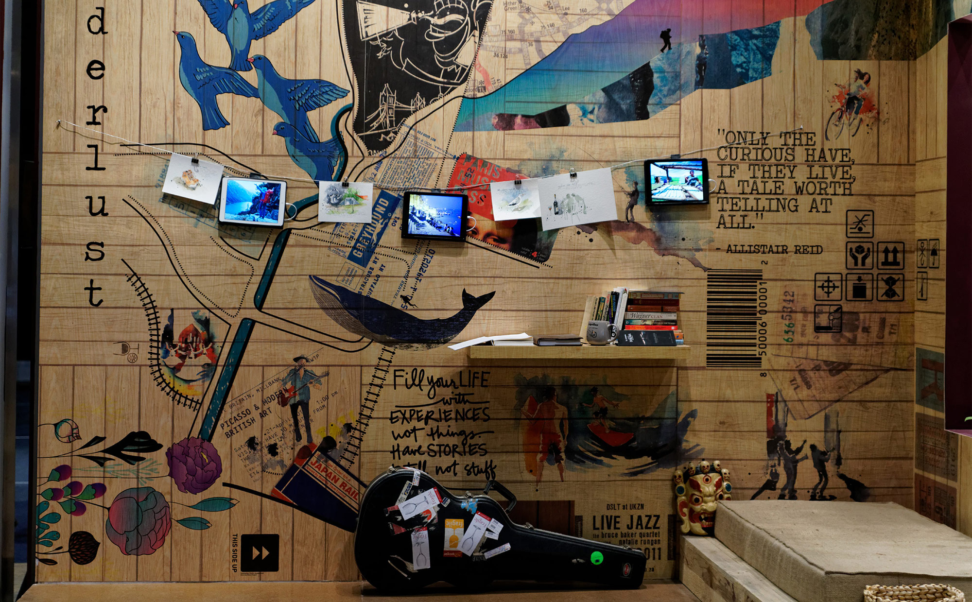
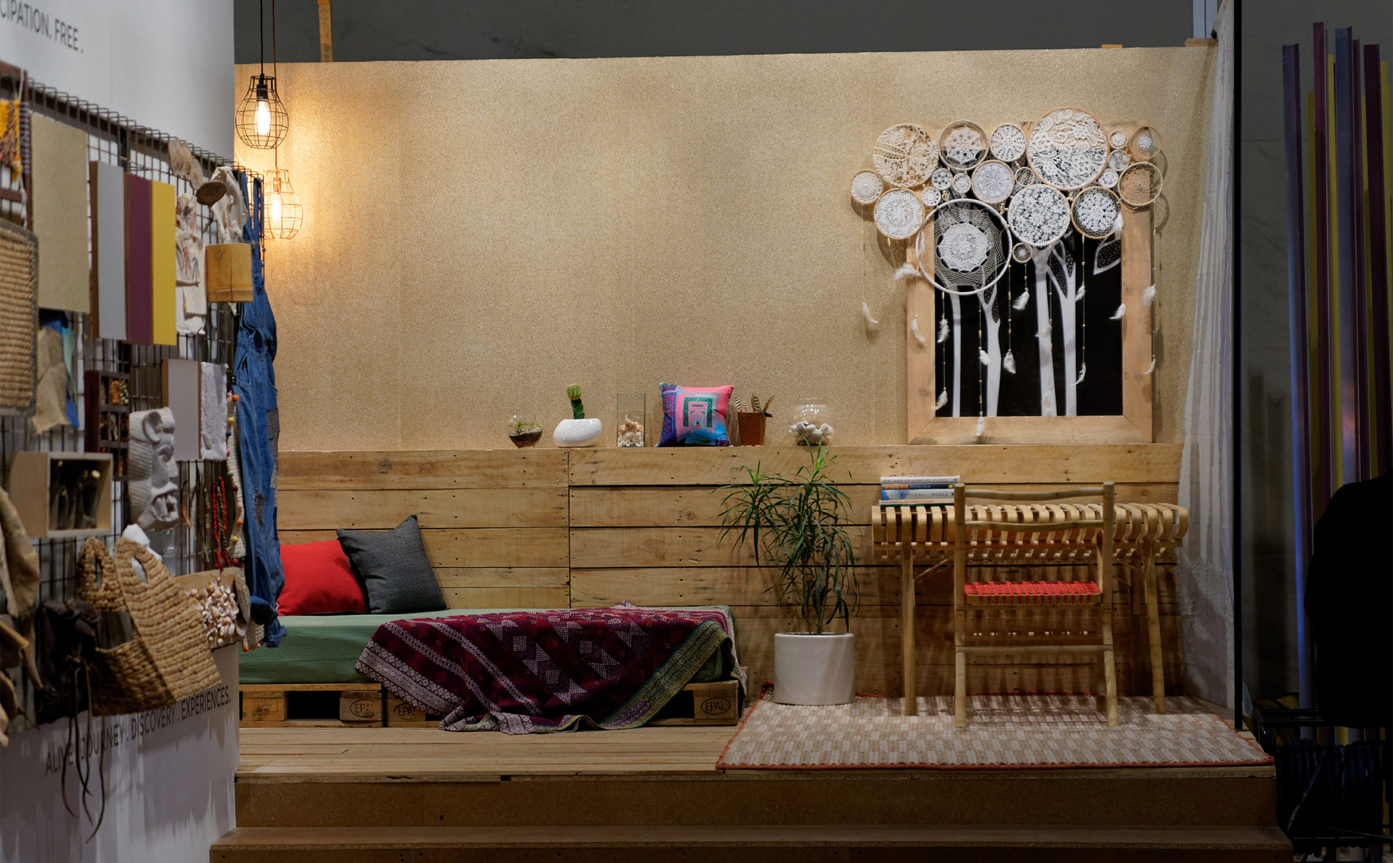
Growing up doesn’t mean settling down. The contemporary urban Indian is unafraid to live in the now, travelling the world to change the way they see it. On the lookout for fleeting experiences that last a lifetime,
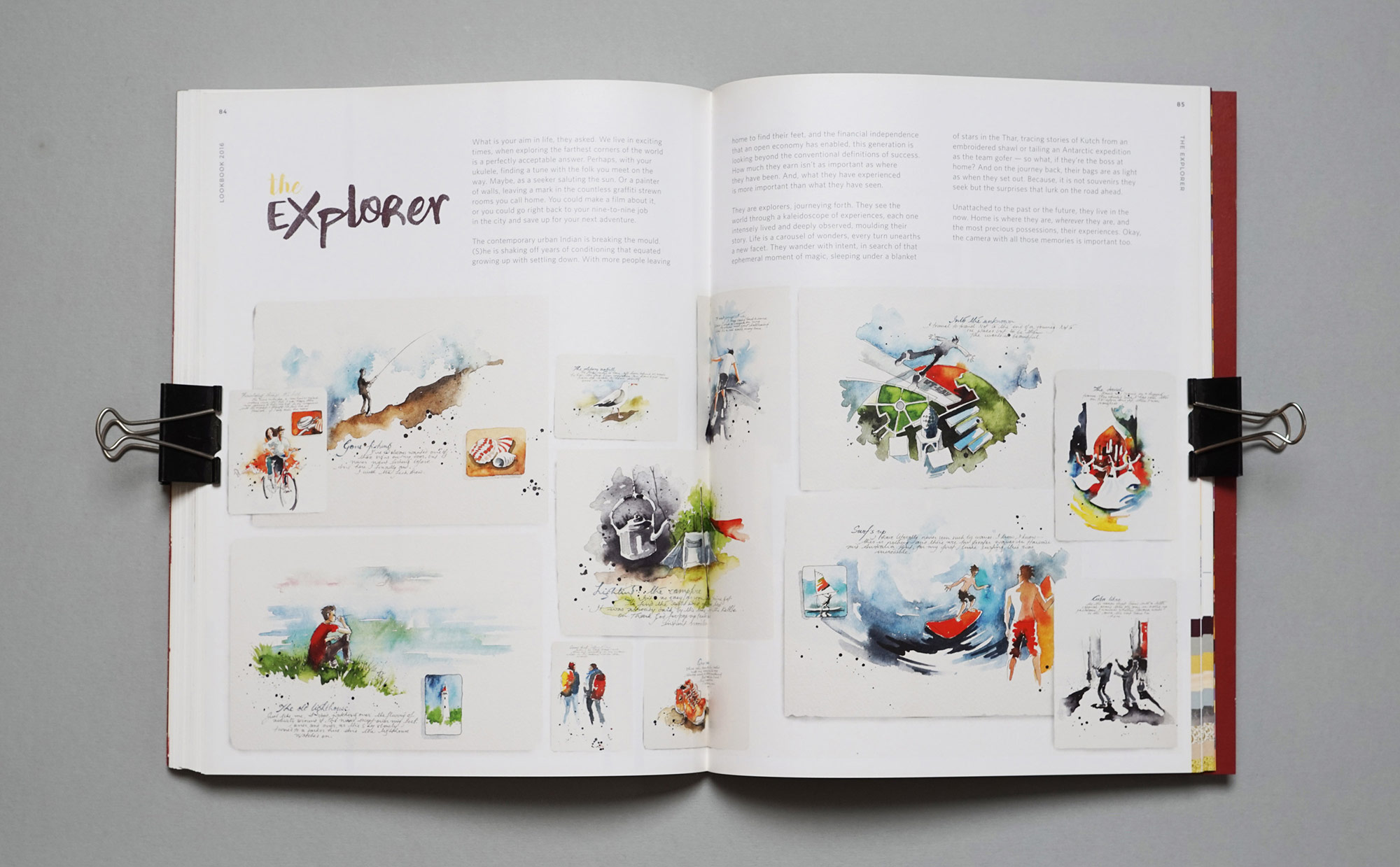
The Explorer is seen as an intrepid diarist, imprinting moments in his/her mind, if not on paper or wooden walls. Captured in cinemagraphs, remembered in postcards, the spirit of The Explorer recounts old adventures, one foot forever in those to come. This theme was presented to the visitor through an intimate collection of glimpses of various experiences collected over a long span of time. In the form of photographs, sketches, handwritten notes, poetry, videos etc., memories were captured and shared with the audience in a perceived natural setting of this personality. The idea was to use a visual of layered corrugated sheets and parts of crates (and their incidental graphics) to create the base wall as a metaphor of the ‘humble collector’ of rich experiences, instead of material objects.



Curated Products from : THE LIGHTBOX SANGARU, THE RUG REPUBLIC, KINCHE, NO-MAD
Cinemagraphs
Flock
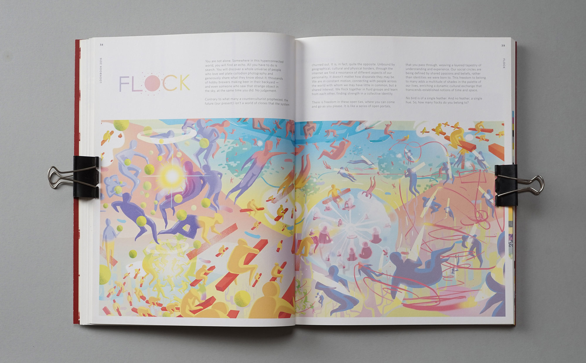
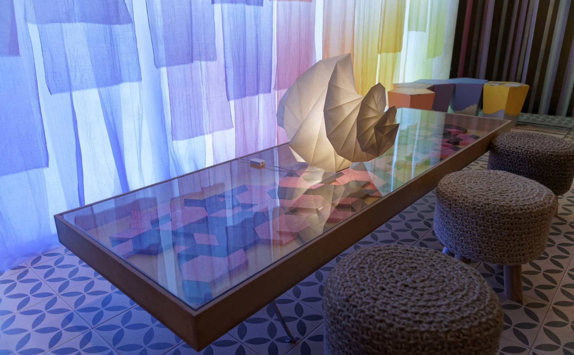
This theme is about finding not just one, but a whole universe of groups and forums with people that share your interests — from the popular to the most peculiar. Flock is a world of individuals who actively pursue their passions. Their paths cross in the virtual world, and sometimes even in the real world — momentarily, perhaps, yet memorably.There are two broad elements. One being the stories of various individuals wanting to engage their interests through various mediums, conveyed through comics strips (graphic novel style). Another is the visual idea of various flocks, conveyed through animated Gifs/videos/Multiple frame gif’s as per the nature of the activity. The installation is about these various/many comic style stories leading to the active nodes (animated gifs) that signify a flock, in an interesting way.


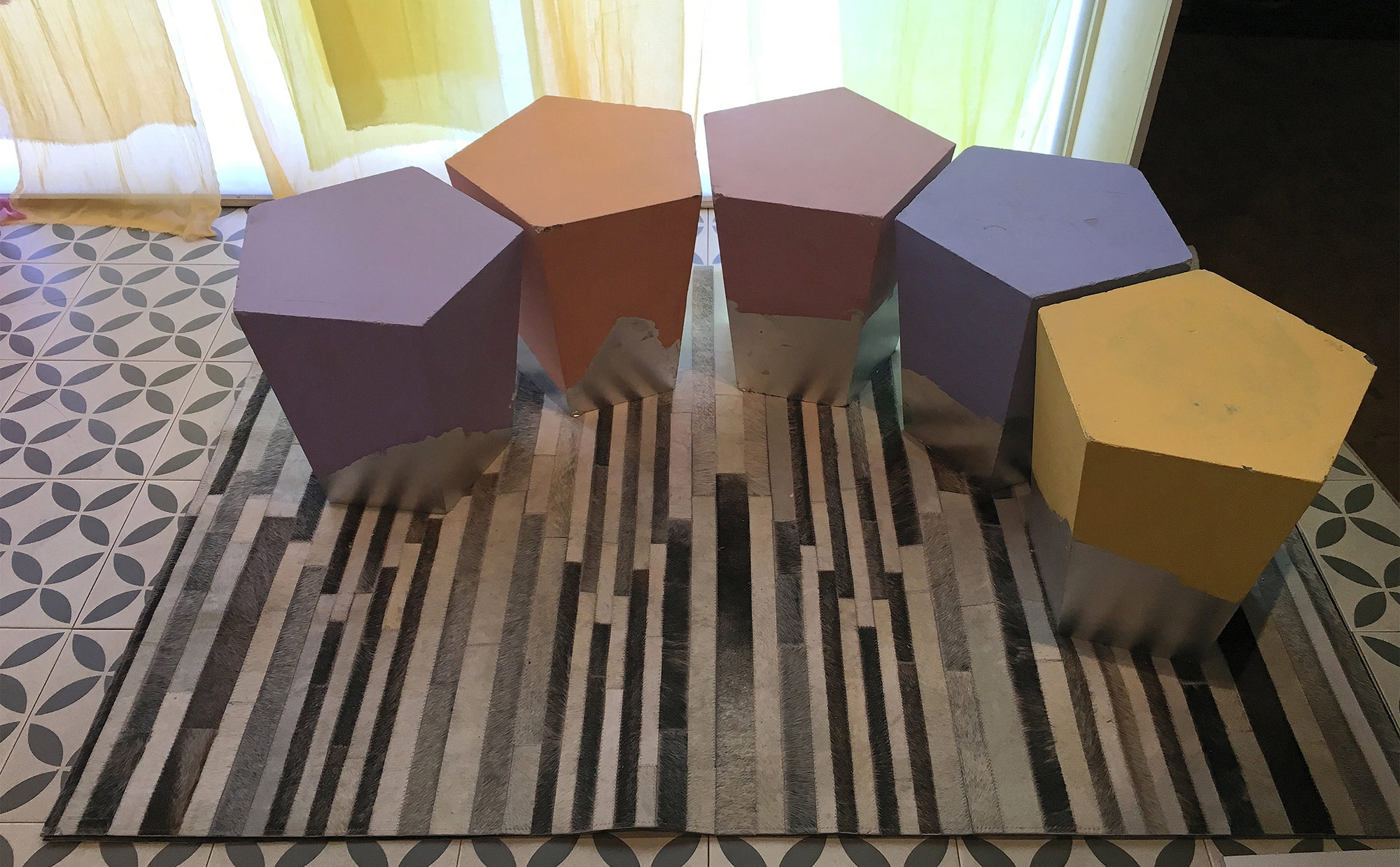
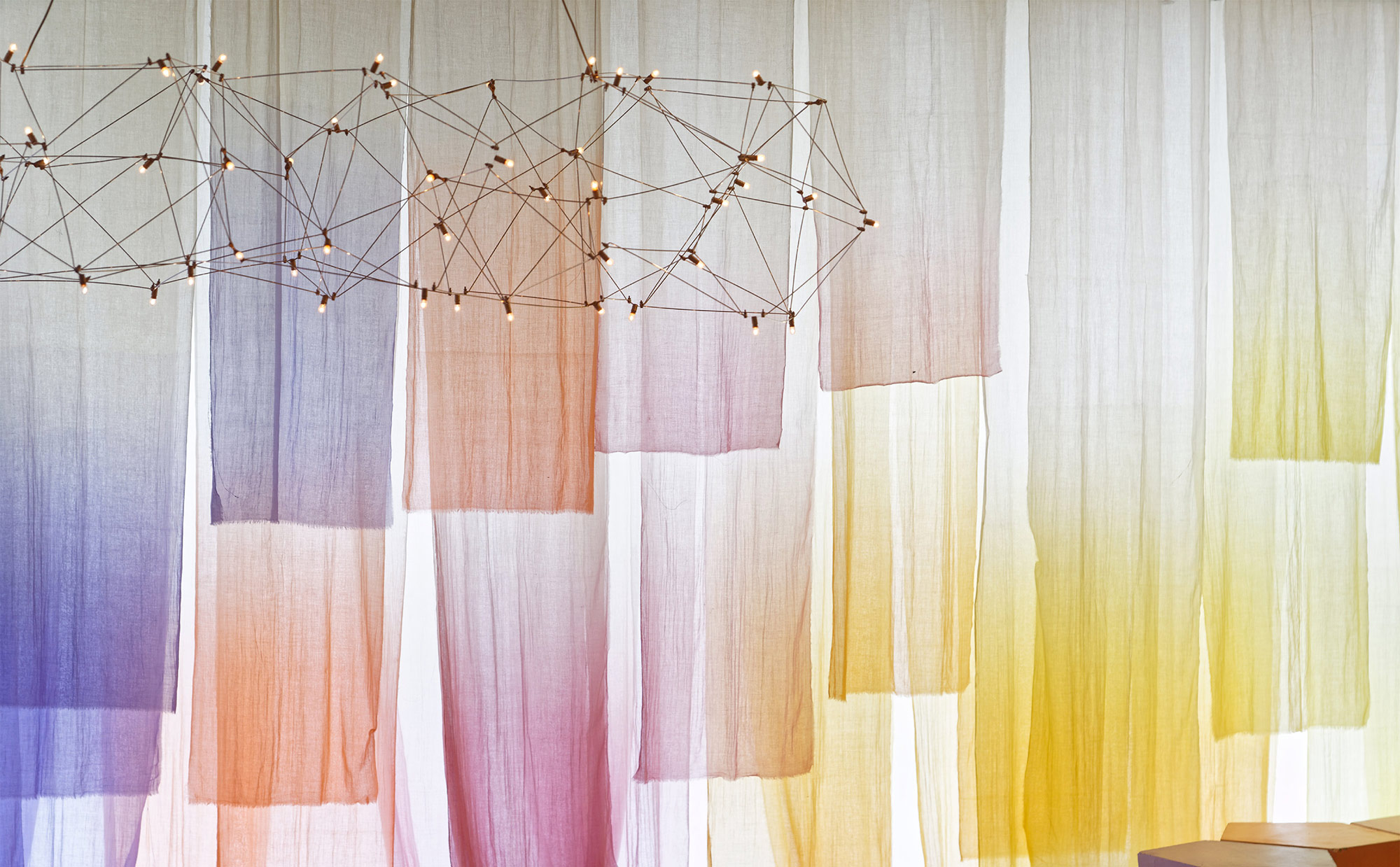
Curated Products from : BOCONCEPT, THE LIGHTBOX, NITCO TILES, ARTEMIDE LIGHTS, THE RUG REPUBLIC
Moodboards
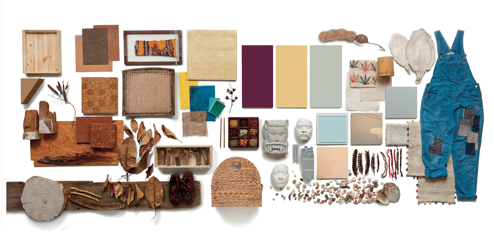


COLOURNEXT 2016 TREND STORIES . PRINT DESIGN
Lookbook 2016
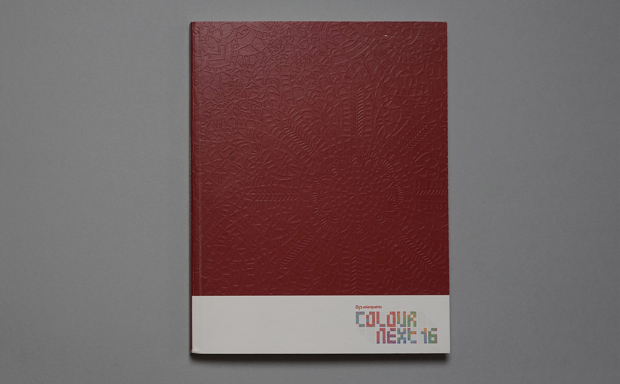
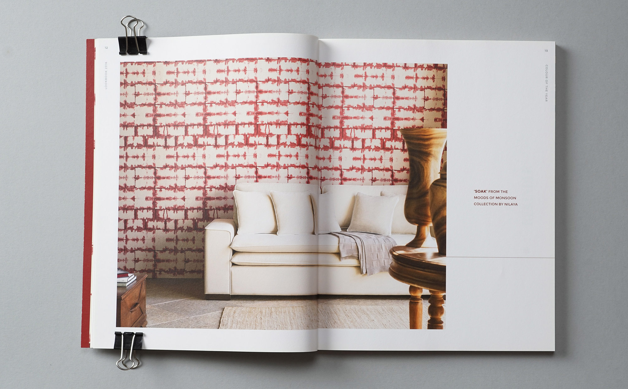
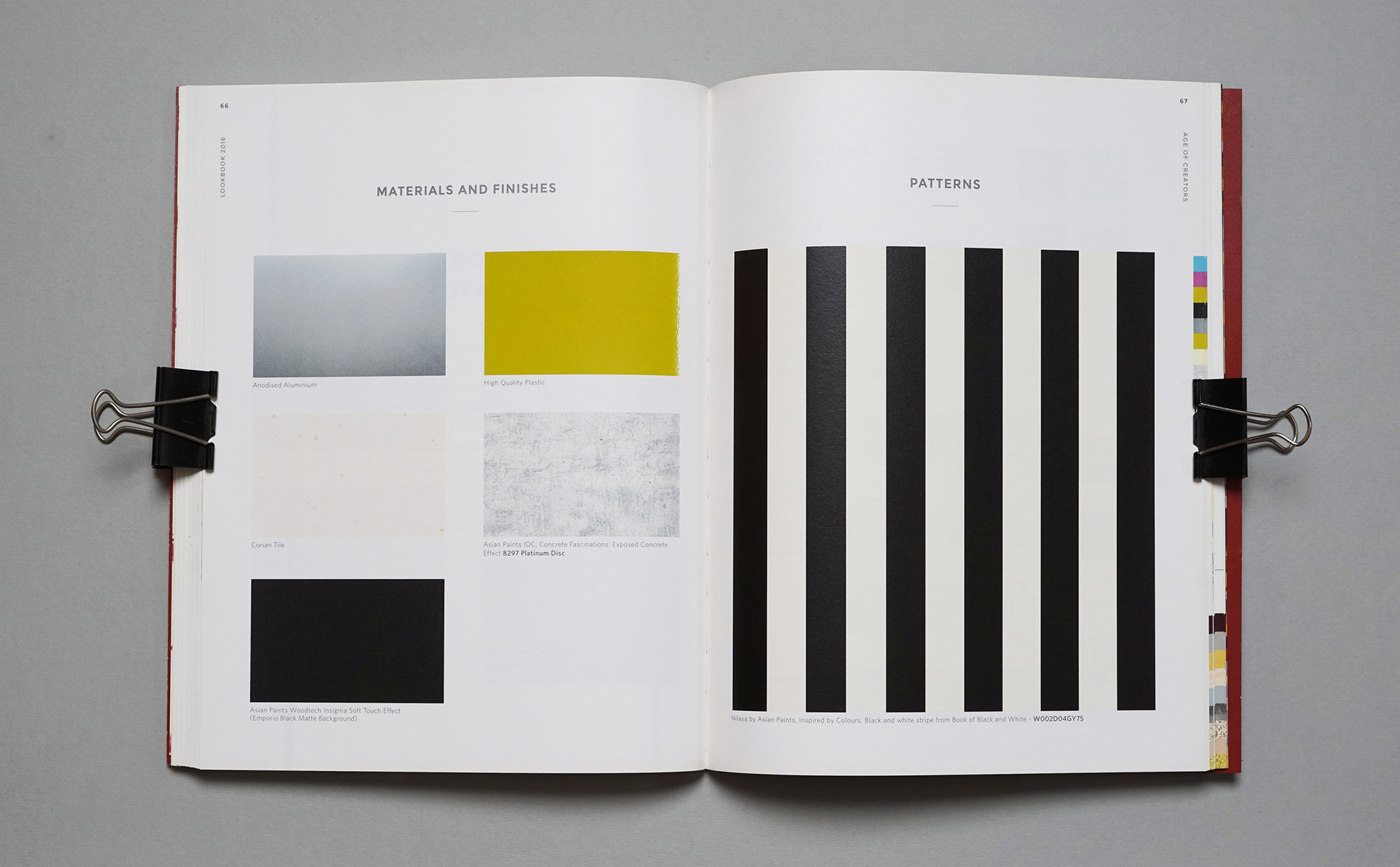
The lookbook-workbook is a concise and handy reference, complete with theme stories, visualisations, moodboards and swatches designed to inspire designers across disciplines and contextualise colour, material, finishes and textures for the year to come.
Lookbook 2016
The lookbook-workbook is a concise and handy reference, complete with theme stories, visualisations, moodboards and swatches designed to inspire designers across disciplines and contextualise colour, material, finishes and textures for the year to come.