EXHIBITION DESIGN, PRINT DESIGNColourNext 2015
ColourNext is the annual colour forecast for Indian interiors. Targeting architects and interior designers through an exhibition, digital and print media, this excercise has been instrumental in positioning Asian Paints not just as a manufacturer of paints but
a market leader and proactive visionary.
ColourNext 2015
ColourNext is the annual colour forecast for Indian interiors. Targeting architects and interior designers through an exhibition, digital and print media, this excercise has been instrumental in positioning Asian Paints not just as a manufacturer of paints buta market leader and proactive visionary.
My City My Home
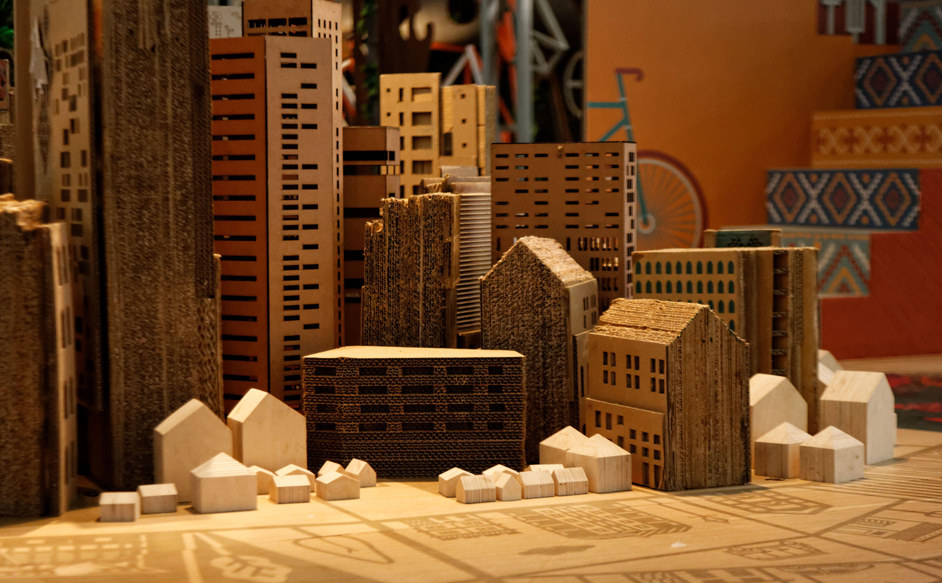
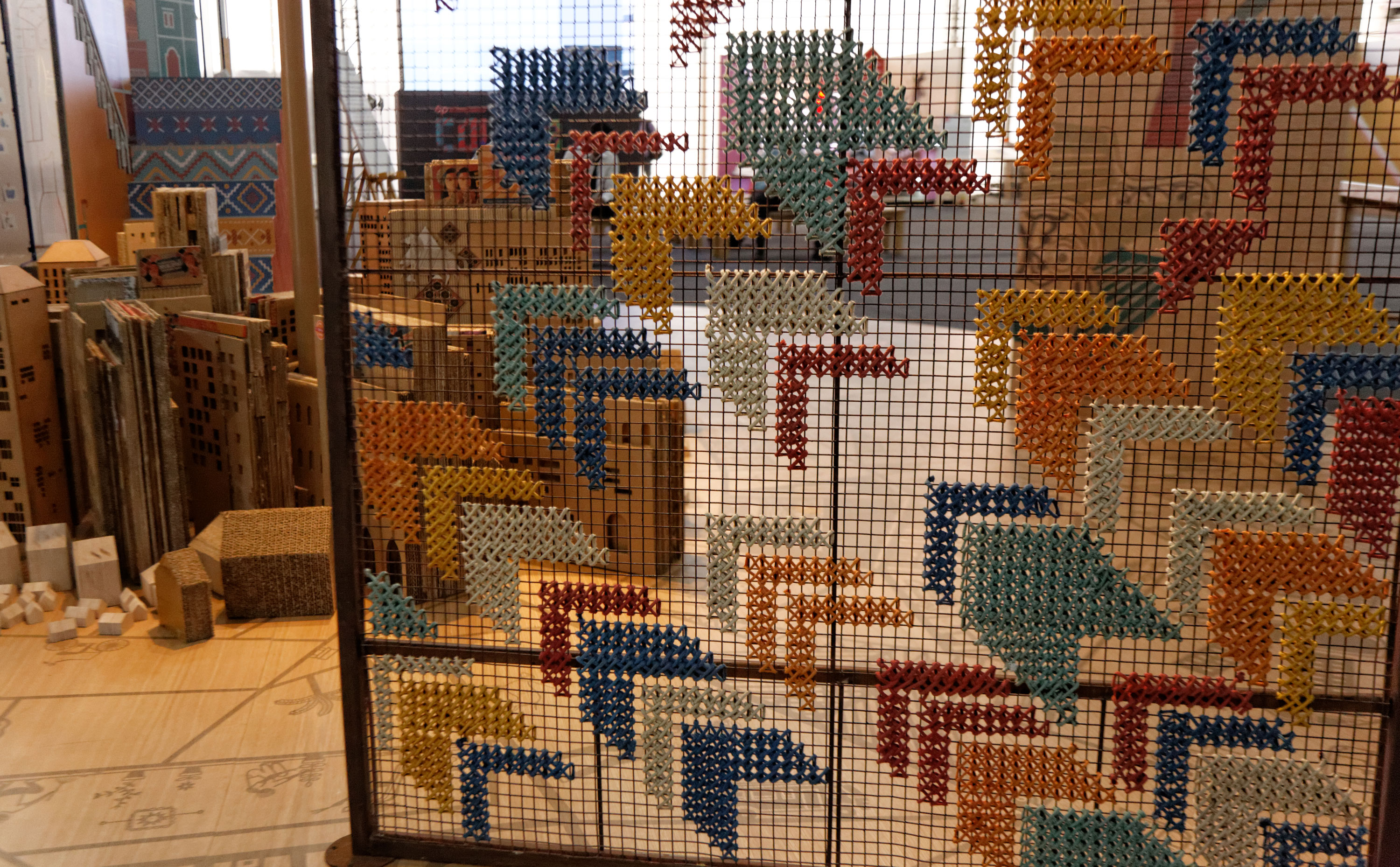
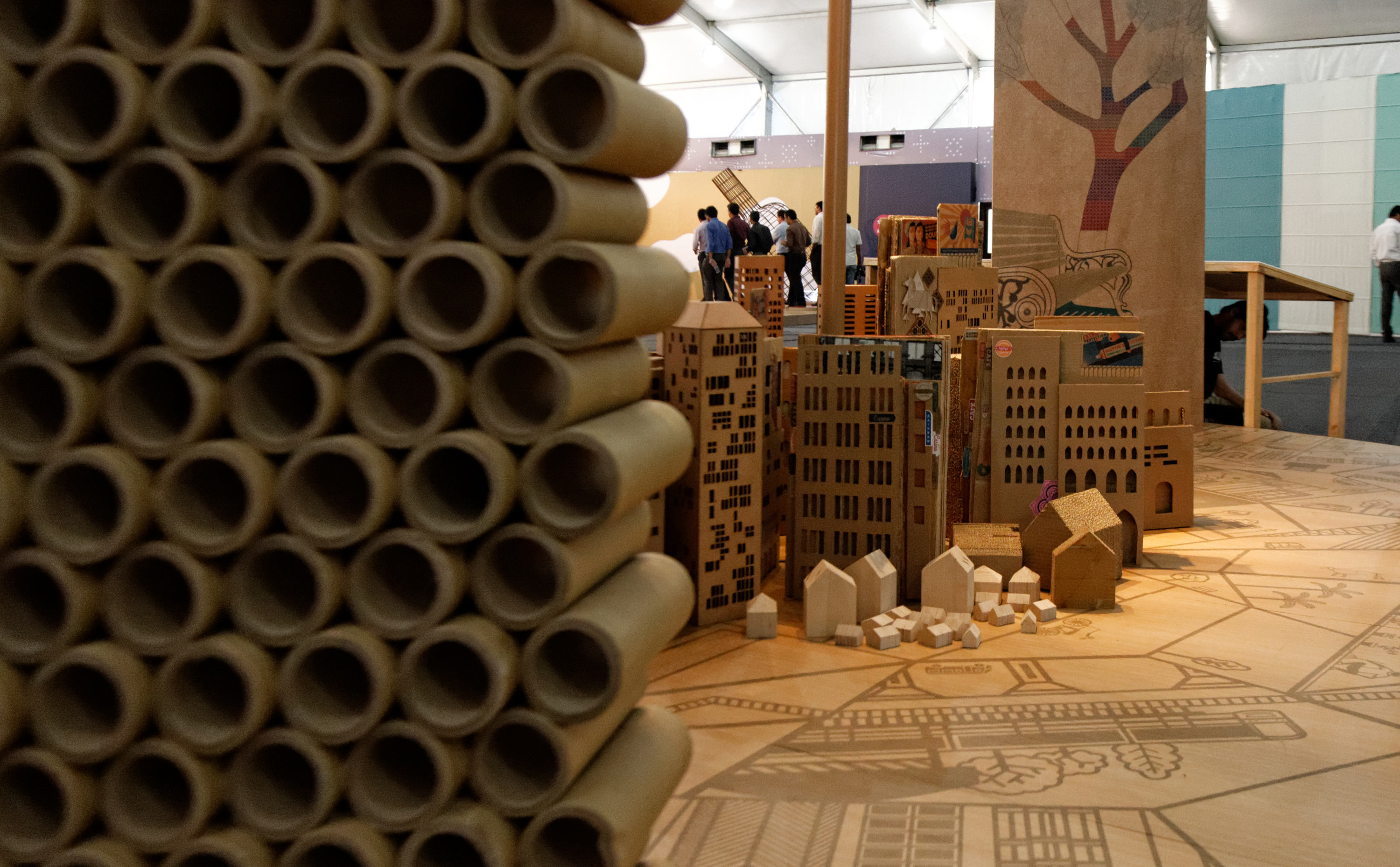
The installation is an exploded view of a city neighbourhood. It is a discovery to varied ideas of transforming your neighbourhood. The circular space allows for an interesting way of displaying these interventions and viewing the neighbourhoods from a macro
as well as micro perspective.
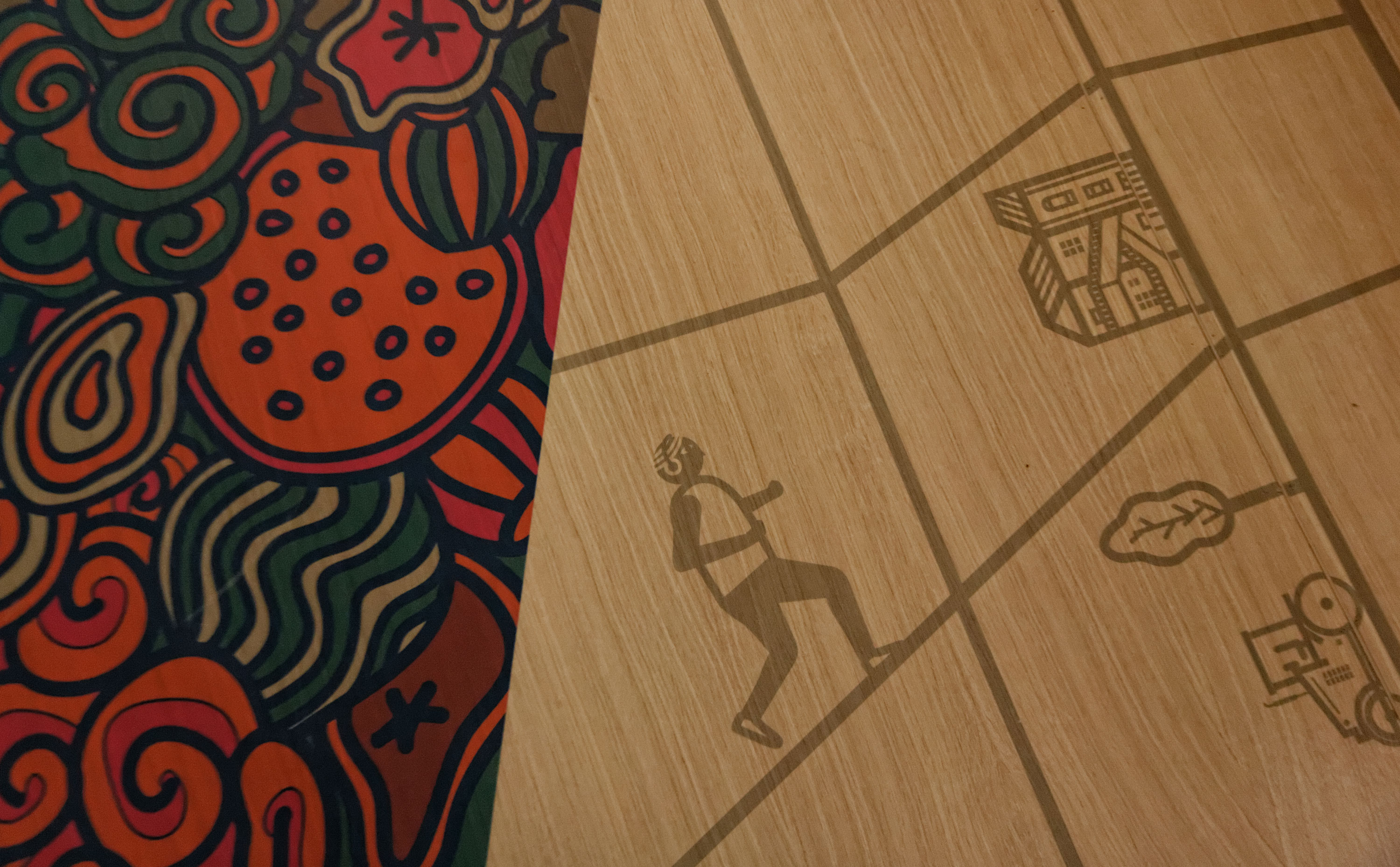
The core part is an abstract miniature cityscape, created with various small neighbourhoods put together. It rests on a larger map which provides a macro image backdrop to the entire idea
of creation of a city. Each part of neighbourhood miniature, further explodes out to the peripherie of the circular space showing details of the various interventions inside.

My Freewill
A matrix is created with vertical walls perforated with digital code graphics. The walls are alive and active - mapped with localised projections of people in the pavilion and faces of individuals present in the installation itself. These images would be a live feed captured by cameras placed within the installation and the pavilion. They help create an element of surprise, as you become a part of the installation itself. The individual is in the midst of the space, almost consumed and overwhelmed by it.
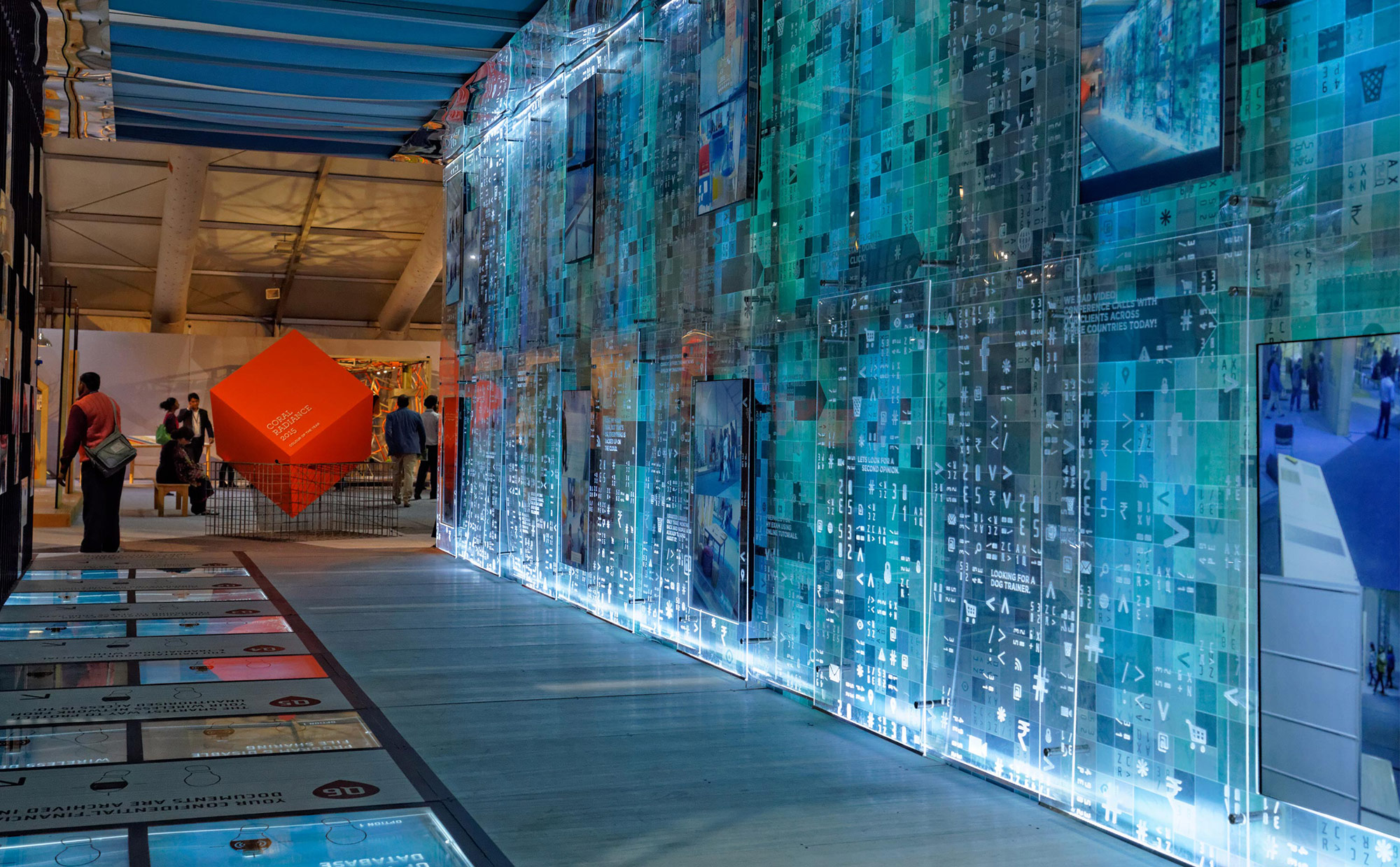
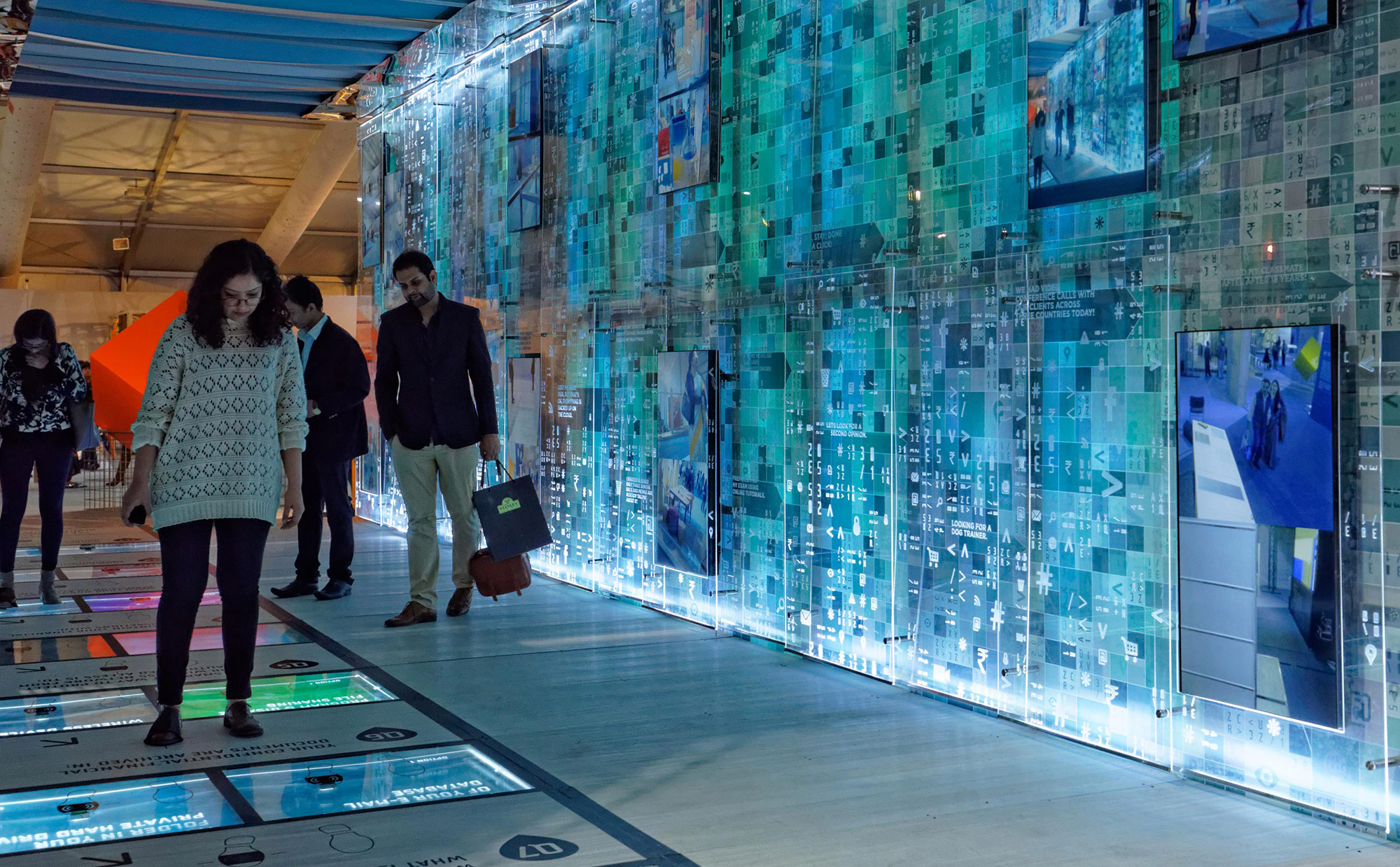
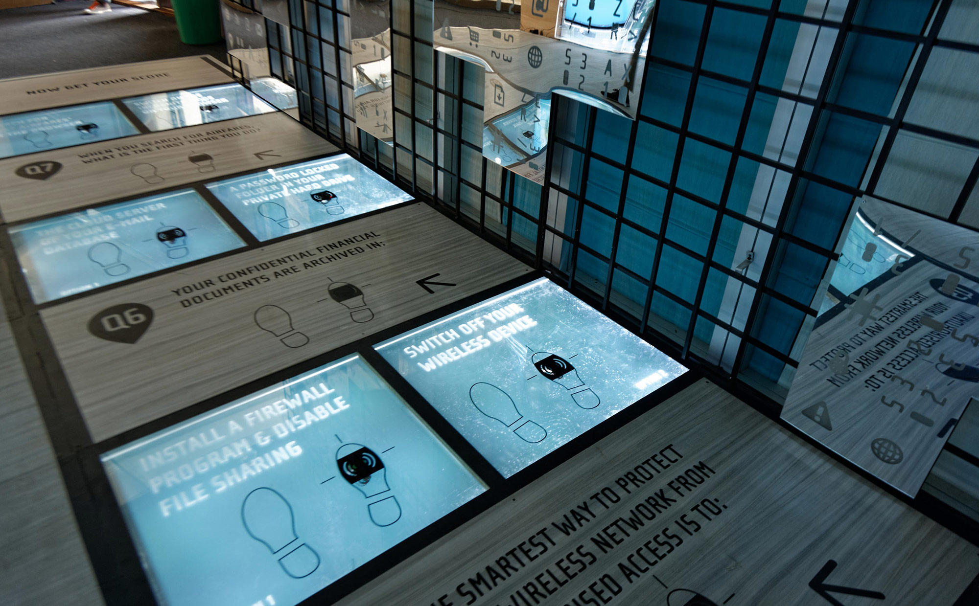
The high walls act as a larger milieu of the web while the floor acts as a playful navigation tool. The individual navigates through a set of choices/ options embedded in the floor as he walks across the installation. It is an interactive medium and introduces an element of fun. People exercise their freewill and the concept of freedom is introduced playfully as they choose the options on the floor which in turn trigger reactions onto the corresponding sections of the wall.
The individual navigates the information highway playfully rather than being afraid of it.
The individual navigates the information highway playfully rather than being afraid of it.
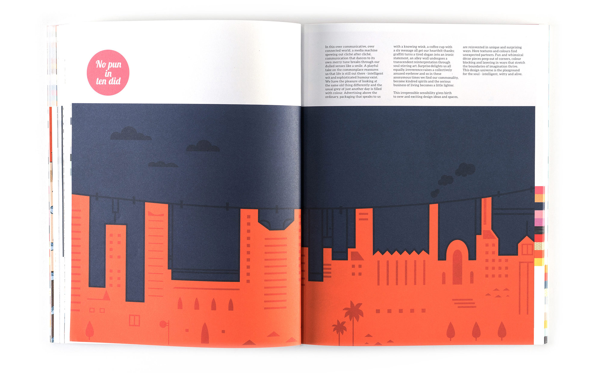
No Pun In Ten Did
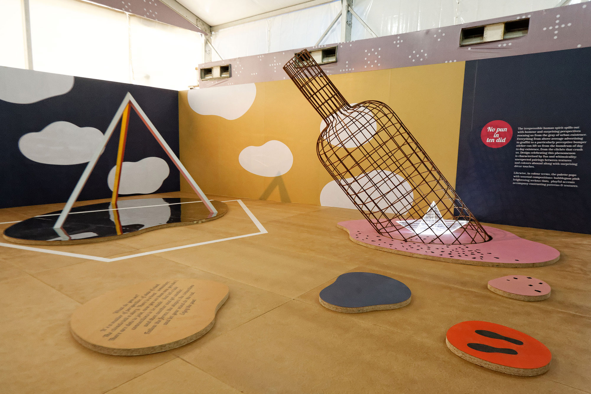
An installation with puns and surprises at many levels, it takes the viewer on a journey of discovery and wonder. It begins with a message in the bottle that is sailing across the sea. As one looks closer one realizes that the message is a ship and the ship contains a message/story. And the ship is sailing inside the bottle. Looking ahead there is huge geometrical shape emerging out of the sea. An iceberg?! When one looks carefully, the form echoes the mast of the ship inside the bottle. Soon one sees a ship, almost like a mirage. As one goes closer towards the mirage, the ship form disappears and the geometrical shape reveals itself further and transforms into a tetrahedron. Further, the tetrahedron transforms into a hexahedron as it reflects in the puddle. A message in a message, like the perfect pun.


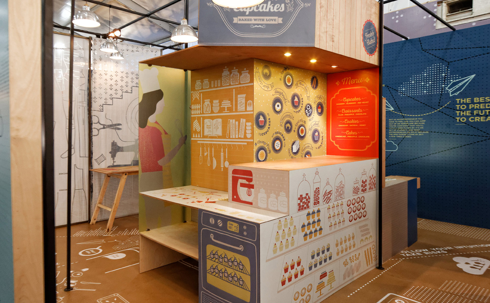
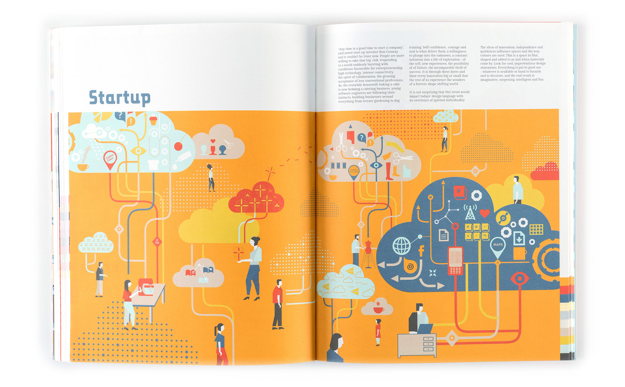
StartUp
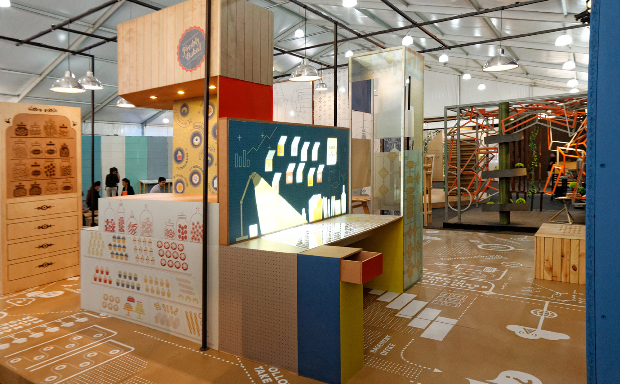
The installation represents a space that is in
the making to achieve a larger goal. It contains
the spirit and the exuberance of its initial
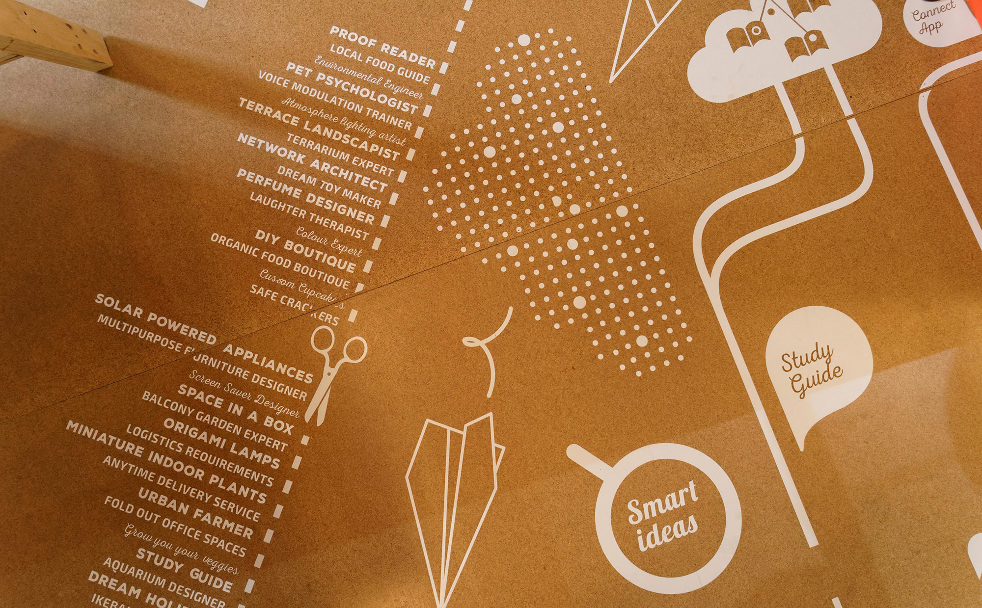
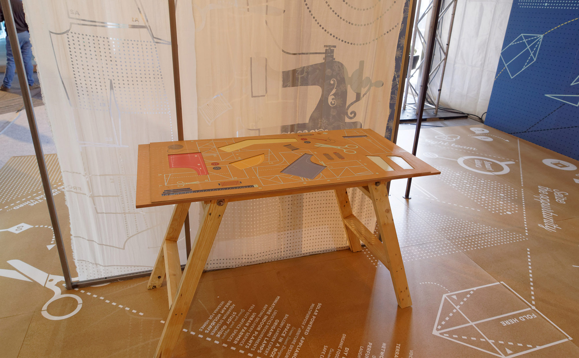
start up phase. Energetic, active, dynamic and constantly in the mode of transformation.It is cleverly constructed with forms, elements,and materials to illustrate the inspired spaceof a start up. Thetranslucent vertical wallrepresent the blueprints (plan drawings) ofideas with dotted gridlines and directionsto possibilities for spaces to pop out. It alsofollows the language of paper folding whichgives the impression of spaces with ideas ofinnovation which are flexible and multi purpose.It acts as a base framework to demonstrate
the varied startup ideas on the surfaces.
Some of the surfaces are translucent which allow for a layered space where the audience in the exhibit become part of the installationgiving the impression of a dynamic start up.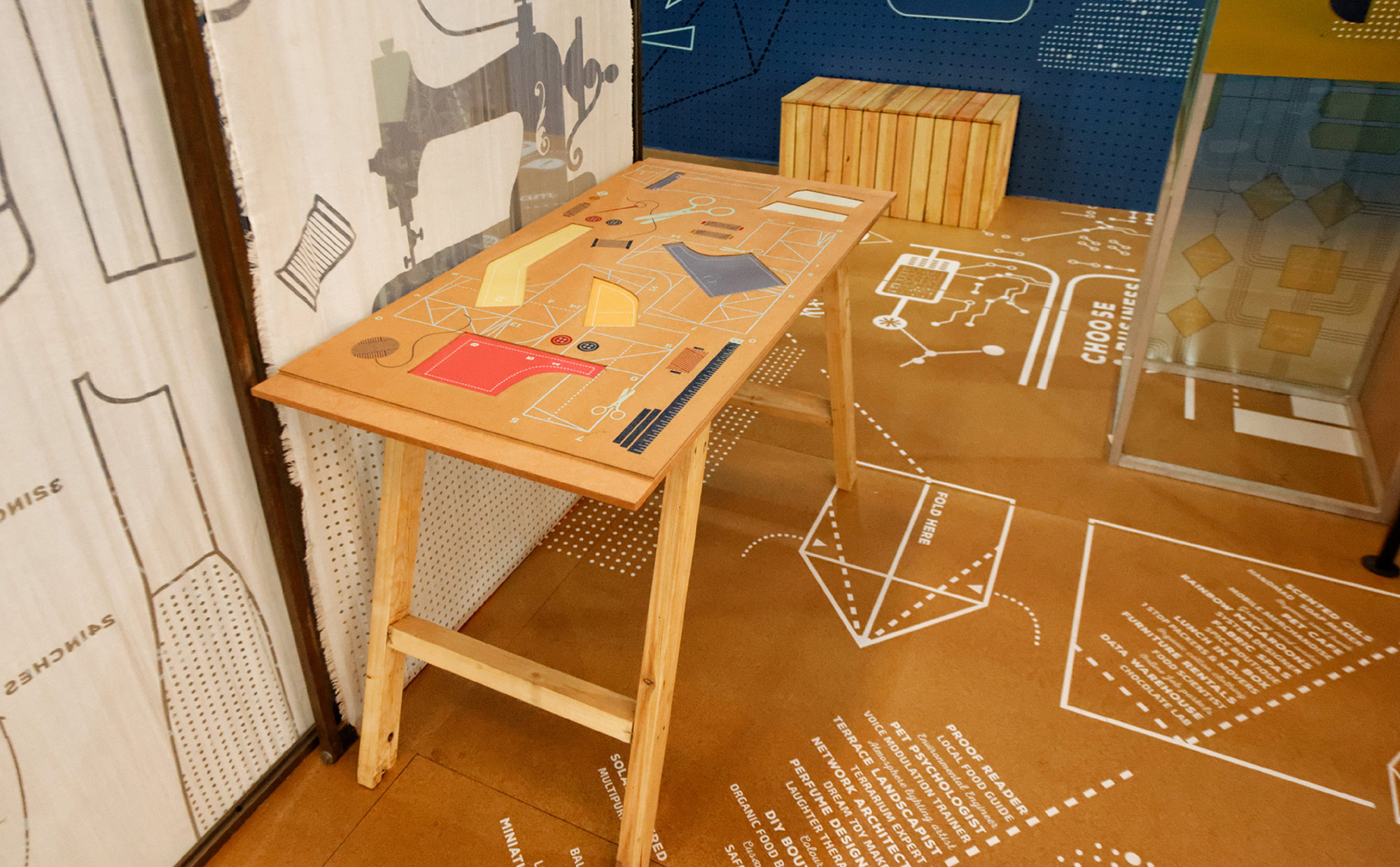

PRINT DESIGN
Lookbook 2015
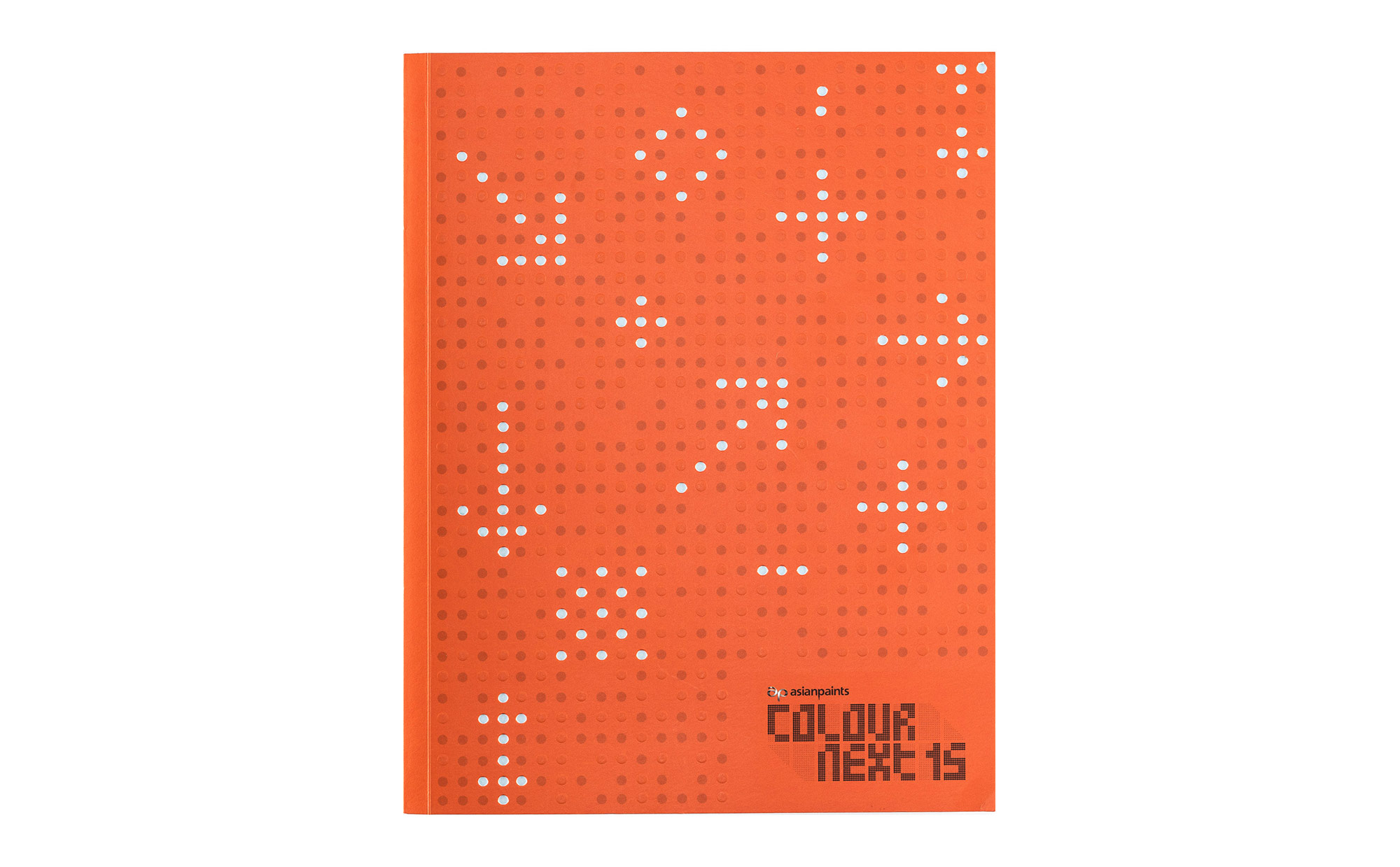
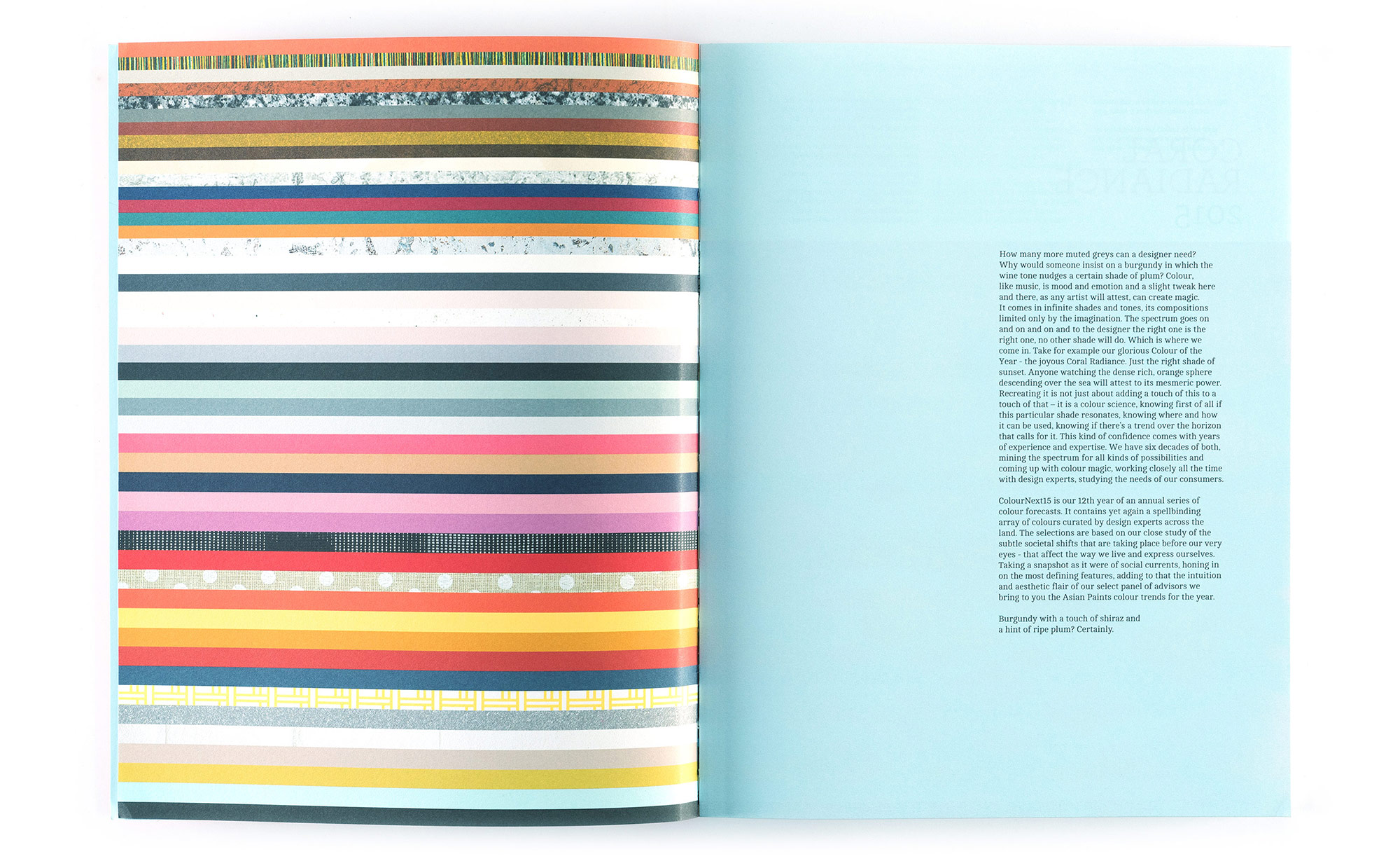
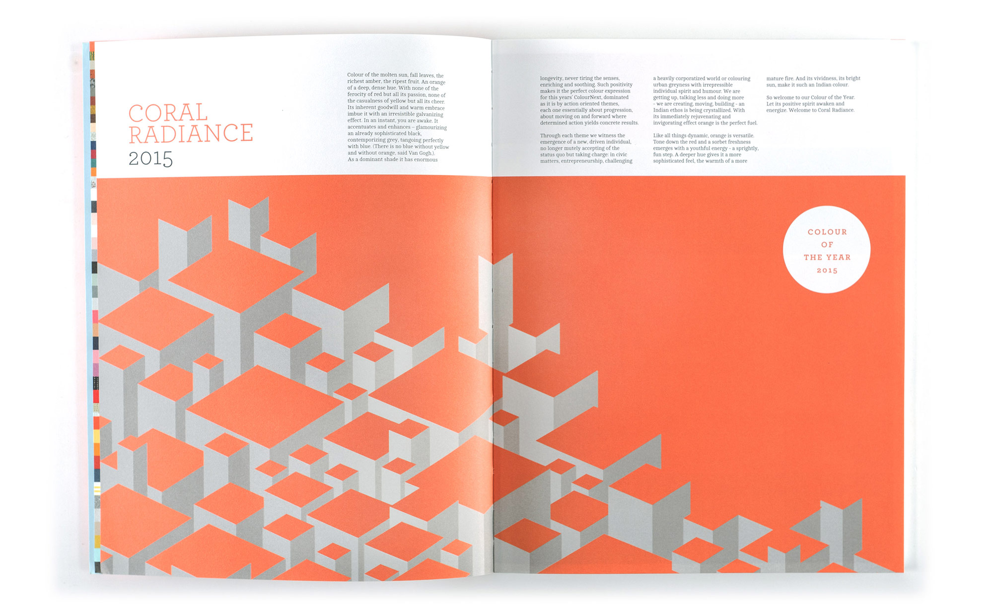
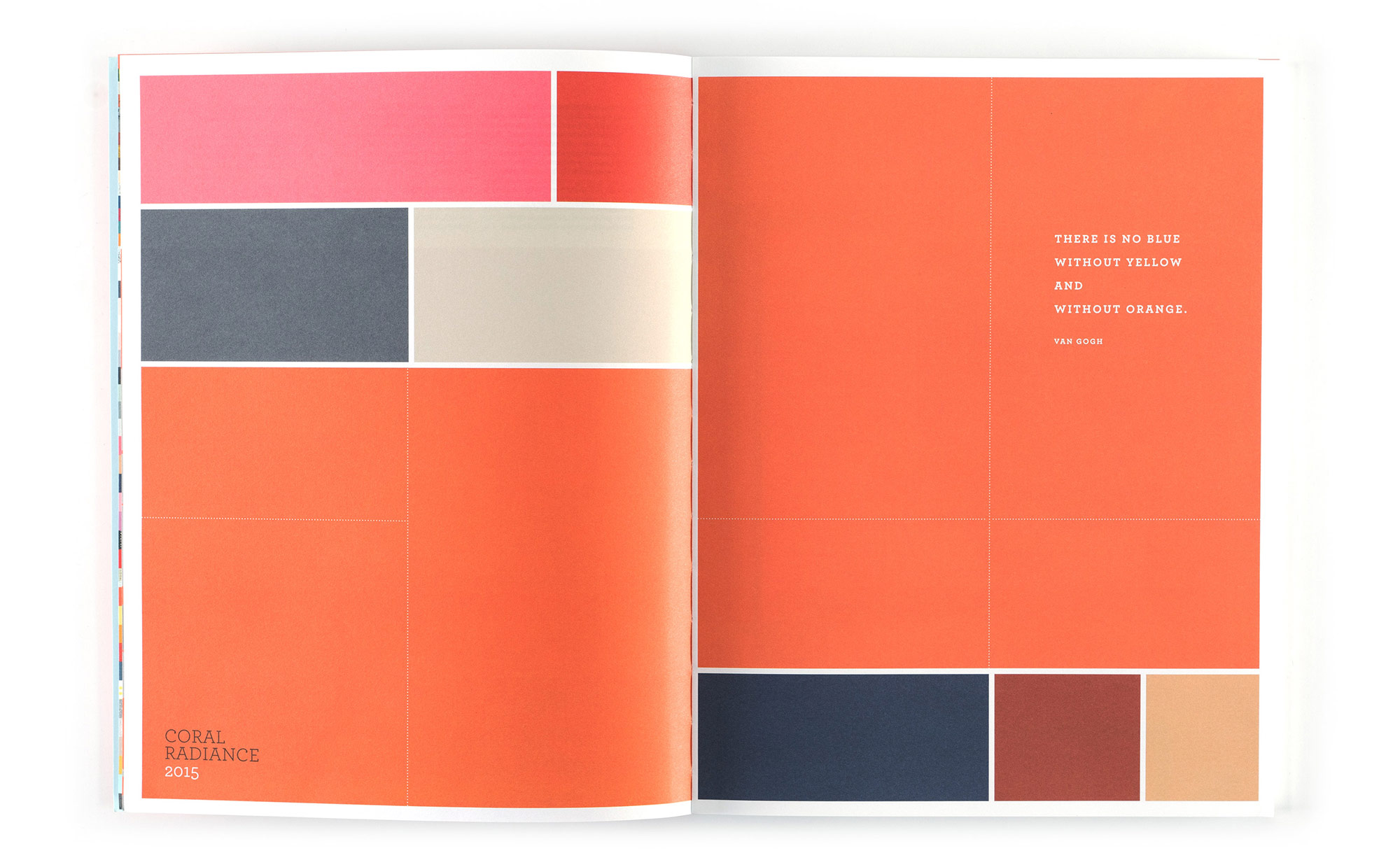
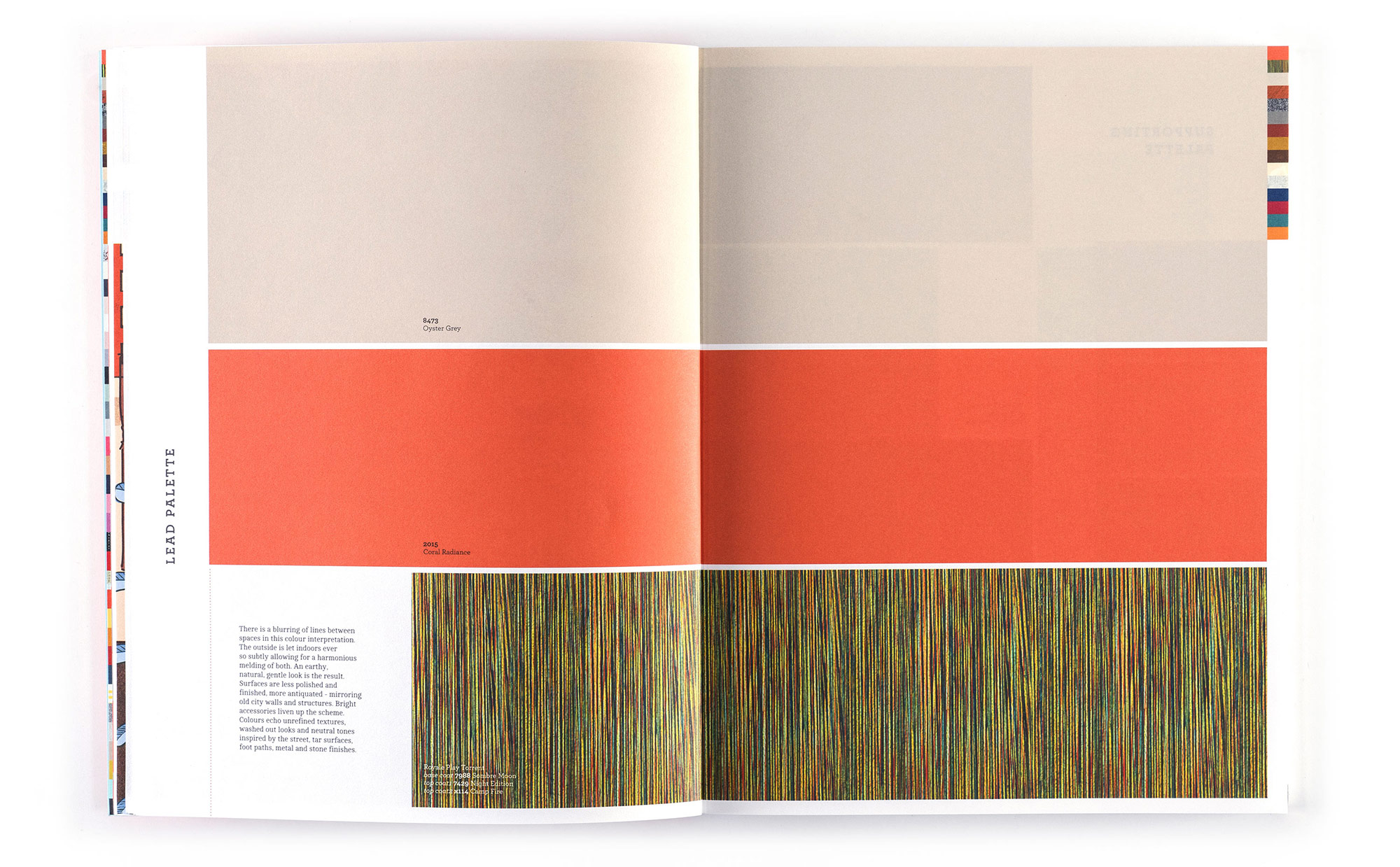
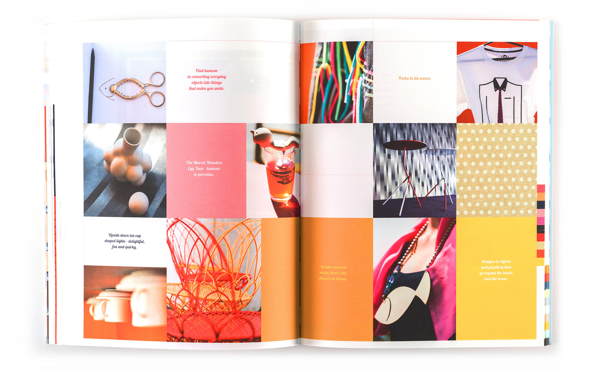
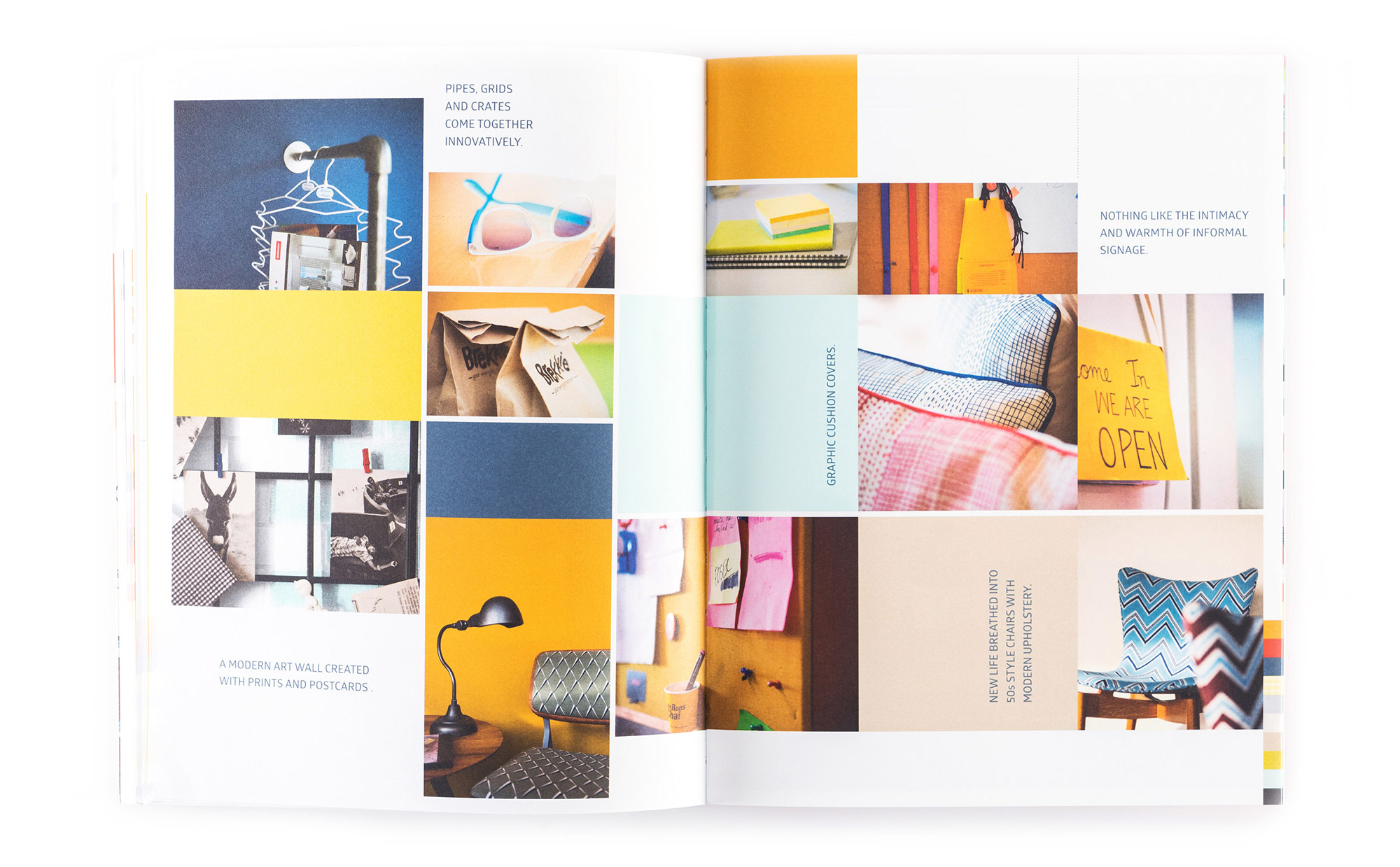
The lookbook-workbook is a concise and handy reference, complete with theme stories, visualisations, moodboards and swatches designed to inspire designers across disciplines and contextualise colour, material, finishes and textures for the year to come.

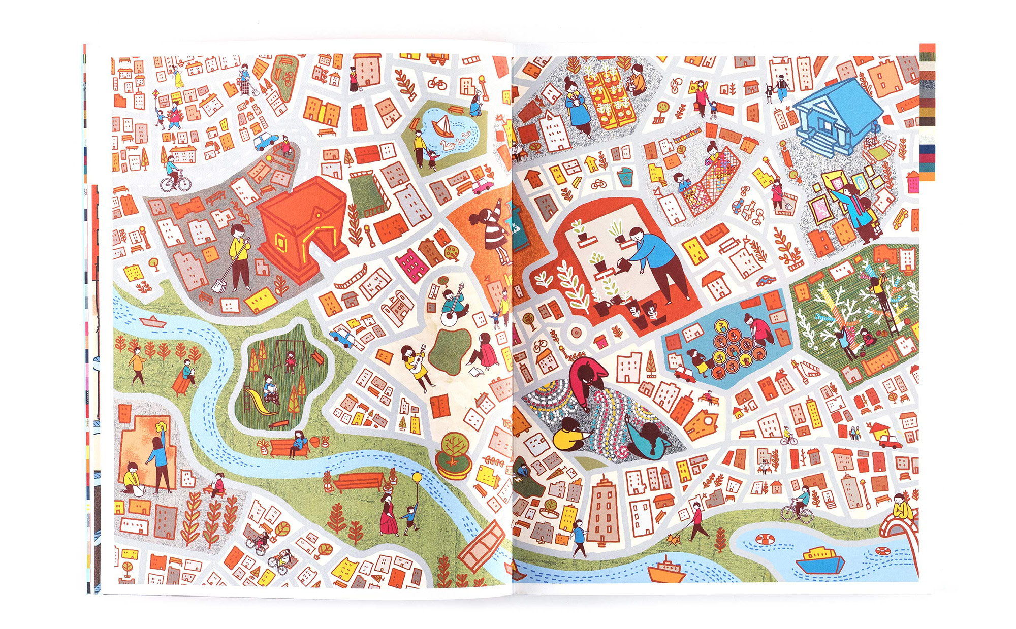


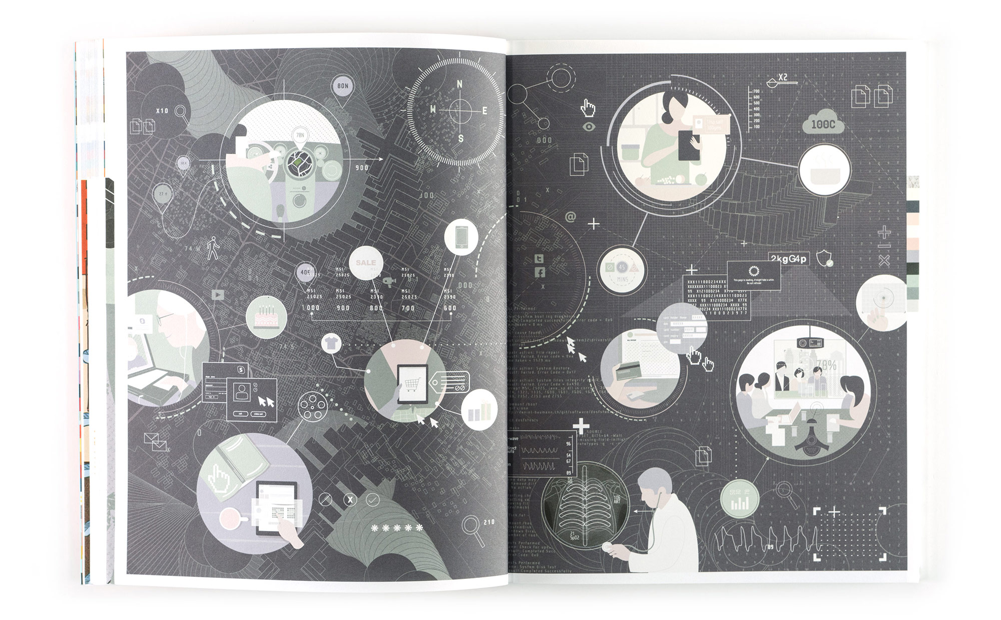

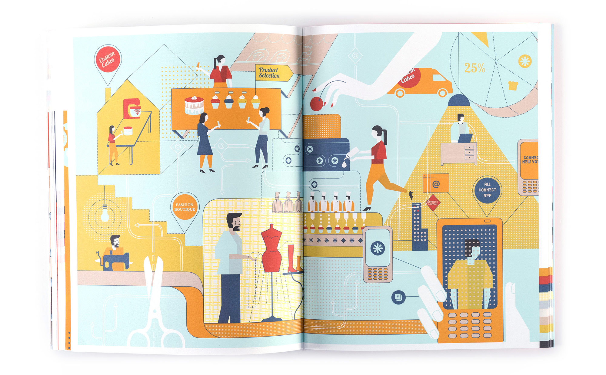
Illustrators : Abhijeet KR, Lavanya Naidu, Wari Watai, Lokesh Karekar