Studio
TRAPEZE
Concept & Creative Direction
RAM SINAM
(Co-Founder, Trapeze / Founder, Wari Watai)
Design
RAM SINAM
APARNA RANJAN
BOOK DESIGN . PRINT DESIGN
Soak Book/Catalogue
Design challenge
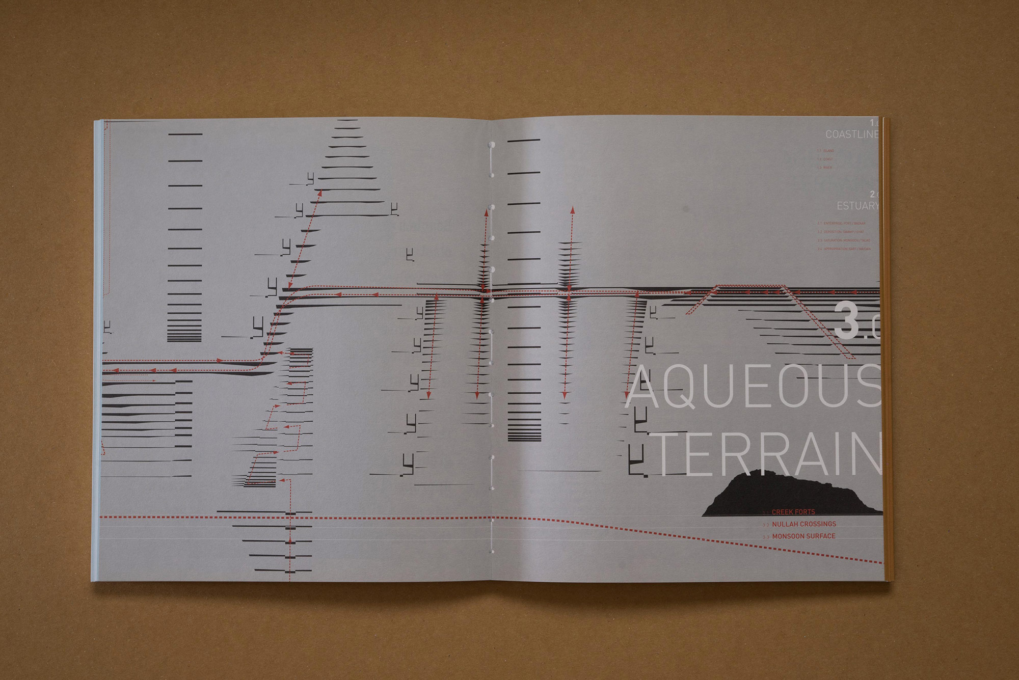
While it was easy to see the beauty of the imagery in the book, it was essential to communicate the concept and insights of the study. One of the fundamental approaches in designing this book was the structuring of text and graphics for an easier read. The book as a physical object echoed the sectional, aqueous terrain perspective of the study.
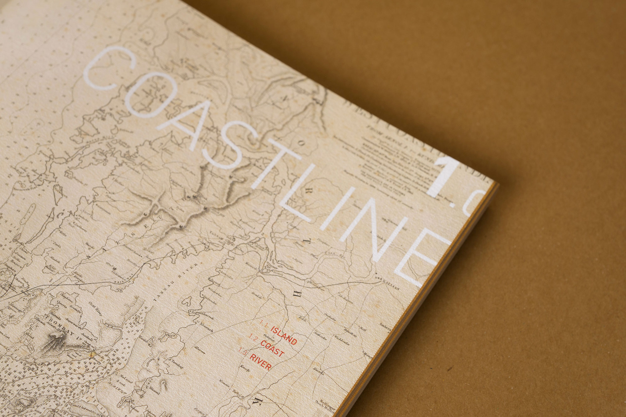
The cover
The design captures the two components of SOAK: land and water. Water is represented in blue in the front cover and land, in brown. The word SOAK is debossed in bold both on the front cover and the back to imply impression on wet soil.
Soak Book/Catalogue
Design challenge
While it was easy to see the beauty of the imagery in the book, it was essential to communicate the concept and insights of the study. One of the fundamental approaches in designing this book was the structuring of text and graphics for an easier read. The book as a physical object echoed the sectional, aqueous terrain perspective of the study.
The cover
The design captures the two components of SOAK: land and water. Water is represented in blue in the front cover and land, in brown. The word SOAK is debossed in bold both on the front cover and the back to imply impression on wet soil.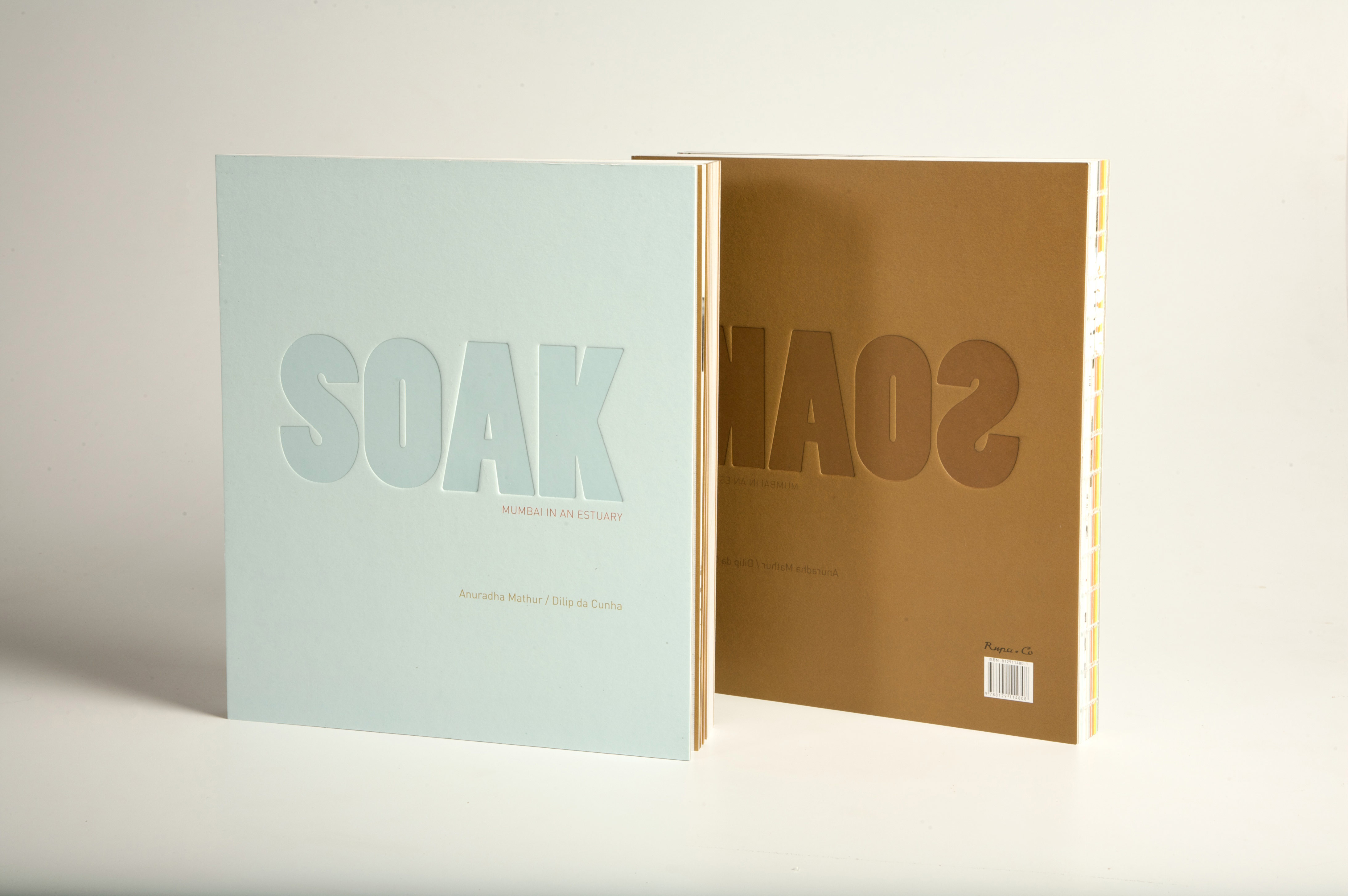
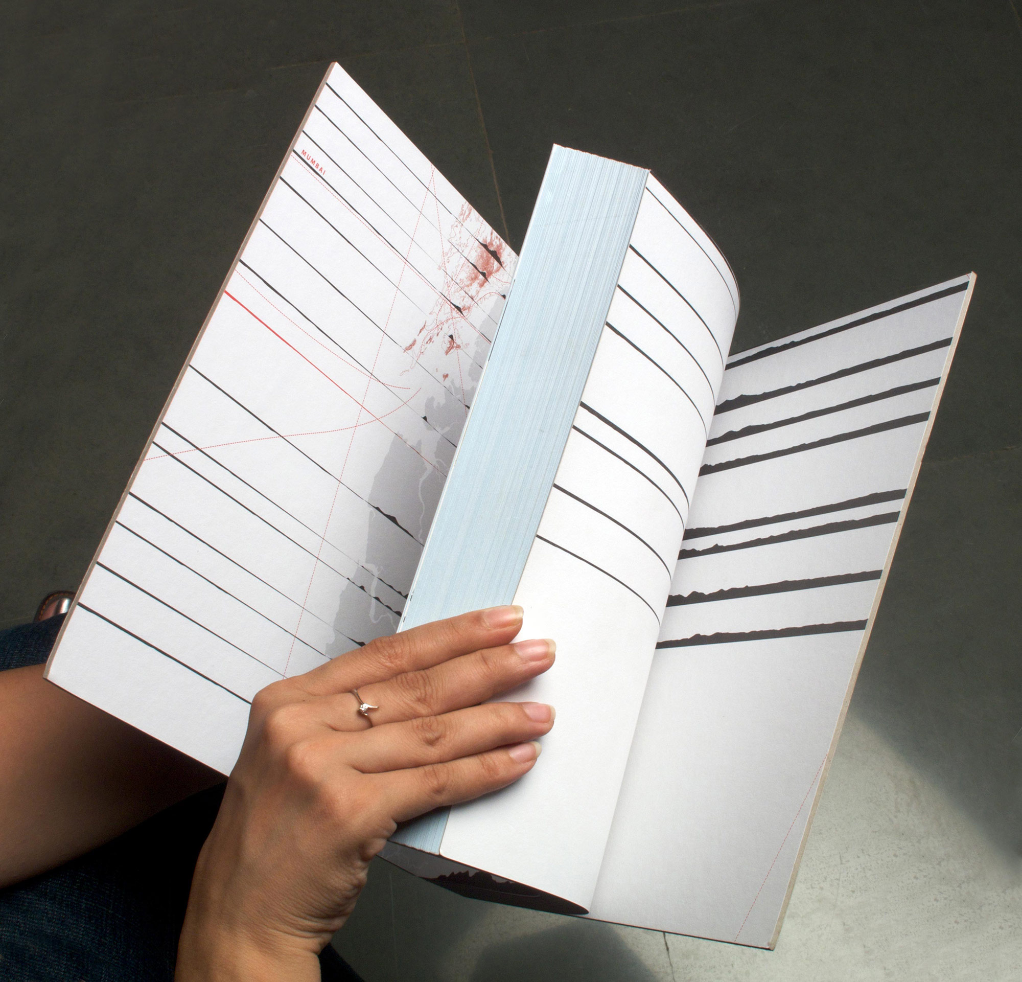
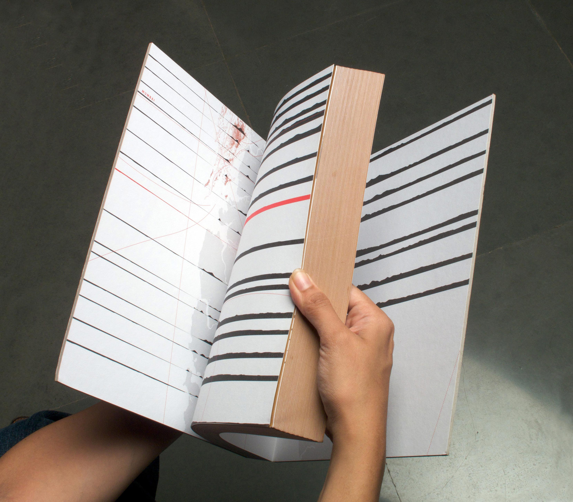
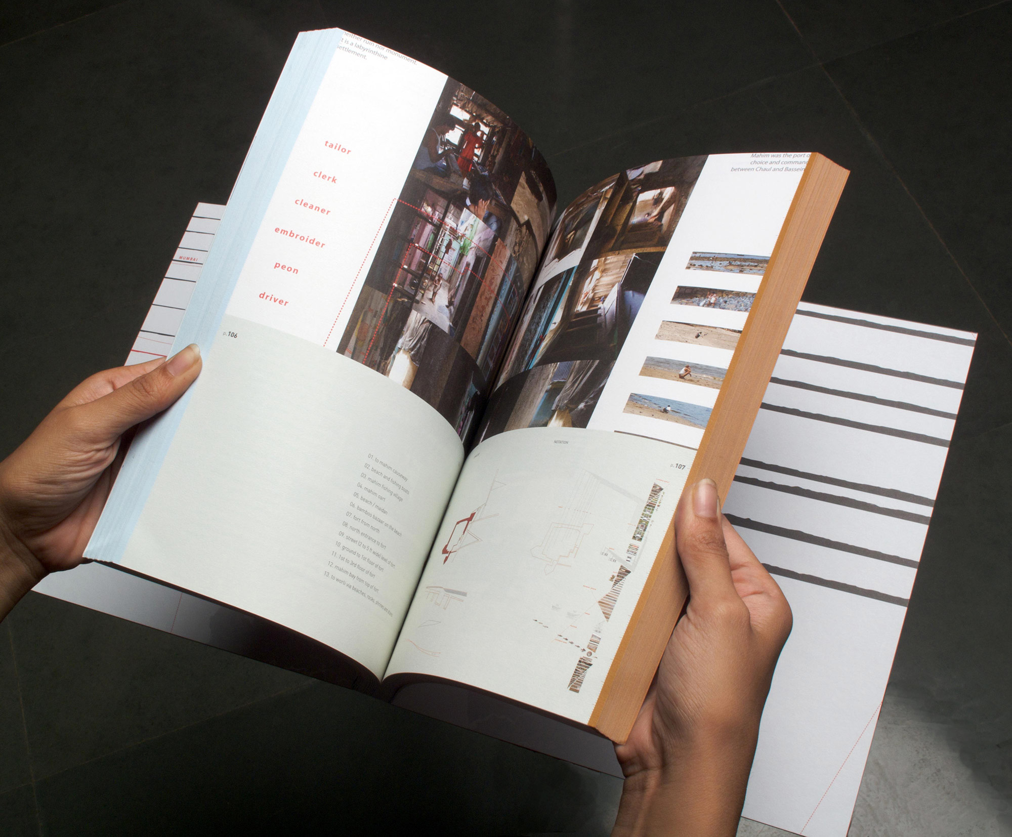
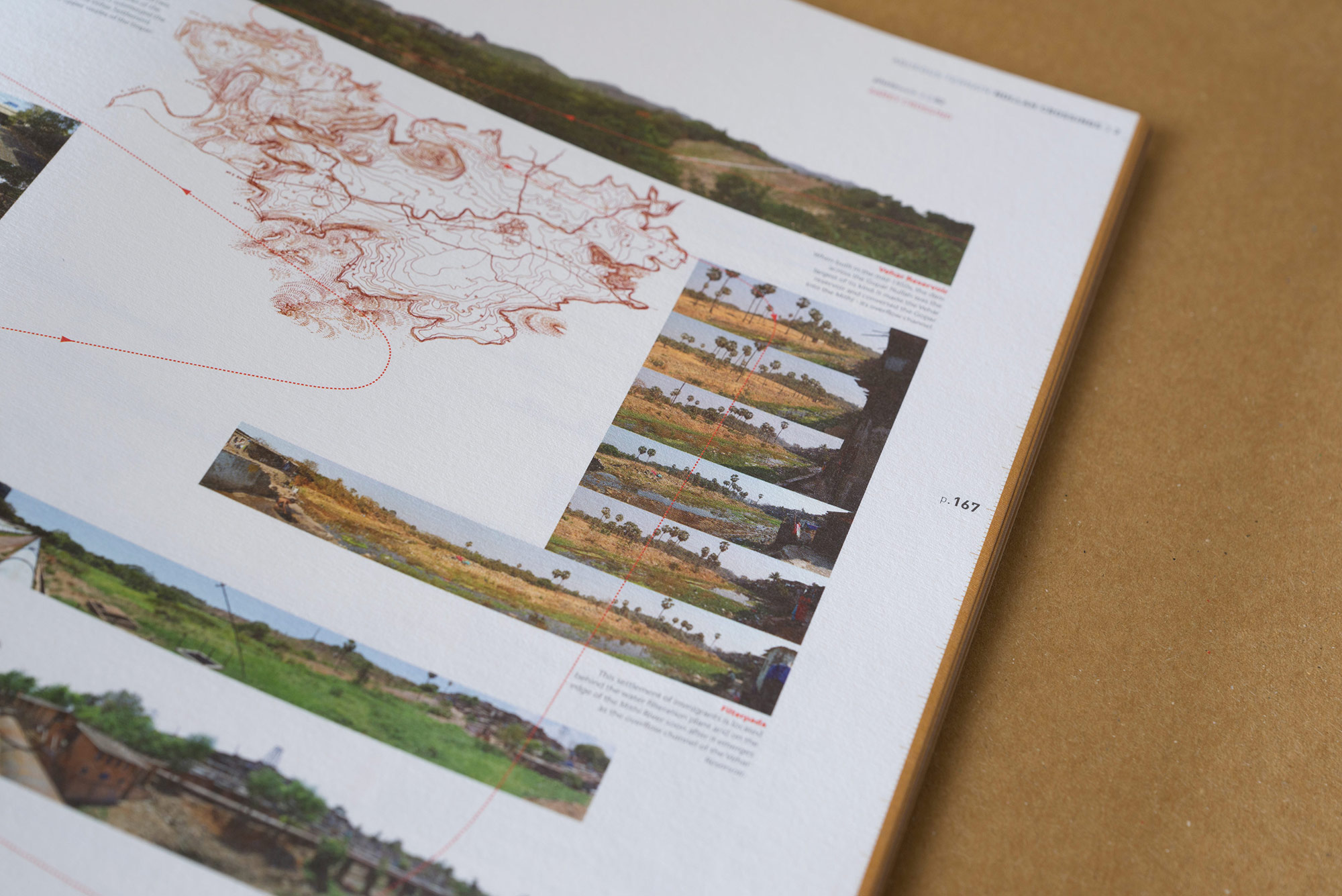
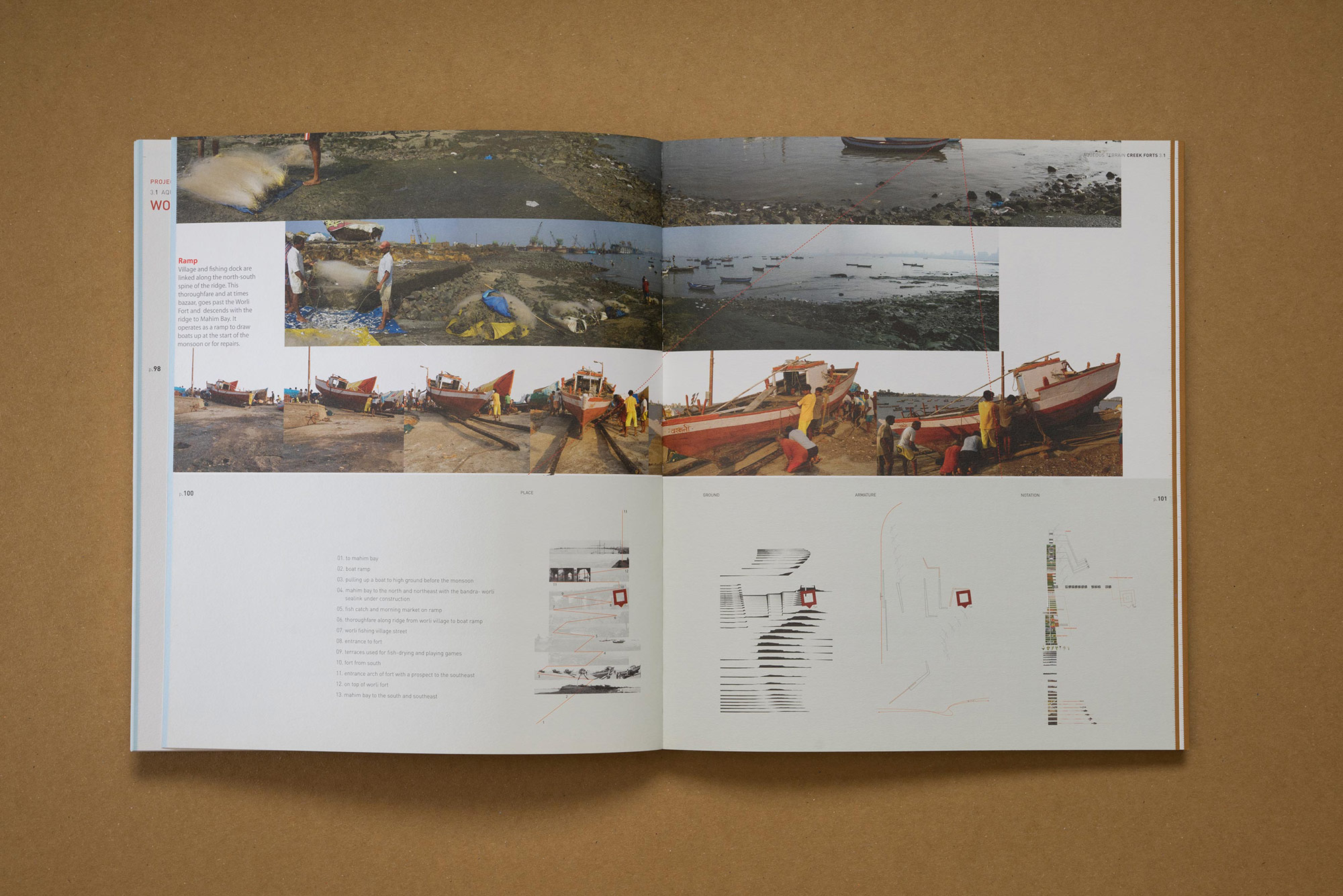
The inner pages
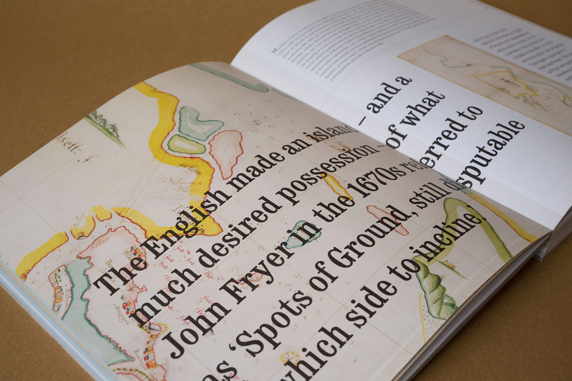
Our aim was for the book to be read by as many people as possible — both the serious and the casual reader. And so, we created a book that reads like an exhibition — the bottom half captures the key concepts of the book in big, bold text with accompanying illustrations, much like panels — a devise to hold the casual reader’s attention. The top half has the core content in its entirety for the serious reader. The idea was that even if one reads only the bottom half , it is enough for a well-rounded understanding of the book.
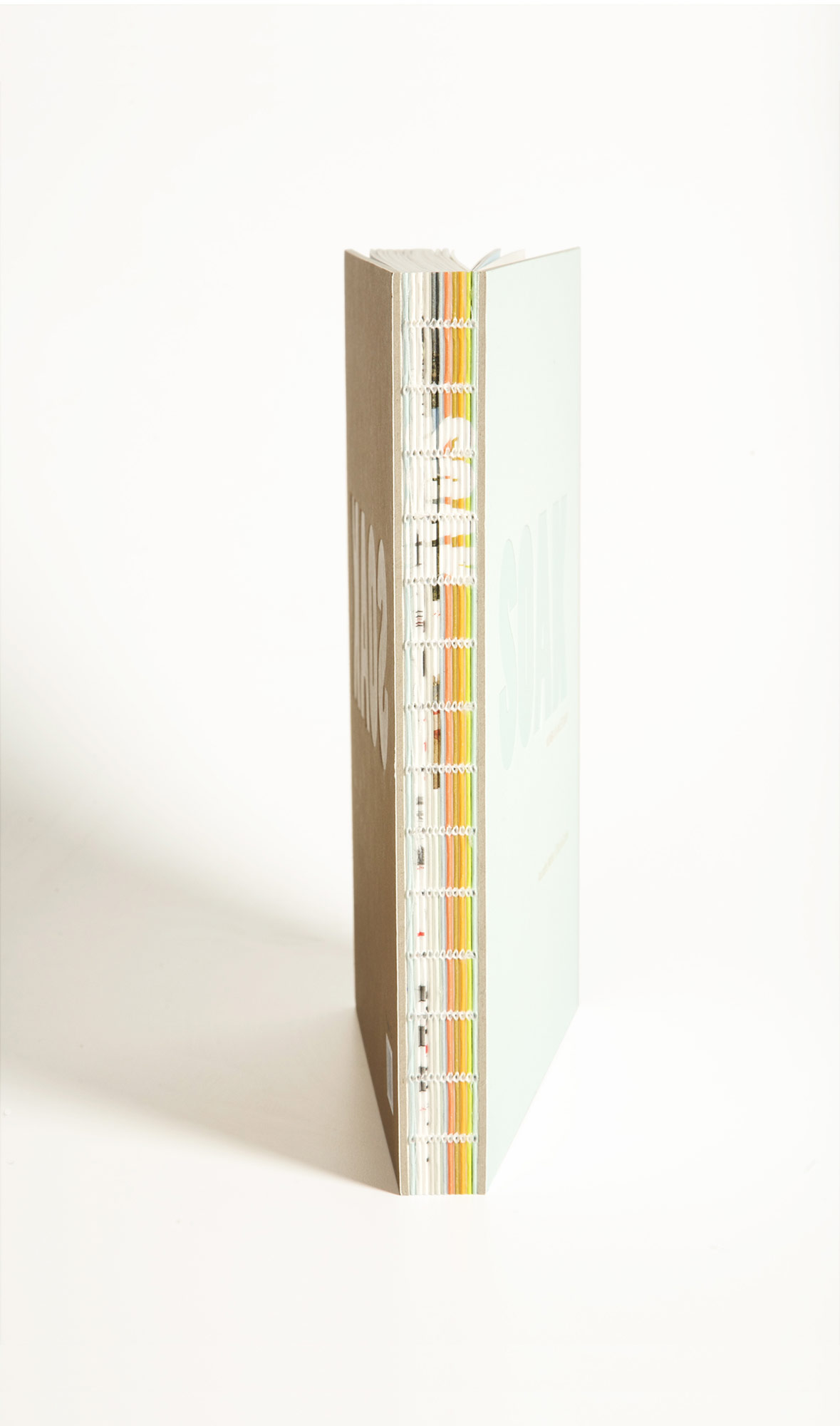
The spine
The spine is exposed to reveal the sectional gathers of the book to reflect the authors’ theoretical premise of ’sectional view’ versus a plan view. Each small sliver of the spine is printed individually to have a collective visual impact when strung together as a composite spine to form the book.The edge
We printed the edge of the book in a way that it turns blue or brown depending on which direction you bend the pages.