How do you make a remarkable study of Mumbai’s terrain and its uneasy relationship with water, accessible to those who are affected by it and those who can mitigate it?
Clients & Authors/Artists
ANURADHA MATHUR
DILIP DACUNHA
Design Studio
TRAPEZE
Concept & Creative Direction
RAM SINAM
(Co-Founder, Trapeze / Founder, Wari Watai)
Project Assistant
APARNA RANJAN
Designers
TRAPEZE TEAM
Industrial Design Detailing
TWIST OPEN
Production
DOVETAIL
ANURADHA MATHUR
DILIP DACUNHA
Design Studio
TRAPEZE
Concept & Creative Direction
RAM SINAM
(Co-Founder, Trapeze / Founder, Wari Watai)
Project Assistant
APARNA RANJAN
Designers
TRAPEZE TEAM
Industrial Design Detailing
TWIST OPEN
Production
DOVETAIL
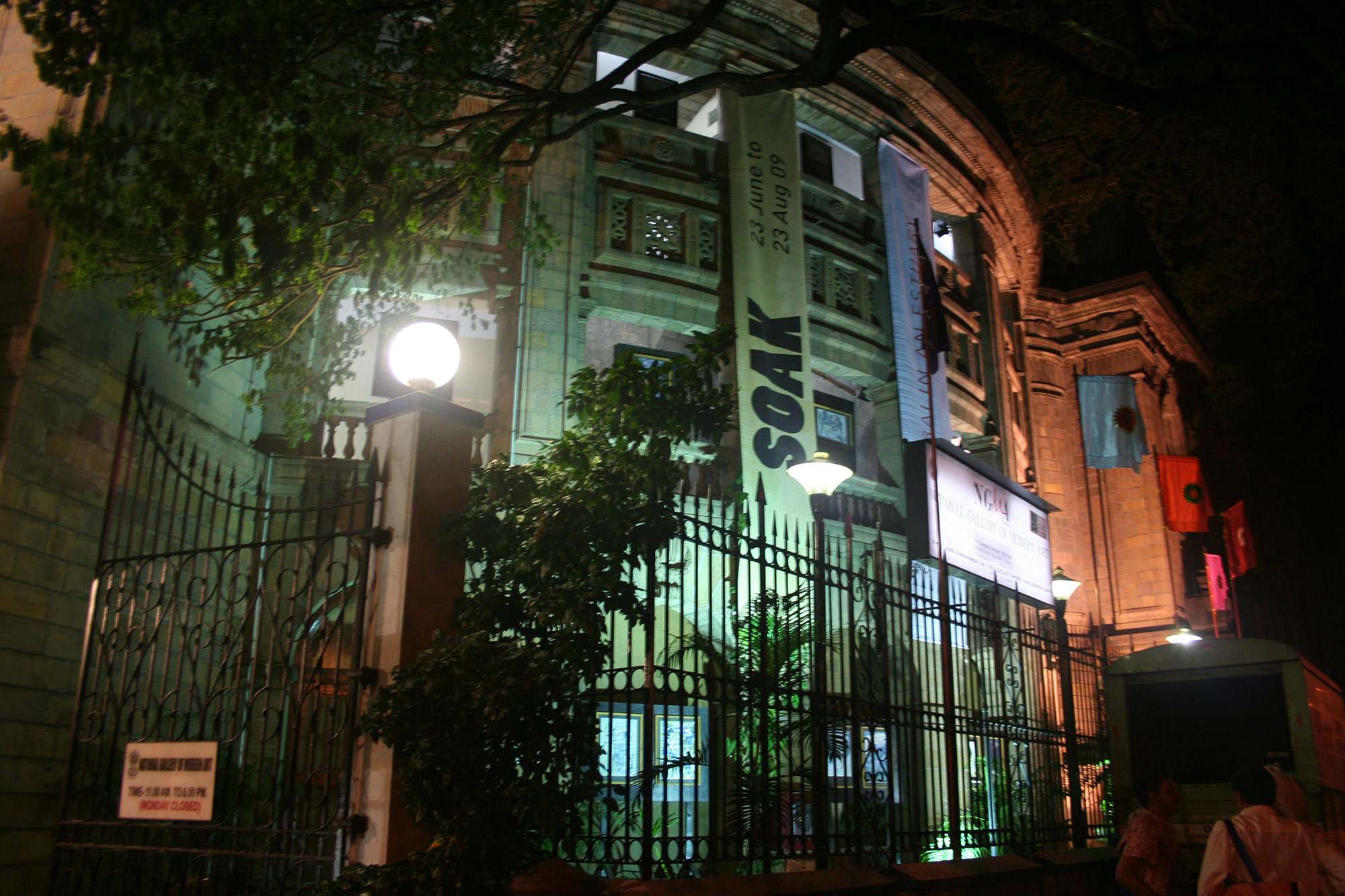
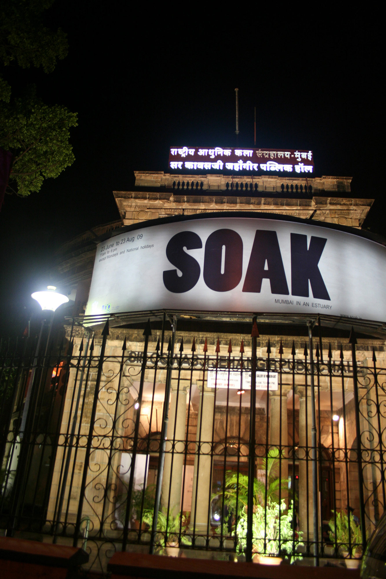
We worked closely with the authors, Anuradha Mathur and Dilip Da Cunha, to understand their findings in order to devise a communication strategy and a design language for their exhibition and the accompanying book, ‘SOAK’ at the National Gallery of Modern Art (NGMA), Mumbai.


SECTION 1
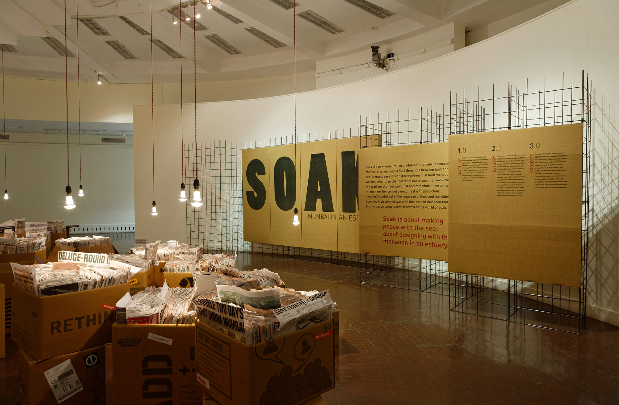
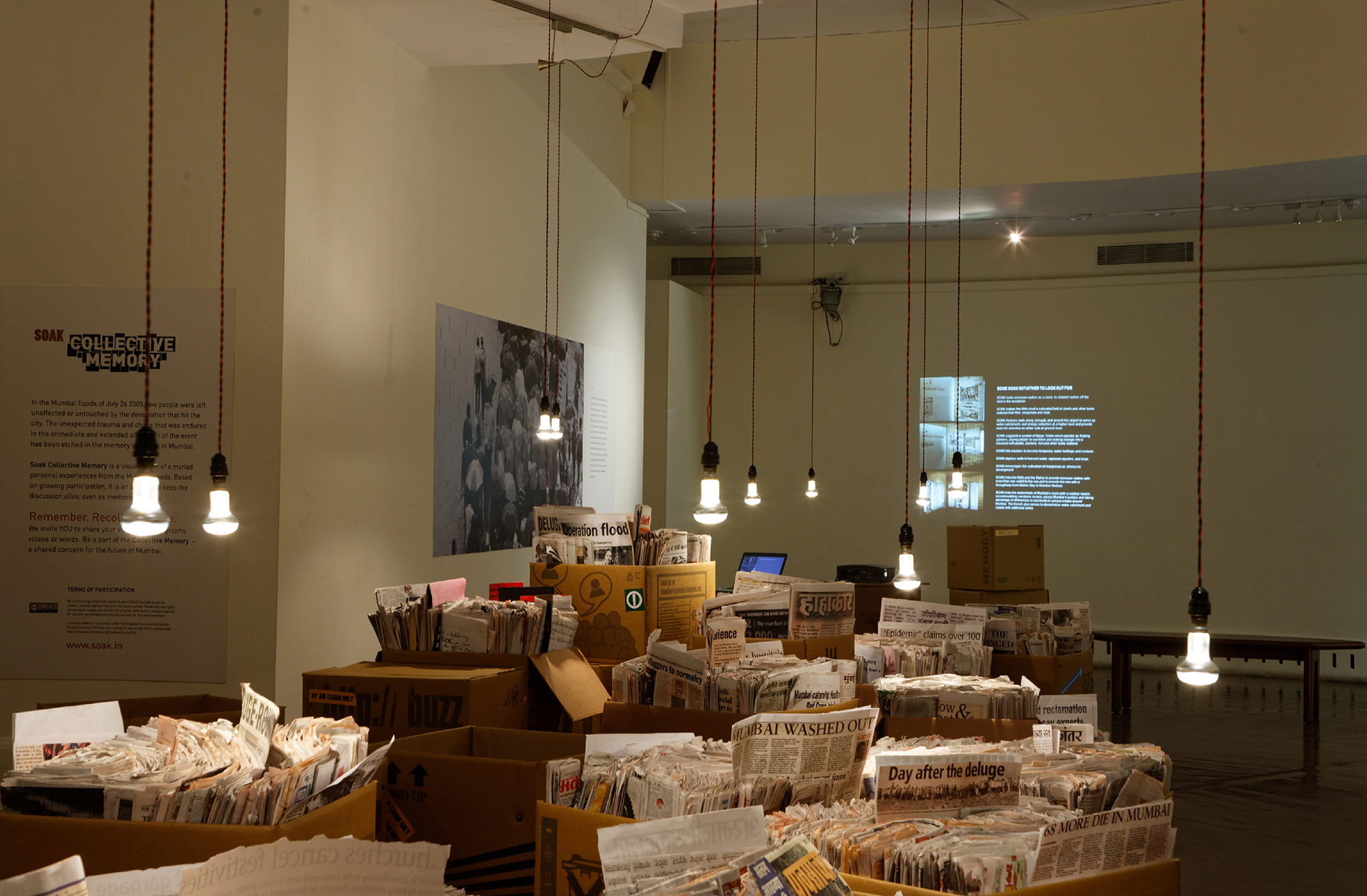
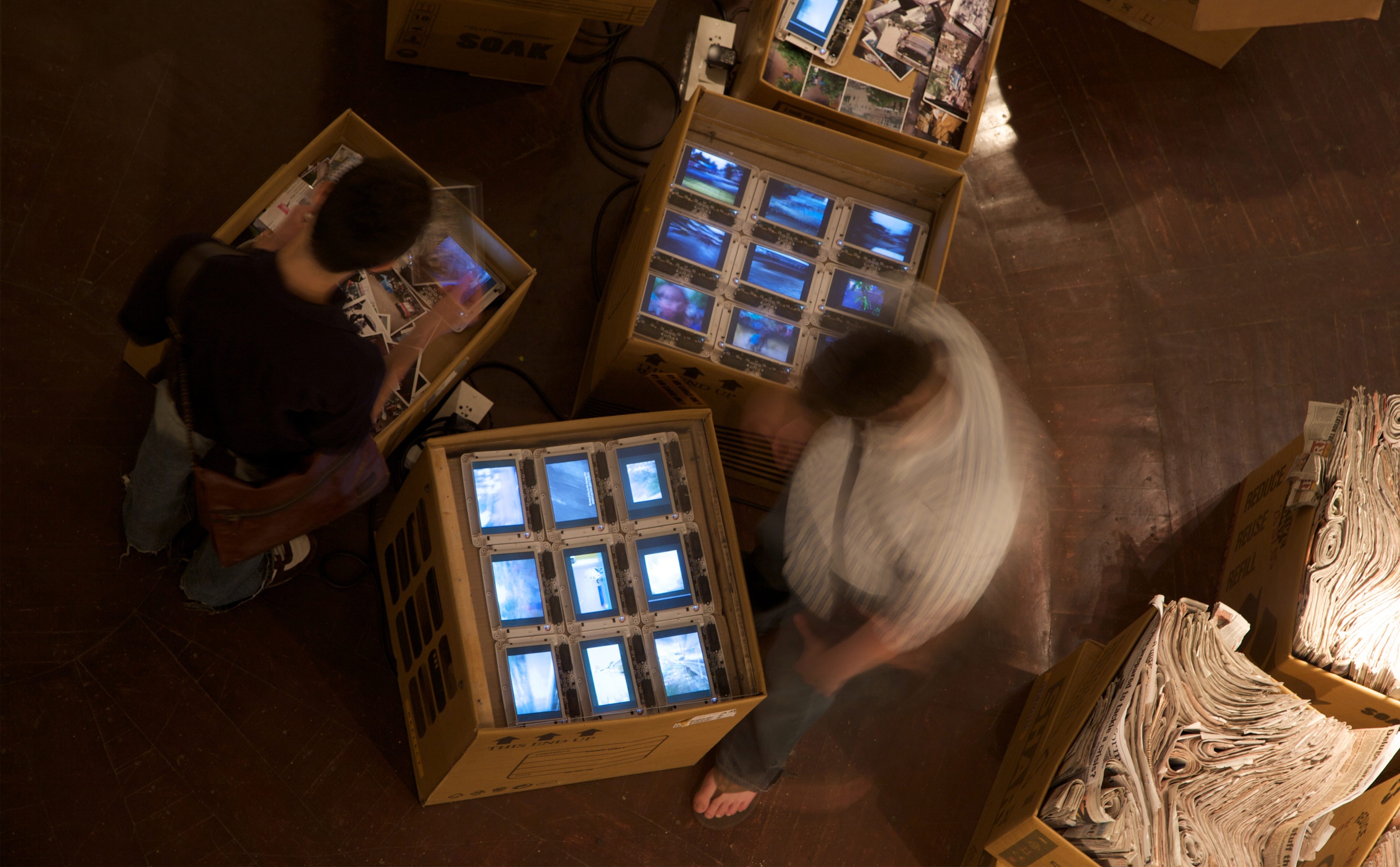
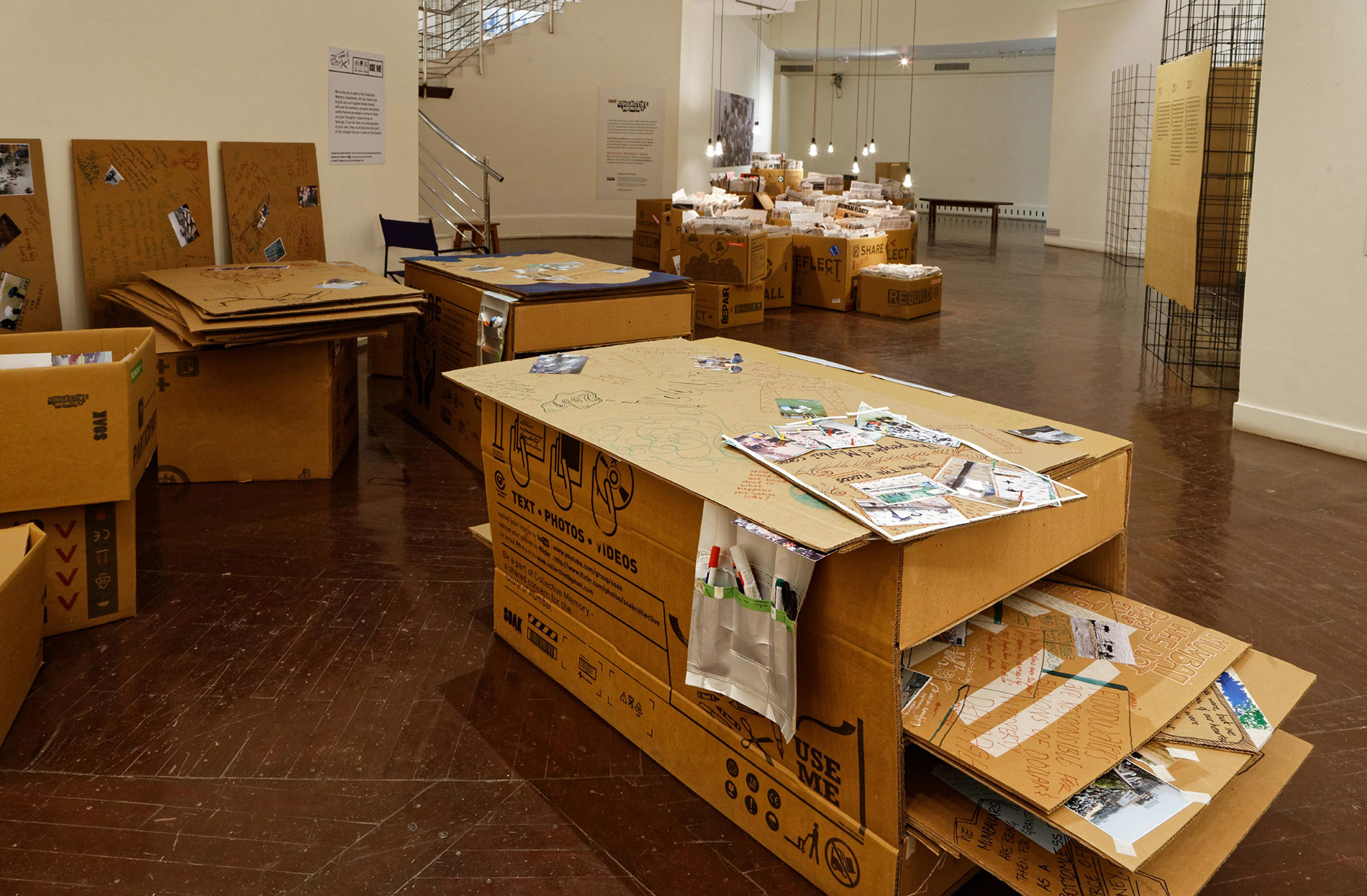
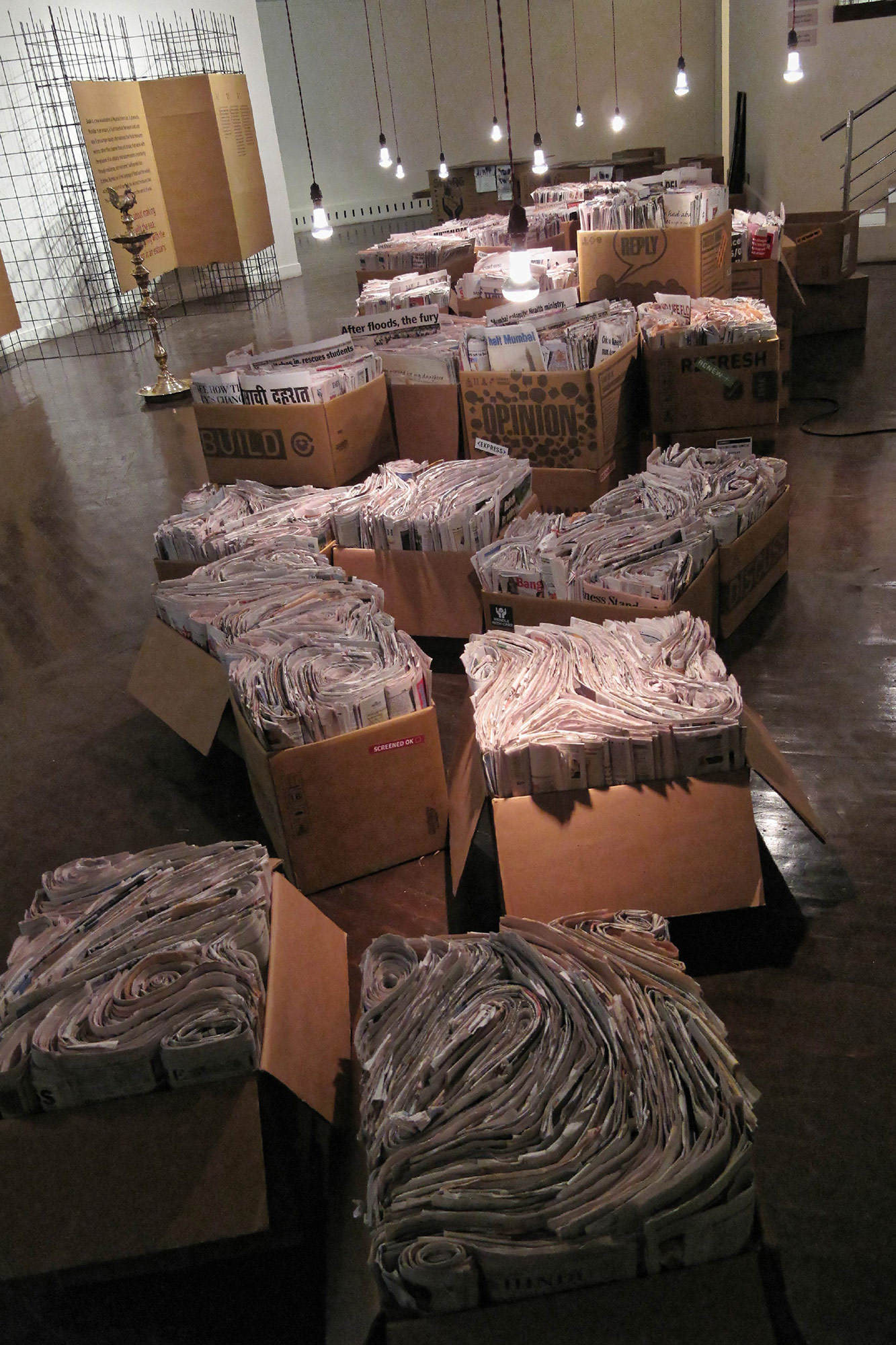
The Collective Memory
The exhibition opens with the devastating floods of 25th July, 2005 to provide a compelling context. The Collective Memory installation is conceptualised as a prelude to the main sections. A flow of swirling water made with newspaper reportage along with the videos and writings of the deluge of 25th July. It is an abstracted and poignant perspective of what Mumbai’s terrain has become. Today the rains are feared instead of being welcomed by its citizens as it once use to.
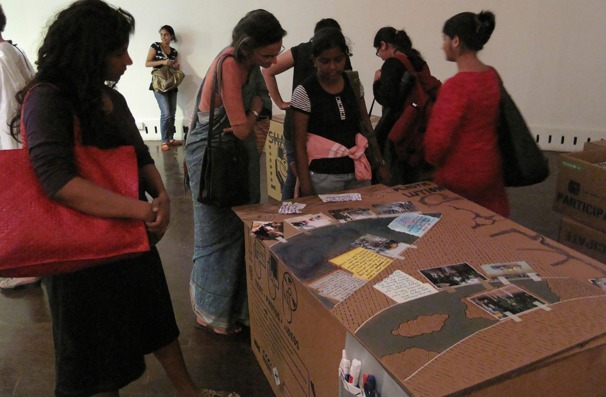
Strategic design to encourage participation
The success of the exhibition depended on the people of Mumbai becoming stakeholders in the idea of SOAK. We asked the citizens of Mumbai to send photographs, videos and writing about their experience of the devatating 25th July flood. A website
(www.soak.in) introducing SOAK that outlined the intent of the exercise and also how to participate. This then became a collective event and an interesting prelude to the main exhibition.

SECTION 2
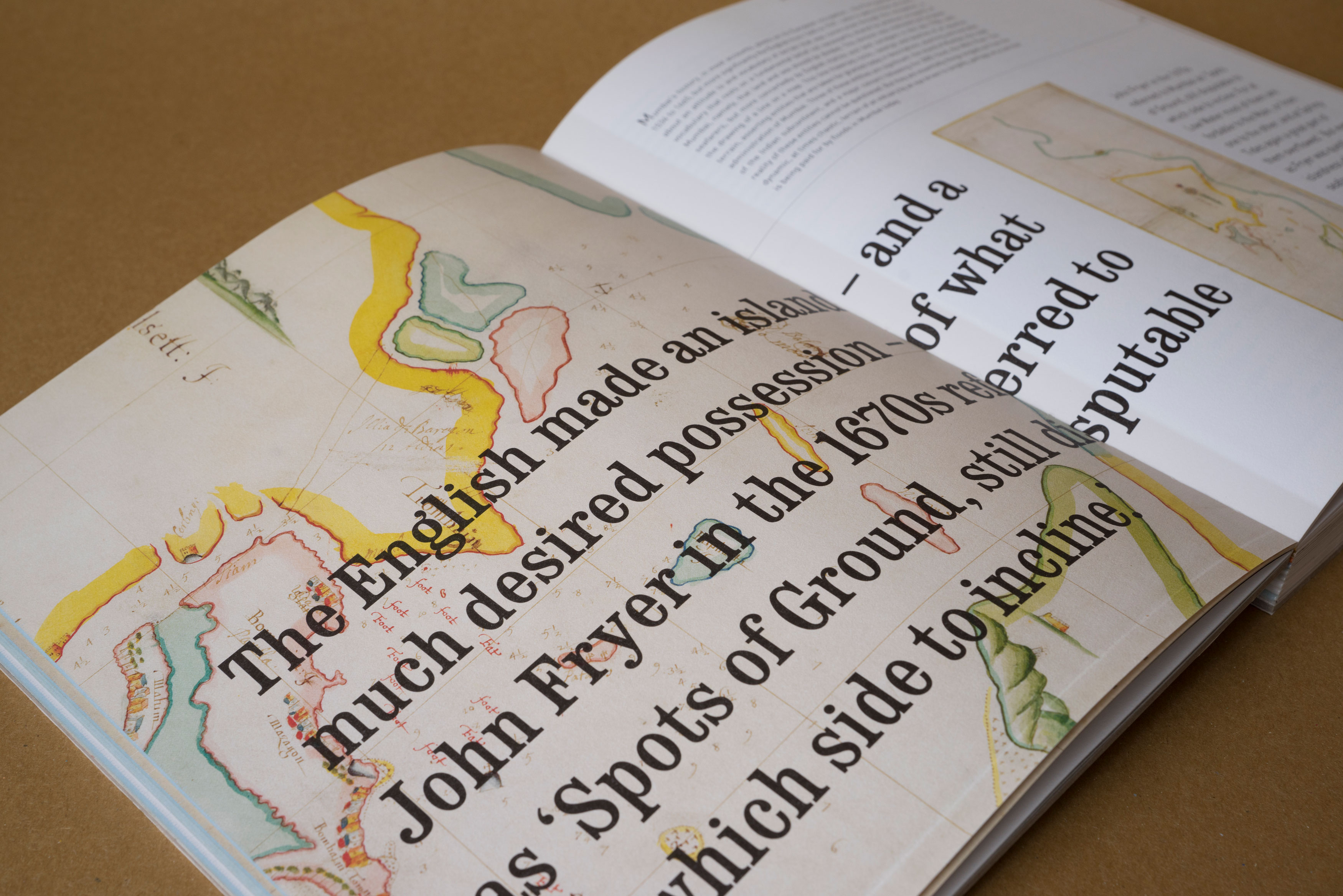
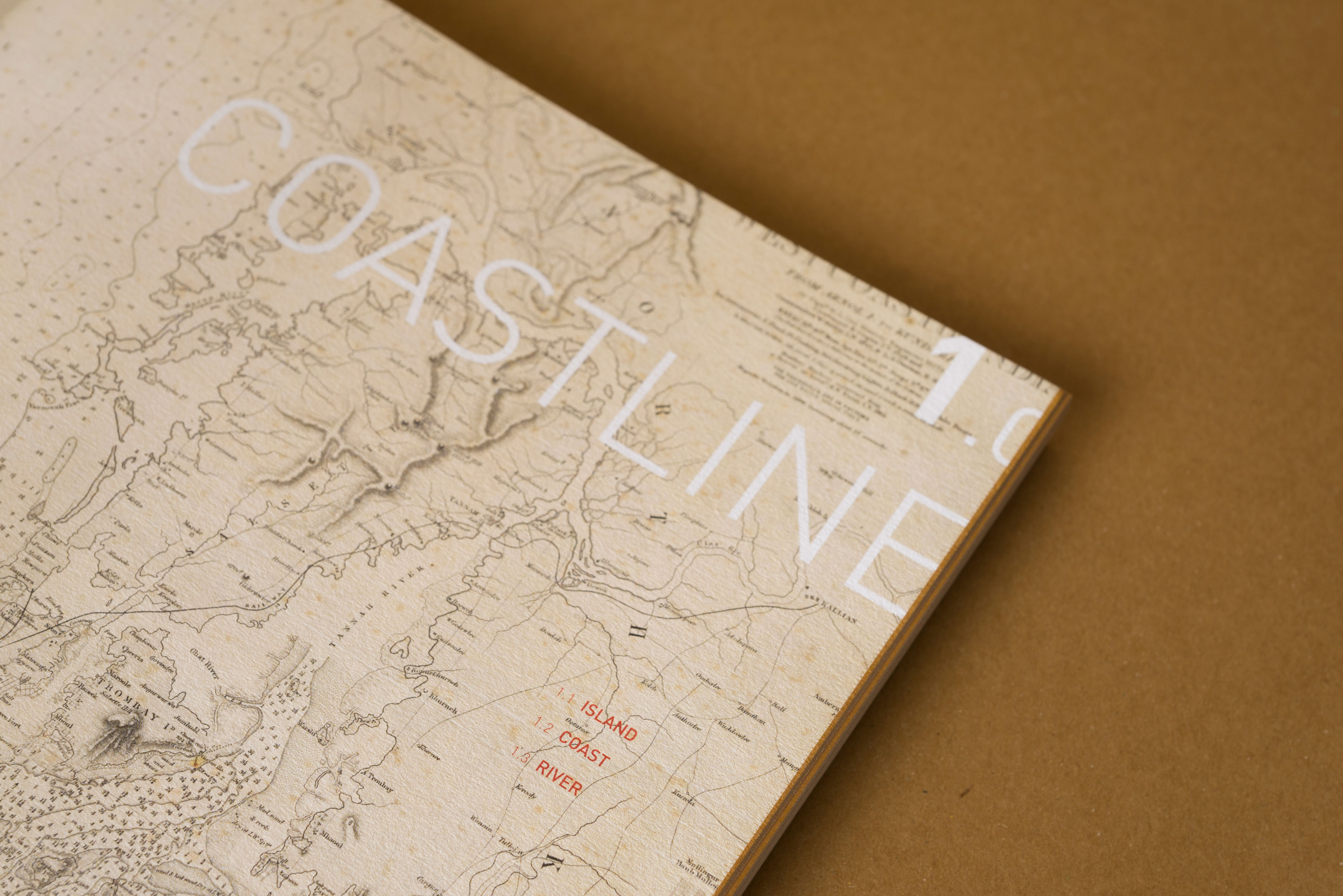
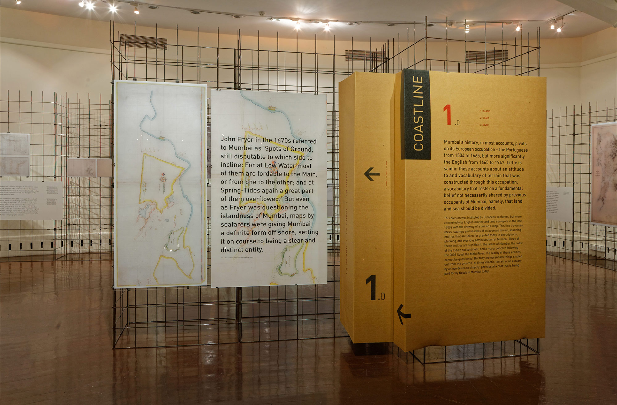
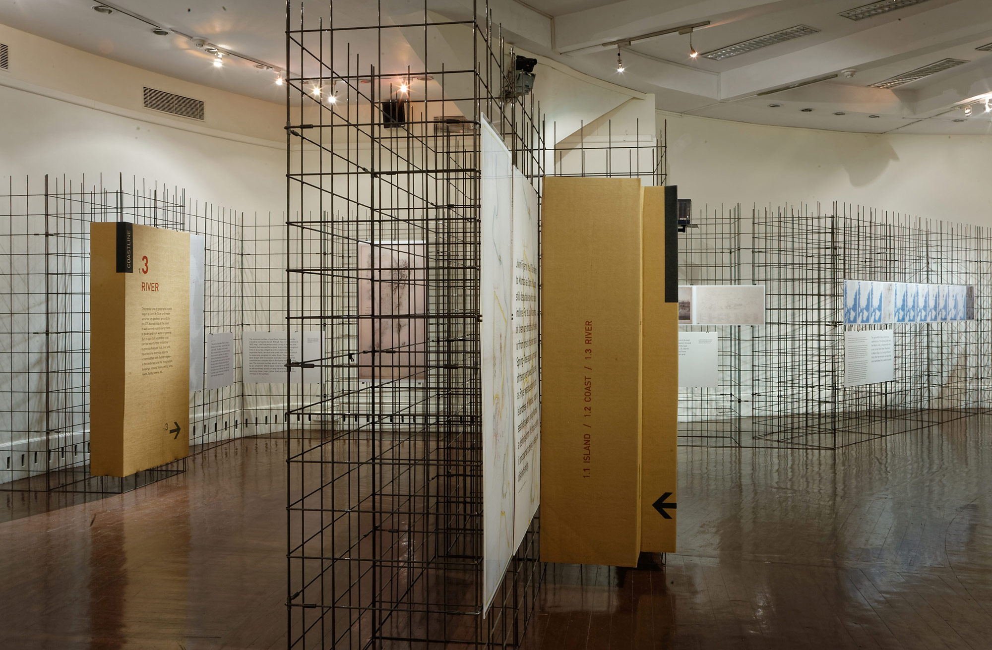
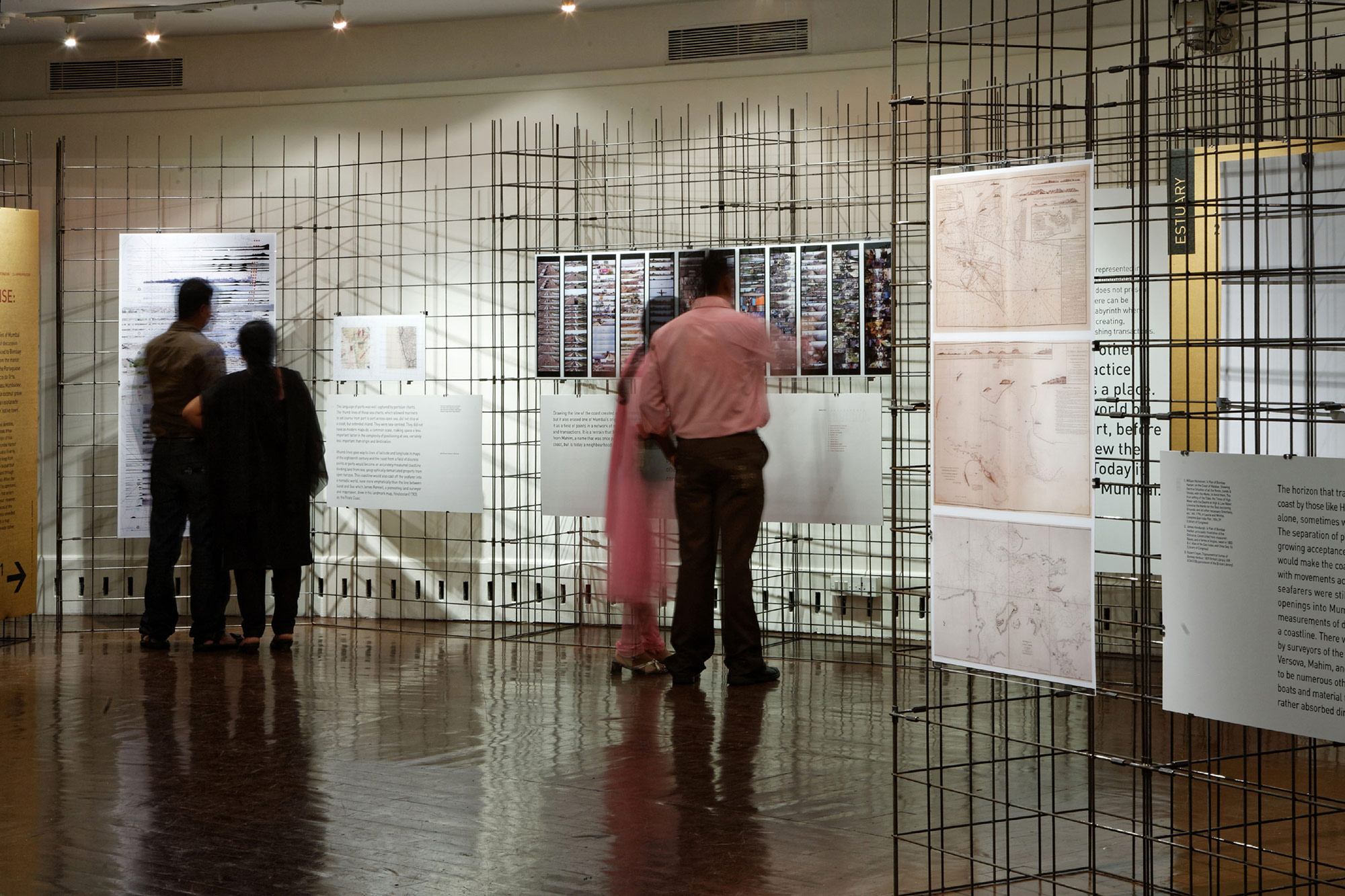
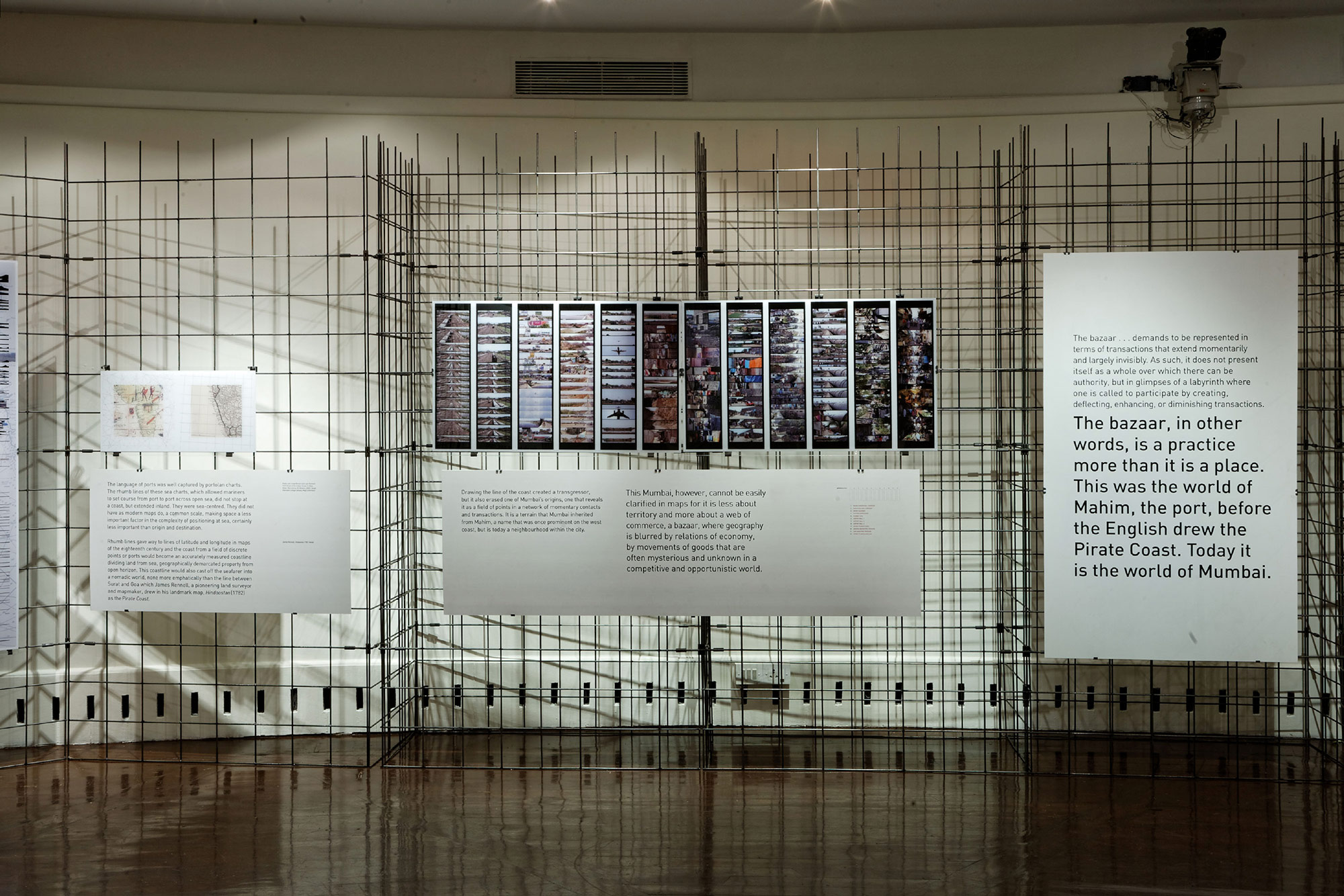
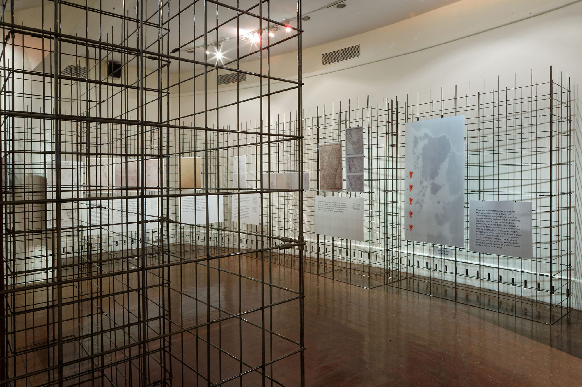
Coastline
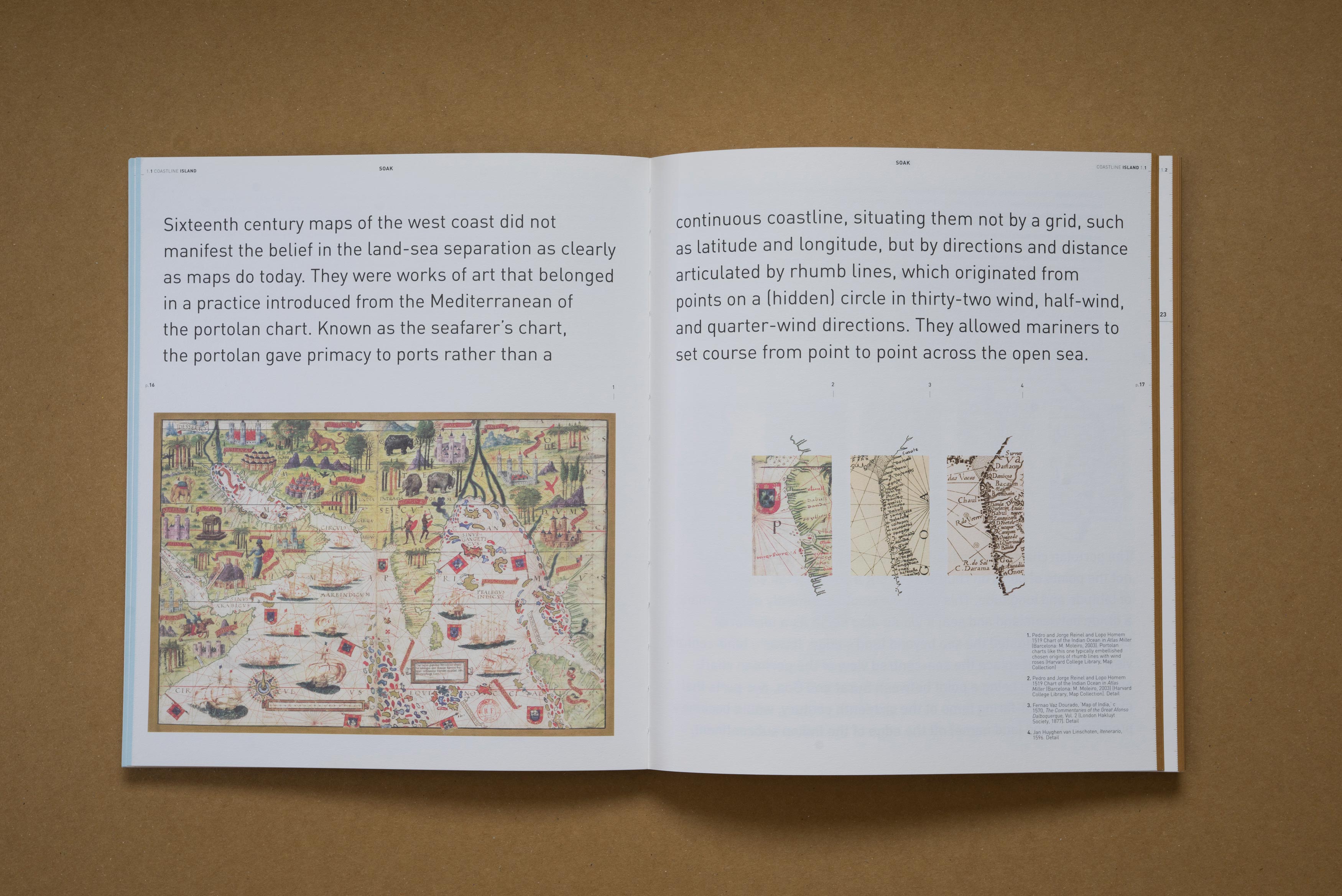
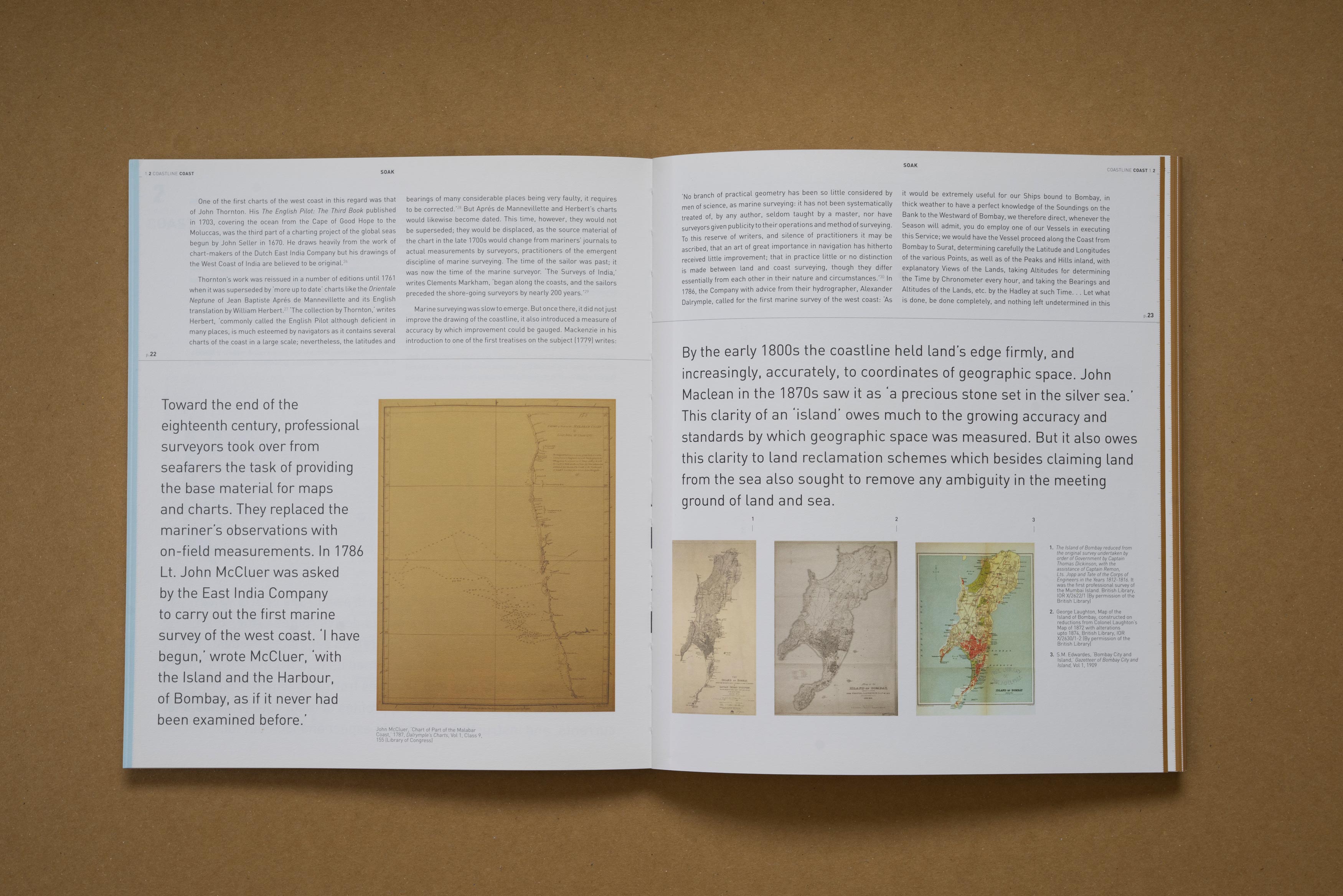
This section looks at the build up to war against the monsoon, rooted in a belief that land can be separated from the sea. It traces the drawing of the coastline; its tentative if artful beginnings in early European maps and its pursuit in the “fair weather season” by English marine and land surveyors in the 18th and 19th centuries.
Designing with form and materials to embed contextual meaning
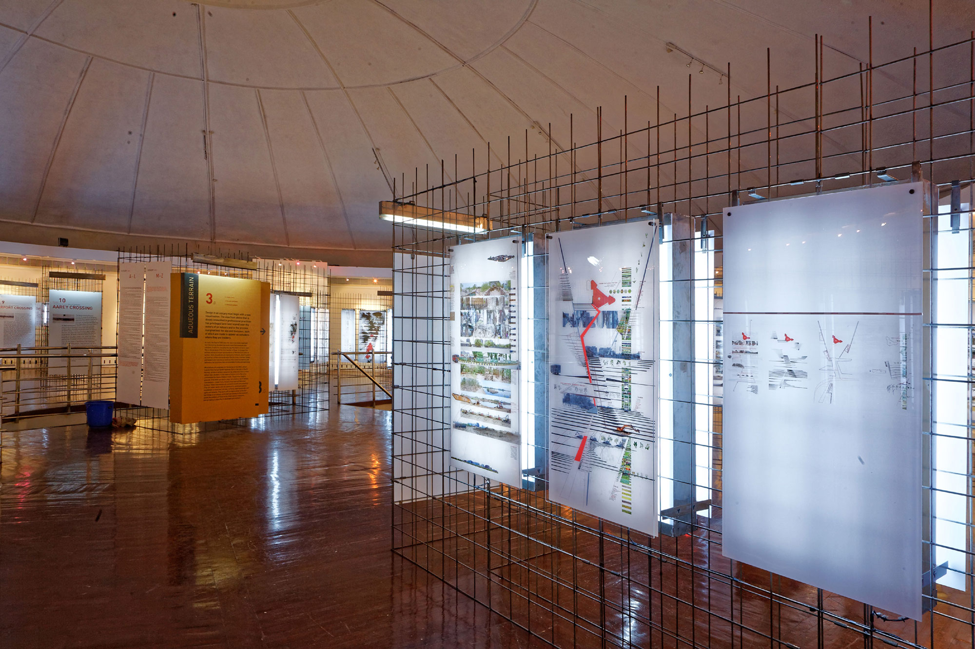
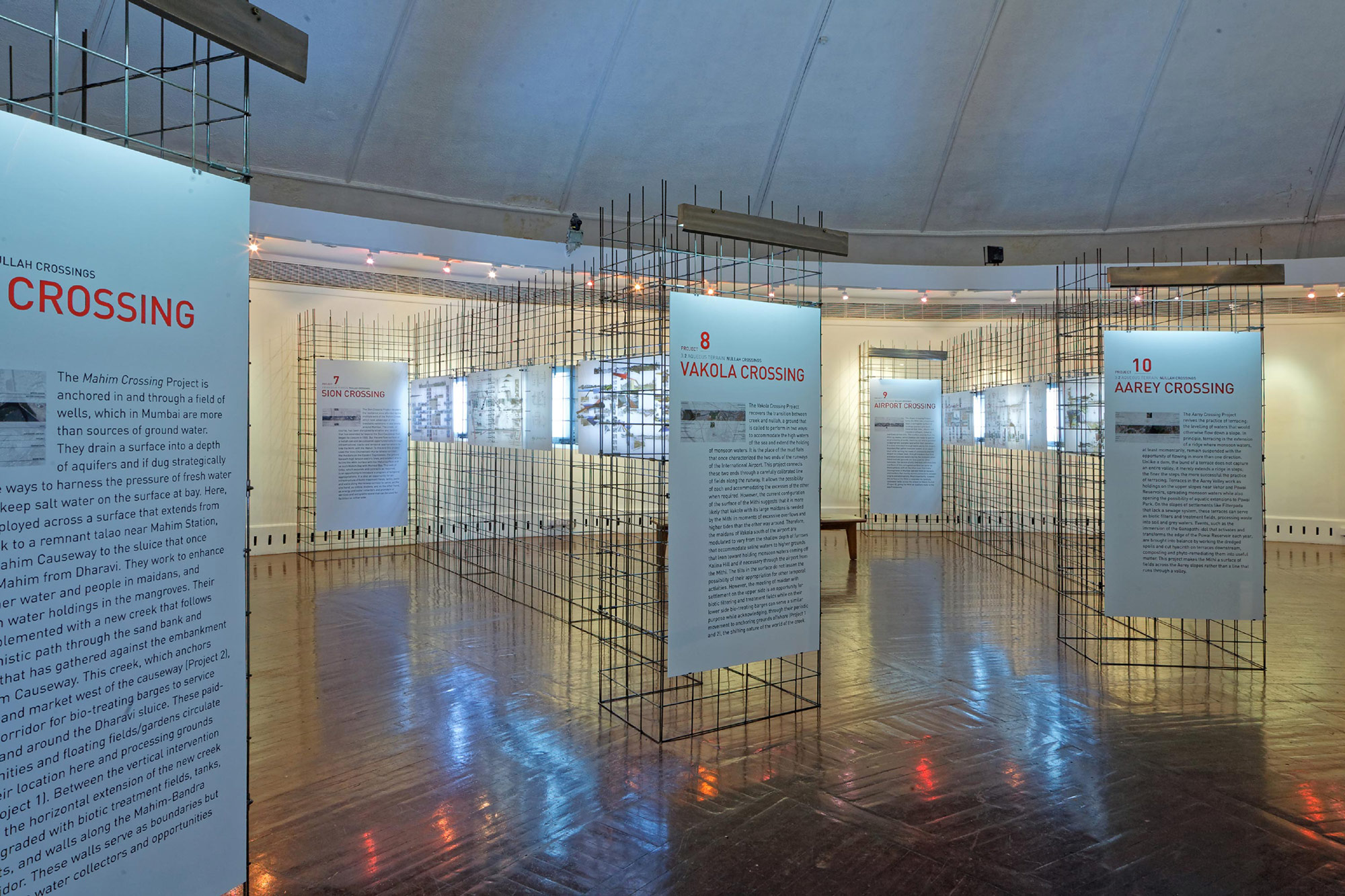
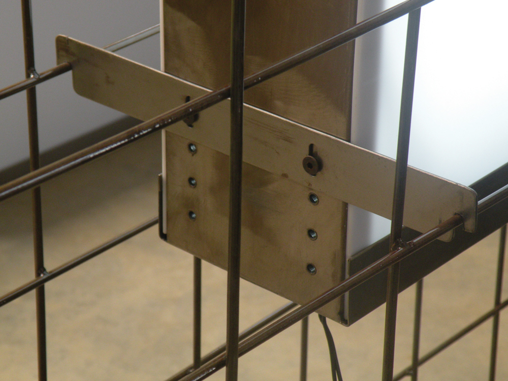
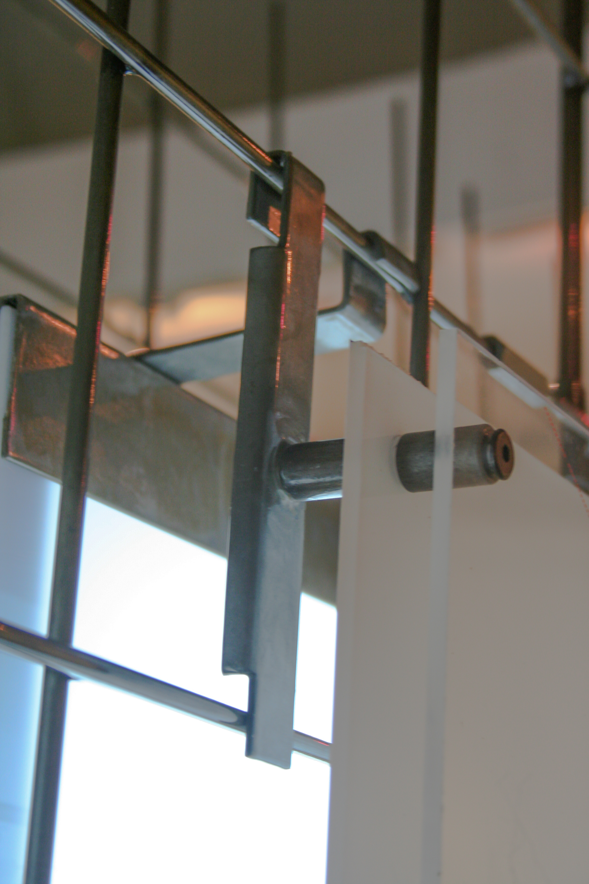
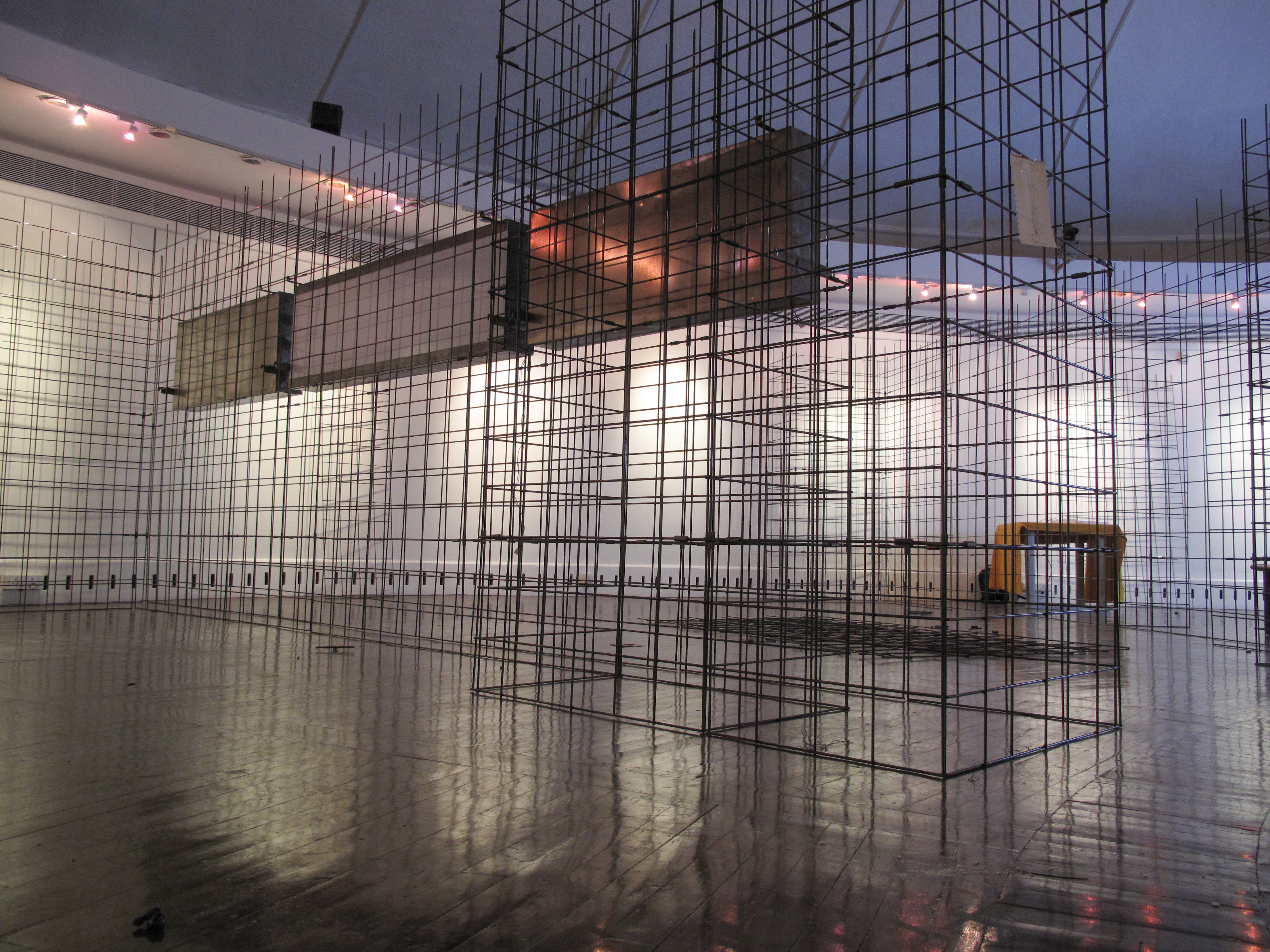
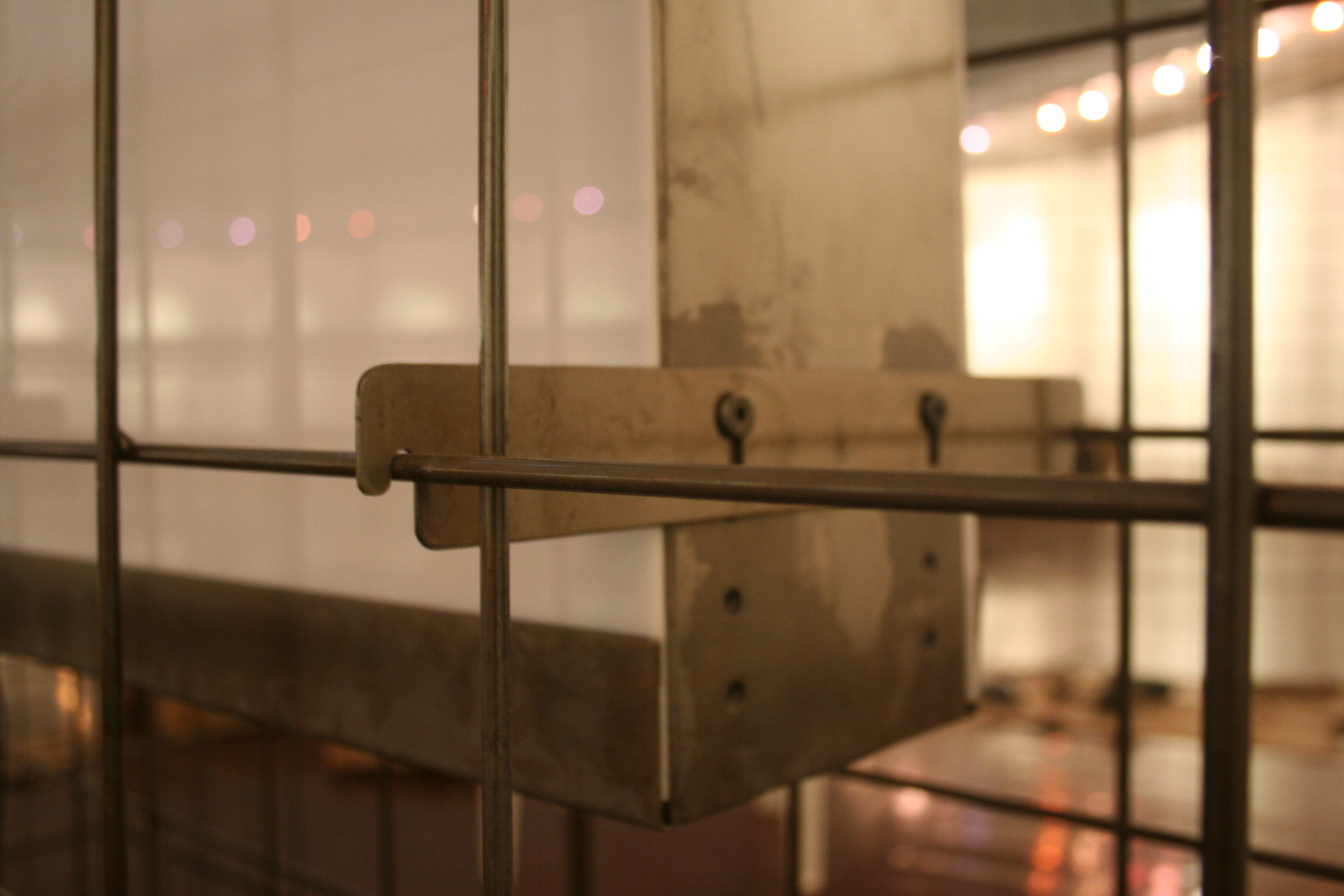
While content can convey direct and targeted messages, it is with elements like material and medium, that a subliminal immersion of the senses occurs. The metal mesh landscape of the exhibition became a metaphor for Mumbai’s cityscape that is perpetually under construction: a blend of exposed, metal mesh evocative of scaffolding with industrial, packaging style instructive graphics and corrugated carton-inspired panels. This was contrasted by finished surface of acrylic display panels which extended the idea of the urban tableaux. Materials and visual treatment became the underlying supportive narrative in experiencing the content of SOAK.


SECTION 3
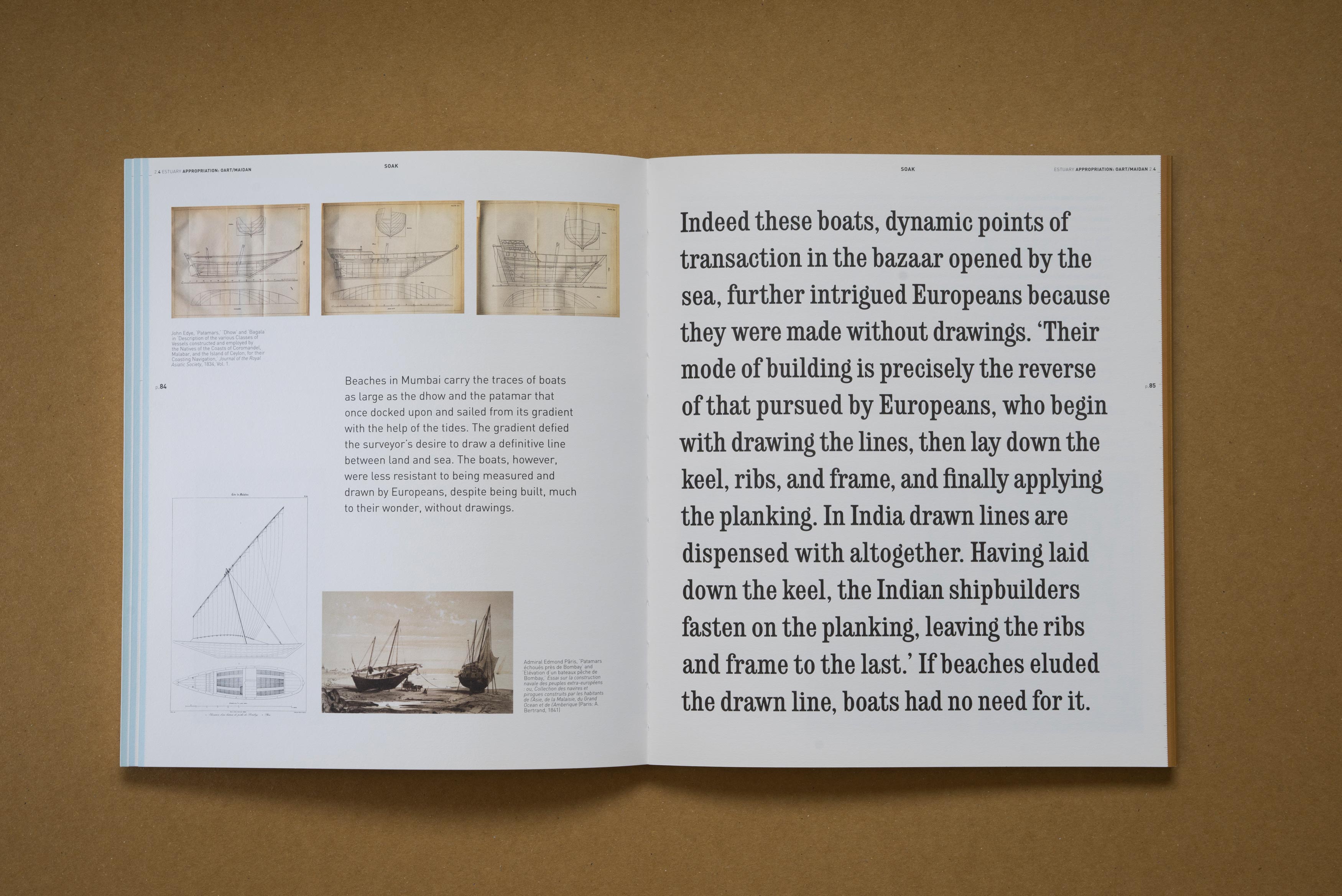
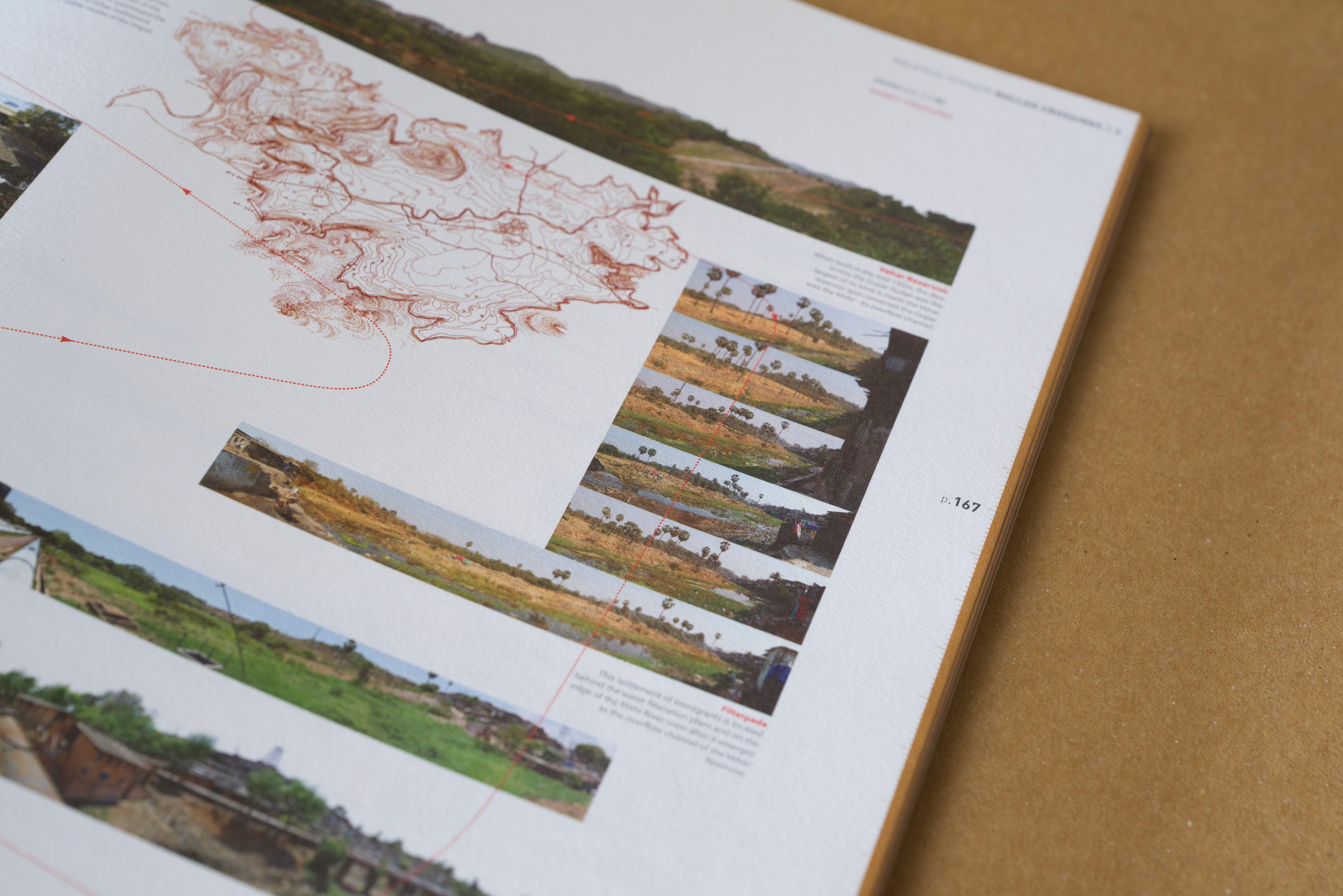
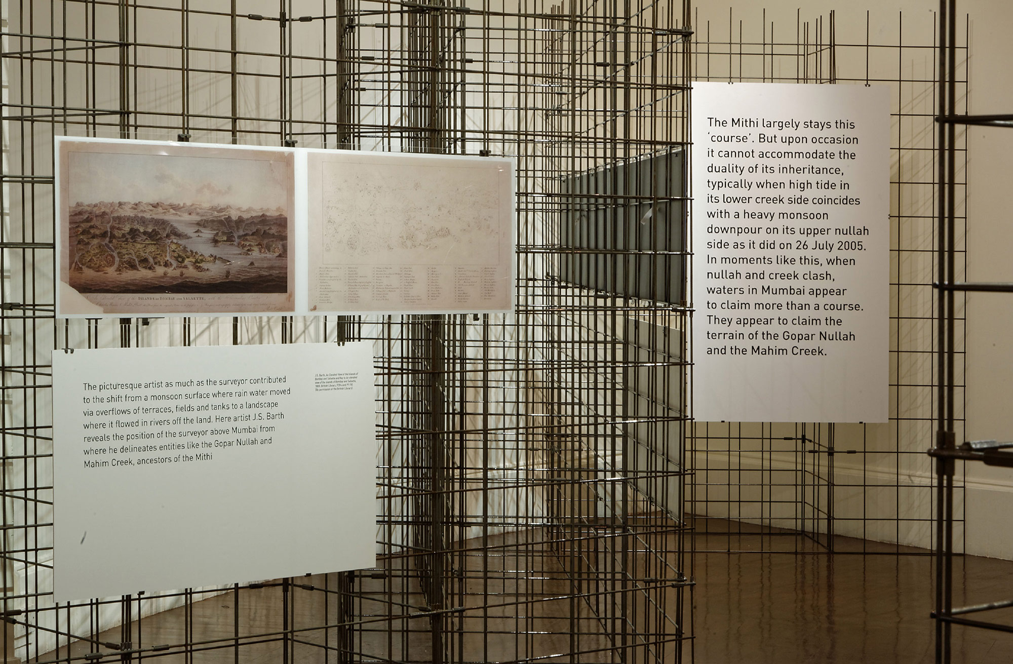
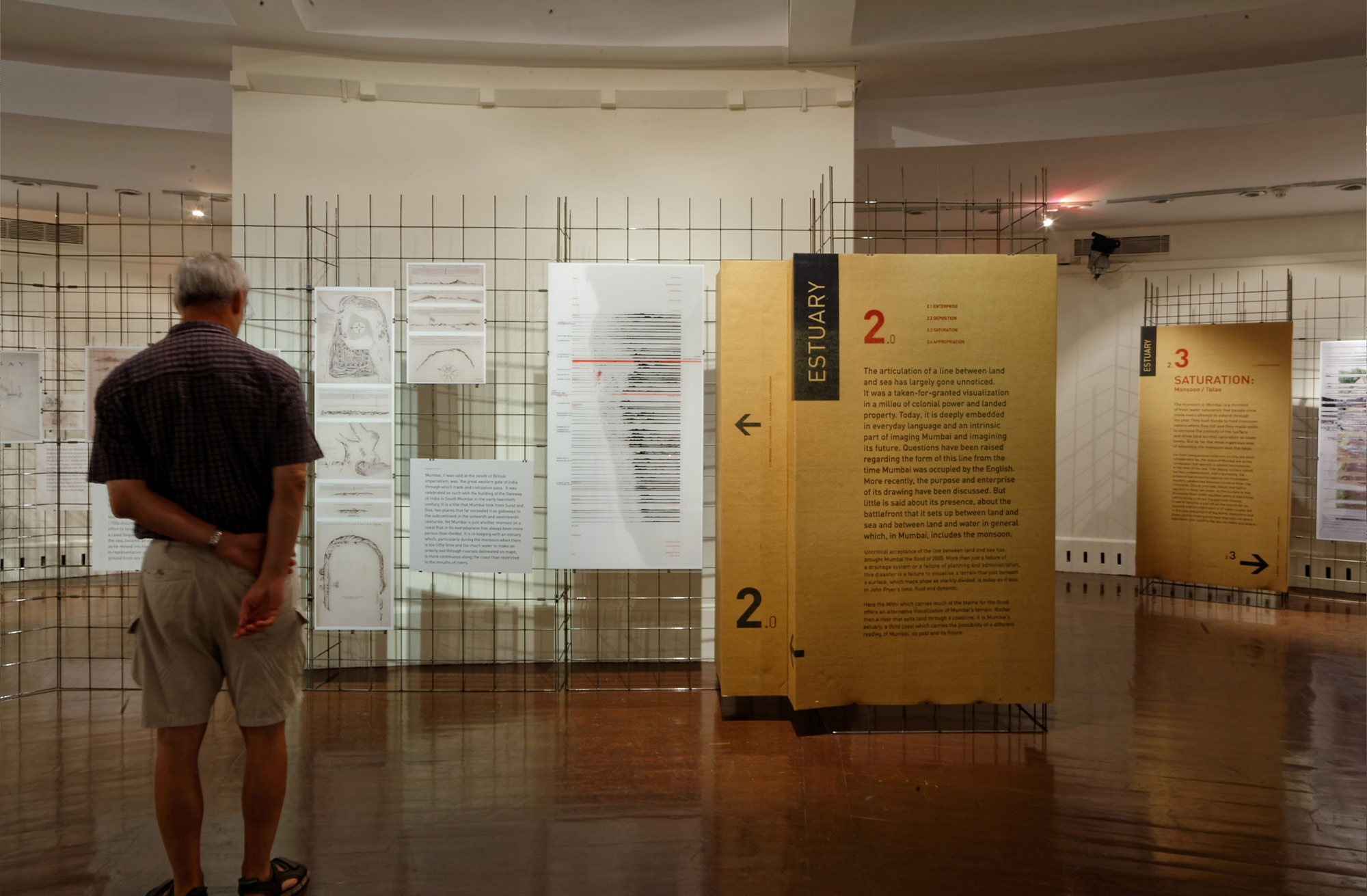
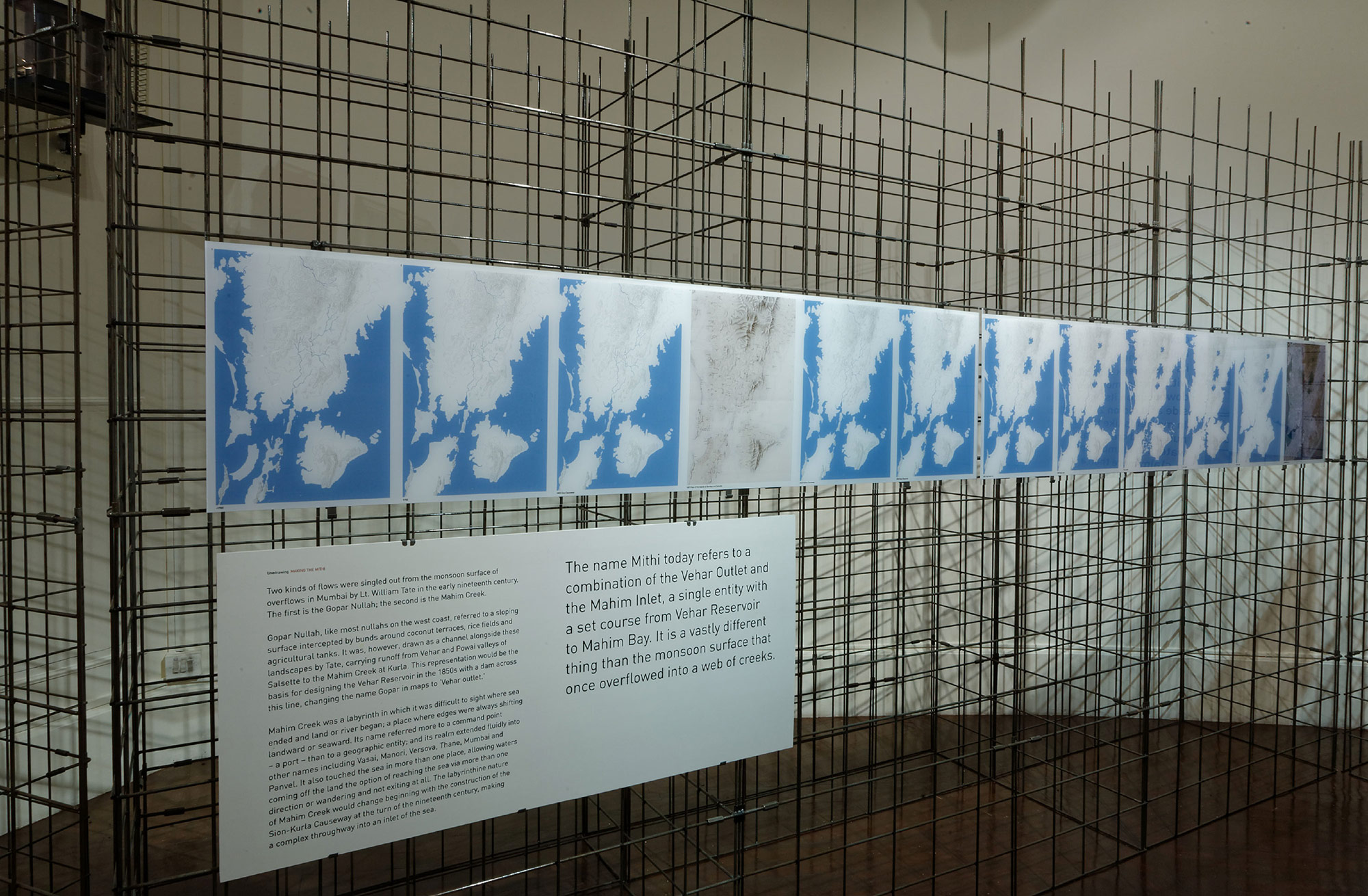
Estuary draws out that landscapes demand a different way of seeing and a different mode of representation through section, horizon and time. It situates Mumbai in a fluid threshold between land and sea, a shifting saline and fresh water gradient of creeks, and a monsoon surface of holdings.

SECTION 5
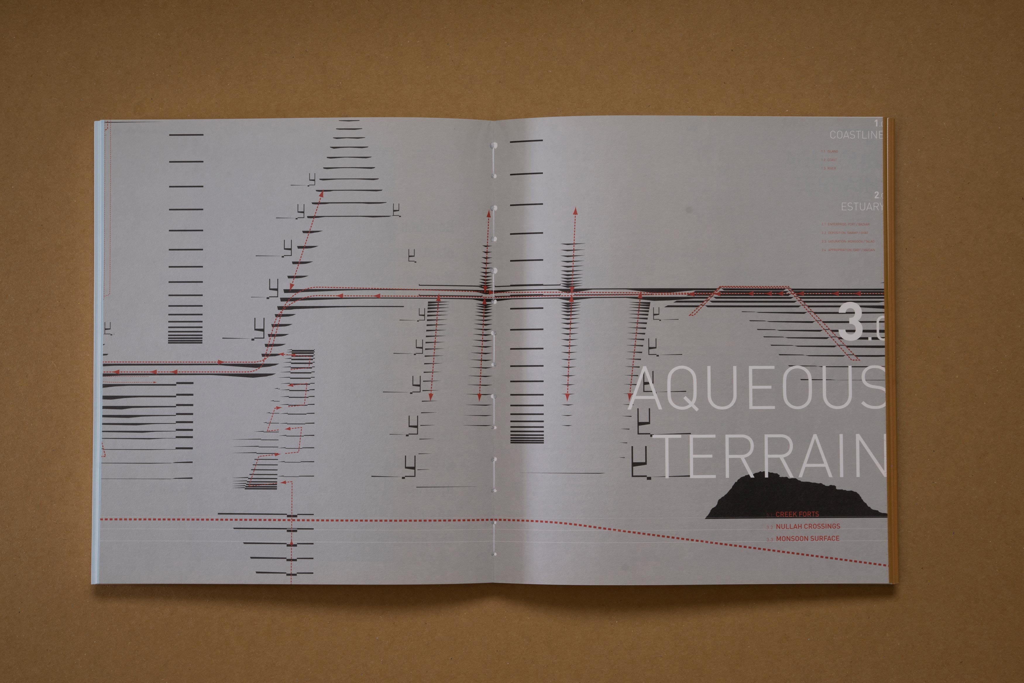
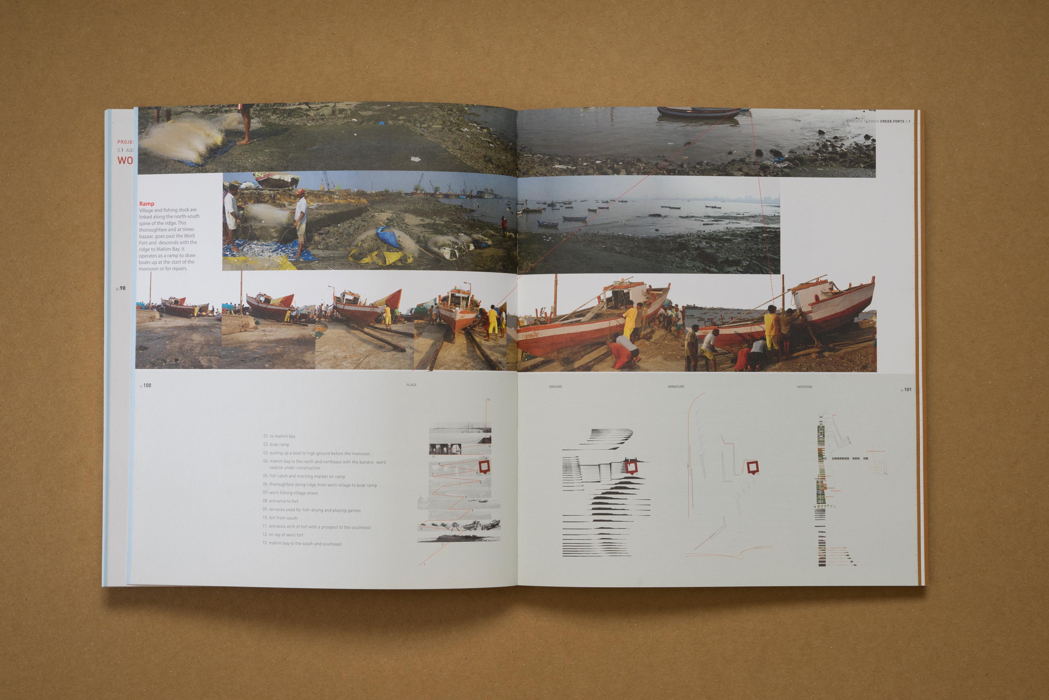
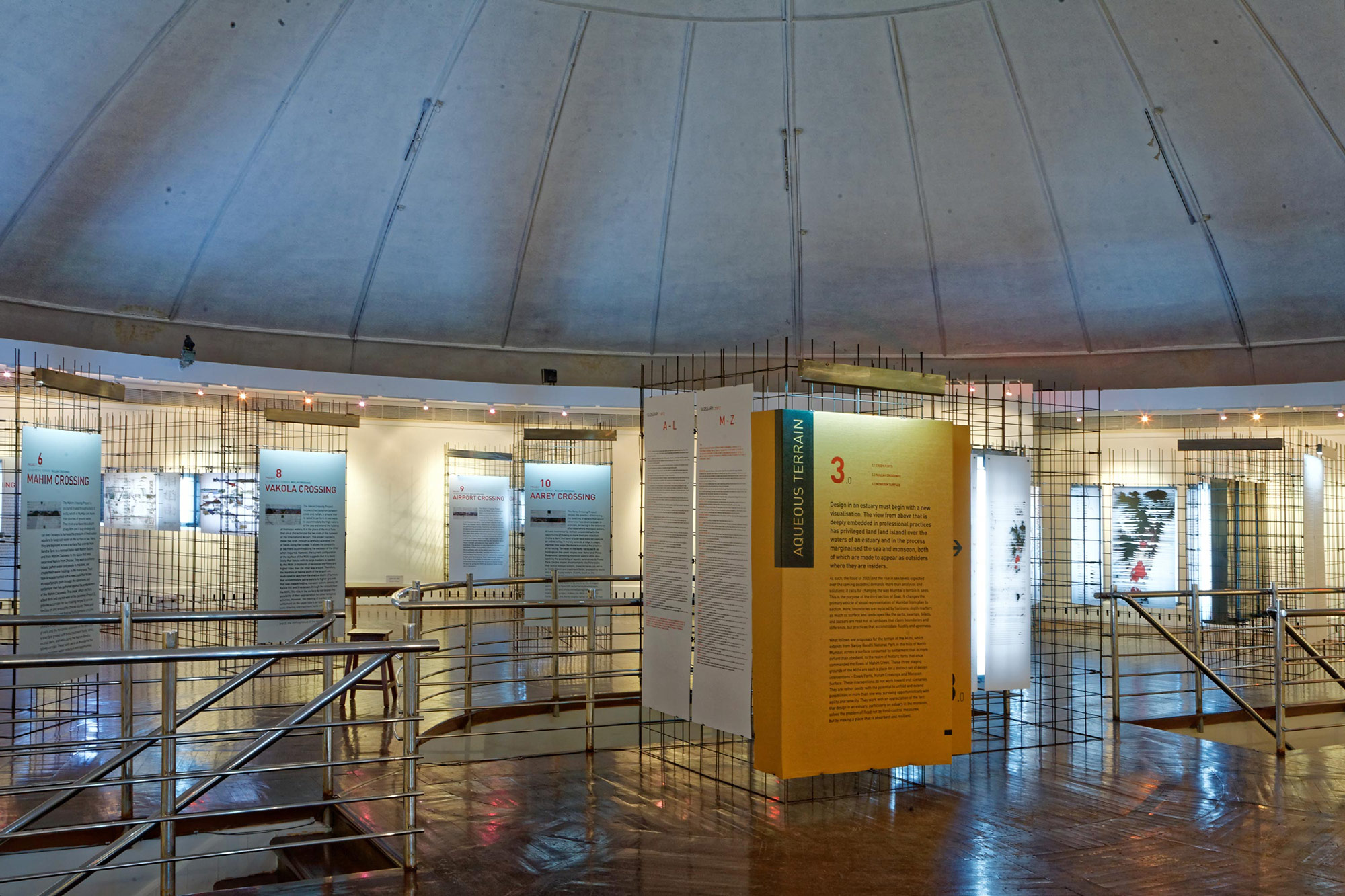
Aqueous Terrain proposes 12 initiations that work to resolve the problem of flood, not by enforcing lines but by transforming Mumbai into a place that absorbs the monsoon and sea, a place that accommodates soak. It showcases design interventions that hold water rather than channel it out to sea; that work with the gradient of an estuary.

SECTION 4
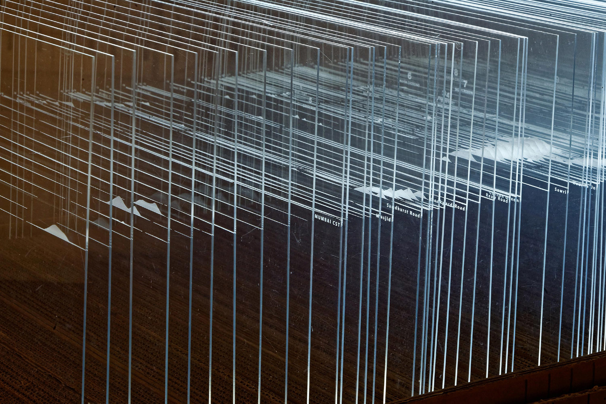
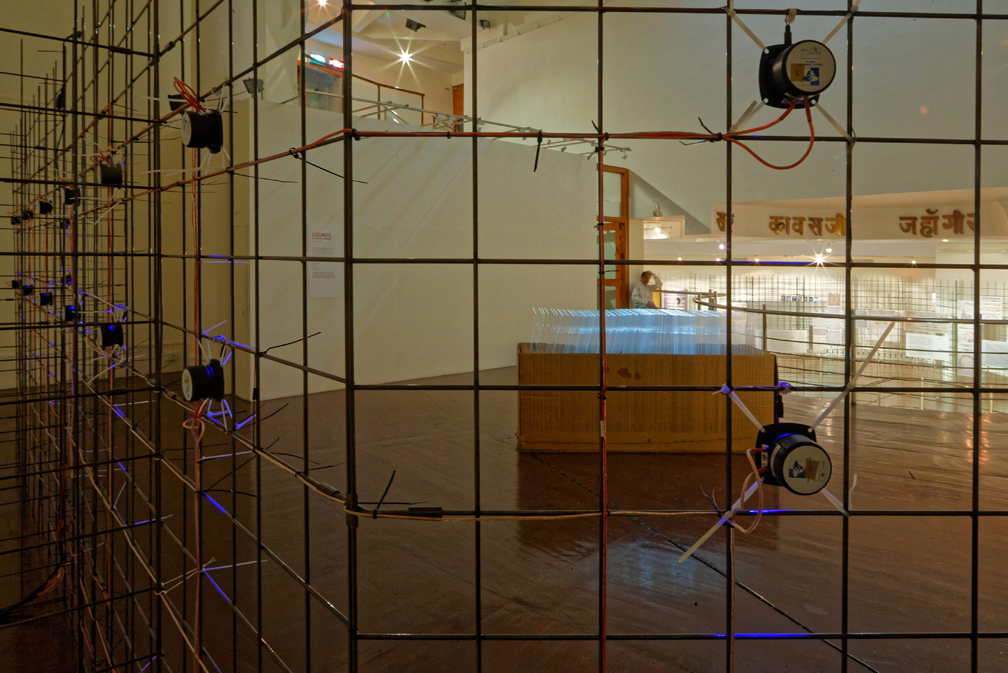
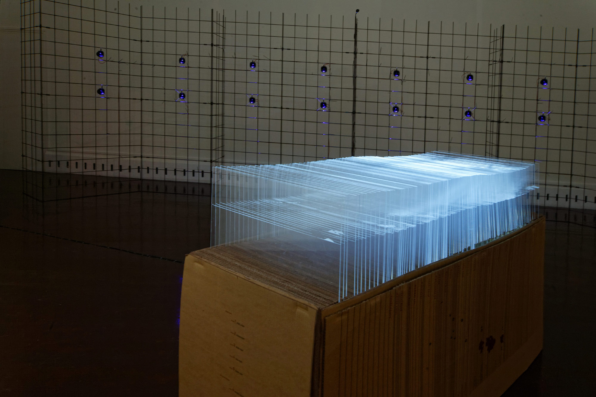
Section and Sound Installation
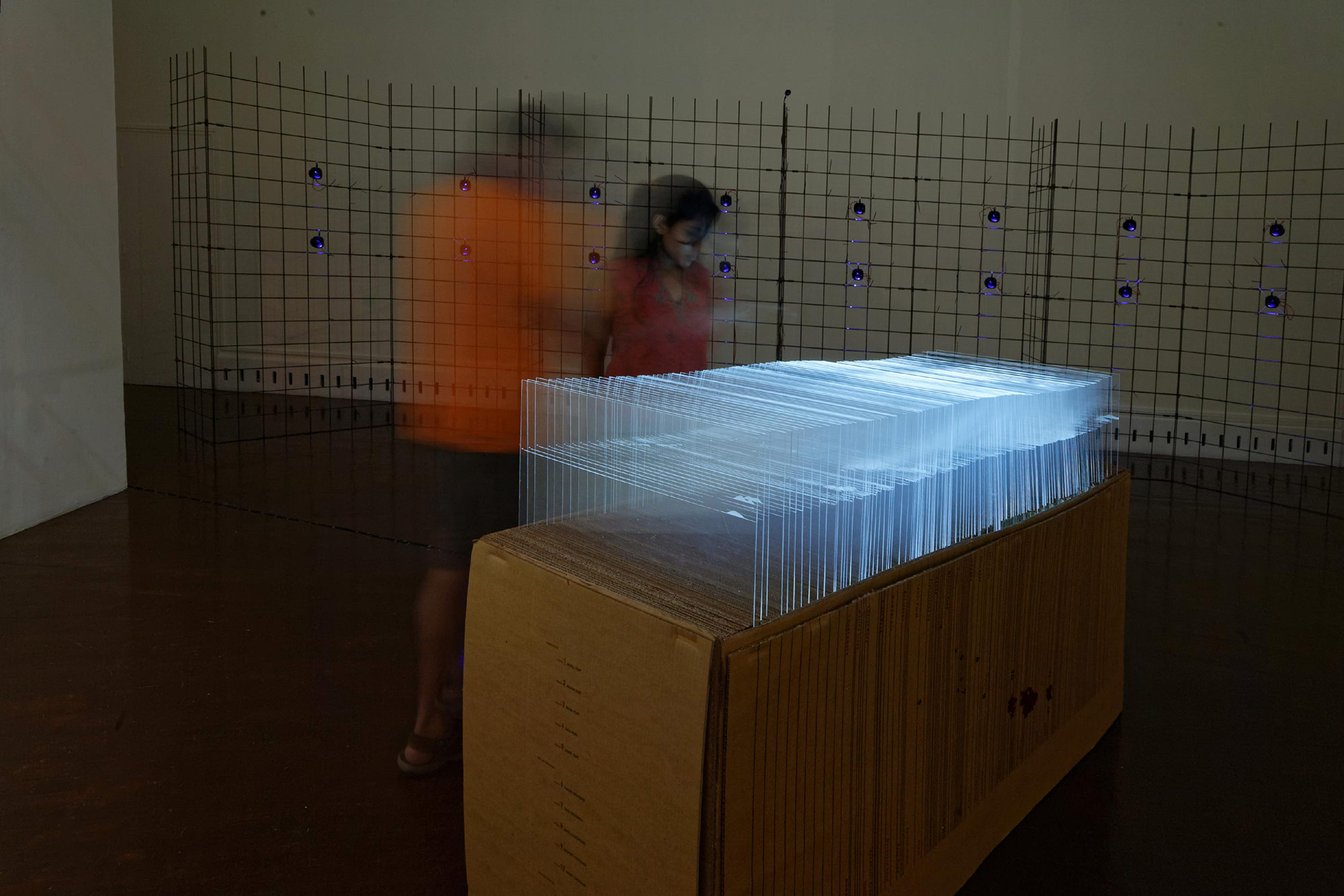
While the plan view of the map celebrates the islands of Mumbai and situates the sea beyond land’s edge, sections reveal a sea that is beneath, within, permeating land through aquifiers well known to offer Mumbai citizens ‘brackish’ water far inland.
Orchestrating Rich Experience
We transformed one of the section illustration of the authors into a 3D installation. This allowed the viewers to actually experience the concept of sectional viewing. It was made of 149 edge lit vertical acrylic sheets, arranged sequentially to capture Mumbai’s terrrian in a series of sections.
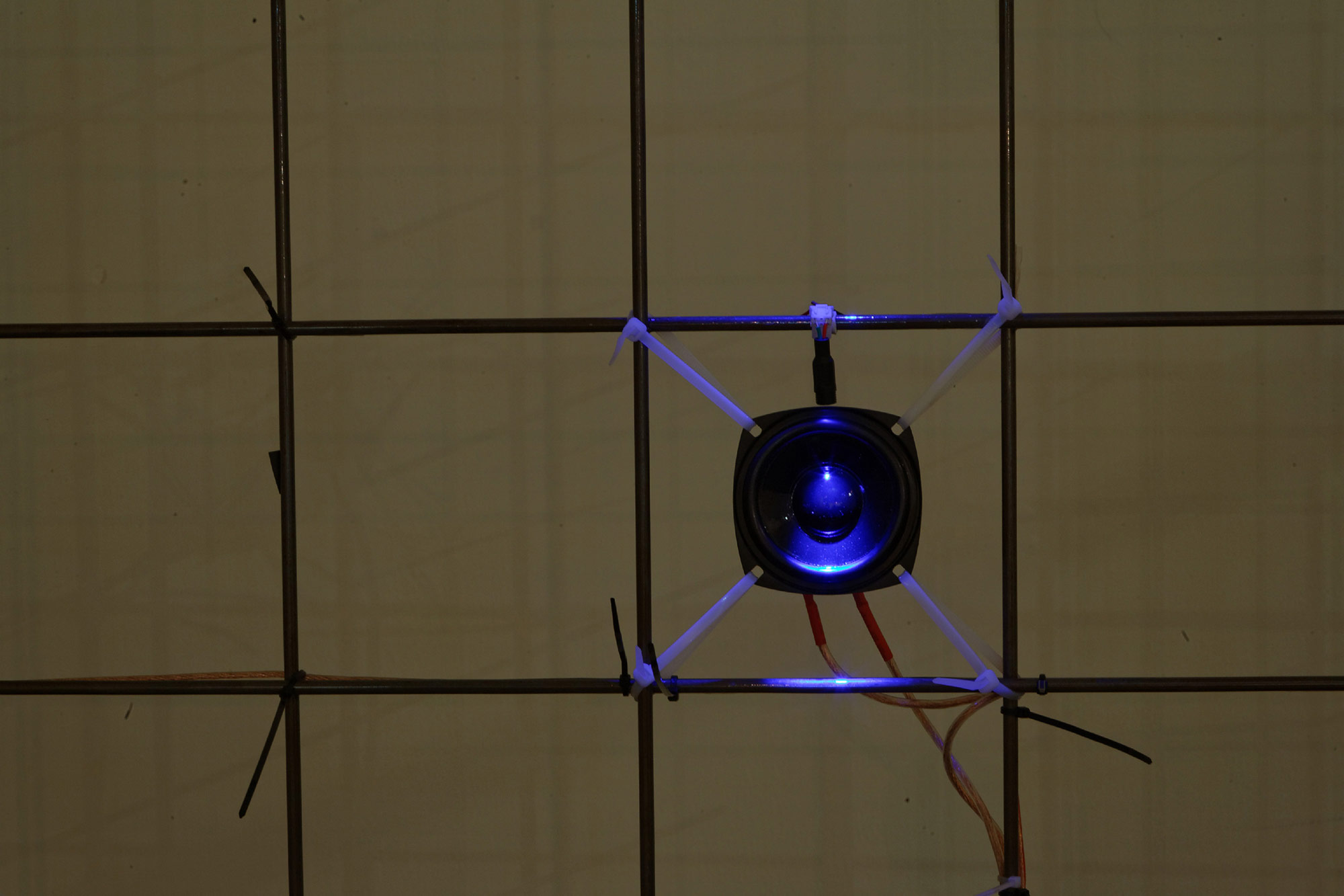
This experience was complemented by an interactive sound installation; a library of sounds around the river Methi played back through 8 pairs of speakers by sound artist Rajivan SA. The viewer was able to play and interact with the soundscape as they moved around the installation.
Structural Design for Easy Installation and Movement
Intended to be a travelling exhibition, the elements of the structure were modular keeping in mind that it needed to adapt to different venues of varying floor areas. Four basic mesh sizes with 3 types of joinery detail allowed a variety of self standing panel configurations quickly. Clever clip-on metal fixtures were designed to assist quick installation as well as dismantling of acrylic or corrugated panels.


Soak Book/Catalogue
Design challengeWhile it was easy to see the beauty of the imagery in the book, it was essential to communicate the concept and insights of the study. One of the fundamental approaches in designing this book was the structuring of text and graphic content for an easier read. The book as a physical object echoed the sectional, aqueous terrain perspective of the study.
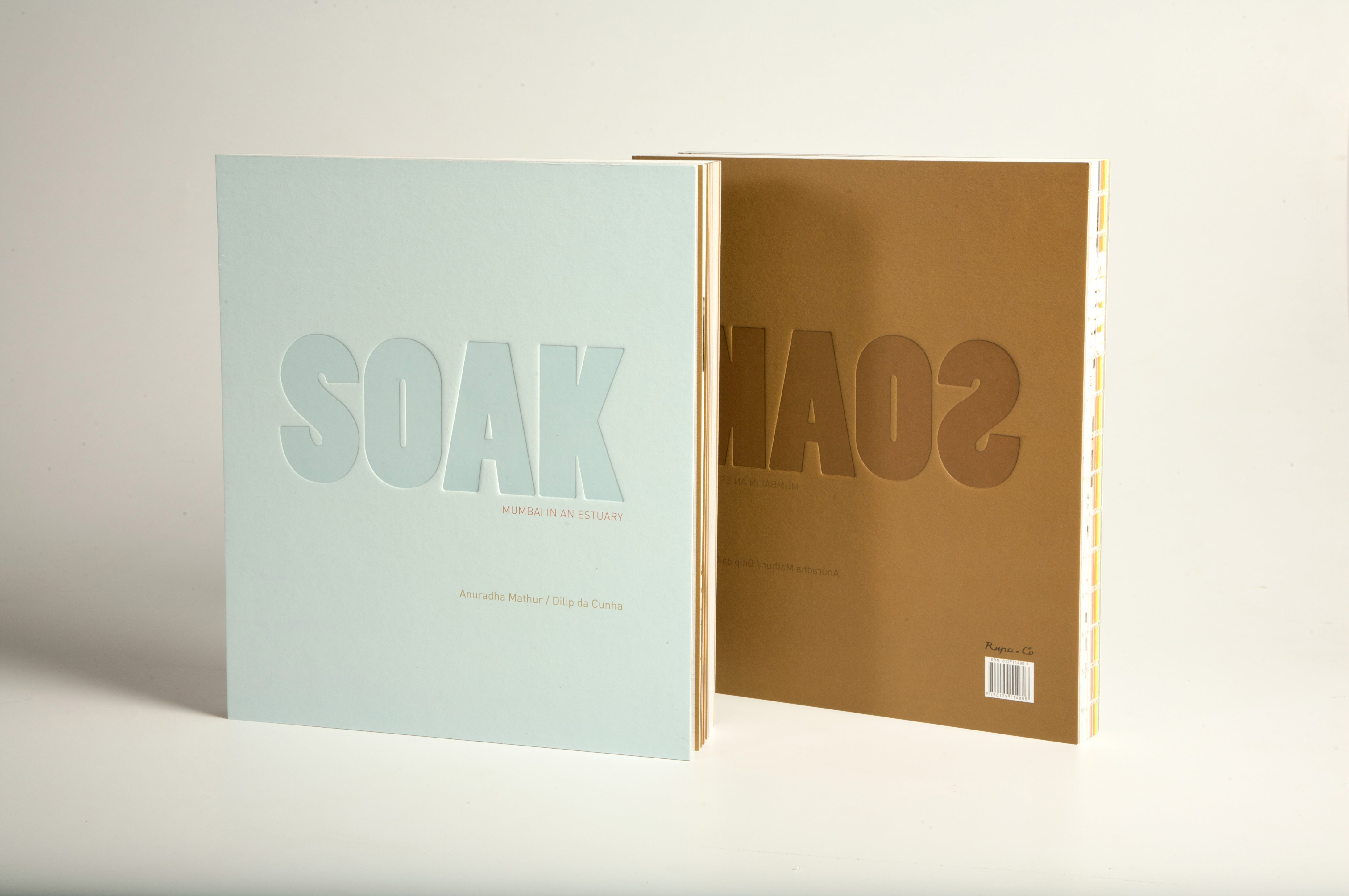
The cover
The design captures the two components of the SOAK: land and water. Water is represented in blue in the front cover and land, in brown. The word SOAK is debossed in bold both on the front cover and the back to imply impression on wet soil.
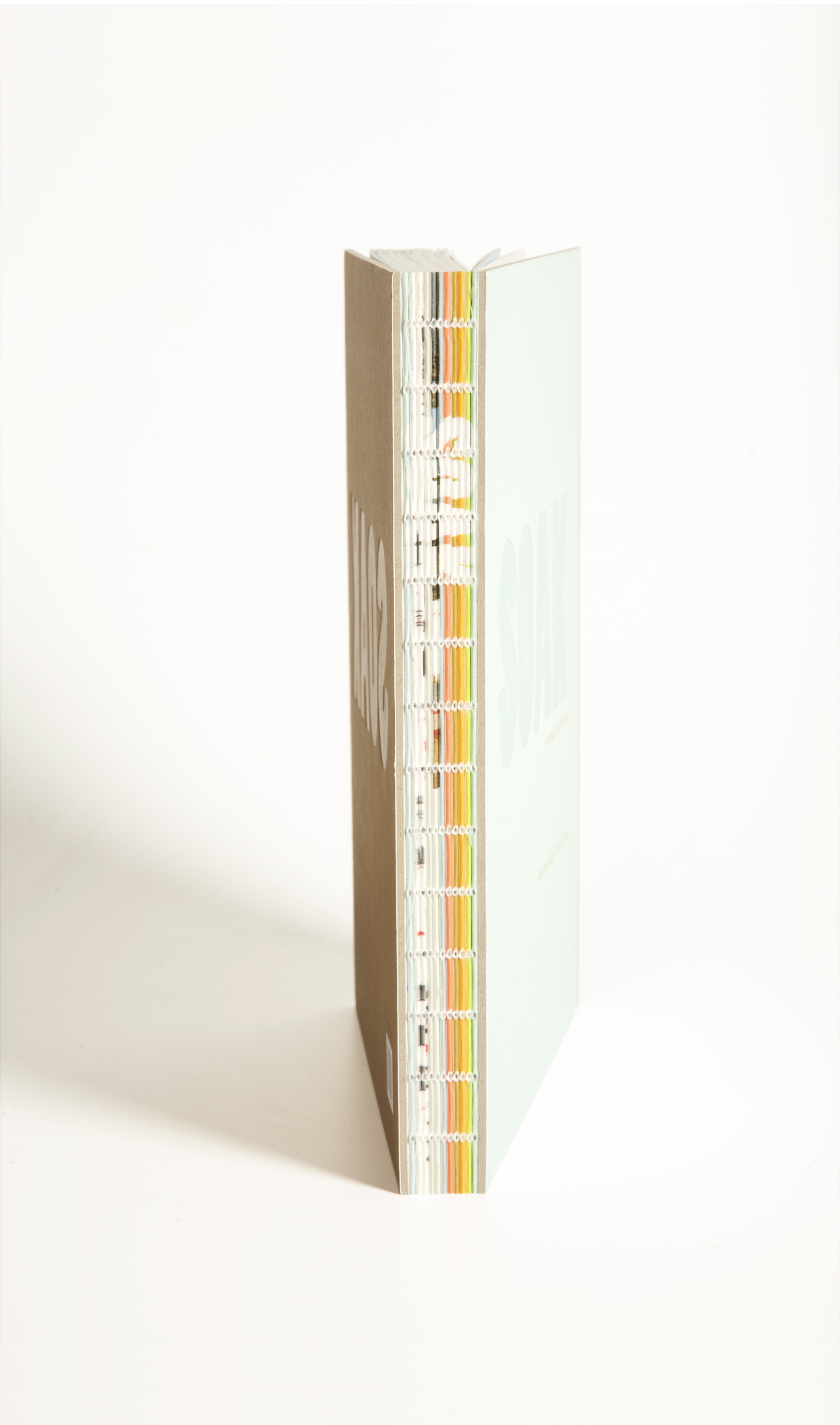
The spine
The spine is exposed to reveal the sectional gathers of the book to reflect the authors’ theoretical premise of ’sectional view’ versus a plan view. Each small sliver of the spine is printed individually to have a collective visual impact when strung together as a composite spine to form the book.
The edge
We printed the edge of the book in a way that it turns blue or brown depending on which direction you bend the pages. This in a way conceptually demonstrates the fluid edge between the land and the sea.
The design captures the two components of the SOAK: land and water. Water is represented in blue in the front cover and land, in brown. The word SOAK is debossed in bold both on the front cover and the back to imply impression on wet soil.
The spine
The spine is exposed to reveal the sectional gathers of the book to reflect the authors’ theoretical premise of ’sectional view’ versus a plan view. Each small sliver of the spine is printed individually to have a collective visual impact when strung together as a composite spine to form the book.
The edge
We printed the edge of the book in a way that it turns blue or brown depending on which direction you bend the pages. This in a way conceptually demonstrates the fluid edge between the land and the sea.
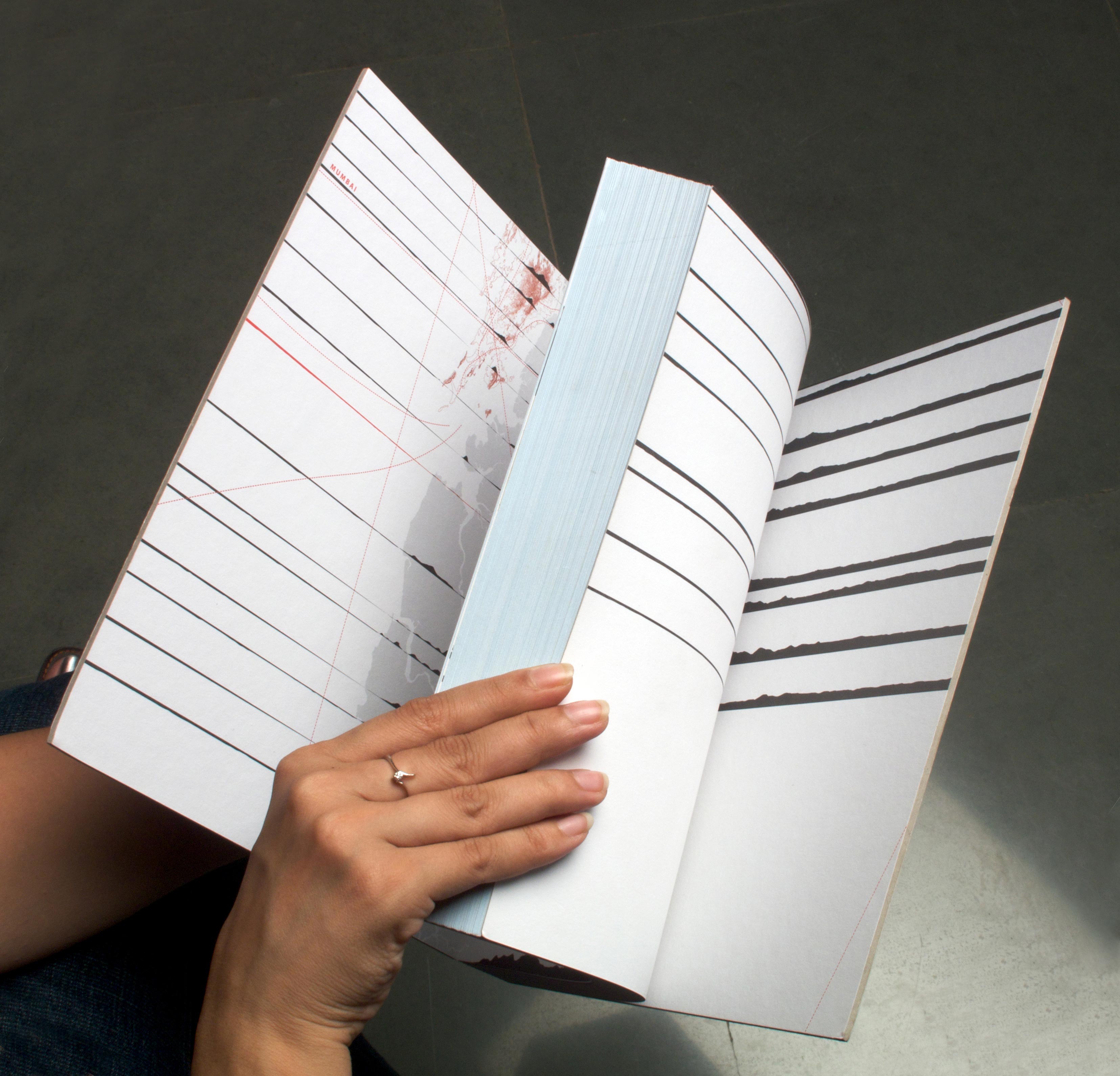
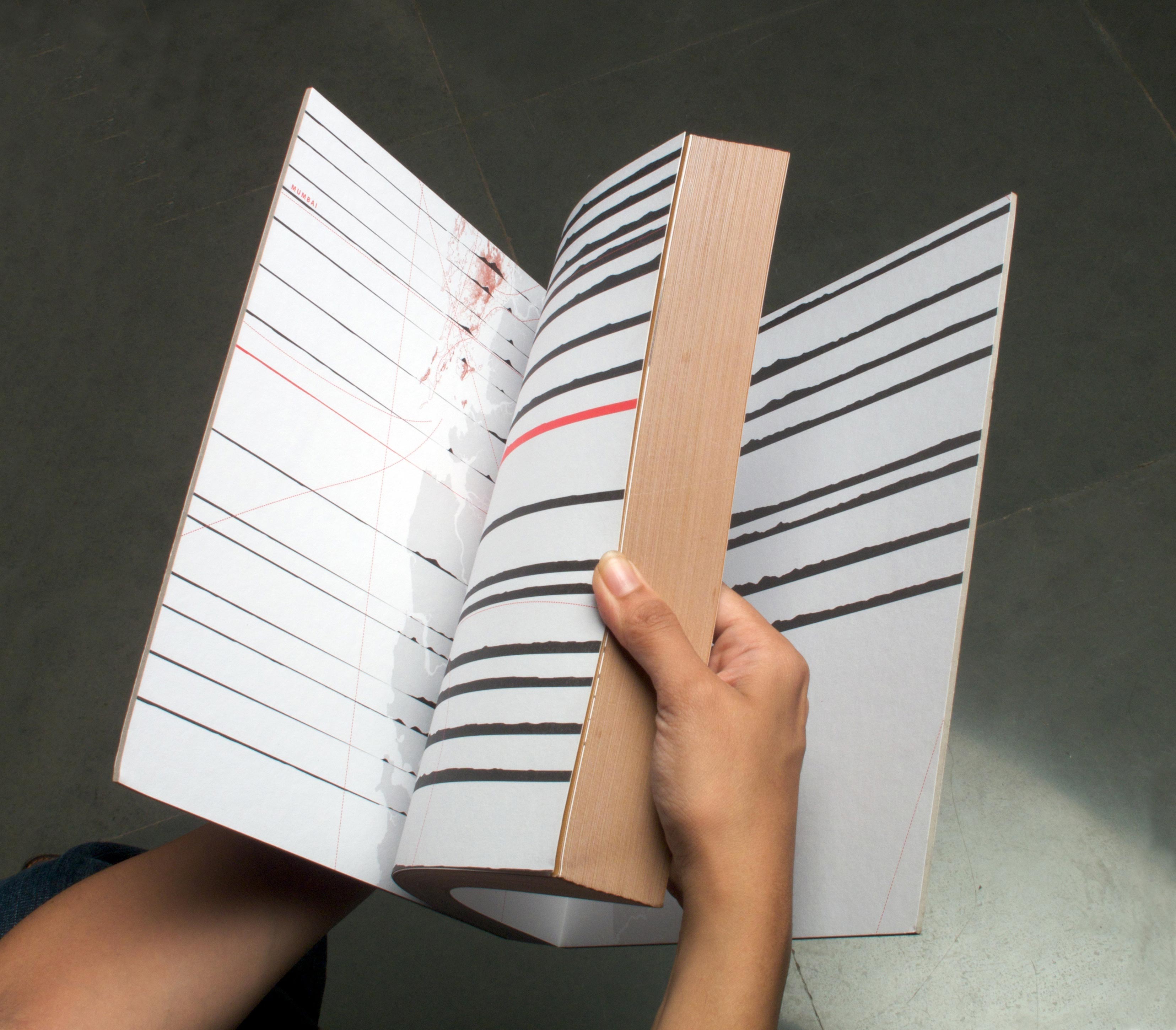
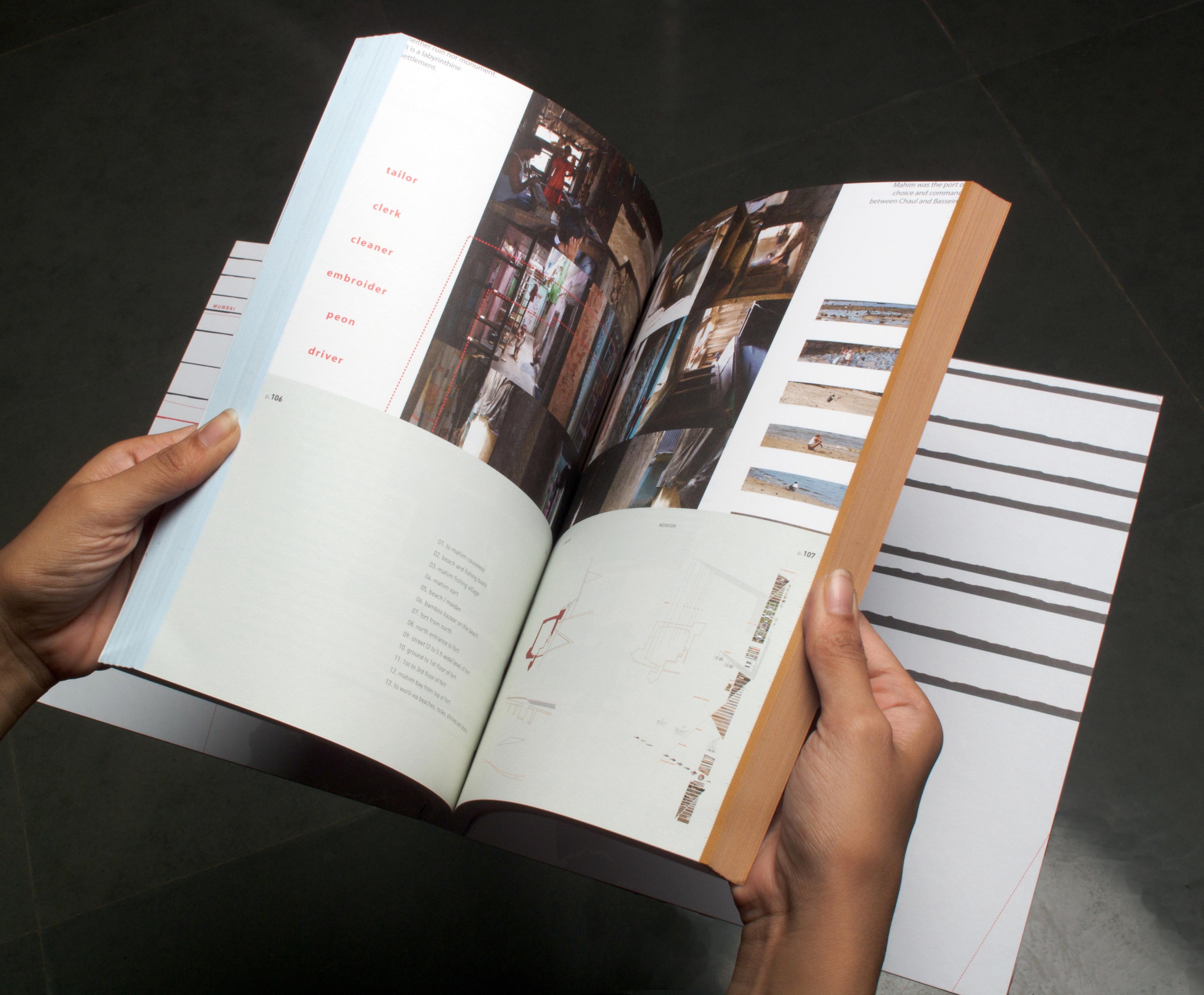
The inner pages
Our aim was for the book to be read by as many people as possible — both the serious and the casual reader. And so, we created a book that reads like an exhibition — the bottom half captures the key concepts of the book in big, bold text with accompanying illustrations, much like panels —
a devise to hold the casual reader’s attention. The top half has the core content in its entirety for the serious reader. The idea was that even if one reads only the bottom half (‘exhibit like layout’), it is enough for a well-rounded understanding of the book.