Studio
TRAPEZE
Concept & Creative Direction
RAM SINAM
(Co-Founder, Trapeze / Founder, Wari Watai)
Design
TRUSHA SAWANT
PRIYANKA BORANA
Illustration
SHREYAS KRISHNAN
DEEPU SASI KUMAR
Industrial Design Detailing
TWIST OPEN
TRAPEZE
Concept & Creative Direction
RAM SINAM
(Co-Founder, Trapeze / Founder, Wari Watai)
Design
TRUSHA SAWANT
PRIYANKA BORANA
Illustration
SHREYAS KRISHNAN
DEEPU SASI KUMAR
Industrial Design Detailing
TWIST OPEN
EXHIBTION DESIGN, PRINT DESIGN
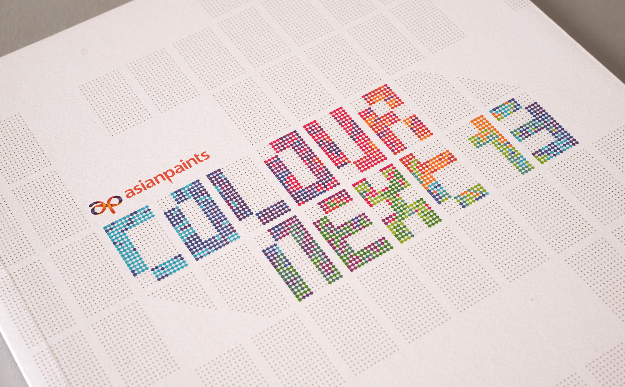
ColourNext 2013
ColourNext is the annual colour forecast for Indian interiors. Targeting architects and interior designers through an exhibition, digital and print media, this excercise has been instrumental in positioning Asian Paints not just as a manufacturer of paints but a market leader and proactive visionary.
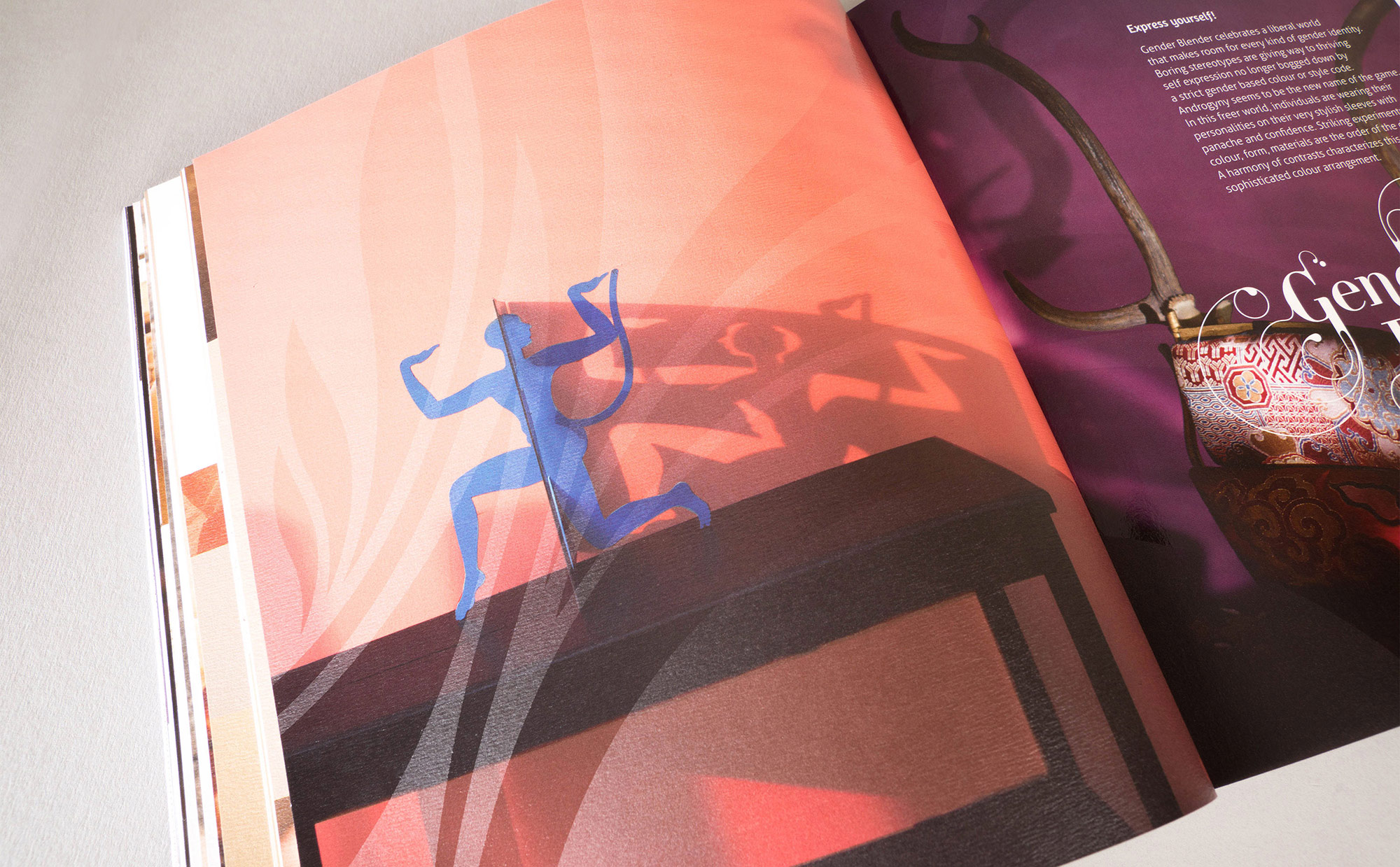
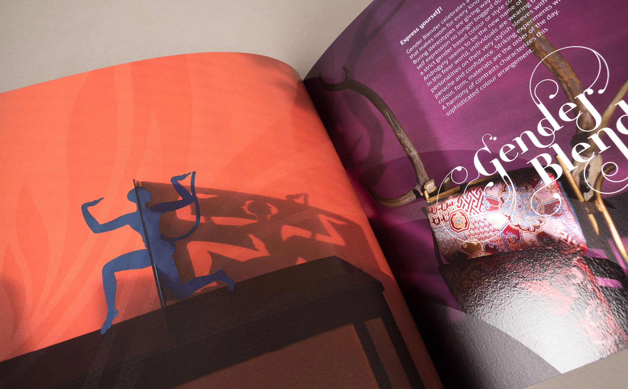
Gender Blender
'Gender Blender' reflects on today's take on gender identity. The theme suggests that society is more accepting of what was earlier considered taboo – distinct gender identities are blurred, gender expressions are now androgynous.
We conceptualized a ramp that becomes the stage for exhibiting one's identity depicted through abstracted and androgynous images of individuals who are experimenting and expressing themselves without being tied down by color, form, material attributed to gender identification – blurring the typical gender expressions.
We conceptualized a ramp that becomes the stage for exhibiting one's identity depicted through abstracted and androgynous images of individuals who are experimenting and expressing themselves without being tied down by color, form, material attributed to gender identification – blurring the typical gender expressions.


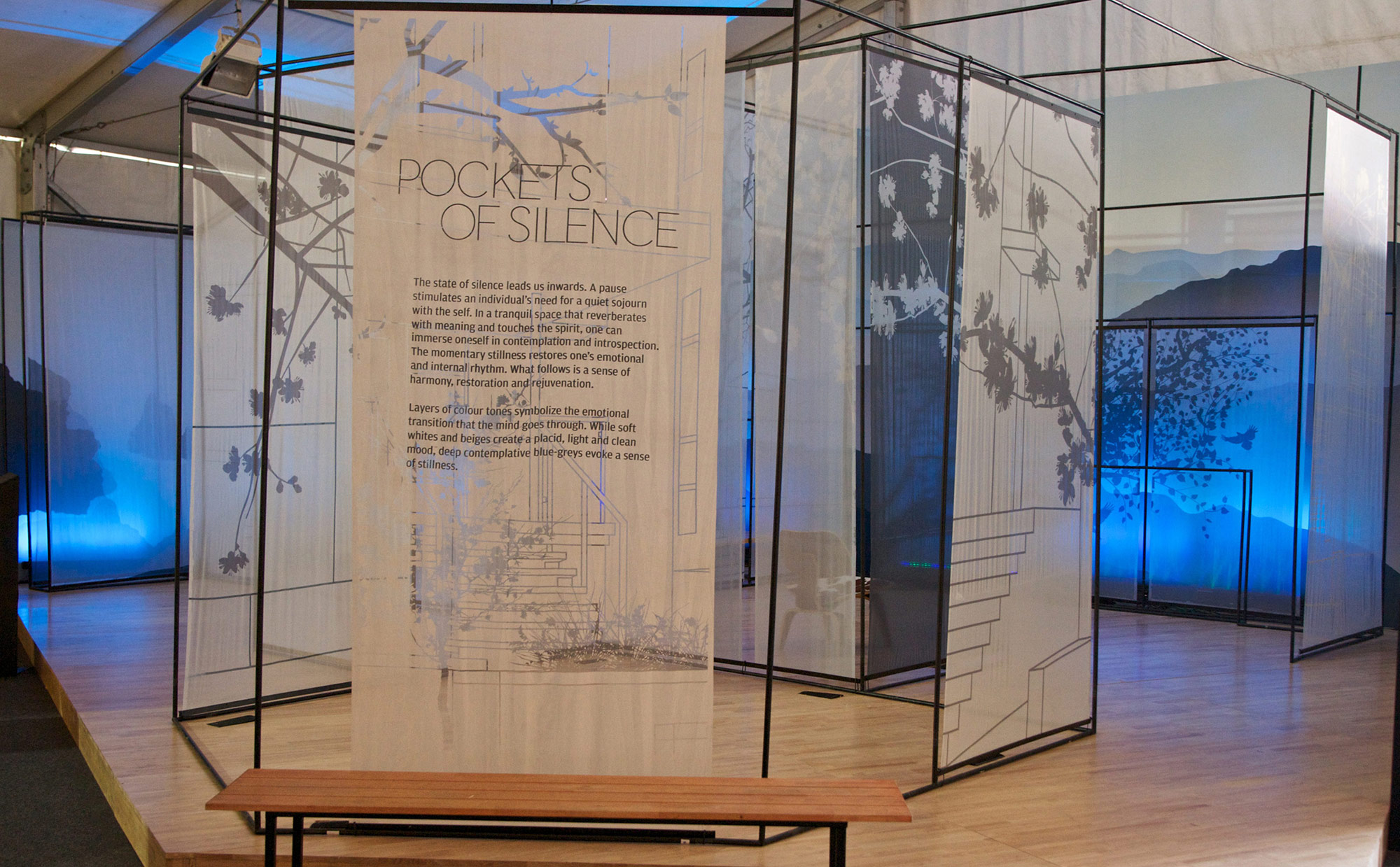
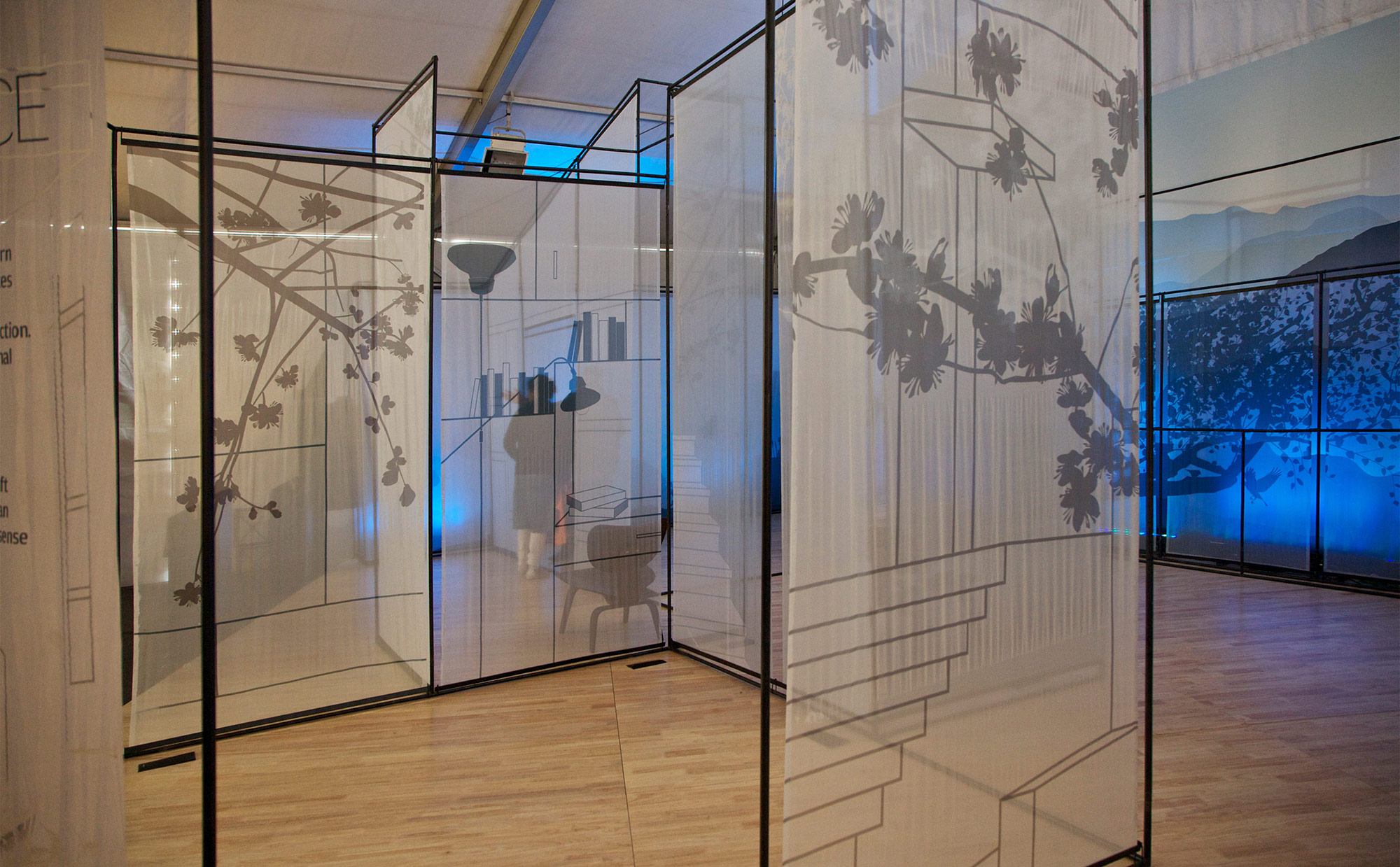
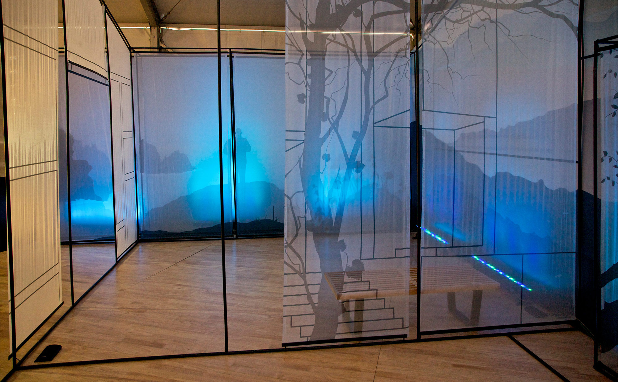
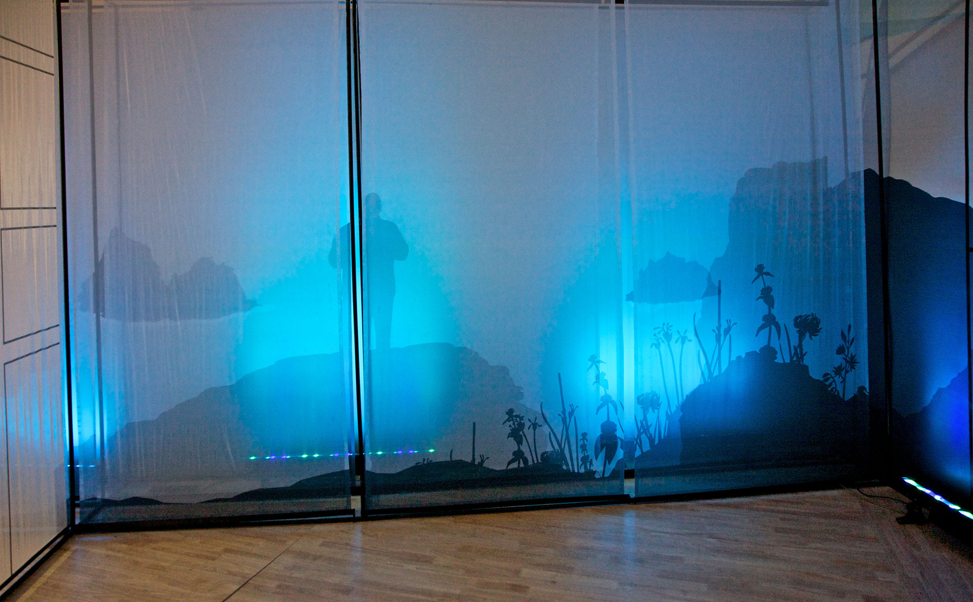
Pockets of Silence
'Pockets of Silence' is about how, in an ultra-busy contemporary urban society, people need pockets of silence to rewind and rejuvenate which does not necessarily has to be a long break. Something that is for a shorter duration that they can find it even inside their home, in a small corner.
The idea was to create a mental landscape where the physical space transforms to distinct experiences of silence – forests, sea-side and mountains while retaining the traces of the physical space through a fine black outline. The printed landscapes on the translucent fabrics brought the mental images of the tranquil landscapes. The translucency of the fabric panels also gave an opportunity to play with the theme colors and create depth in images. In the conceptual and translucent space, the wooden floor brought the feeling of warmth of a home and also reminded the viewer of the real space. This concept if further enhanced by introducing sounds complimenting the visual experience.
The idea was to create a mental landscape where the physical space transforms to distinct experiences of silence – forests, sea-side and mountains while retaining the traces of the physical space through a fine black outline. The printed landscapes on the translucent fabrics brought the mental images of the tranquil landscapes. The translucency of the fabric panels also gave an opportunity to play with the theme colors and create depth in images. In the conceptual and translucent space, the wooden floor brought the feeling of warmth of a home and also reminded the viewer of the real space. This concept if further enhanced by introducing sounds complimenting the visual experience.

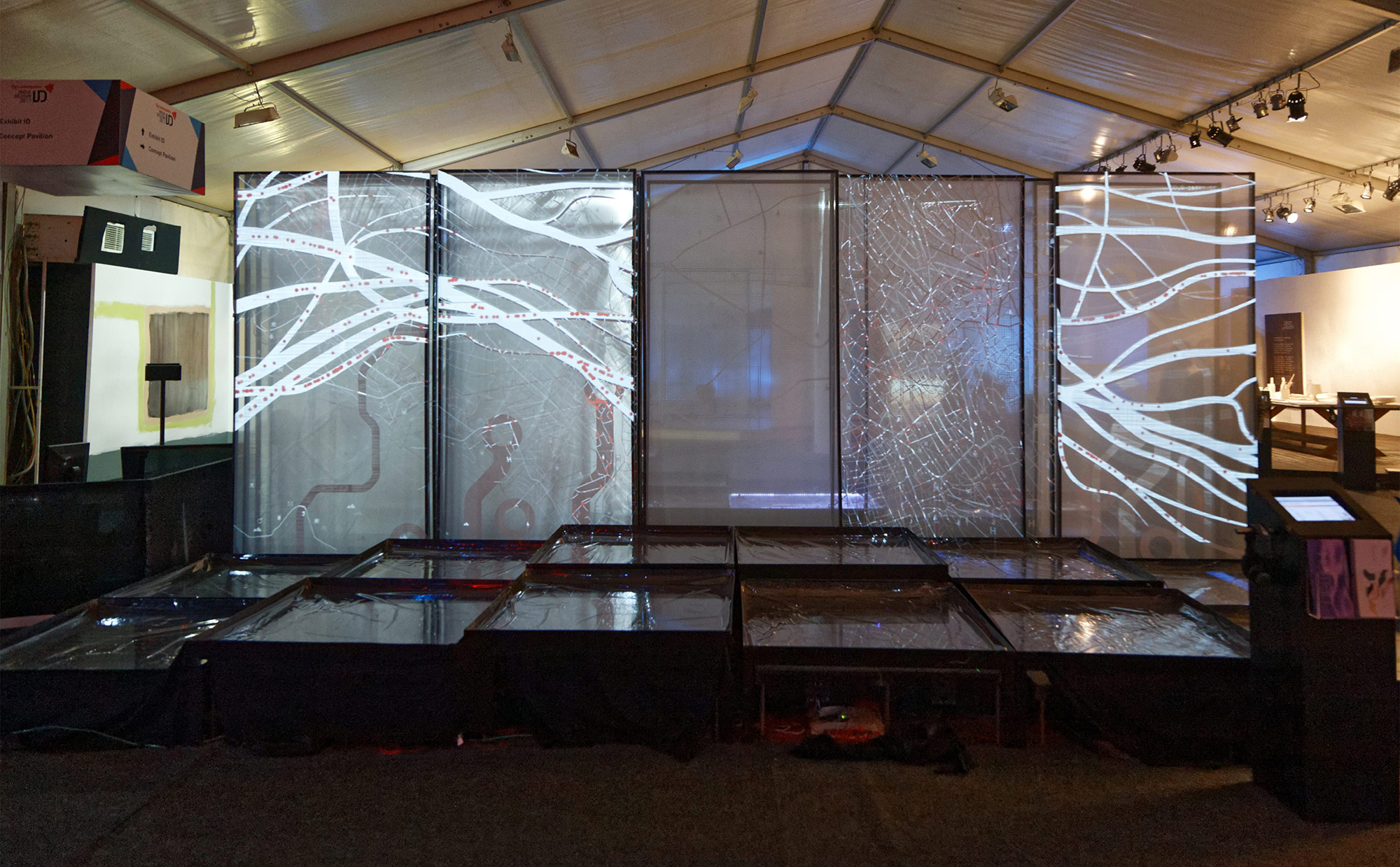
Human
The theme talks about how technology is becoming more intuitively connected with every aspect of Human and enhancing life. The installation shows the interwoven aspect of technology and human though an abstract and imersive visual and interactive experience; the slow moving flow
of electron/blood cells/cars on a dramatic overlapping landscape of PCB/arteries/city map.
of electron/blood cells/cars on a dramatic overlapping landscape of PCB/arteries/city map.
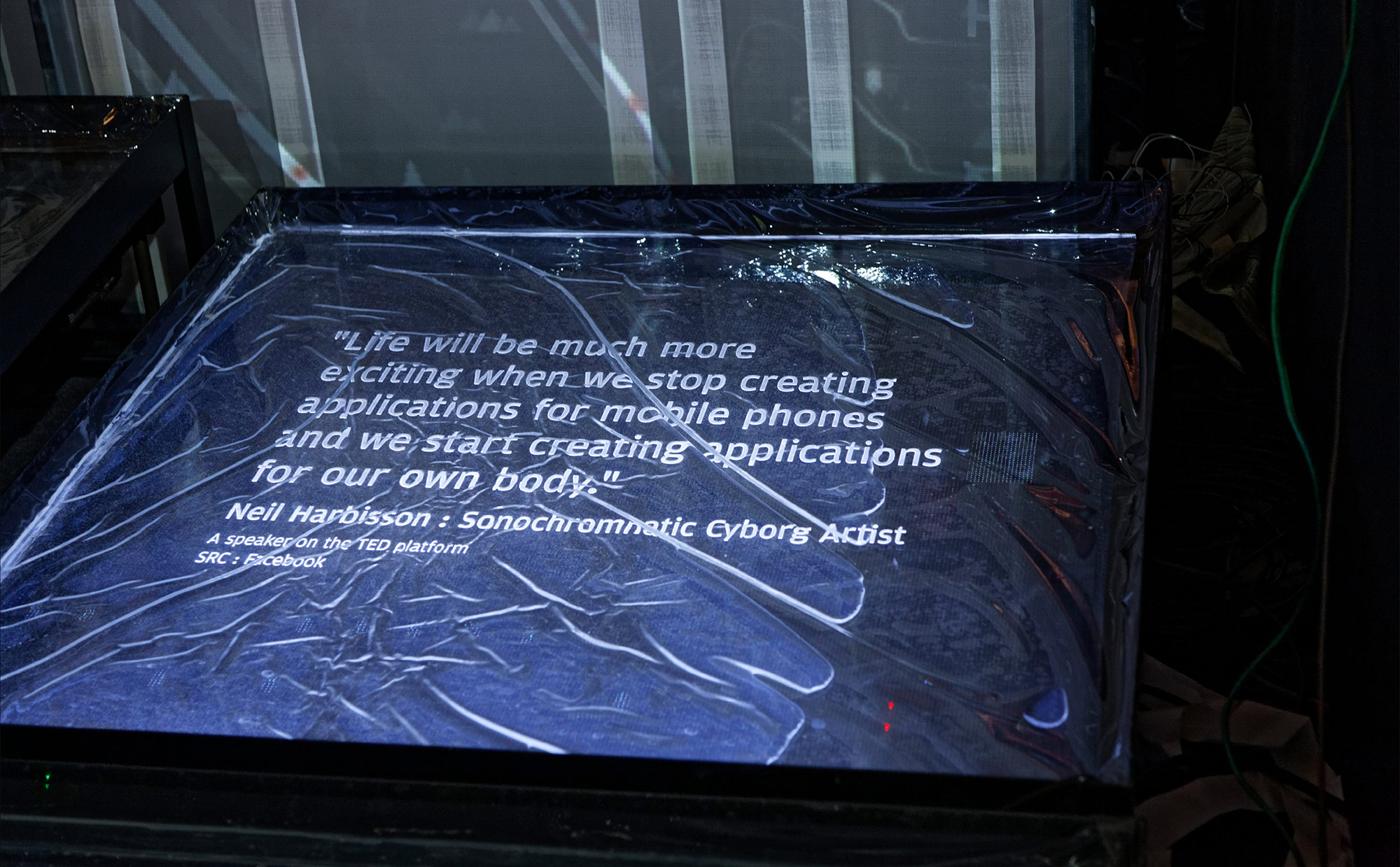
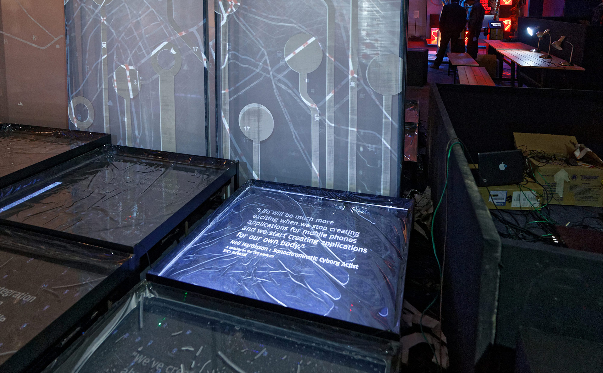
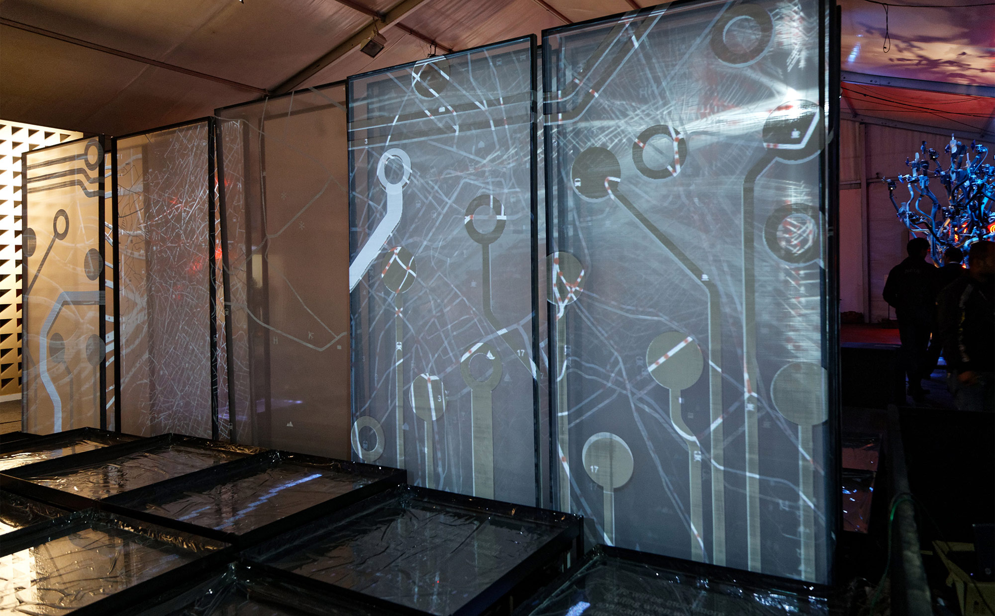
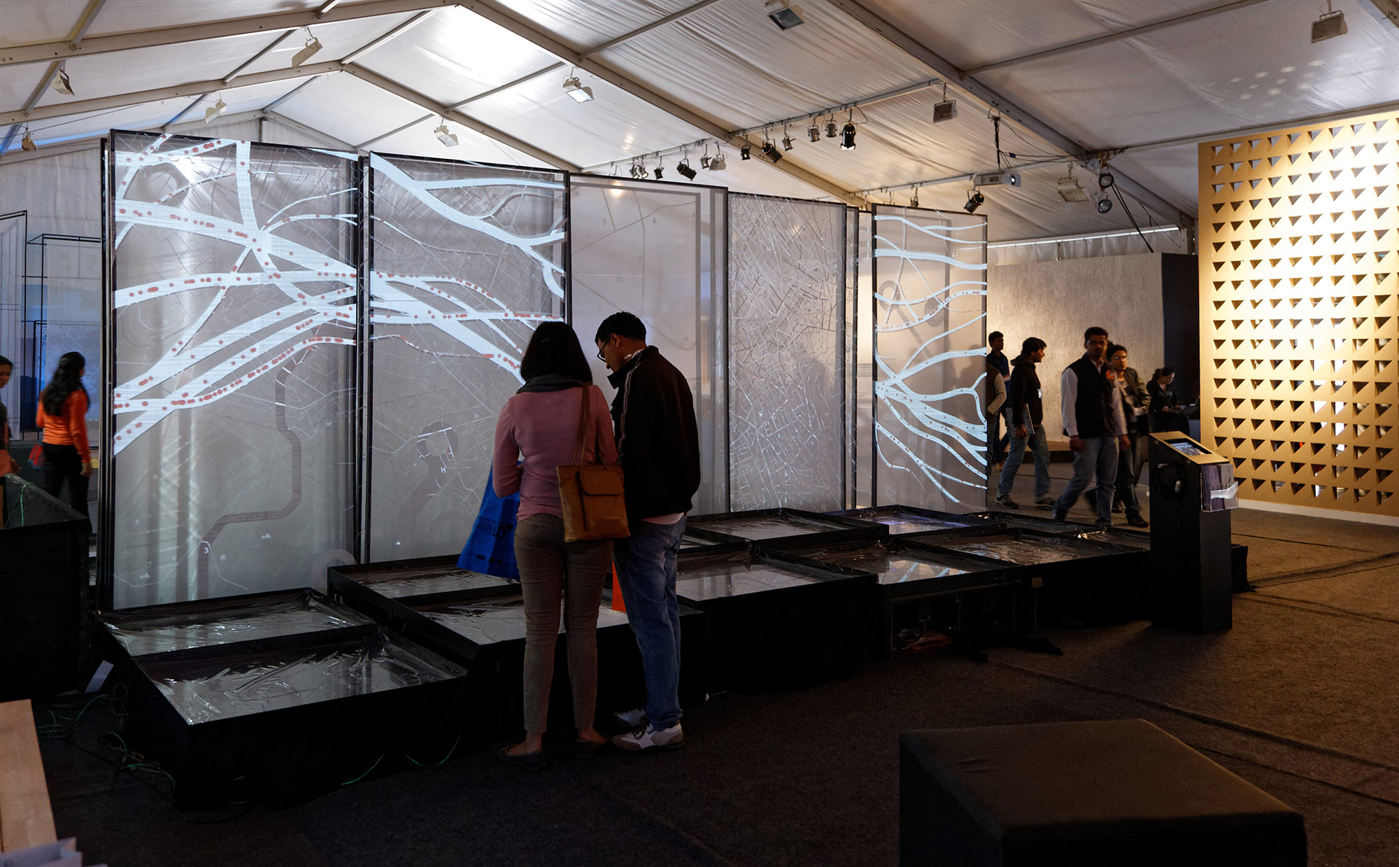
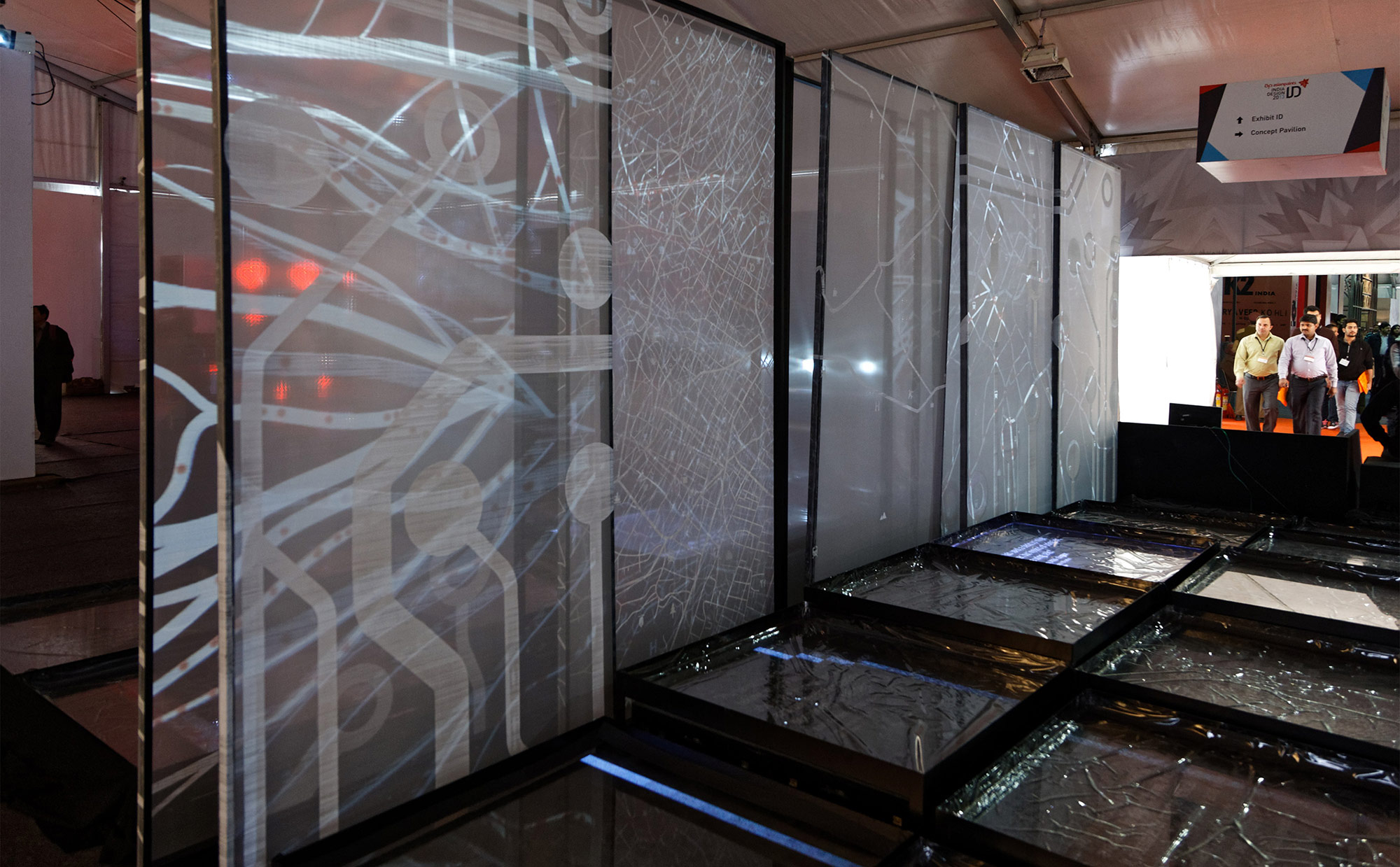
'Human' narrates the aspect of technology that is becoming increasingly intuitive to and integrated for extending human needs. This idea is carried forward in an installation made of layered translucent fabric representing the virtual space, with generative projection of three kinds of 'maps' - geographical, circuit boards and human arteries. This huge multi-layered and overlapping landscape, with dots moving on its paths on the various layers, becomes a visual metaphor for human aspiration and the quest for the next-tech idea. Diverse quotes by various professionals and individuals, that reflect on future technology, is part of this installation.
An interactive installation that can be viewed from front and back. Its consists of 3 layered 20 feet translucent screens (with printed patterns) with interactive animation locally projected on the pattern (projection mapping) front and back. It also had 20 floor mounted LCD screens, 10 LCD on either side that displayed animation and informations triggered by visitors through the floor mounted sensors on either side.

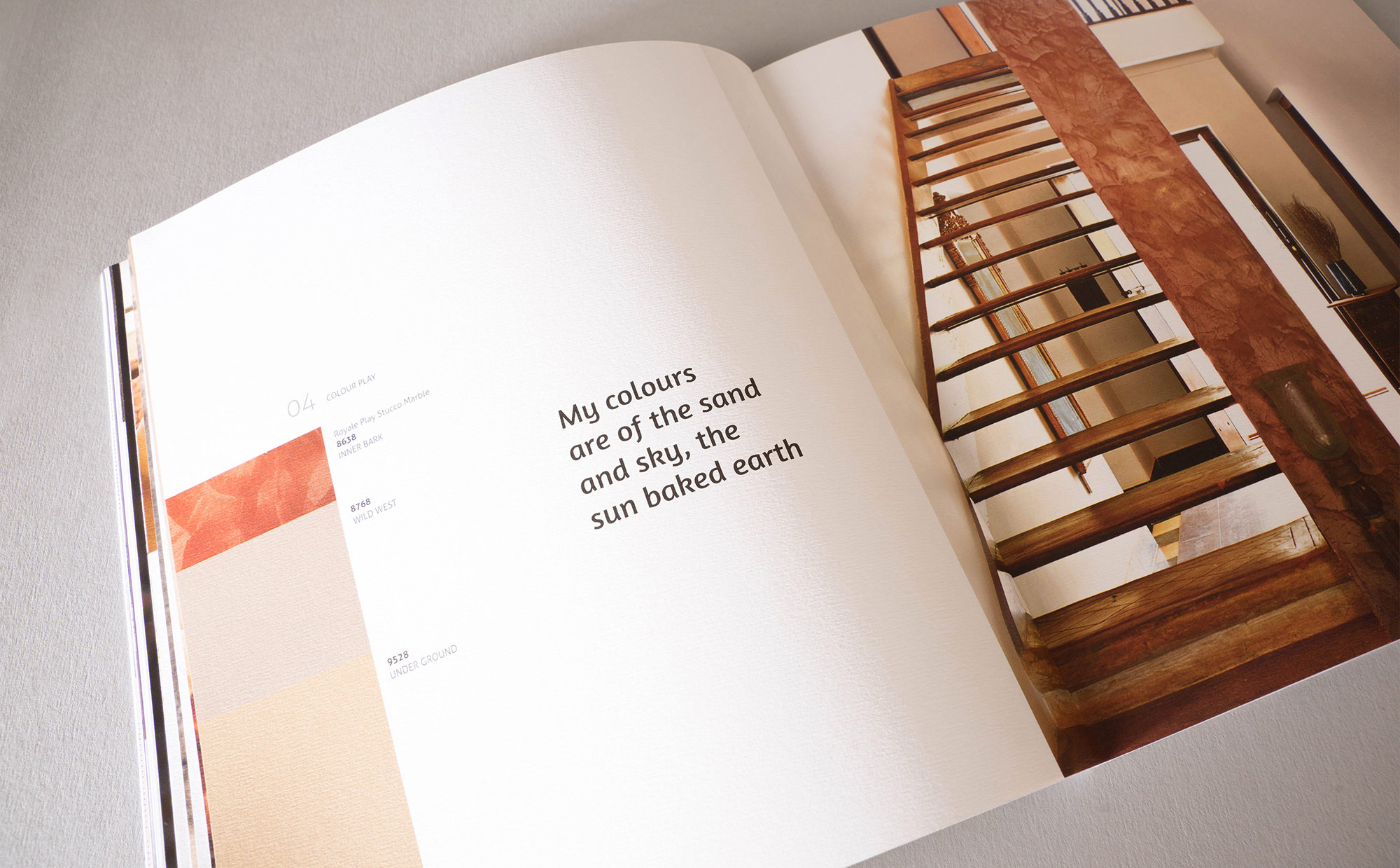
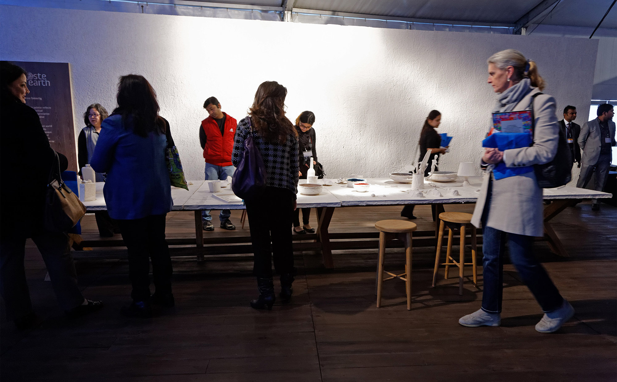
Taste of Earth
‘Taste of Earth’ is about the well travelled aesthete, who not only appreciates local skills and materials, but also participates in bringing out highly refined objects from such an environment.
The idea is conveyed through an installation that reflects an active creative studio environment. The main exhibit is a long 17 x 5 ft work table set in a room of about 450sqft. The table’s surface is embellished with many objects – both made and collected – and interspersed with everyday art tools which lie alongside.
The idea is conveyed through an installation that reflects an active creative studio environment. The main exhibit is a long 17 x 5 ft work table set in a room of about 450sqft. The table’s surface is embellished with many objects – both made and collected – and interspersed with everyday art tools which lie alongside.
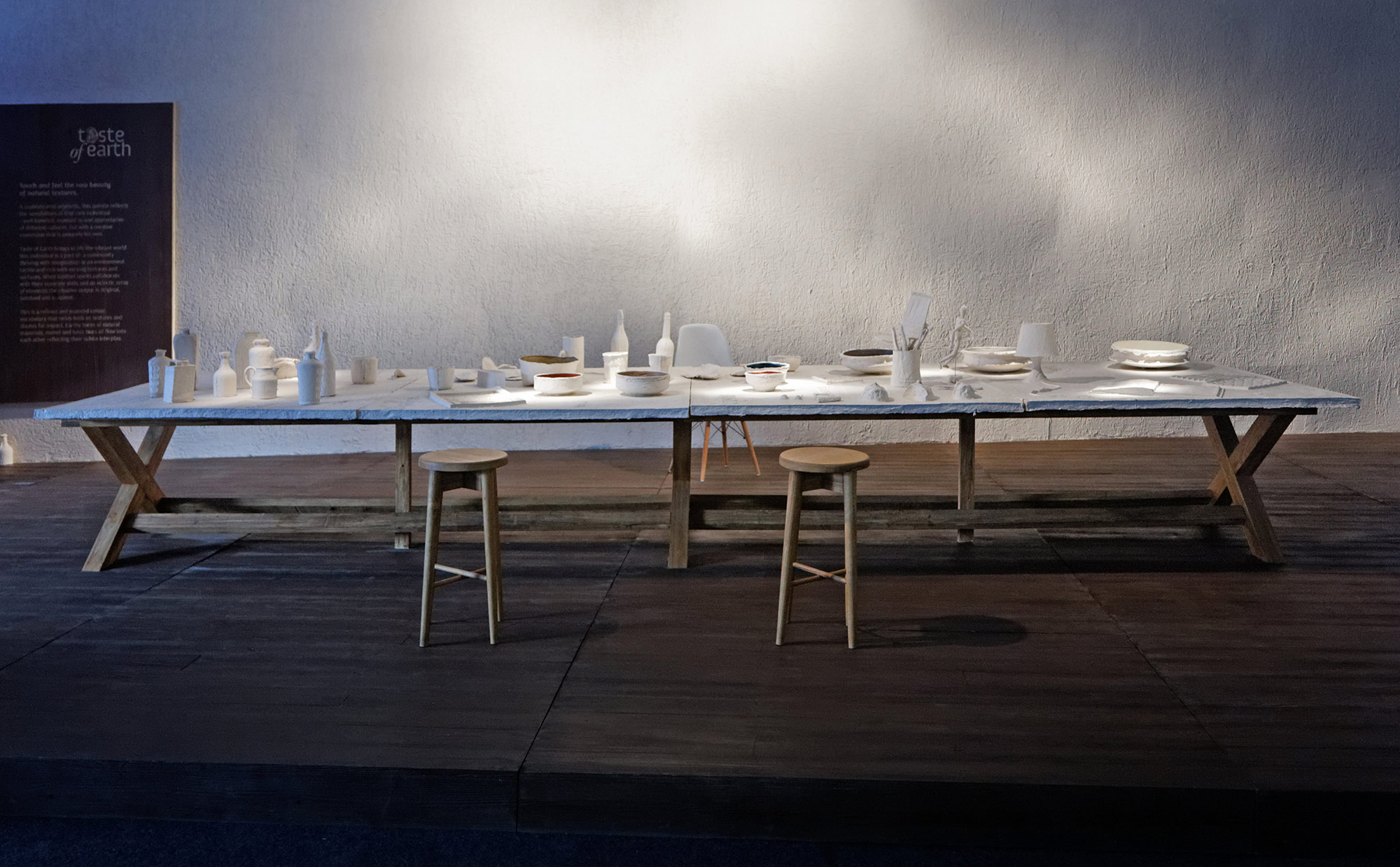
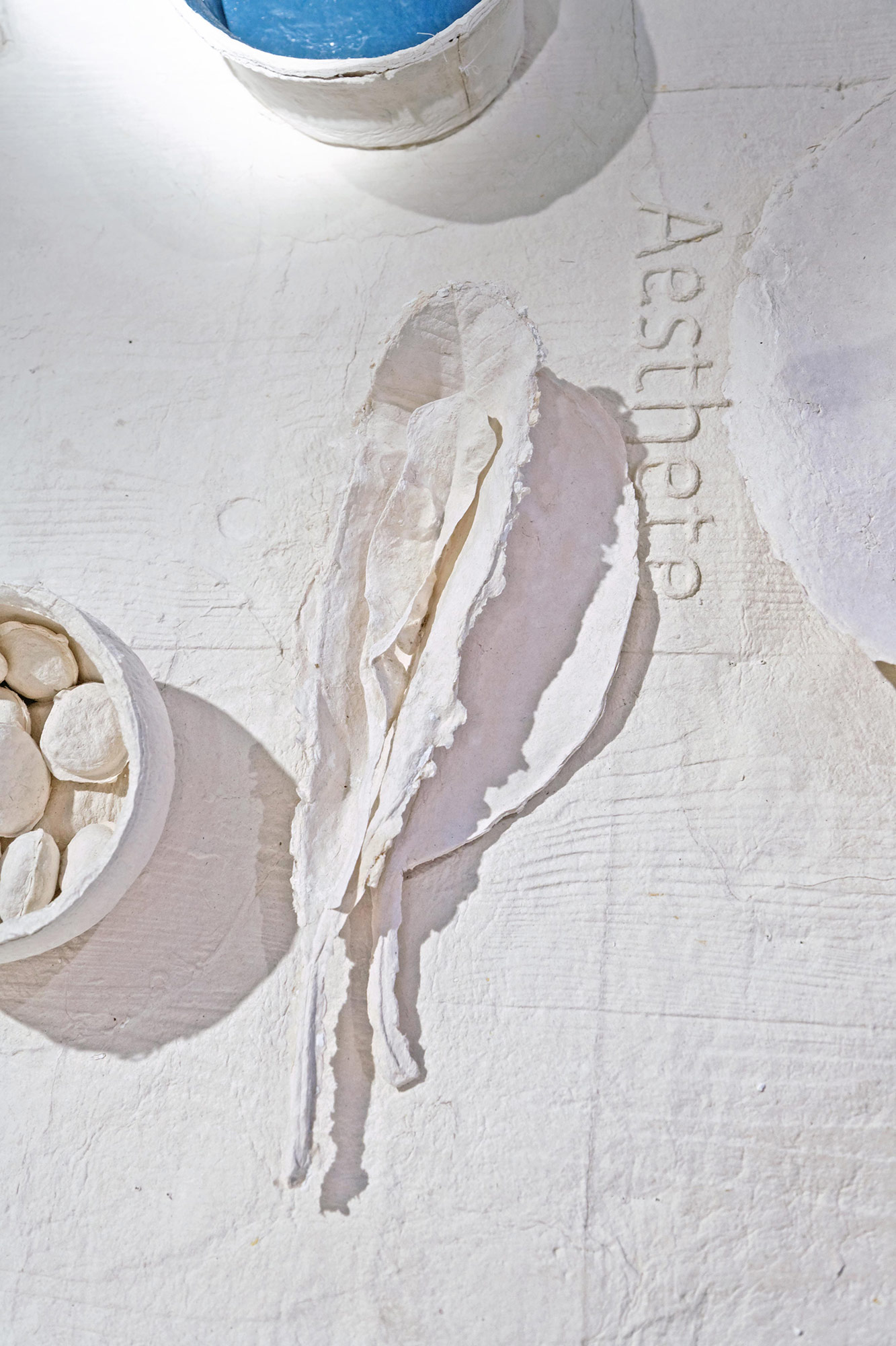
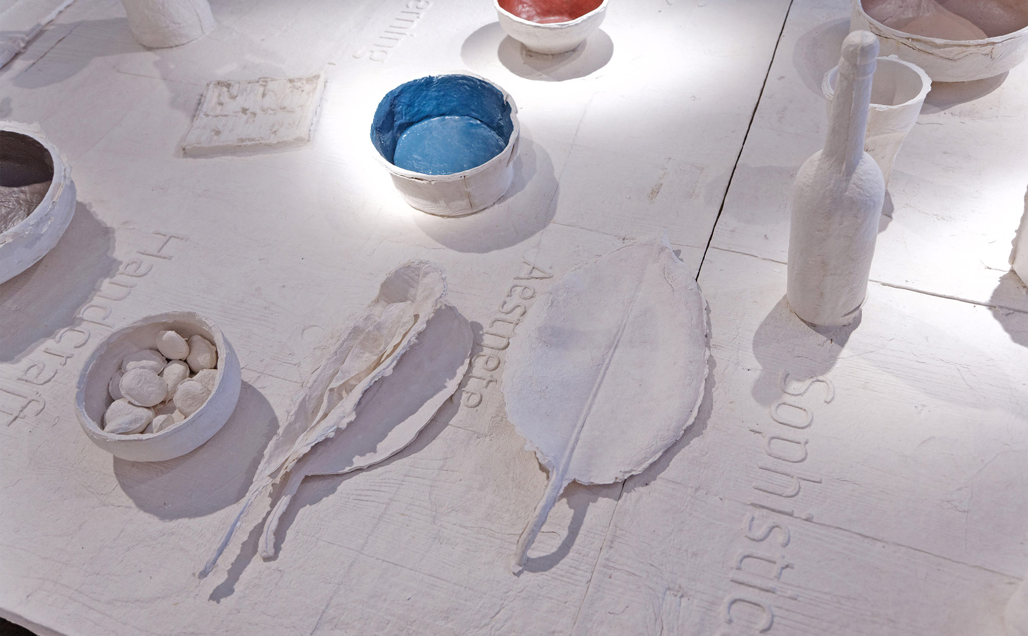
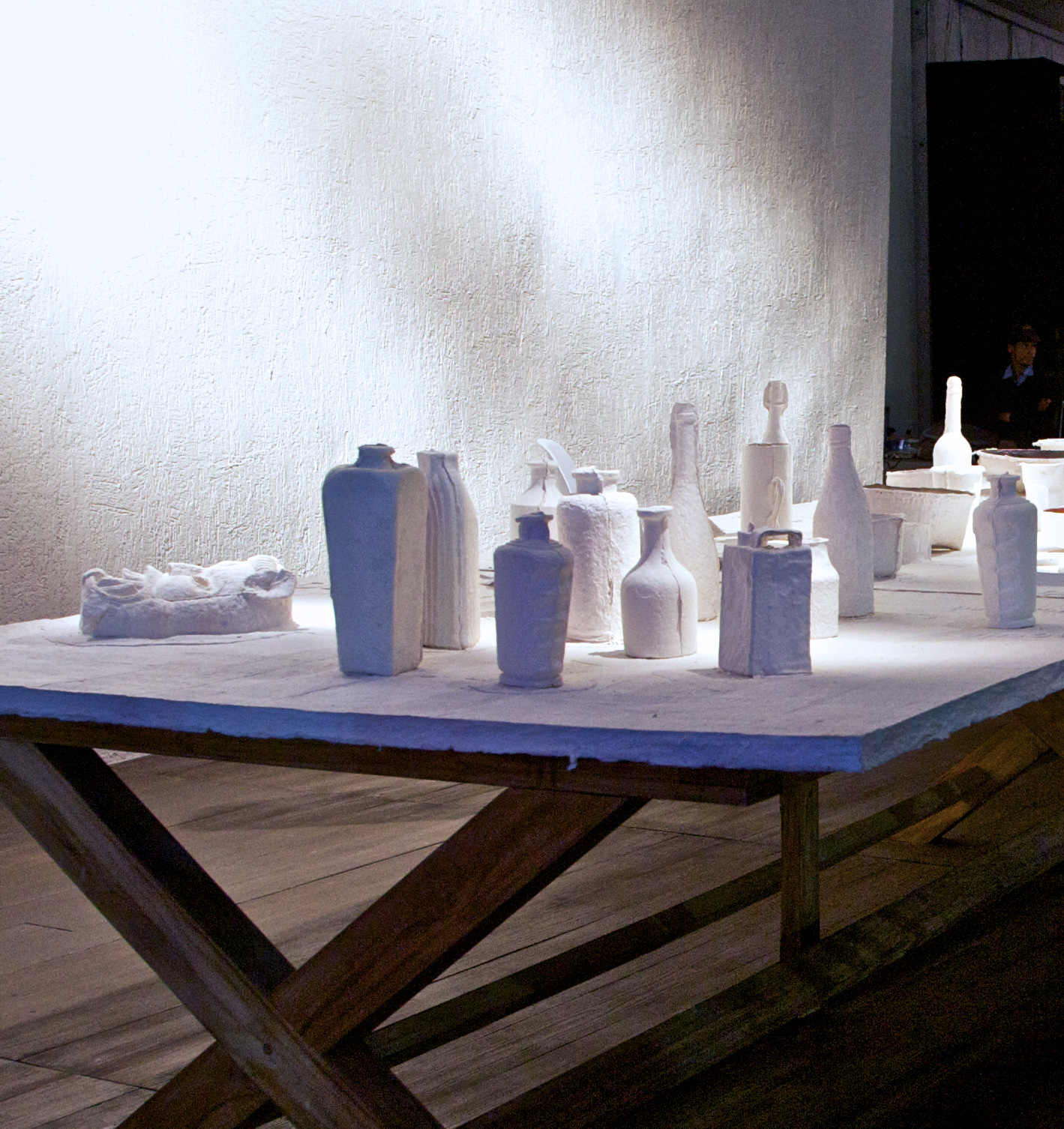
The concept is made more pronounced by having this entire table top, replete with objects casted in paper. A long sculptural table in unbleached white paper devoid of colours, suspends reality of the actual objects and brings focus to the larger abstracted, implied meaning and experience of the installation, that of the contemporary craftsperson, the curator, the collector and appreciator of good things – the aesthete. The installation of the creative work studio becomes an experience in itself, a work of art. The minimalism in the choice of materials (paper and wood), and of the room (except for the 2 stools and chair) allows the large white work-table to glow and radiate the concept– the refined persona of the them
Finally, in the midst of the pristine white landscape, the only colours seen are the theme colours revealed inside selected bowls and containers that concludes the overall composition and intent of the installation.
Finally, in the midst of the pristine white landscape, the only colours seen are the theme colours revealed inside selected bowls and containers that concludes the overall composition and intent of the installation.
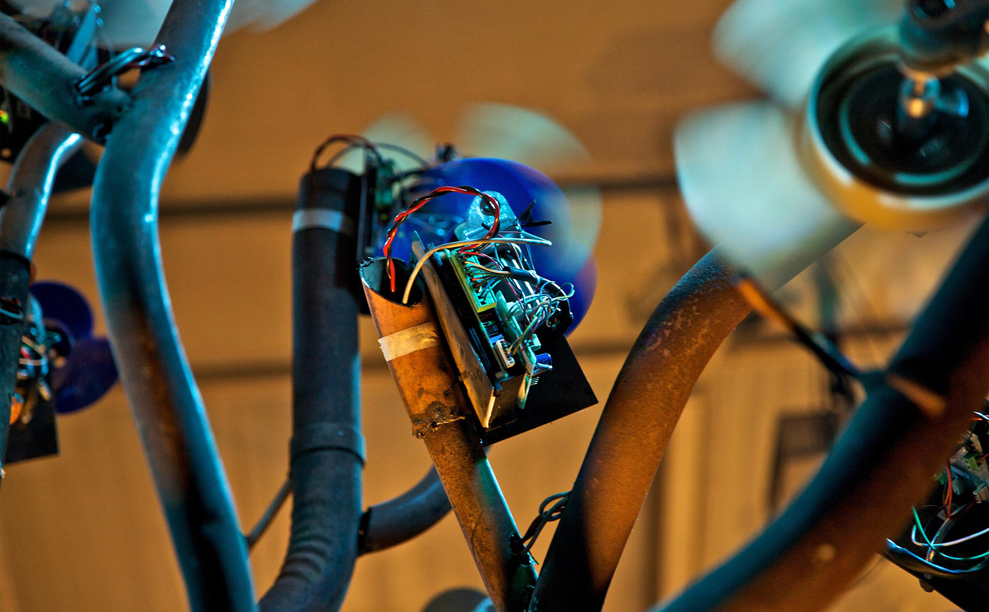
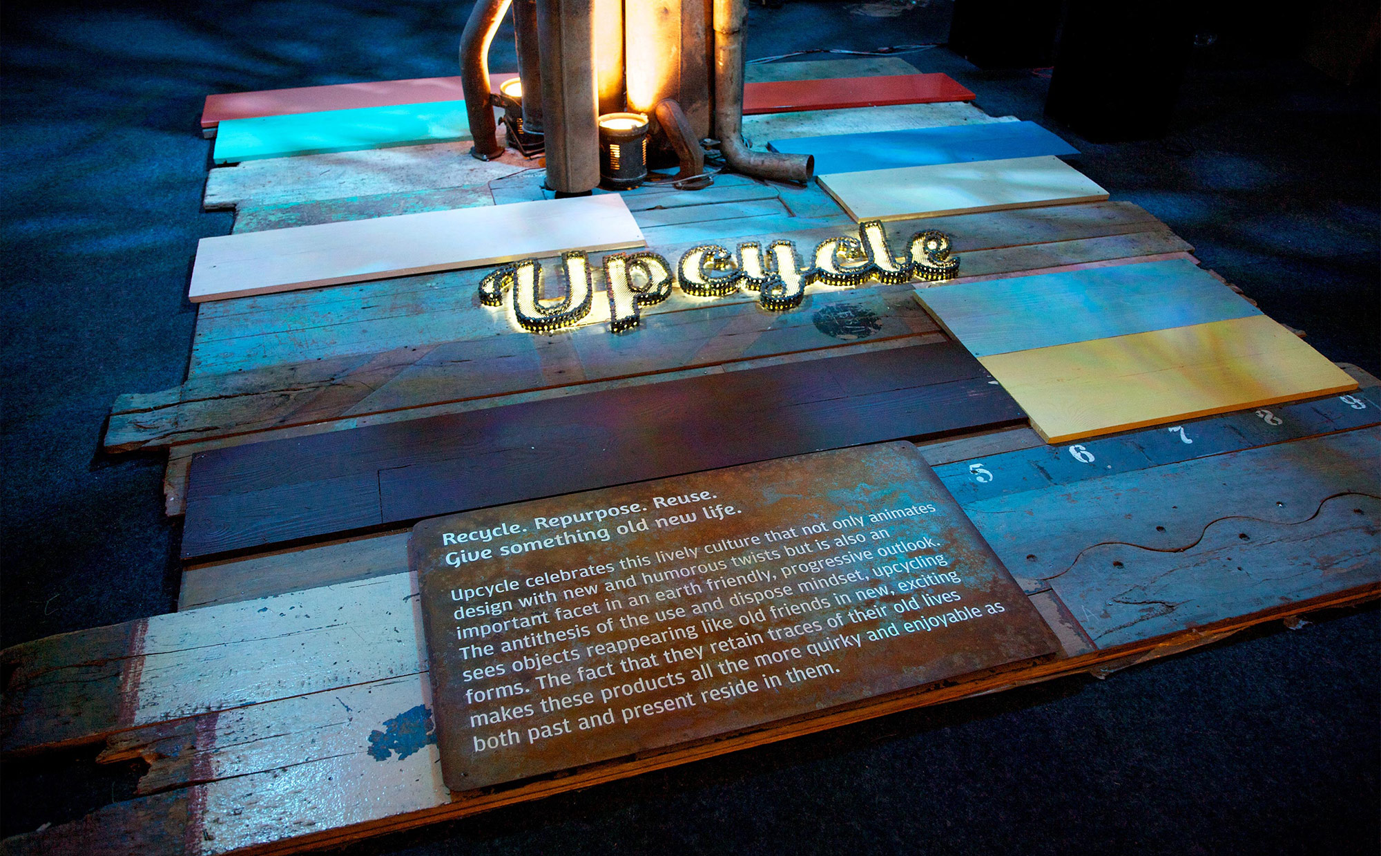
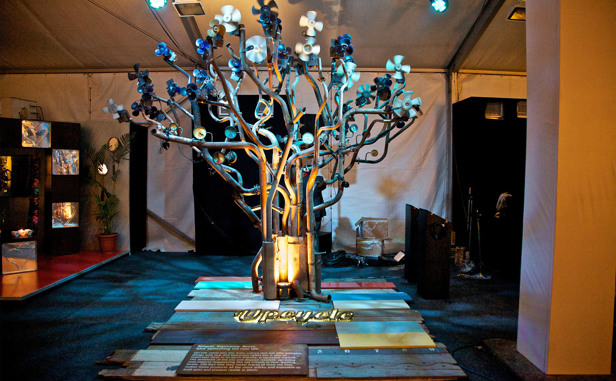
Upcycle
In this consumerist society of use-and-throw-away, there is a counter-culture that seeks to reuse by repurposing. There is great fun and meaning in repurposing objects that are old or discarded, into something meaningful and quirky.
‘Upcycle’ is encapsulated in an installation of a vibrant tree that is made of exhaust pipes of cars and trucks, along with other discarde objects. An old product which once polluted the landscape becomes a metaphor for something that is good for the environment! The tree is made richer in experience with the addition of the dynamic foliage -a series of discarded fans that are programmed to rotate at a specific RPM on a time line to mimic the gentle breeze that brings comfort and solace. There are 5 headphones embedded on the tree that have soundtrack reminiscing of the many journeys each exhaust would have travelled across the country.
‘Upcycle’ is encapsulated in an installation of a vibrant tree that is made of exhaust pipes of cars and trucks, along with other discarde objects. An old product which once polluted the landscape becomes a metaphor for something that is good for the environment! The tree is made richer in experience with the addition of the dynamic foliage -a series of discarded fans that are programmed to rotate at a specific RPM on a time line to mimic the gentle breeze that brings comfort and solace. There are 5 headphones embedded on the tree that have soundtrack reminiscing of the many journeys each exhaust would have travelled across the country.

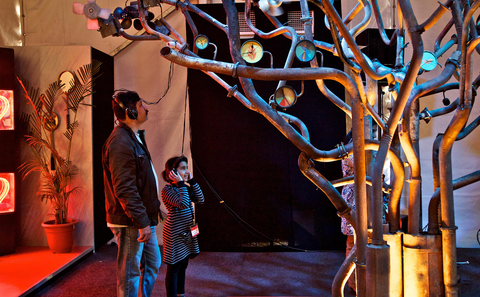
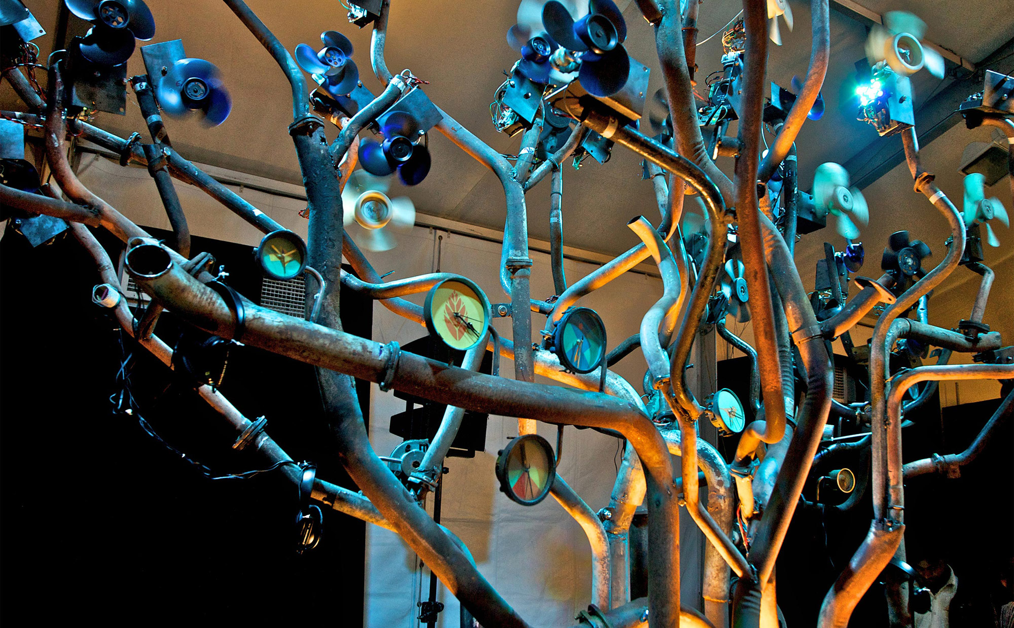
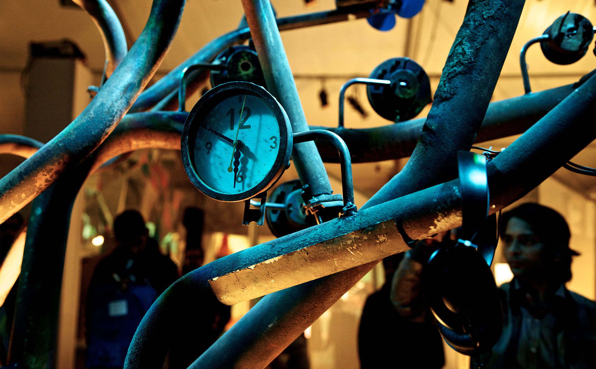
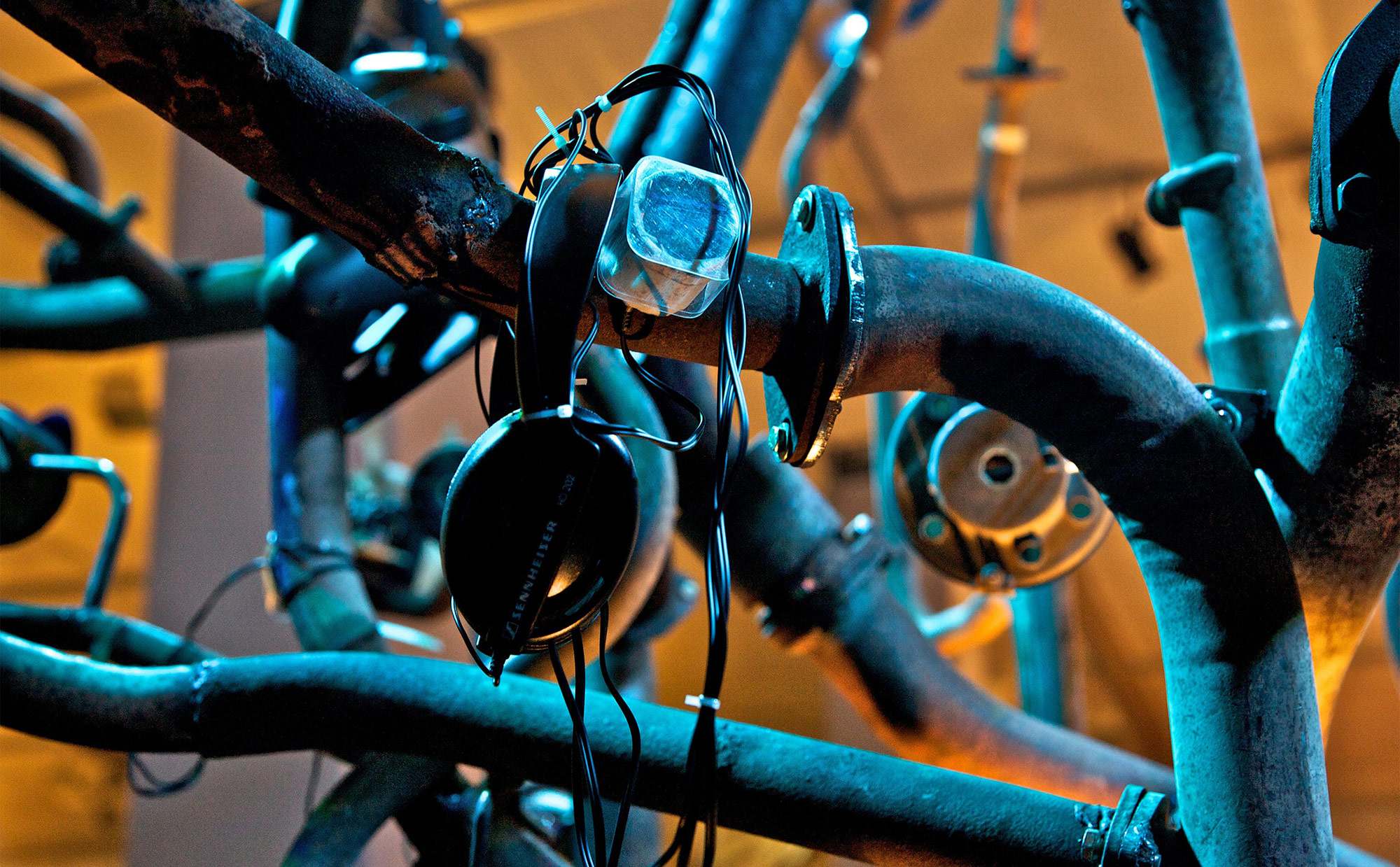
The motorcycle chain is repurposed to become the glow sign ‘Upcycle’ for the installation, while the theme colours are introduced on the repurposed discarded boards, doors etc. These surfaces add to the warm, quirky atmosphere of the colour theme by retaining the textures and memories of the many layered stories.
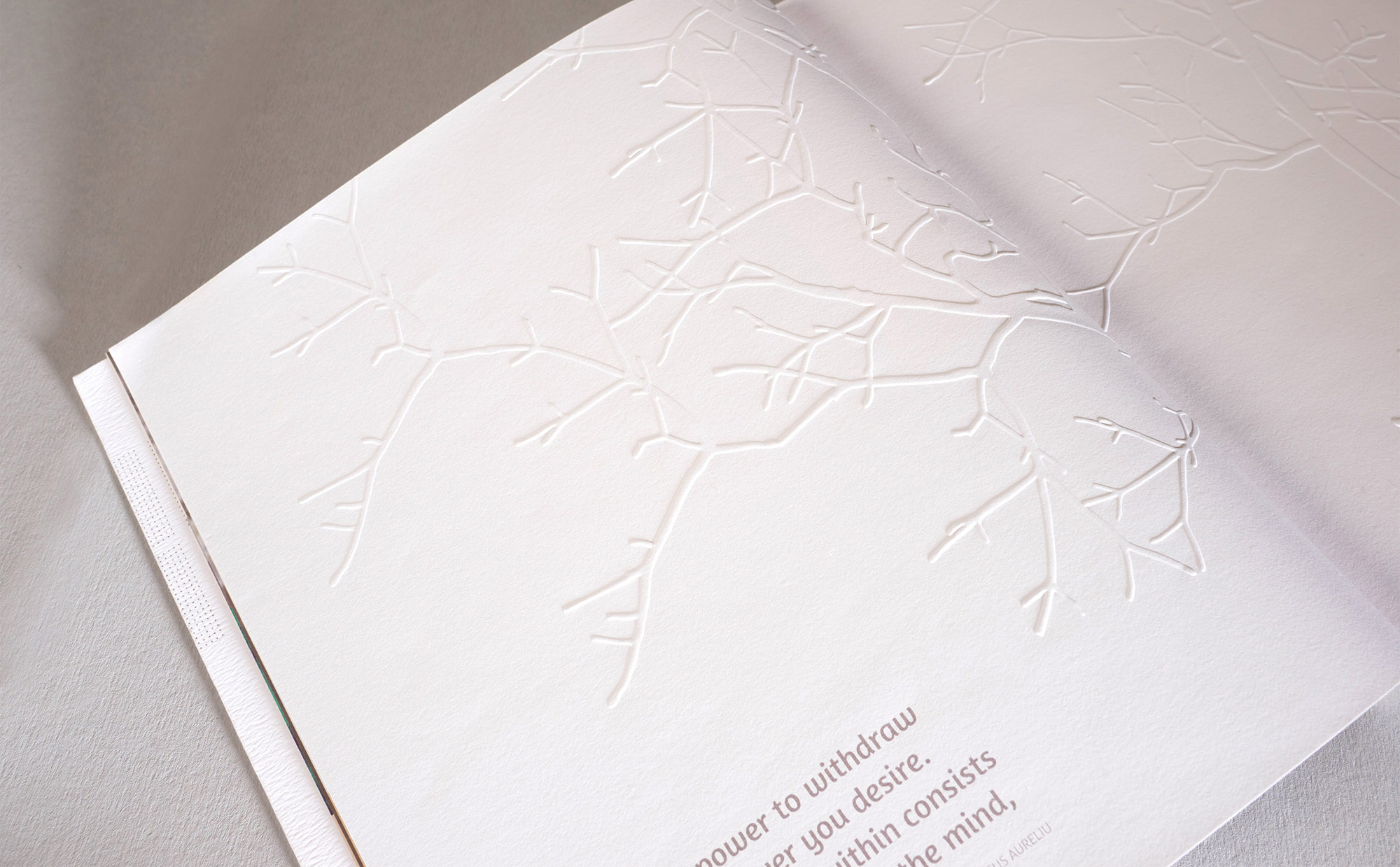
PRINT DESIGN
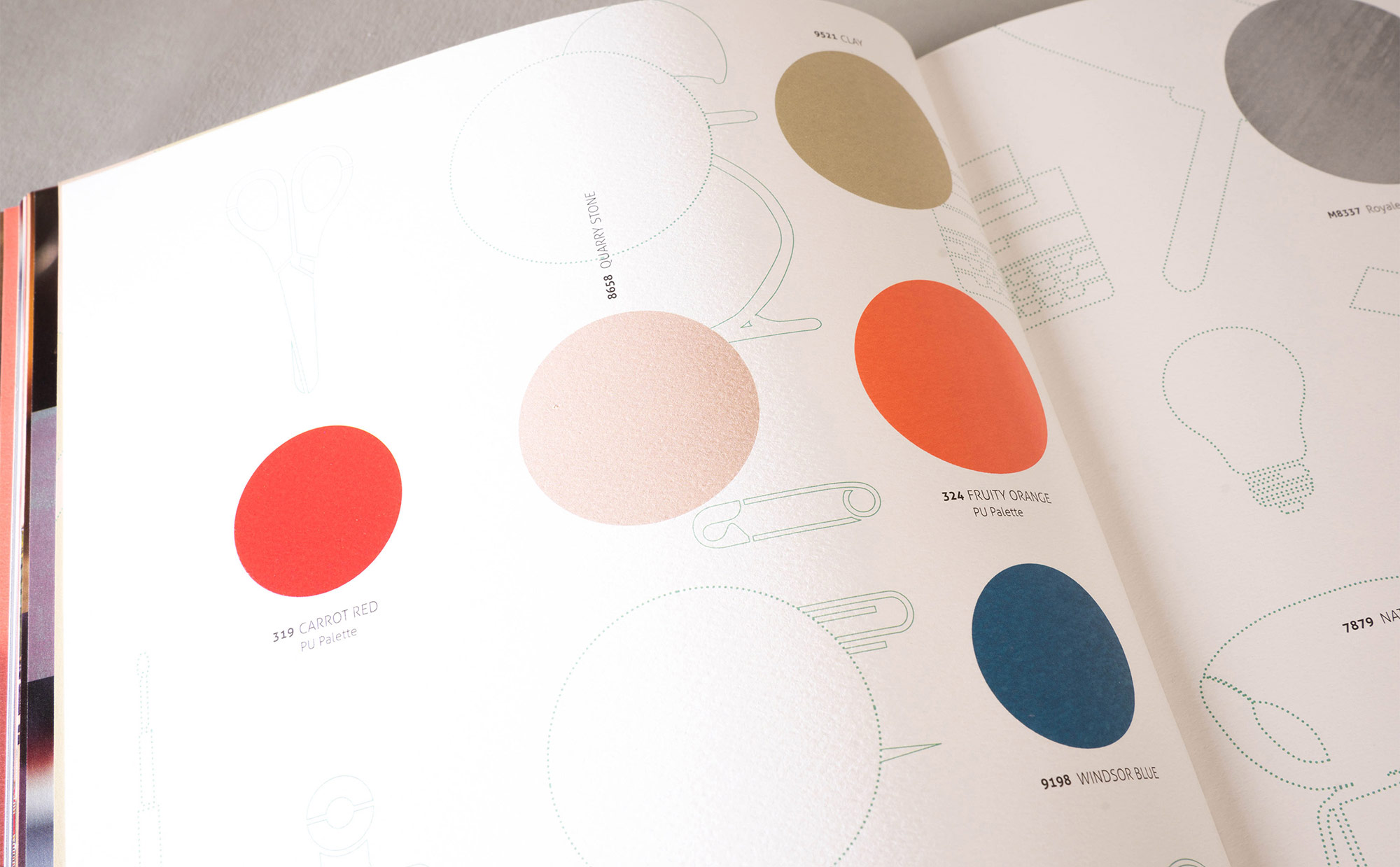
Lookbook 2013
Lookbook 2013
The Lookbook-workbook is a concise and handy reference, complete with theme stories, visualisations, moodboards and swatches designed to inspire designers across disciplines and contextualise colour, material, finishes and textures for the year to come.