IDENTITY DESIGN . PRINT DESIGN
CEPT Identity
Established as Centre for Planning and Technology in 1962, CEPT had long outgrown the full form of its name as it evolved into a university with multiple schools under it. We were approached to create a coherent brand hierarchy that reflected the structure of the university and united the schools within — and one that was dynamic and ready for the future, just like its forward-looking curriculum, thinking and spirit.
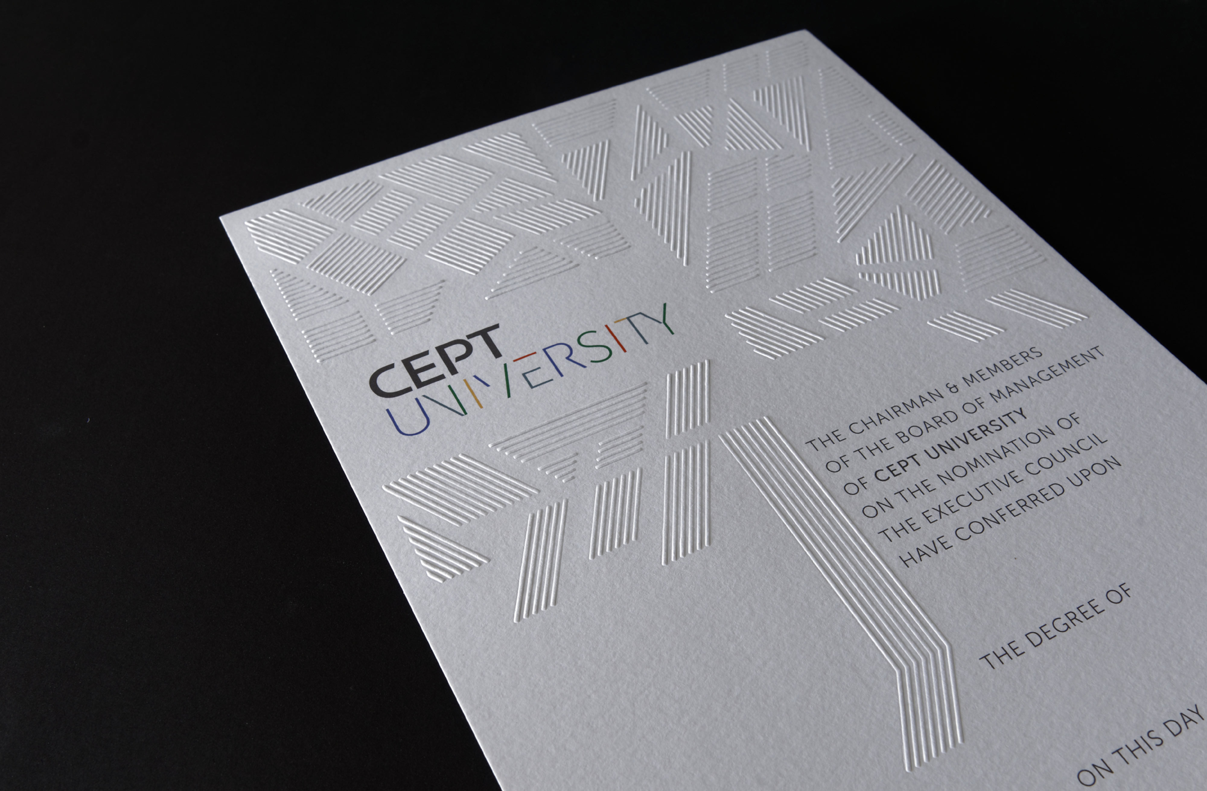
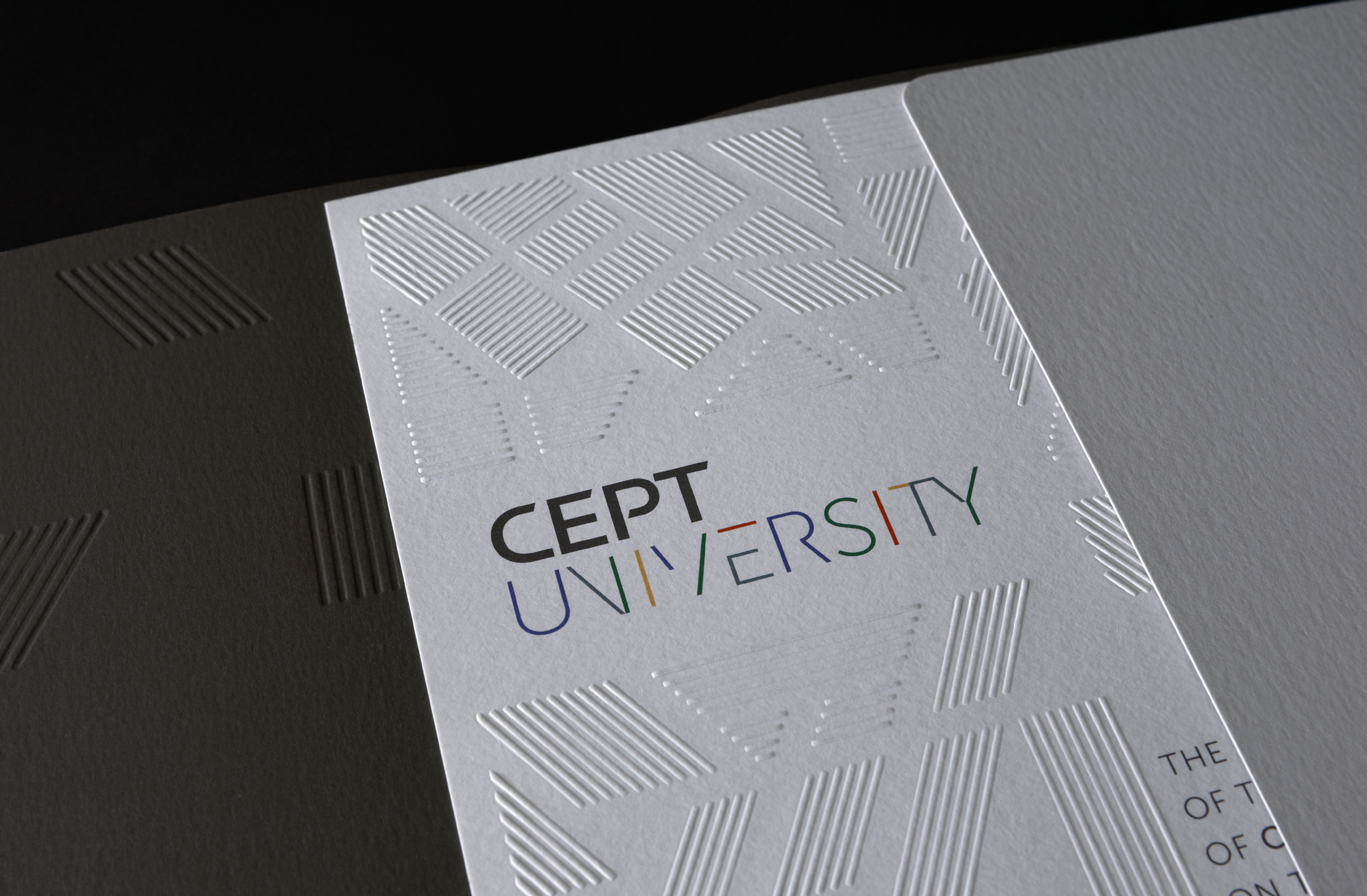
CEPT Identity
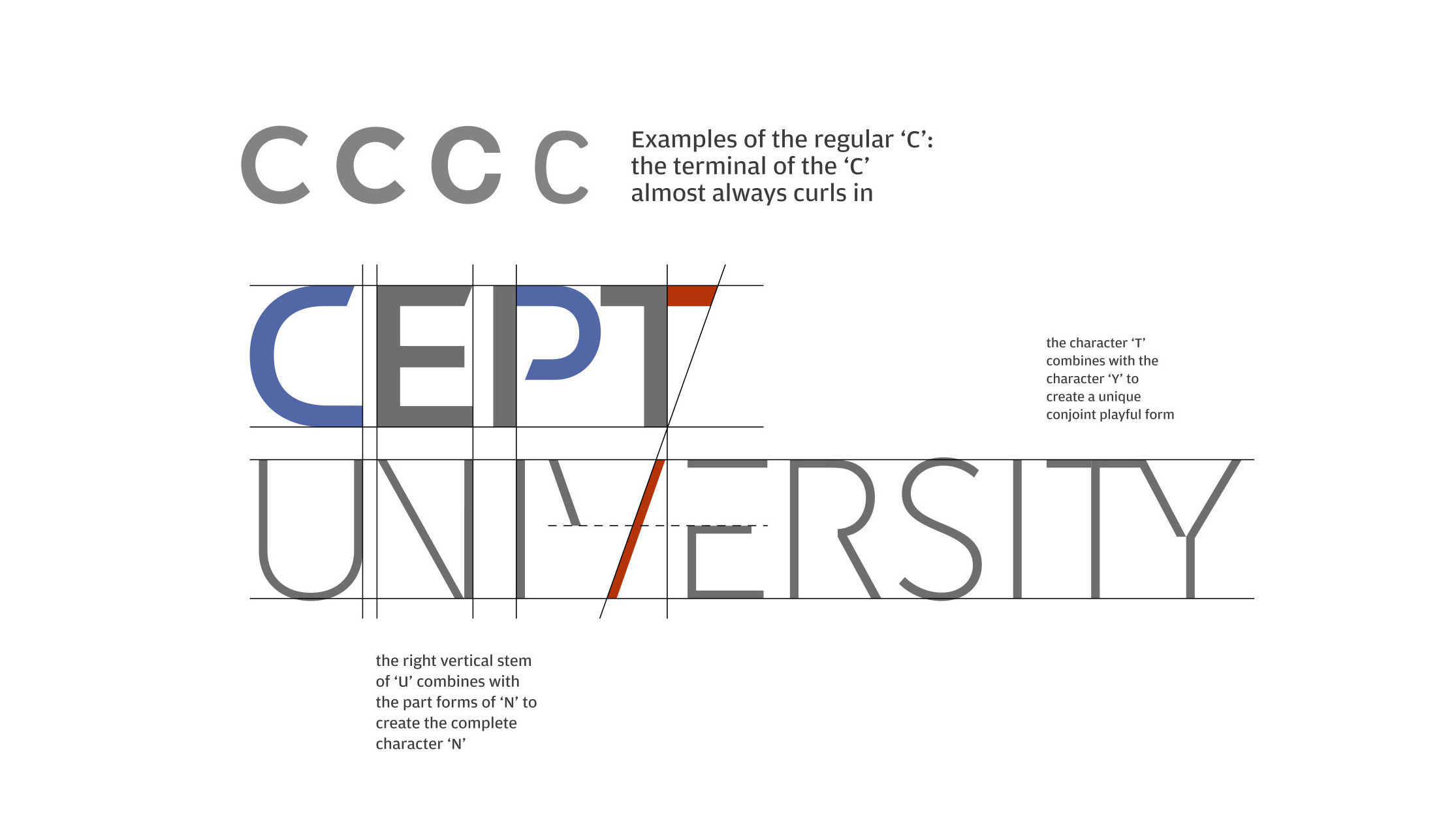
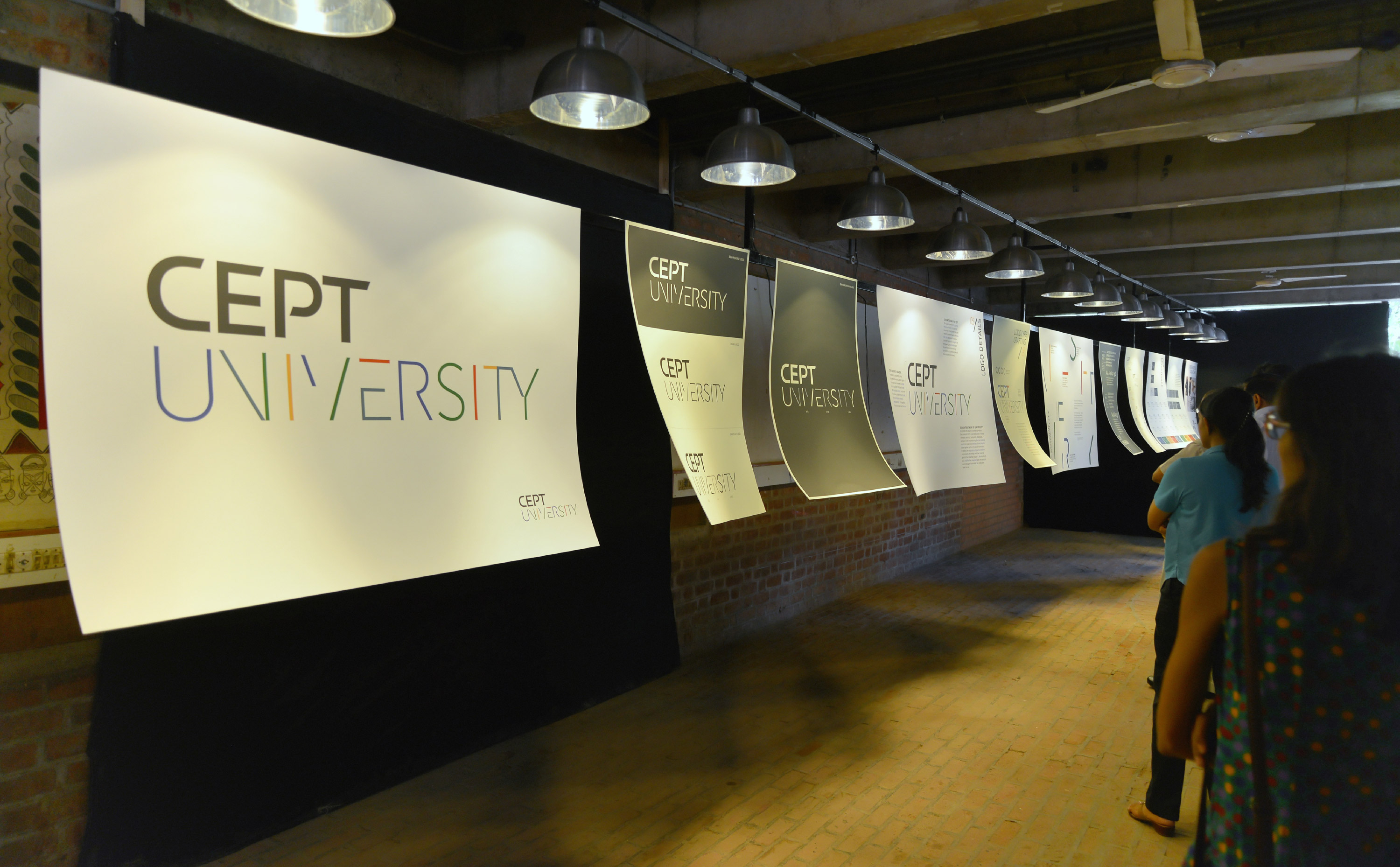
Established as Centre for Planning and Technology in 1962, CEPT had long outgrown the full form of its name as it evolved into a university with multiple schools under it. We were approached to create a coherent brand hierarchy that reflected the structure of the university and united the schools within — and one that was dynamic and ready for the future, just like its forward-looking curriculum, thinking and spirit. CEPT was much more than the sum of its parts. We chose a typographic path where CEPT and UNIVERSITY complement each other while individually evoking the values of its educational environment. Shorn of unnecessary embellishment, ‘CEPT’ was strong — an accessible form with open and interflowing counter forms. ‘University’ with its indicative forms and imagined lines, was an orchestration of diagonals, horizontals, verticals and arcs: reflecting an exploratory, dynamic and creative environment. A colour was chosen for each of the five faculties, together creating a vibrant logo, held together by the stoic grey anchor of CEPT.
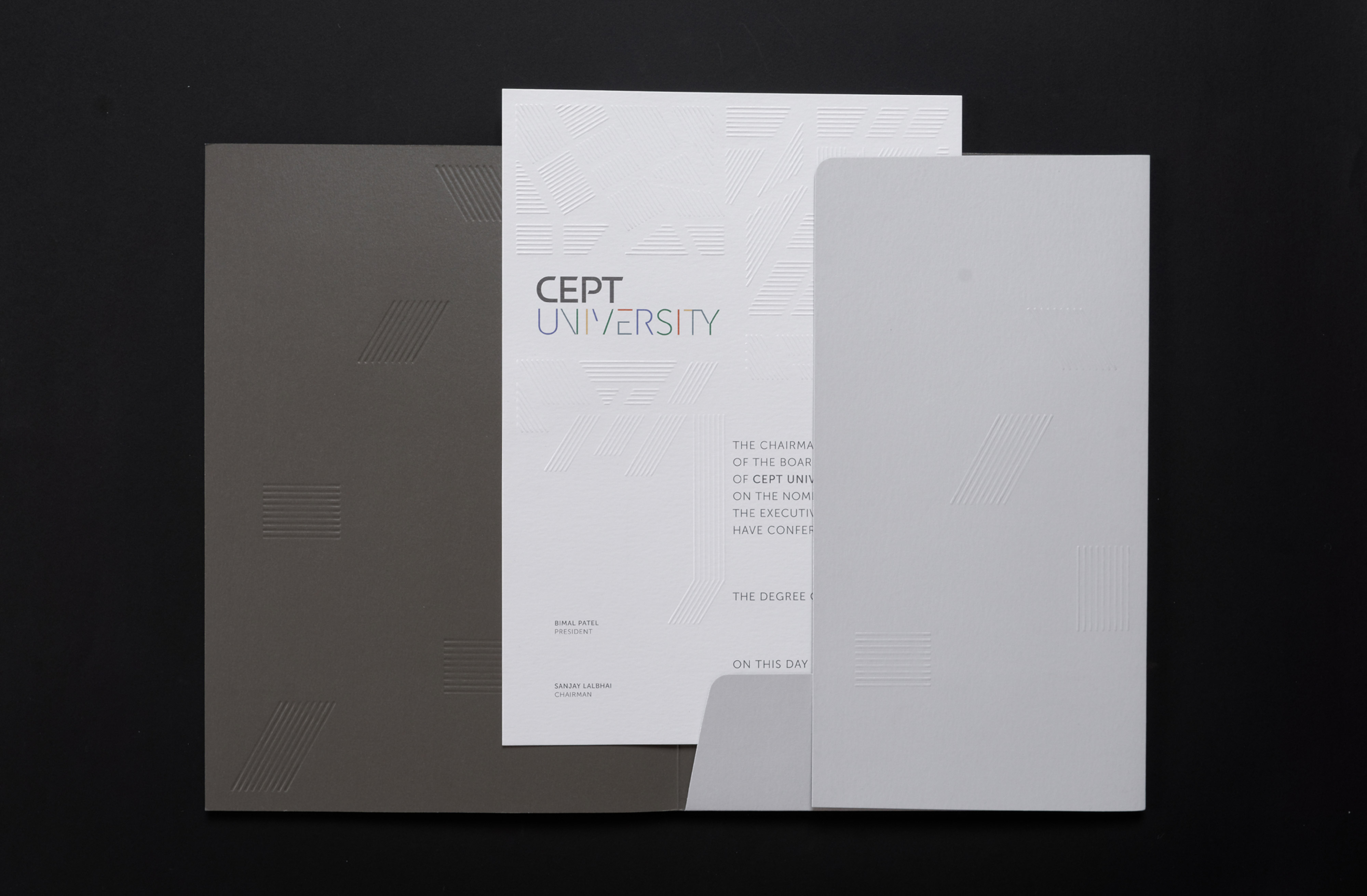
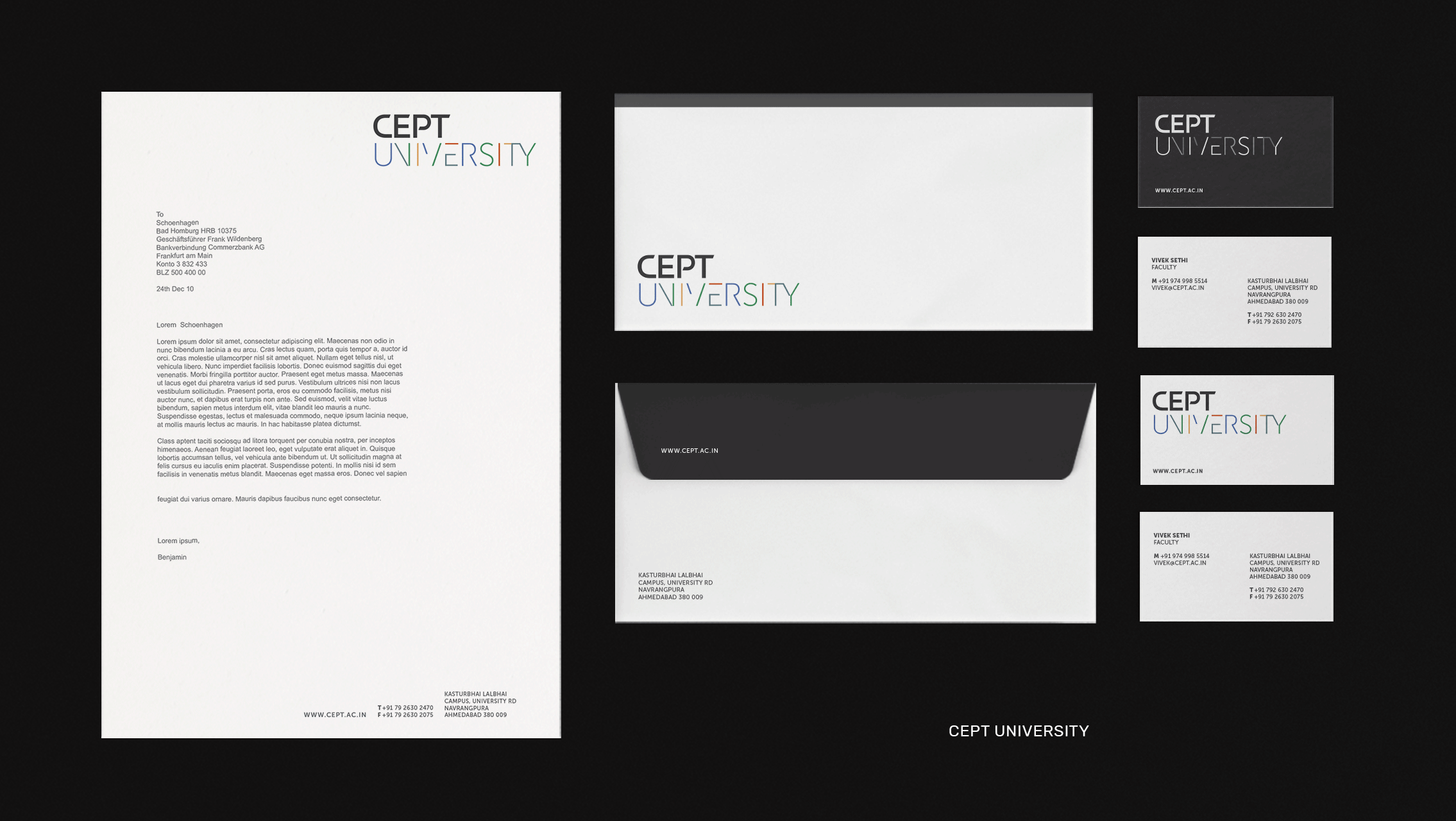
Stationery
Modern, minimal, young yet with all the seriousness of an institution — the stationery walked a thin but distinctive line between formal and fun.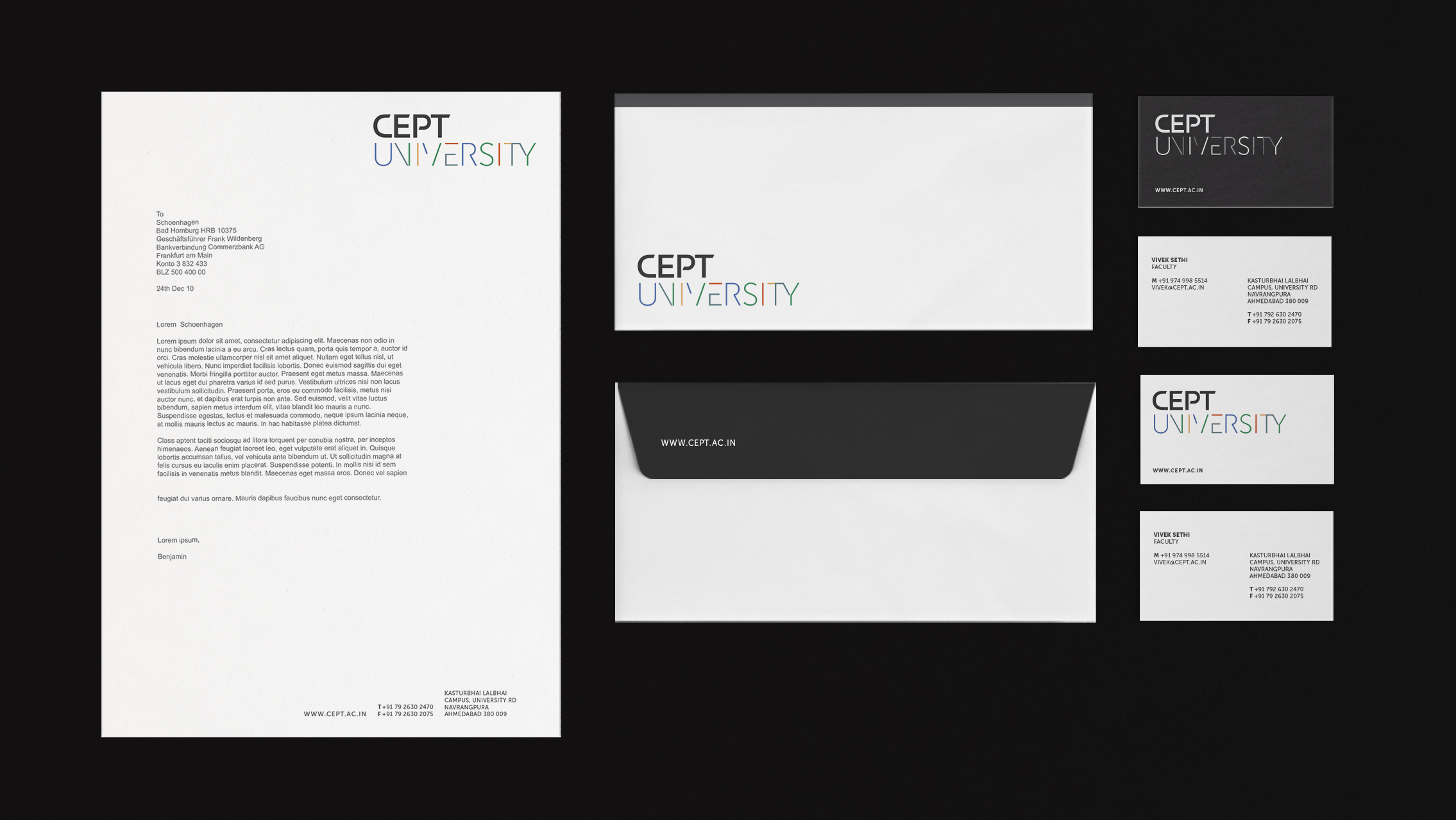
Branding for Faculties
A palette of primary colours inspired by Polychromie Architecturale was the perfect way to reflect the diversity within the university across its 5 faculties. Each one was given a colour which became central to the identity of individual faculties. 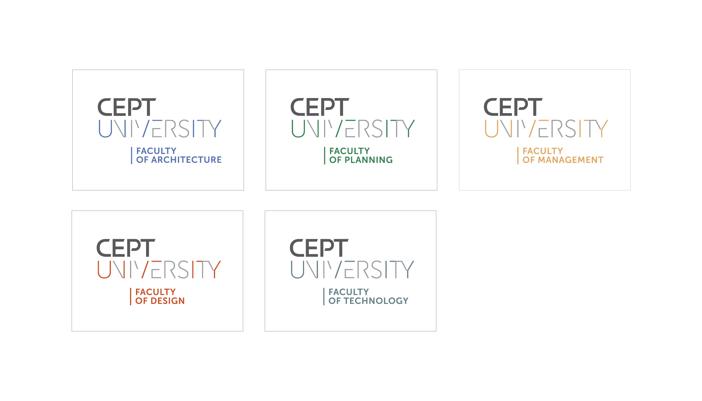

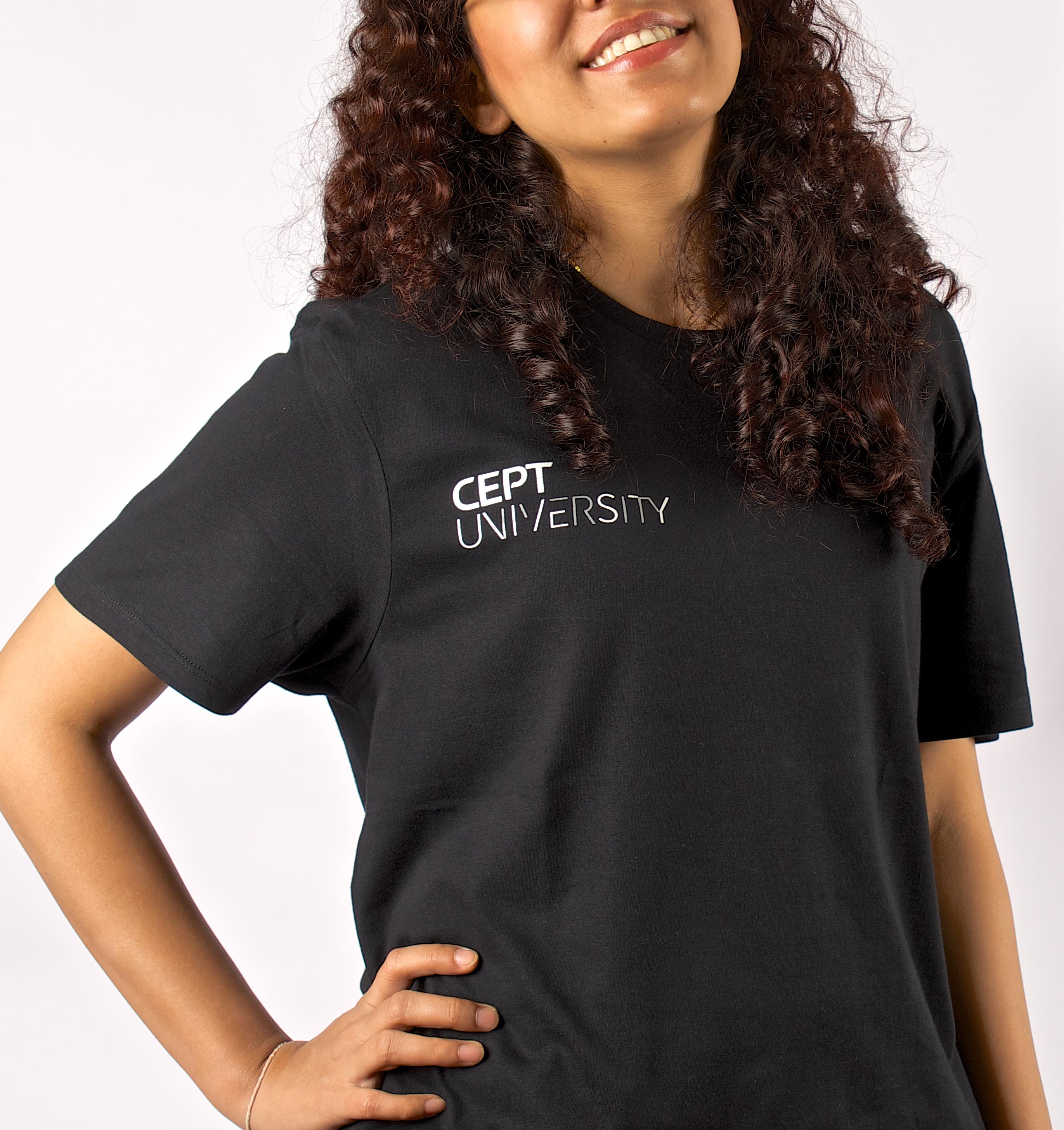
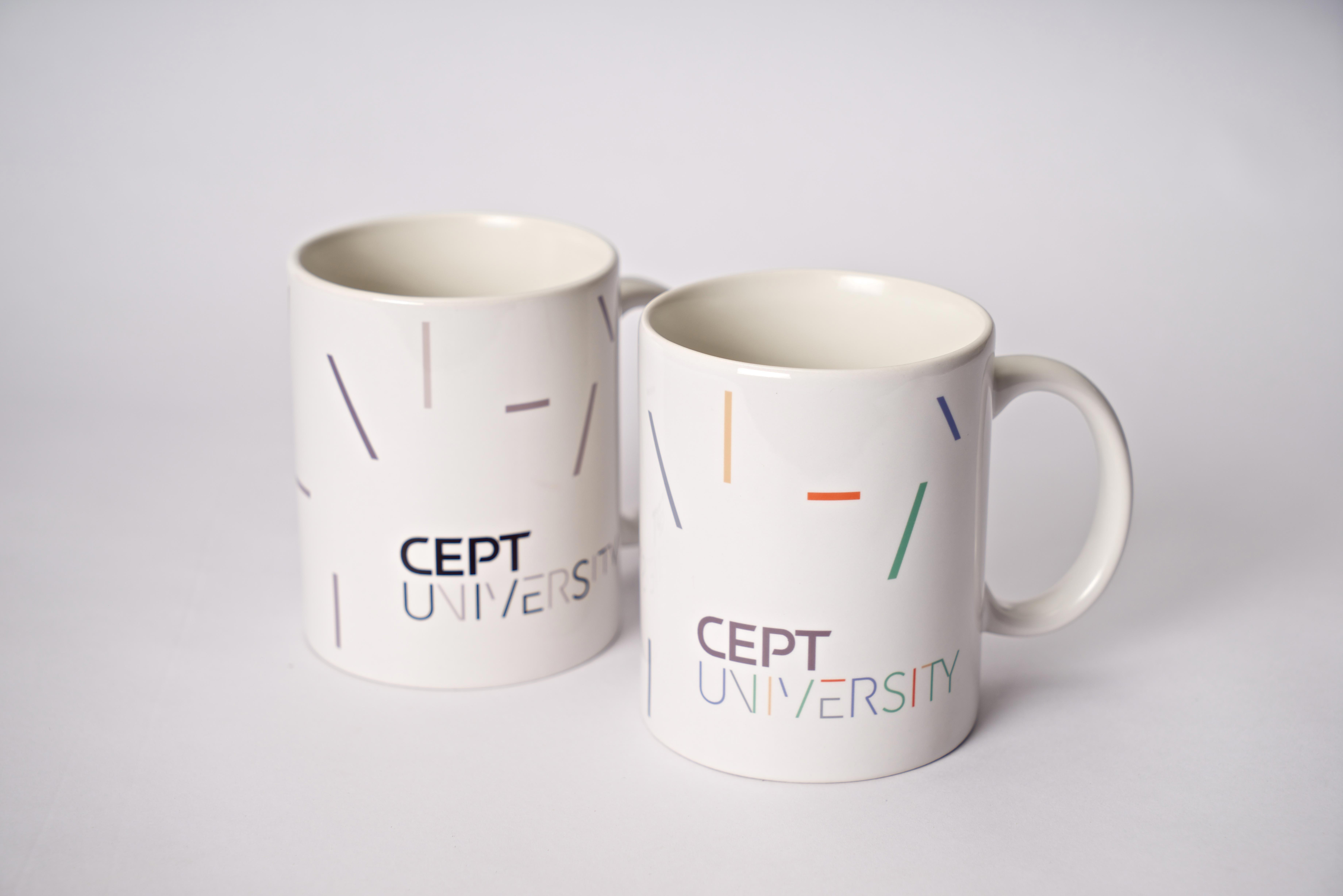
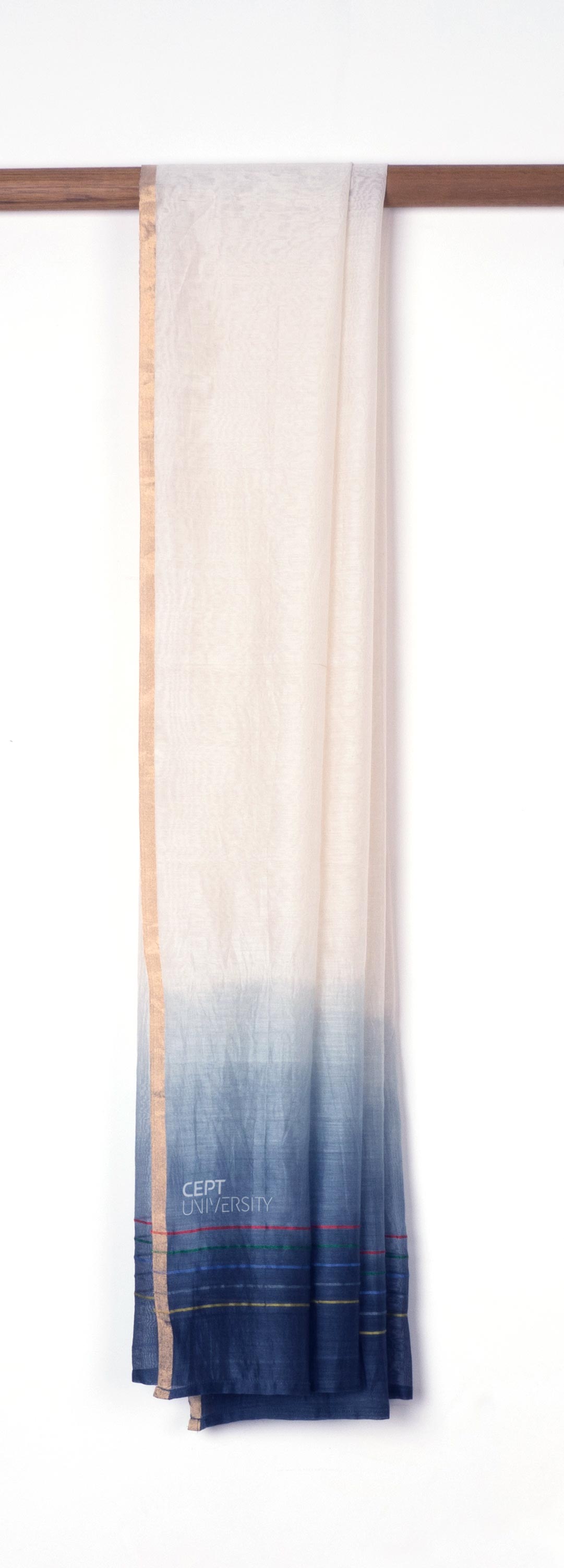
Applications
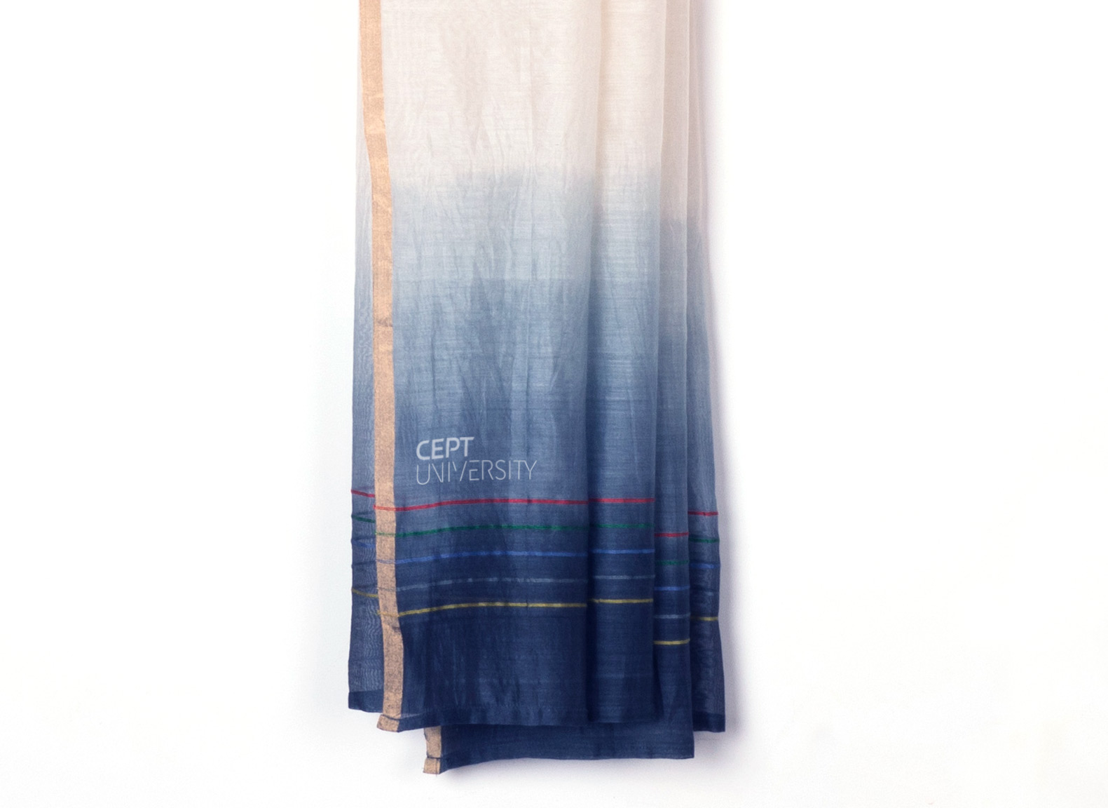
An indicative set of branded merchandise was developed based on the projected needs of university life. The line elements from the the UNIVERSITY part of the logo lent to abstract and interesting design interpretations. The graduation stole, integral to the ceremony and the memory of student life, was designed in dip-dyed chanderi, with the colours of the university woven in fine lines at each end — a keepsake one would be happy to wear in the years to come.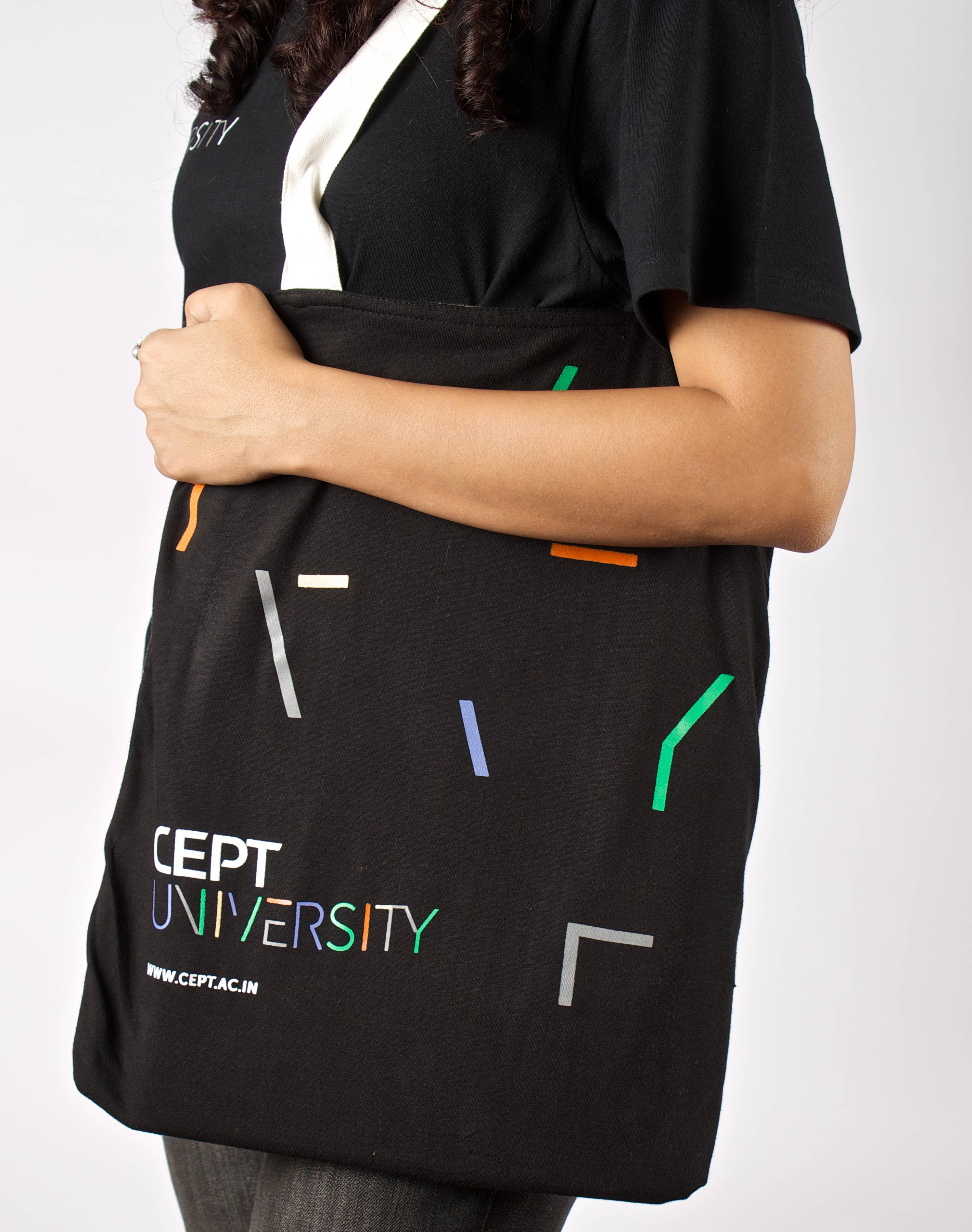

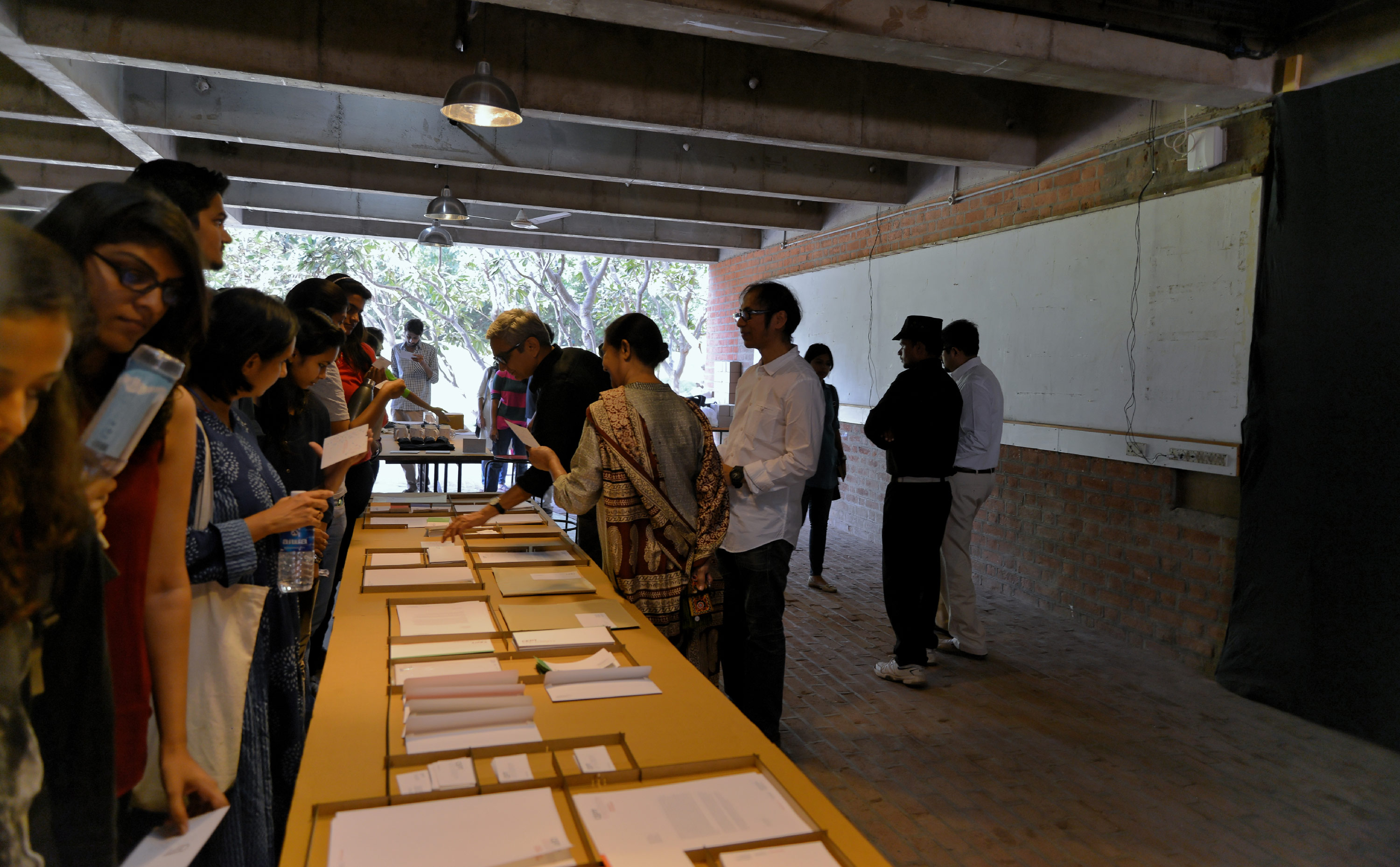
Launch Exhibit
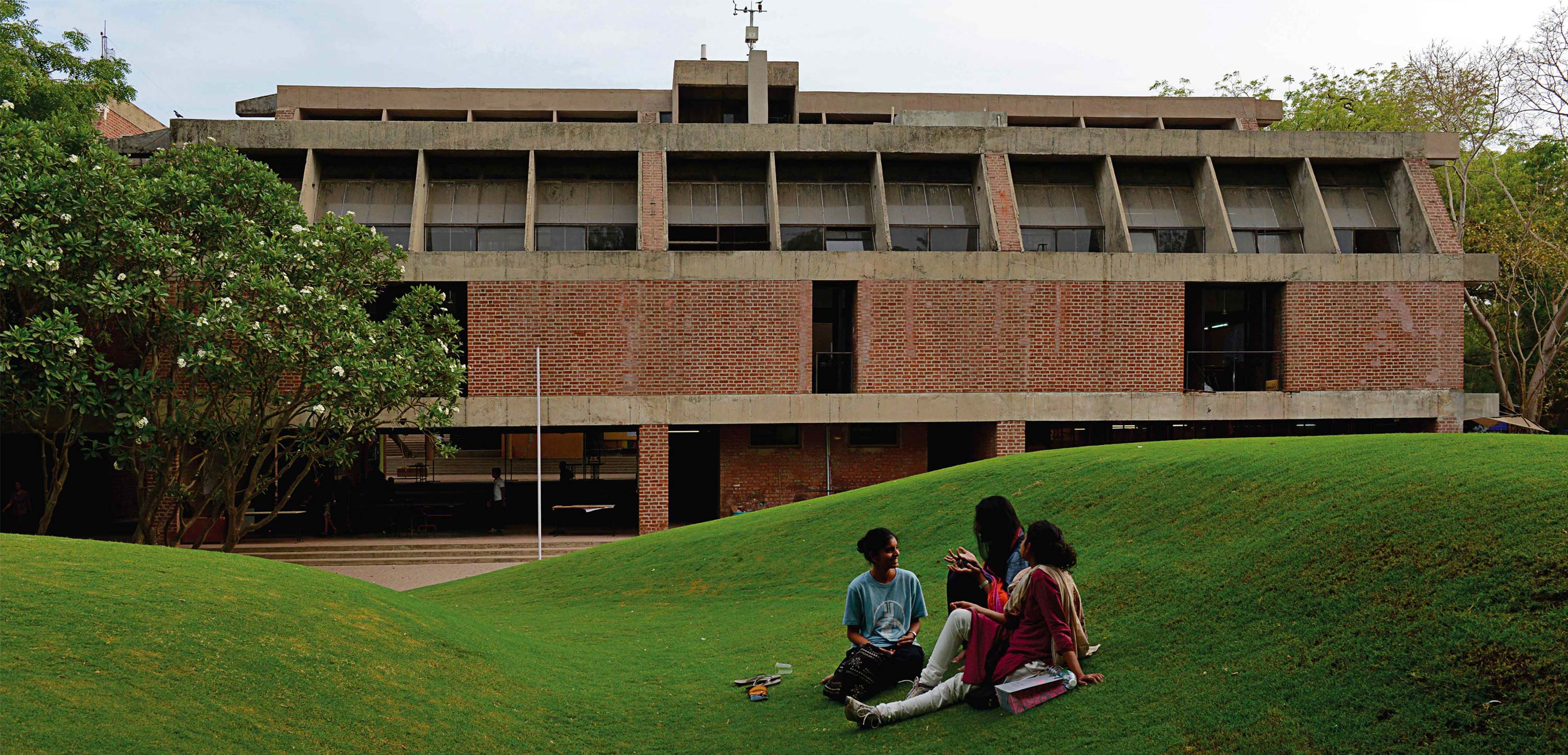
The new visual identity was unveiled in an exhibition open to all, especially students and alumni. It was, after all, inspired by the university they called home and, we hope, it would be an identity they would go on to make their own.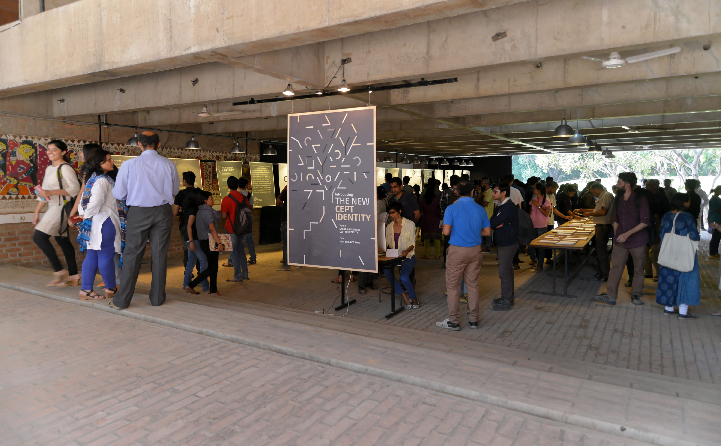
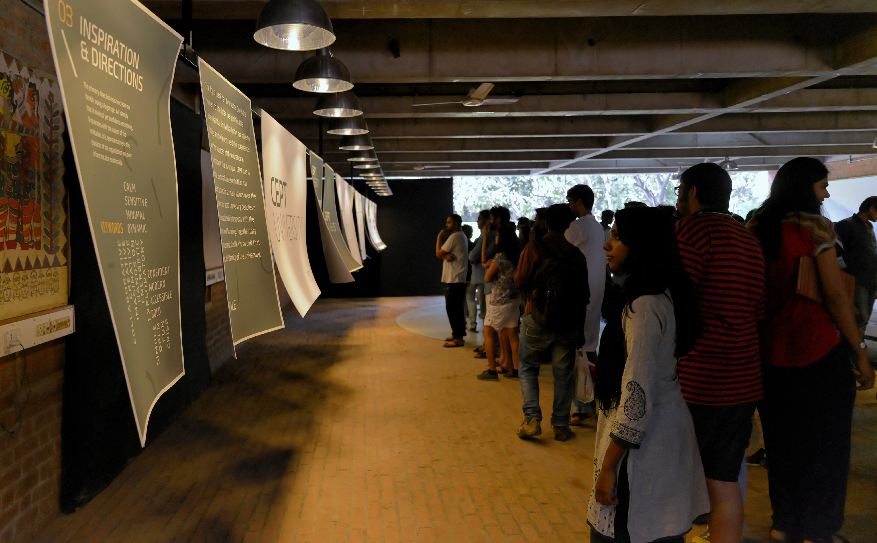


Typeface Systems
The logo mark has two words – the name followed by a qualifier. It is essential that they individually embody and project the relevant and unique characteristics and nuances of the educational environment.